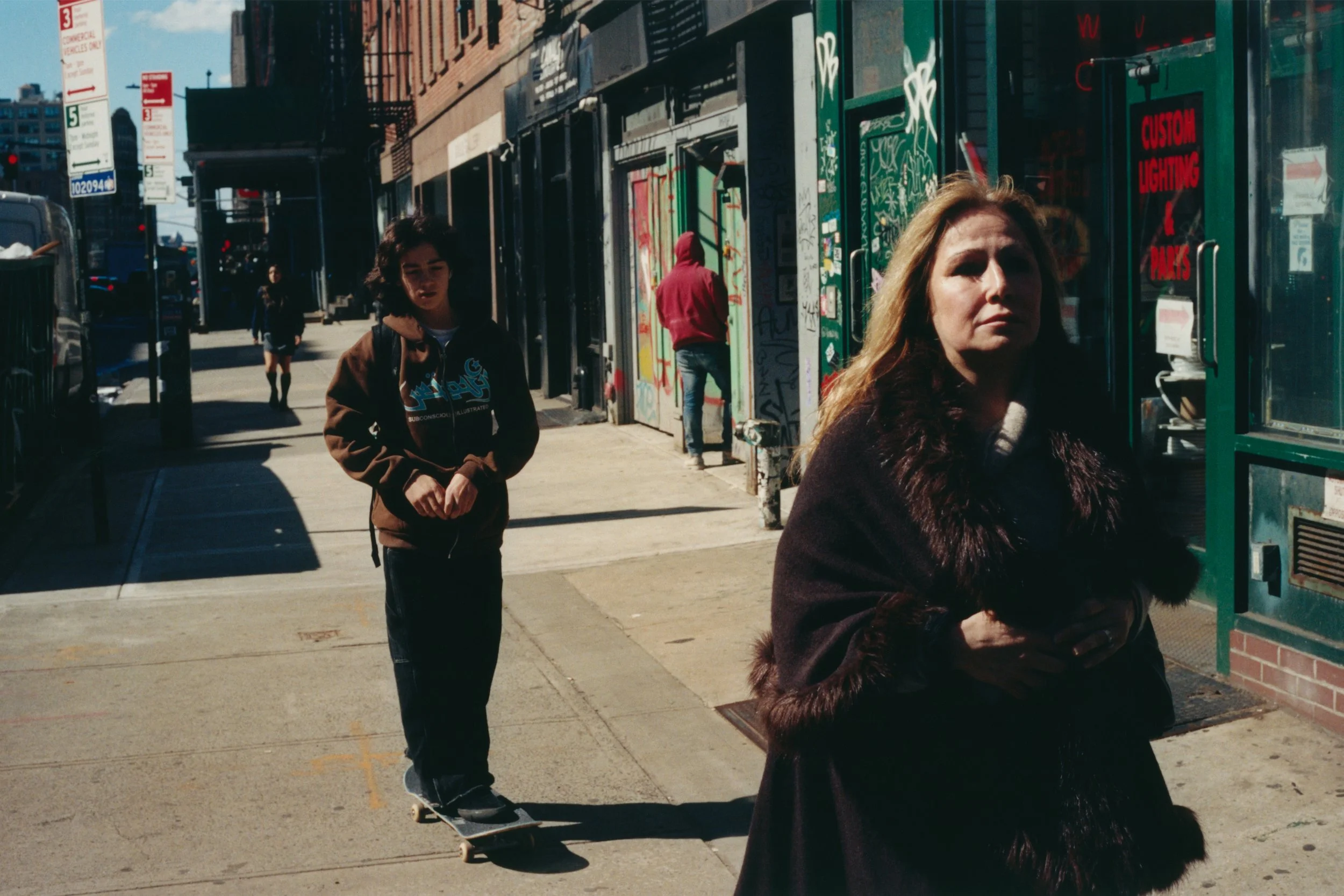
Subversion Of Bureaucracy: Read An Interview Of Artist and Private Investigator Julia Weist

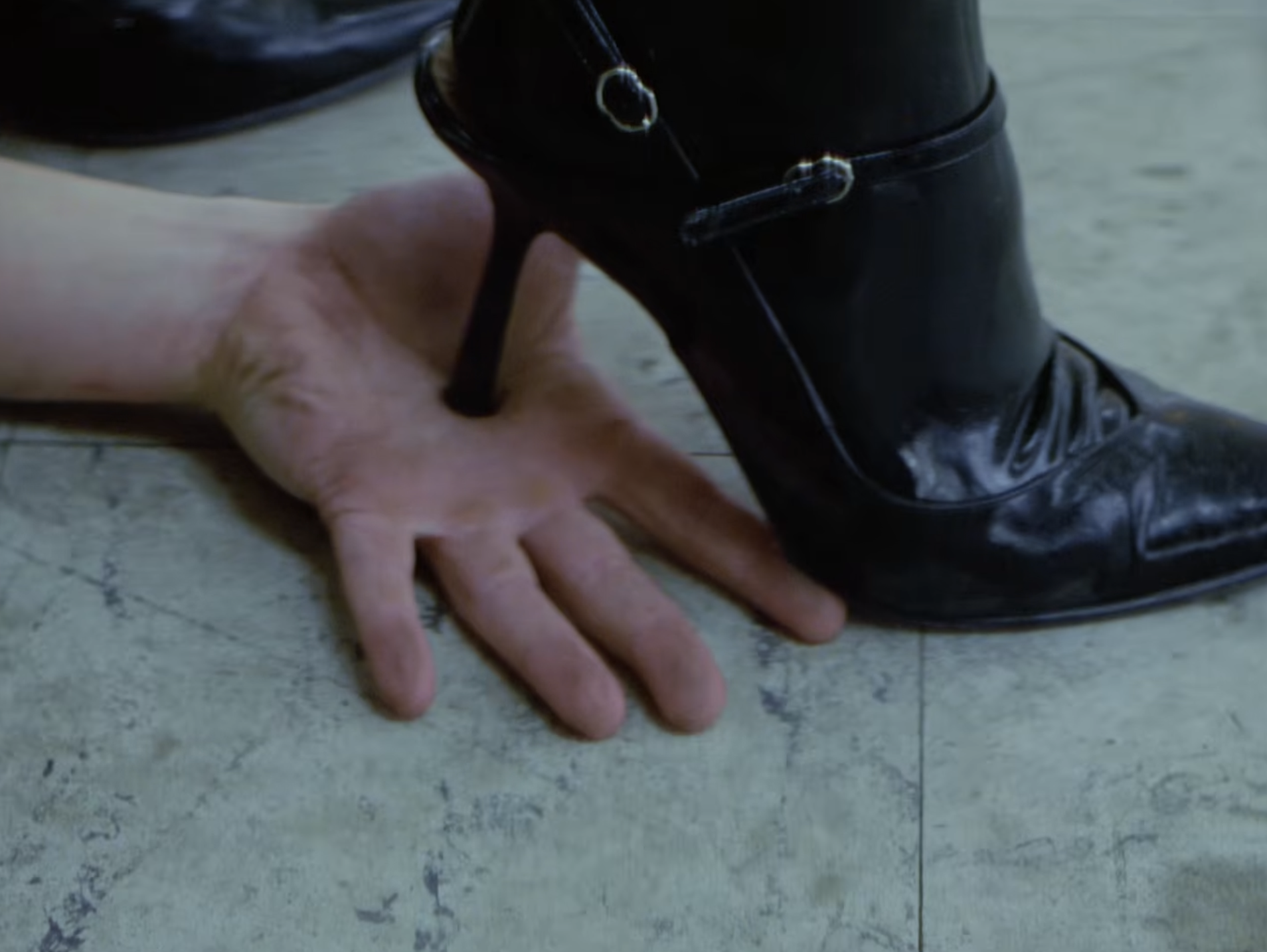
In her latest work, artist Julia Weist turns the machinery of surveillance back on itself. After obtaining a private investigator’s license in New York, Weist used the same tools and databases available to investigators, law enforcement, and corporations to examine the hidden systems of data collection that shape everyday life. What began as an investigation into the infrastructures of privacy, identity, and power became a real-life confrontation with the state when she was called in for questioning by the New York Department of State to clarify why an artist would need a PI license in the first place.

The resulting work, Questioning, transforms that interrogation—an encounter between an artist, government officials, and the invisible architecture of surveillance—into a live performance that examines the legal gray areas, ethical contradictions, and personal stakes of being watched in a data-driven society. Blurring the boundaries between documentary, theater, and conceptual art, Weist reveals how easily the systems designed to observe us can themselves become objects of scrutiny. A performance of Questioning is currently on view at New Theater through July 19.

Iris van Herpen Brings Haute Couture to Life

Installation view of Iris van Herpen: Sculpting the Senses, Brooklyn Museum, 2026. (Photo: On White Wall/Paula Abreu Pita)

text by Hank Manning


Clothing may have originally been developed as a form of portable shelter from the elements, but at the Brooklyn Museum, over 140 garments reveal how nature can inspire fashion and how a garment might serve to connect us to, rather than separate us from, the world around us. In this way, Iris van Herpen invites us to shift our gaze to the organisms and systems we tend to overlook—because they are too small or too big, because they’re underground or under skin, or because they’re far under the ocean or off in outer space, or simply because their process of manufacturing is hidden from consumers. 

Seijaku, the first dress on display, asserts van Herpen’s persistent goal of finding harmony in chaos, looking at the whole world and attempting to find patterns. For this dress, she suspends a wave that somehow looks more calming than many of the symmetrical 3D-printed patterns that come later. Fittingly, as life on Earth began in the water, the first section (of eleven), “Water and Dreams,” reveals many ways in which movements of water—bubbles, raindrops, waterfalls—inspire her. 


Iris van Herpen. Living Algae Look, from the Sympoiesis collection, 2025.
Pyrocystis lunula algae, nutrient gel, H2O, silicone, silk organza, and tulle.
Collaborator: Chris Bellamy. Model: Stella Maxwell. (Photo: Molly SJ Lowe)


Sea life, much of it microscopic, forms an essential part of the world’s ecosystem. Van Herpen uses multidimensional modes of biomimicry; in addition to the stable appearance—shapes and colors—she also considers movement, her outfits simulating the gentle sway of coral or the rhythmic pulsations of a jellyfish. Truly merging biology and fashion, the dress Living Algae contains 150 million bioluminescent algae that light up alongside the wearer’s movement. One of the only dresses kept behind glass, it requires strict maintenance of temperature, humidity, and light cycles to keep the algae alive.

Terrestrial life motivates designs as well. Even some of our smallest neighbors—like bees and their honeycombs—and those seemingly stagnant—like trees’ root networks—form geometrically intricate and often precisely symmetrical systems. Luminous Lichen, replicating fungal networks, could also be said to resemble the wiring of a motherboard. Pioneering 3D printing in 2010, the Crystallization moved skeletons from beneath the skin to above it. 

Installation view of Iris van Herpen: Sculpting the Senses, Brooklyn Museum, 2026. (Photo: On White Wall/Paula Abreu Pita)

Van Herpen explores the diversity within and across human minds. In “Synesthesia,” she intimates the intertwining of senses by visually representing sound waves. She appropriates mythology, rendering gowns in the forms of metal snakes or items in Bosch paintings. Towards the end of the show, she considers how humans will continue to evolve, with biotechnology and extraterrestrial exploration. In “Cosmic Bloom,” some mannequins hang upside down or sideways to consider the opportunities of fashion in environments with little or no gravity, though the exhibition does not approximate how these billowing dresses would move in outer space. 

Throughout, artwork and scientific artifacts complement the dresses, challenging how we categorize the work. With immobile mannequins that the viewer can walk around, the experience differs greatly from a runway show. Here, each dress is its own work of art. The slow pace, encouraged by a somewhat gloomy soundscape by Salvador Breed, van Herpen’s long-time collaborator and life partner, is juxtaposed with the inherent joie de vivre and natural inspiration within the garments; they are like fossils frozen in time.

Installation view of Iris van Herpen: Sculpting the Senses, Brooklyn Museum, 2026. (Photo: On White Wall/Paula Abreu Pita)

To be sure, these pieces are not merely museum specimens. Worn in music videos, on musical tours, and on the red carpet, they are titans of popular culture. Repeat clients include Beyoncé, Björk, and Lady Gaga—Photographs of these and other “muses” appear near the show’s end, bringing the dresses back to life and providing a second perspective on their functions. 

Van Herpen’s reorientation underscores the egocentrism of the human race, with our fixation on things of our own size, in our near vision, and on the most familiar and easily observed processes. Likewise, we often ignore the labors of others even within our species. Inside our own bodies, operations constantly persist to sustain life in our circulatory, digestive, and nervous systems. And each of us, in our minds, has innumerable new and ever-evolving worlds. Van Herpen’s designs make the invisible visible, reminding us of the complex, interlinked, and essential beauty that surrounds us, big and small, near and far. One series at a time, they impress through their novelty and eccentricity; seen in aggregate, as in Sculpting the Senses, we get a sense of awe, an almost life-affirming quality. 

Van Herpen’s boundless curiosity—her ongoing discovery of untapped sources of inspiration—complicates her stated goal of finding harmony in chaos. Although she succeeds at this in many individual dresses, the show’s increasing diversity in color, form, and source hardly feels harmonious in aggregate. But, in this multiplicity, we can easily find comfort in our place in the interconnectedness and infinite beauty of the universe, inspiring a sense of wonder about what is still to learn.  

Iris van Herpen: Sculpting the Senses is on view through December 6 at the Brooklyn Museum, 200 Eastern Parkway, Brooklyn

Installation view of Iris van Herpen: Sculpting the Senses, Brooklyn Museum, 2026. (Photo: On White Wall/Paula Abreu Pita)

Hollywood Glamour: Jools Rothblatt's "Berserker!" @ O-Town House


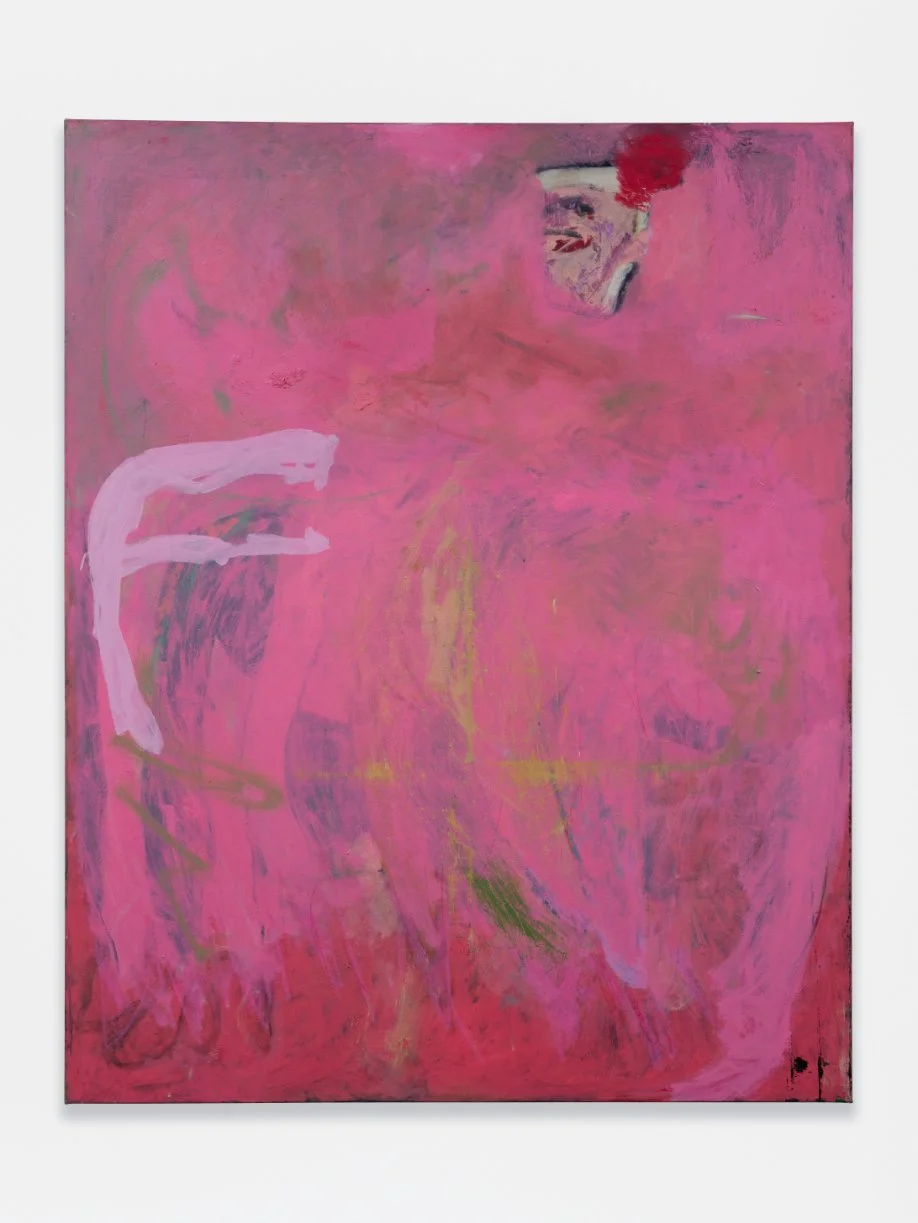
A fog of skirts, 2026
Oil on canvas
60 x 48 in (152.5 x 121.9 cm)
Courtesy of the artist and O-Town House


text by Arlo Kremen
photography by Evan Bedford


Taken from Joan Crawford’s 1967 horror flick Beserk!, Jools Rothblatt’s Berserker!—fixed safely as a noun—centralizes on a filthy and violent aesthetic identity. To try and nail her paintings down with concrete descriptors would disregard their dynamism. Almost lifting off the canvas, figures quickly dissolve into space and other neighboring forms. A fog of skirts envelops space in a cloud of pink, with long limbs hanging low, fingers gesturing at the magenta ground. A muddy nun’s head floats high, smudged dark with a bloody splat at the corner of her habit. As the nun disappears into the fog—or alternatively becomes the fog—it takes on her life force. An animated, living, tense mist. Rothblatt spoke of her paintings as capturing “the perfume of a room. It’s tension and thickness. That thing in the air in a club or a courtroom. That kind of sweat.” If this painting had a perfume, it would smell like cotton candy vape and a punch. A saccharine bruise. 

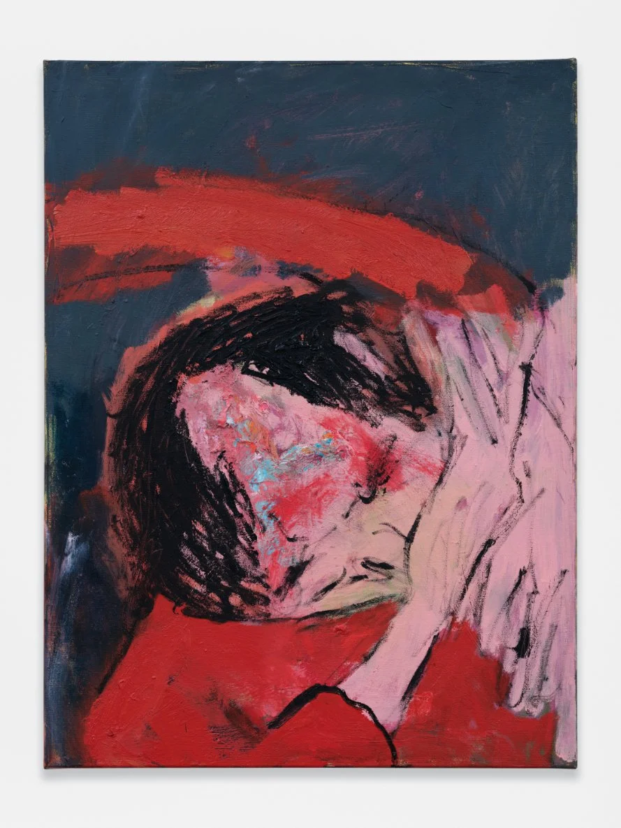
Lifetime Sports (Fistmagnet), 2026
Oil on canvas
24 x 36 in (61 x 91.4 cm)
Courtesy of the artist and O-Town House

Lifetime Sports (Fistmagnet), while not sweet, will undeniably leave a mark. A Bukowski poem as a painting, this barfly has received what might just be the last beating of the night. Head ducked down and shielded by two thin hands, his abuser seems to have pounded a receding hairline into the fistmagnet’s scalp. Red and blue patches creep up his crown like a fungus claiming new ground. His red shirt matches a streak of red slipped on just above his bent figure, all in the fore of a blue night background, a scene this night has gazed upon with an ordinary frequency.

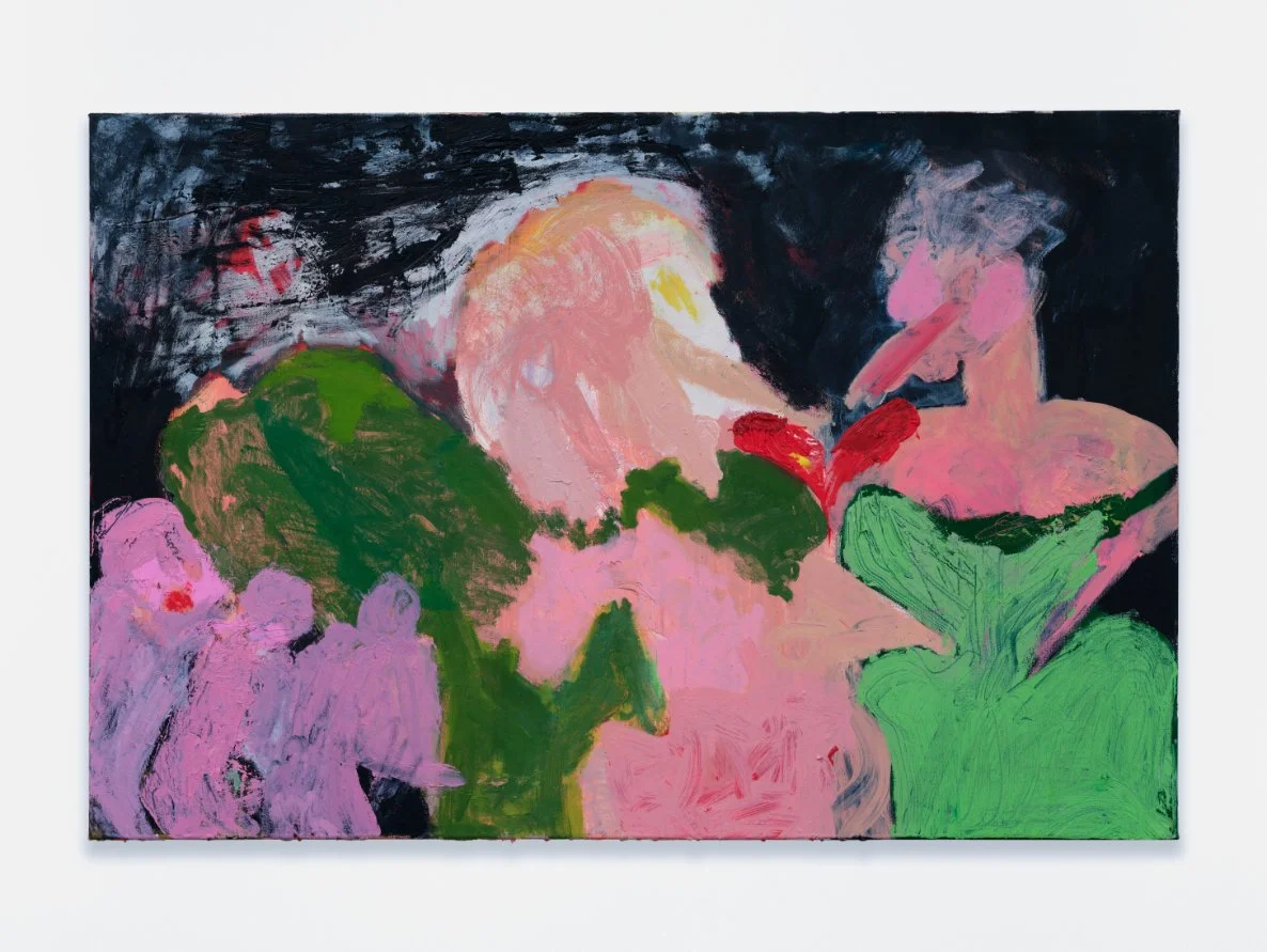
Agitator Cracked Actor haha, 2026
Oil on canvas
24 x 36 in (61 x 91.4 cm)
Courtesy of the artist and O-Town House

Walking around the show, Rothblatt begins pointing to a number of painted figures: “that’s a diva, that’s a diva, a sprawled-out diva, that’s a punch in the face.” The figures which are present are largely sourced or inspired by Hollywood’s Golden Age in which Rothblatt revels in the often overlooked messiness embedded in the “Golden Age” epithet. Lifetime Sports is one such figure. Another is Agitator Cracked Actor haha. Here, not much is discernible other than a tightly corseted green dress with a fleshy body rising out of it, with a chest, shoulders, a neck, and a face somewhere along the spectrum from goose to human. Whatever she might be, what is absolutely certain is her diva attitude. Three tiny pinkish-purple figures creep in like adoring fans to witness her grandeur, and whatever stands between her and her fans is an abstracted intermingling of dark green and peach tones. What is going on is backgrounded by the feeling of a movie star and the vibration in the air when she appears. 

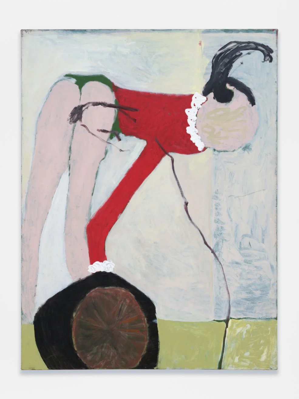
Another movie star, at least an animated one, Popeye’s Olive Oyl, is seen bent over with a gasoline pump up her rectum. On her blank face, her name is scribbled out. 7-Upskirt (gasoyline). What was once her long red dress has become a long-sleeve shirt paired with green booty shorts, plastered across a vehicle where the pump plugs right into her anus—a scatological genre painting for modern life.


7-Upskirt (gasoyline), 2026
Oil on canvas
48 x 36 in (121.9 x 91.4 cm)
Courtesy of the artist and O-Town House


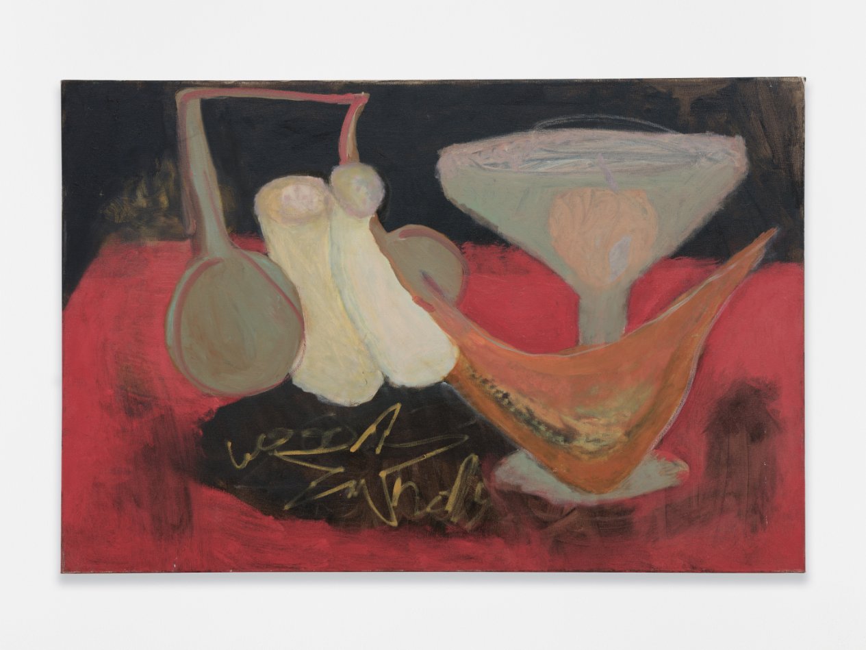
The painted letters on Olive Oyl’s face also appear in Hollywood Music. The word is “Hollywood.” Rothblatt notes that this is the closest she’ll ever get to making a text painting. Many of the works have similar markings, although none of them come out to resemble any single letter or word. Rather, they sit in an interstitial space between meaning and meaninglessness. They come to the viewer like faded, unintelligible graffiti—words now lost to time. The markings demand close, attentive looking to register the nonsensical signs. Despite their lack of a clear referent, these markings do communicate. 

A red wall marking beside O-Town House’s charming second-floor kitchen speaks of Kim Fuck, the artist’s hardcore alter ego persona. Littered around LA bathrooms, Rothblatt mentions, keep an eye out for Kim. Much of the letter-like scribbles and scrapes act similarly to graffiti. Loose lettering, stacked and bleeding, and frequently illegible, both lettering forms communicate something that is floating, left without contextual ground, often meaningless to those who come to it later. Rothblatt makes note of how over the years her penmanship and brush handling have become nearly identical, that there is no longer a significant difference, especially when using smaller brushes. Her notebook is filled with words that are not really about the words themselves but the gesticulation and exaggeration of the forms, nearly identical to the paintings’ incoherent language. While these textual elements may have set meaning, their formal exaggeration betrays a sense of chaos. A babbling ambiance charges each painting with its own—to use the artist’s own words—perfume. 

This overwhelming sense of disorder, however, is the appeal. It is a central tenet of the theater of Hollywood. What would the film industry be if it weren't for stories of people like Joan Crawford, whose on-set abuse is legendary? What would it be were it not the unjust misogynistic targeting and maligning of actresses in the press for things of nebulous accuracy? Probably something much smaller and less interesting. Hollywood itself was a fiction, a story told as journalistic curiosity, whose cruelty and violence locked audiences into a professionalized gossip network. The life of Hollywood actors and filmmakers became its own movie, completely sensationalized. The line between on-stage and off-stage was thin, and it only becomes slimmer as time progresses. The violence of the screen is the violence of life, and Rothblatt meets this spectacular, bloody conflation with a wide, battered grin.

Jools Rathblatt’s Berserker! in on view through June 27 @ O-Town House, 672 S La Fayette Park Place, Suite 44/43, Los Angeles

Hollywood Music, 2025
Oil on canvas
24 x 36 in (61 x 91.4 cm)
Courtesy of the artist and O-Town House

Courting Obscurity: An Interview of Nayland Blake

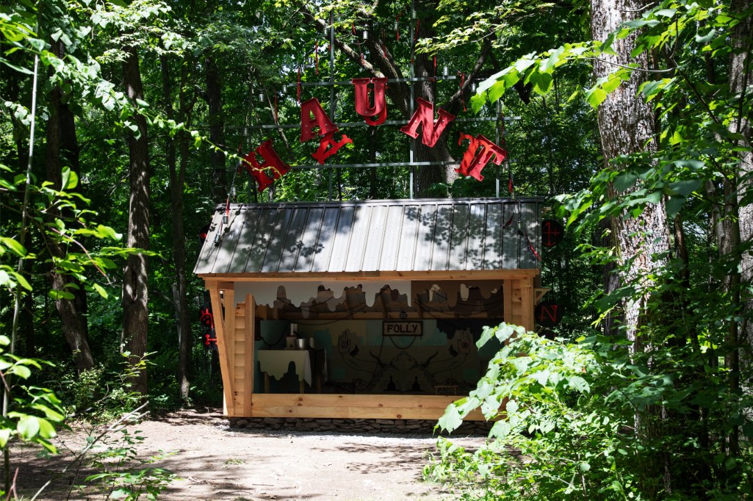
“Haunt”: Being the Folly of One Victorya Spectre (2026)
Nayland Blake
Courtesy of Art Omi and the artist

interview by Emma Grimes

Across decades of practice, Nayland Blake’s work has explored identity, desire, power, and subcultures while posing incisive questions around freedom, bondage, gender, shame, and the complexities of human relationships. Born in New York City, Blake attended Bard College before earning an MFA from CalArts in the 1980s.

Blake’s newest work, Haunt, premiered at Art Omi on June 27. Marking their first outdoor installation, the work draws inspiration from the figure of the ornamental hermit—a historical practice in which wealthy landowners hired men to live in seclusion on their estates for years at a time. With Haunt, Blake continues their ongoing investigation into how discourse and exchange can take place beyond the limits of the white cube.

Read more.

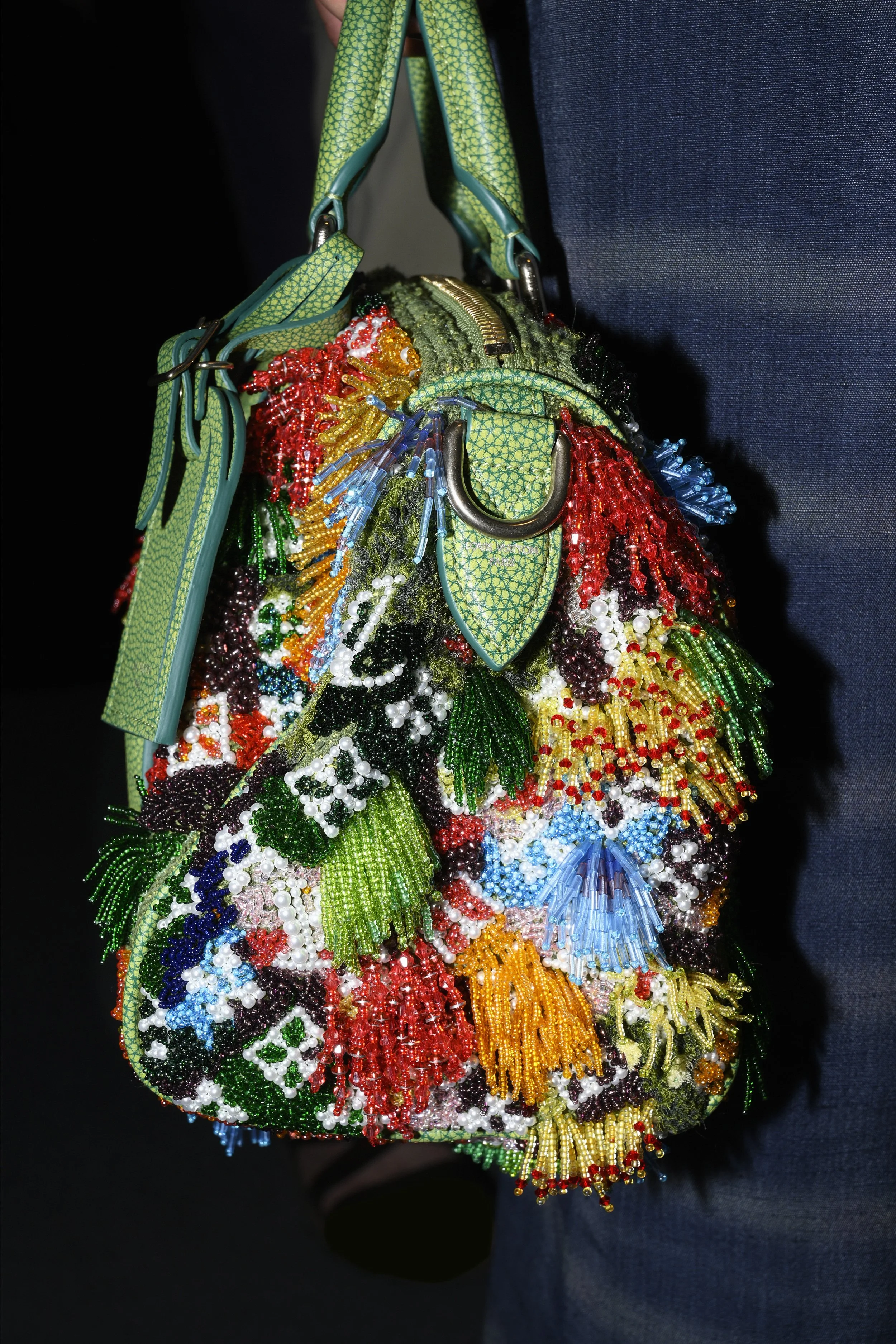
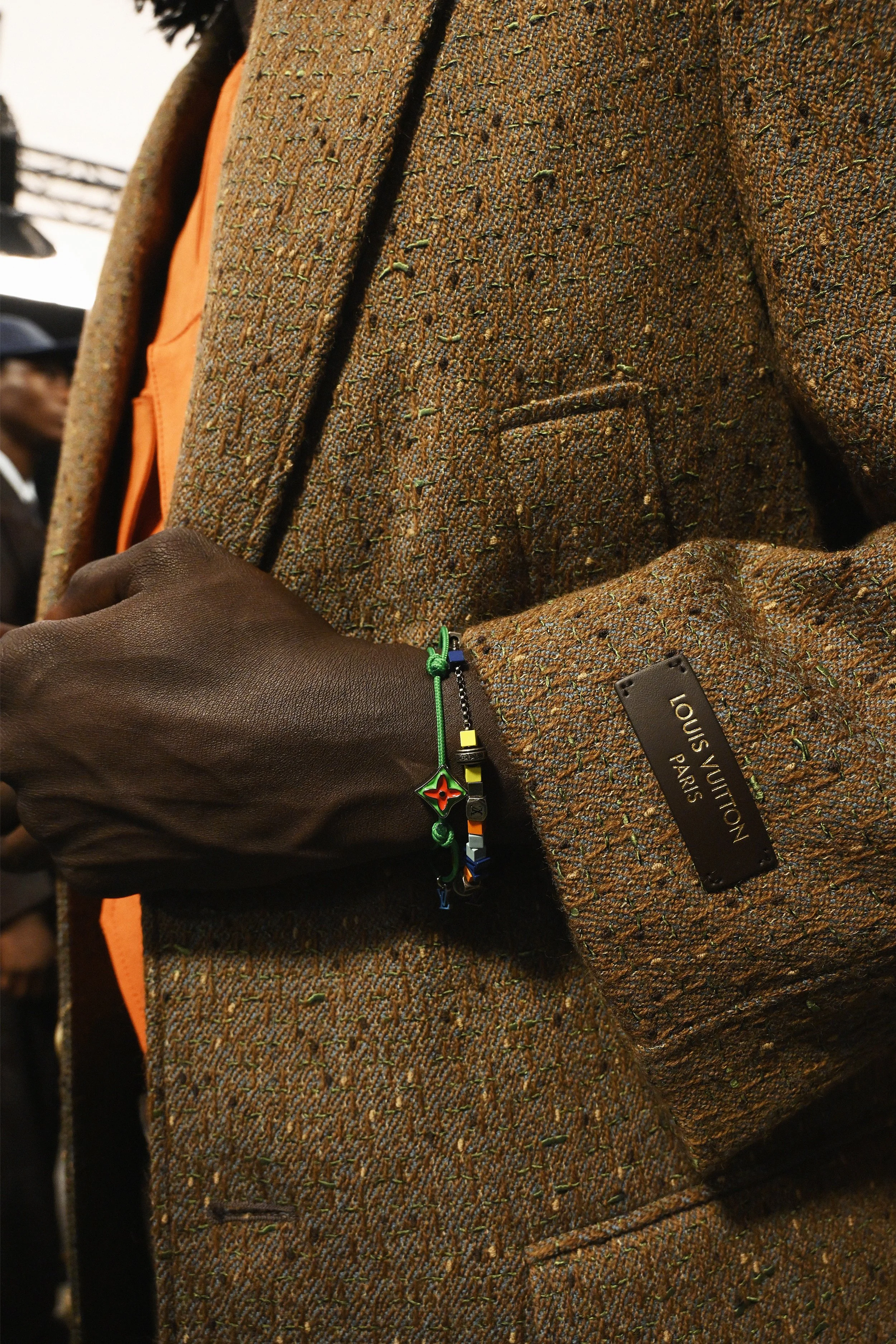
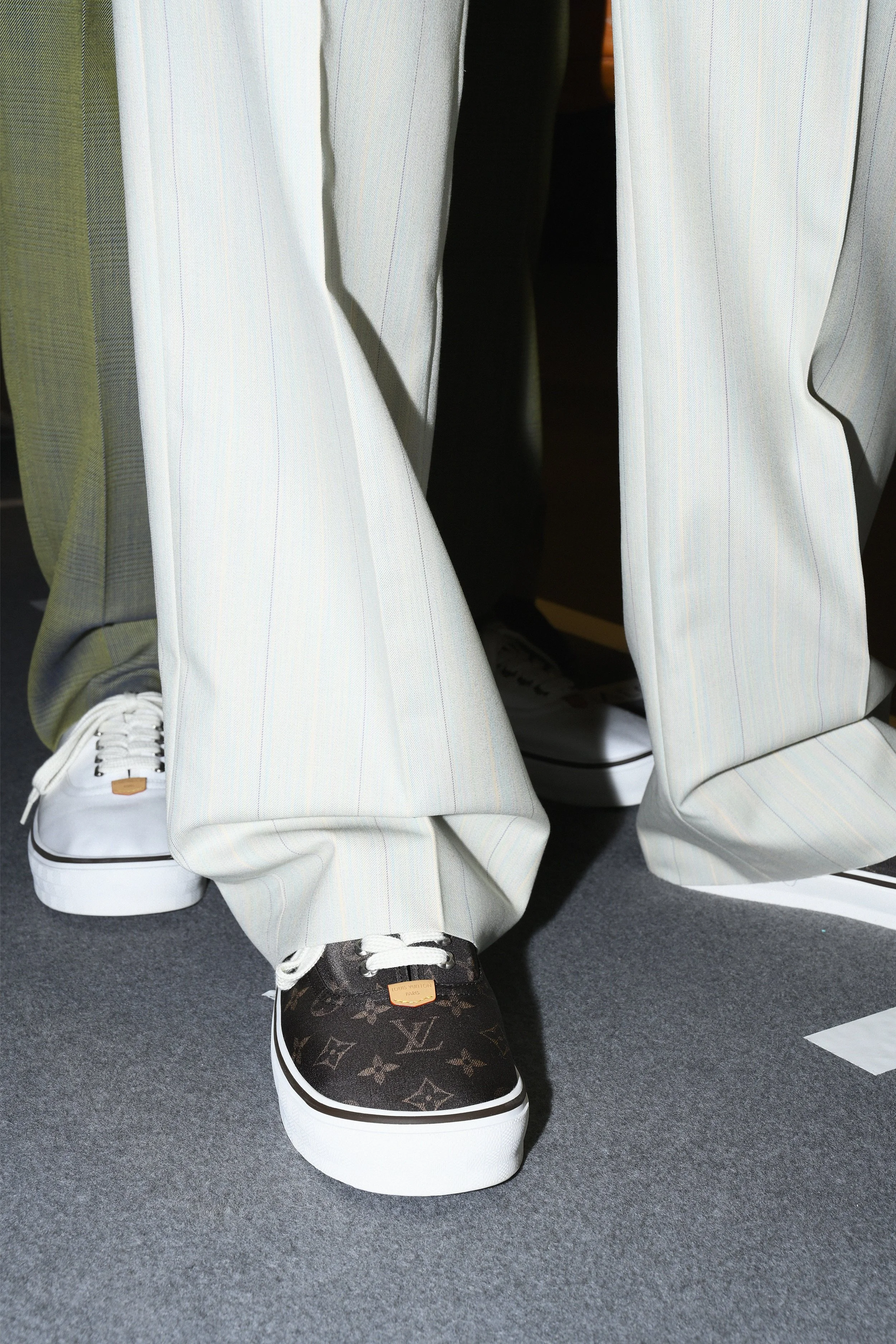
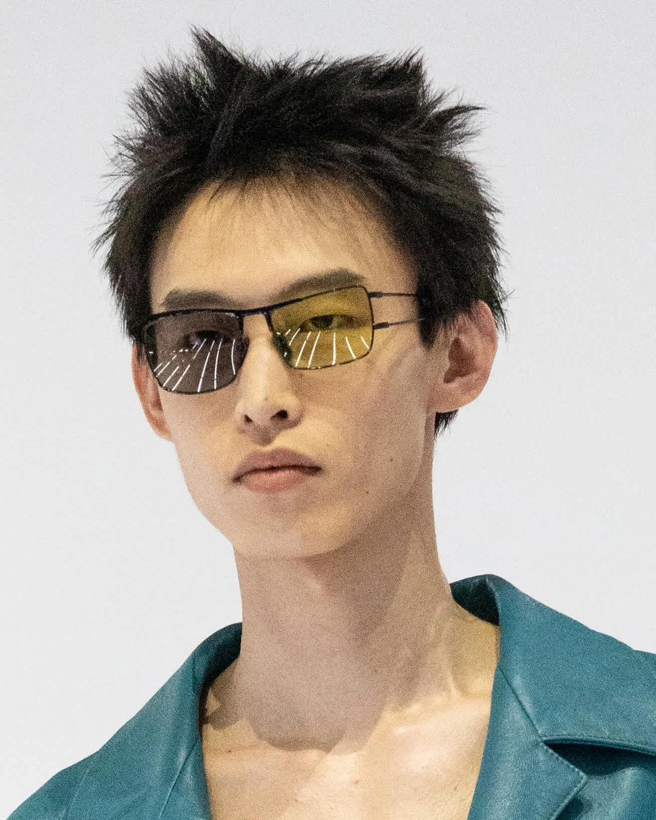
Backstage: Louis Vuitton Men's Spring/Summer 2027

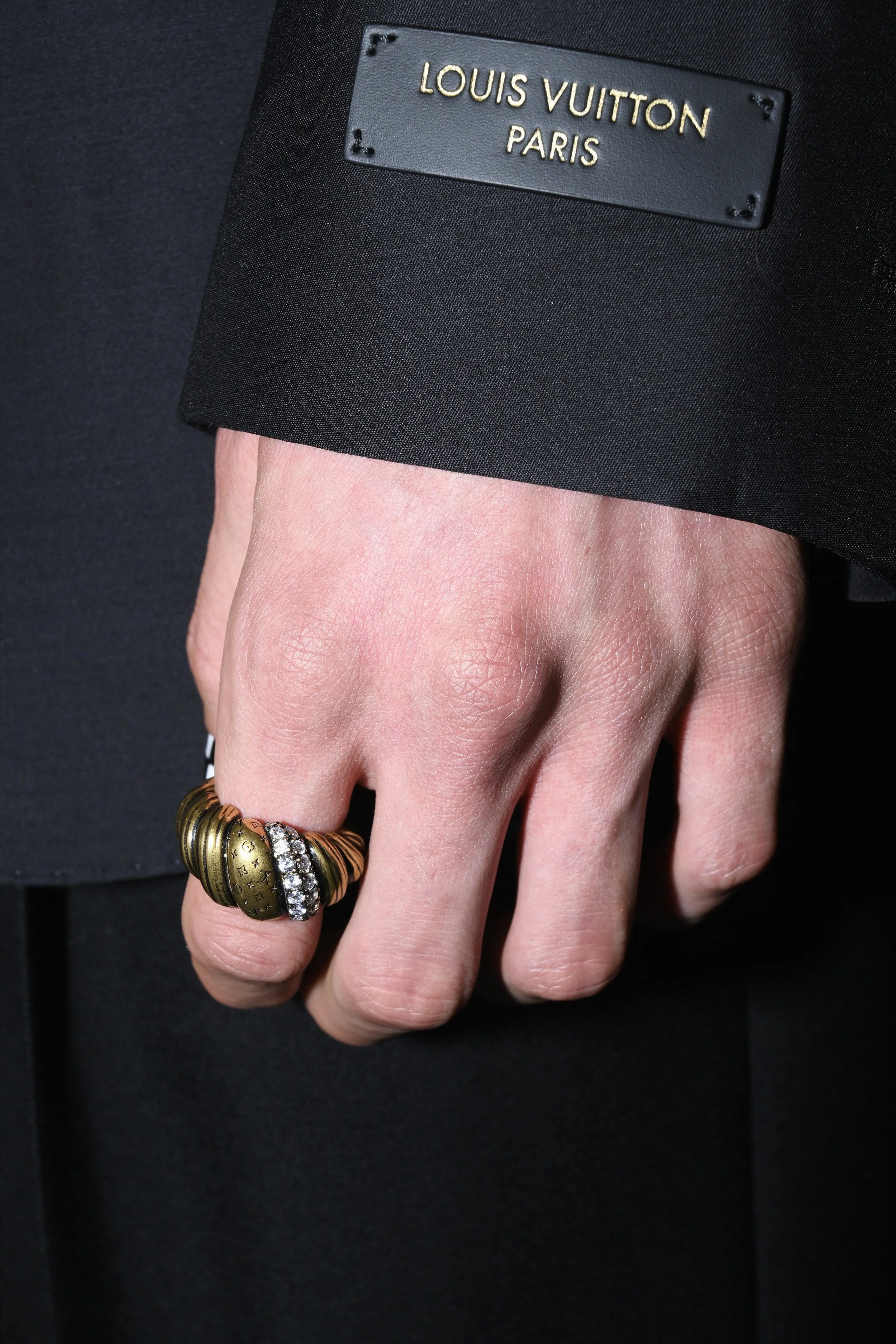
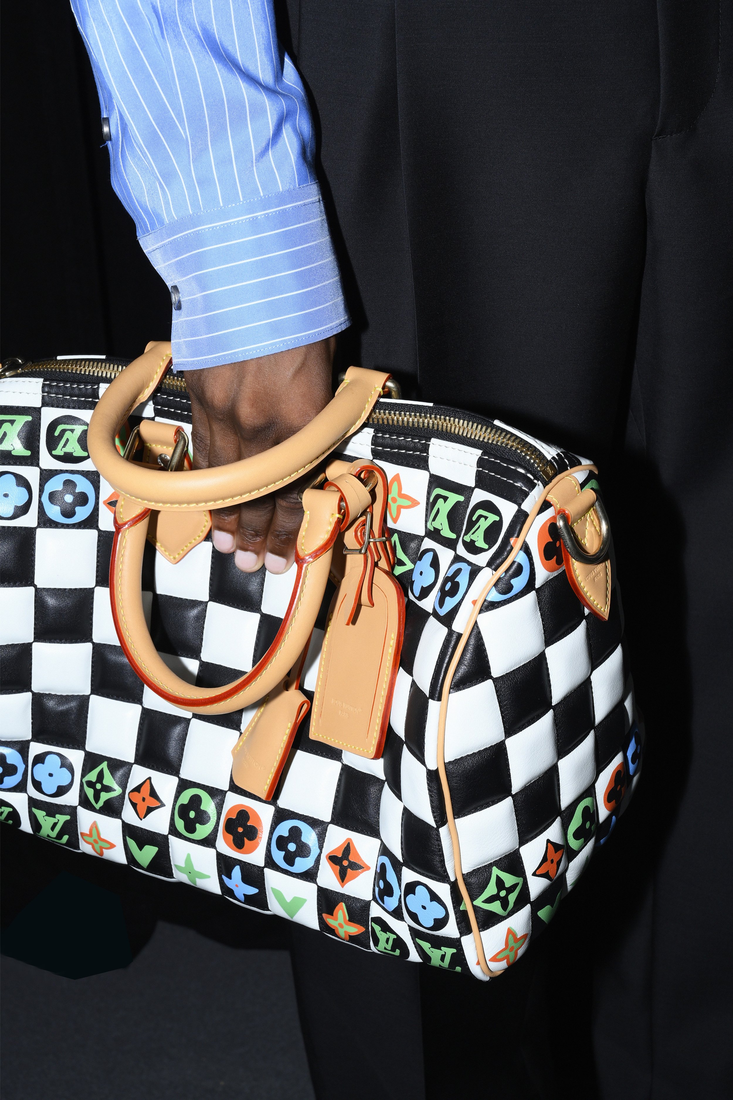
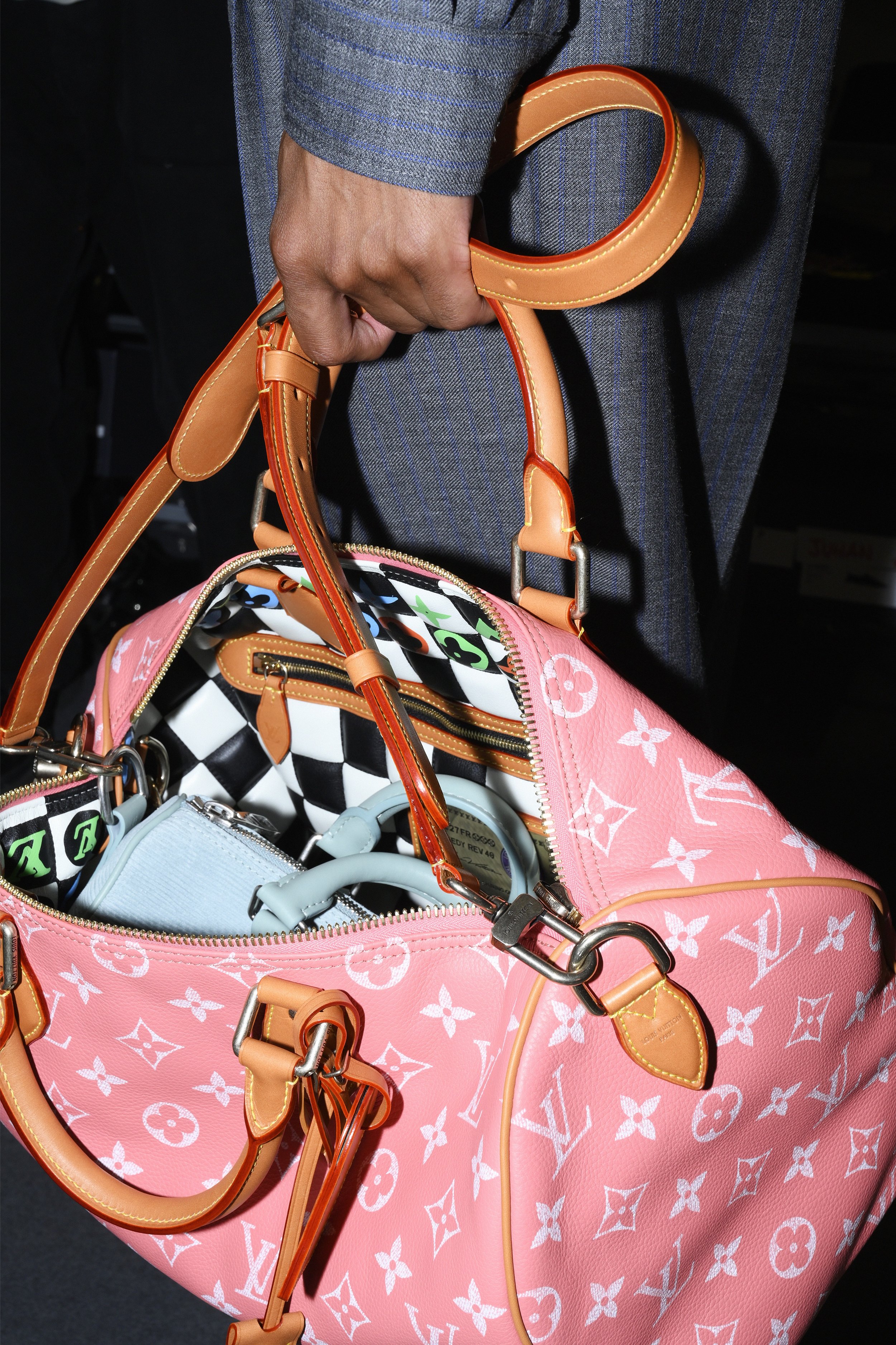
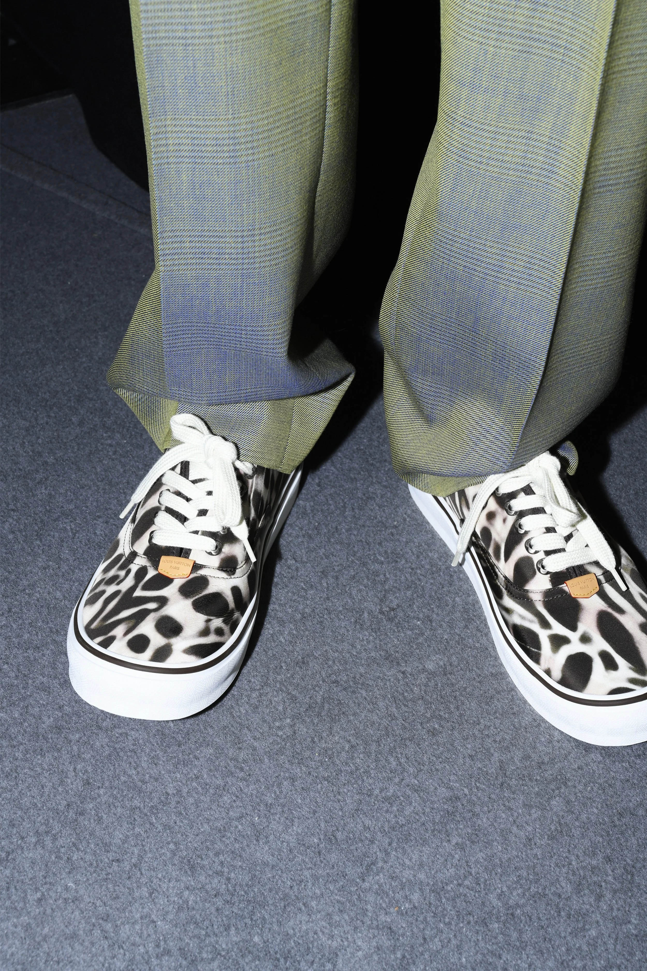
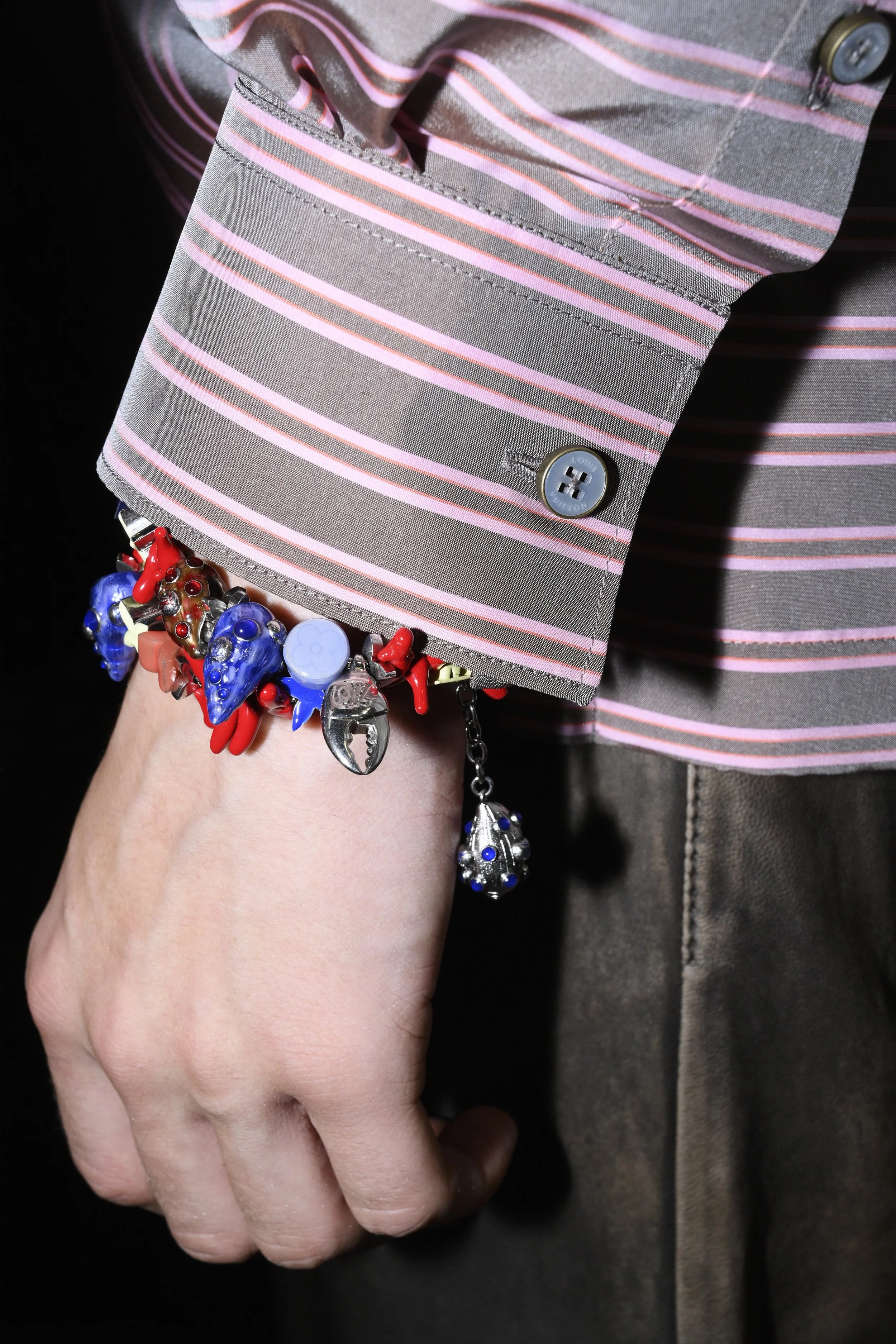
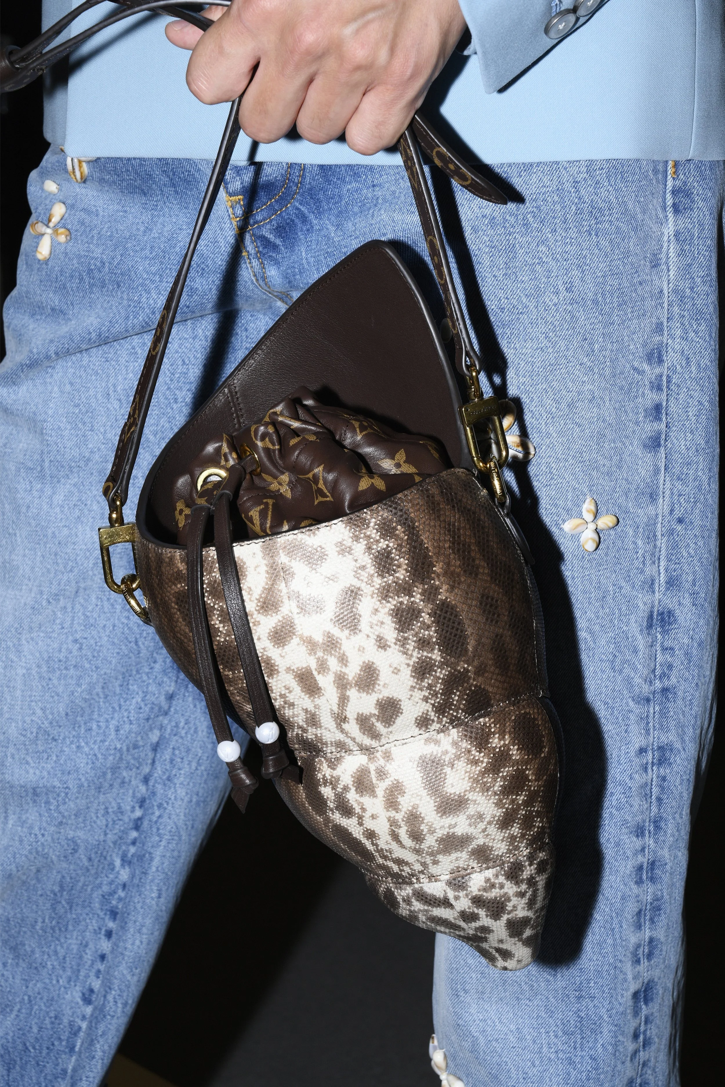
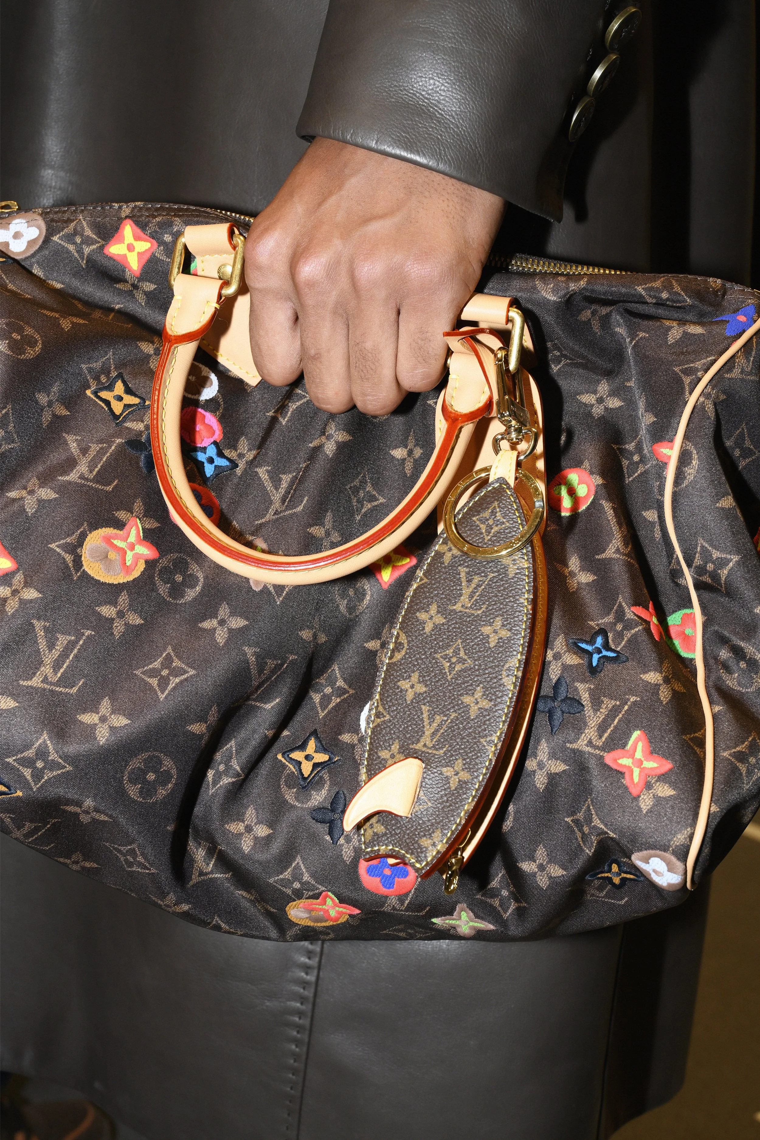
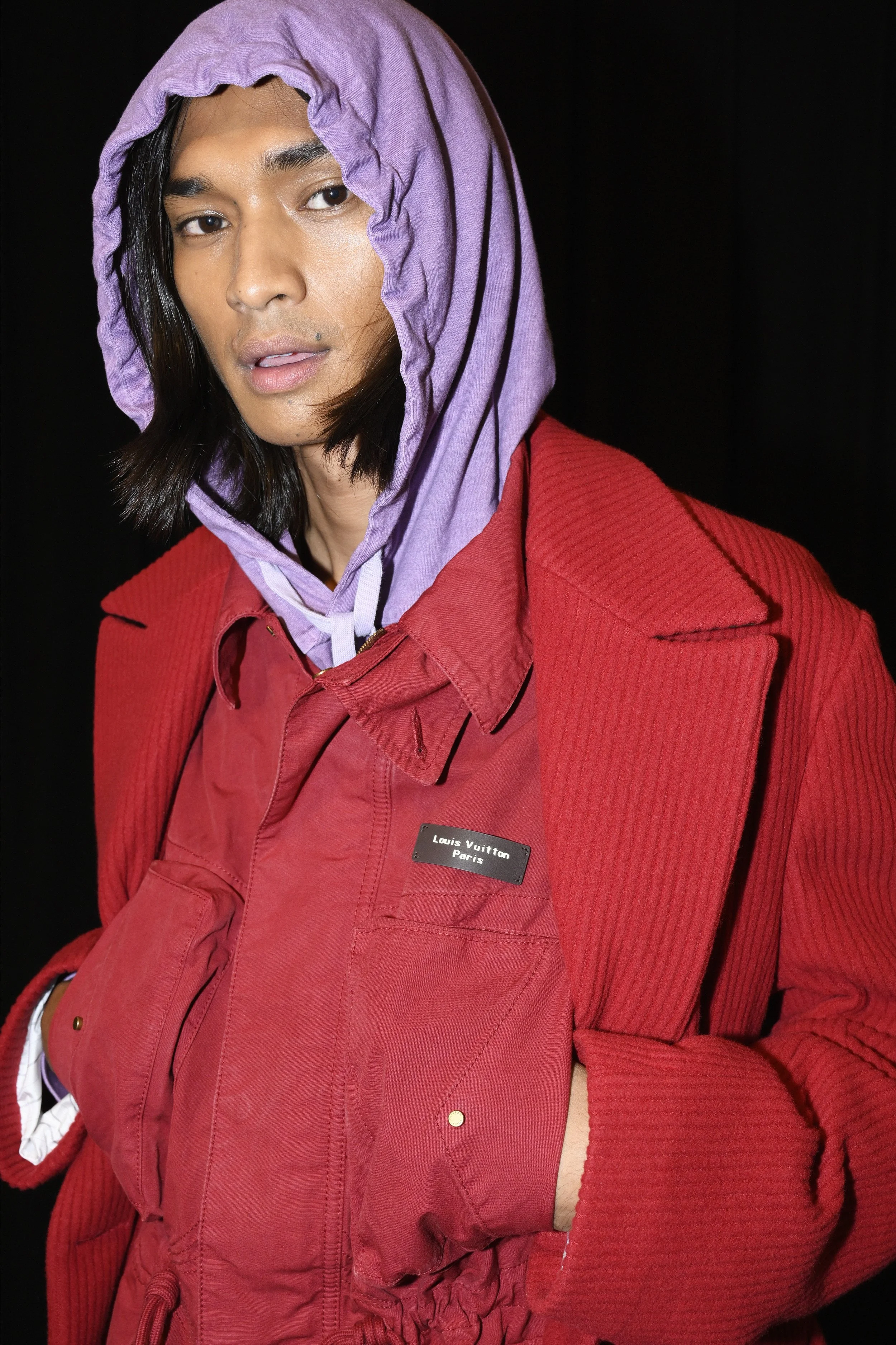
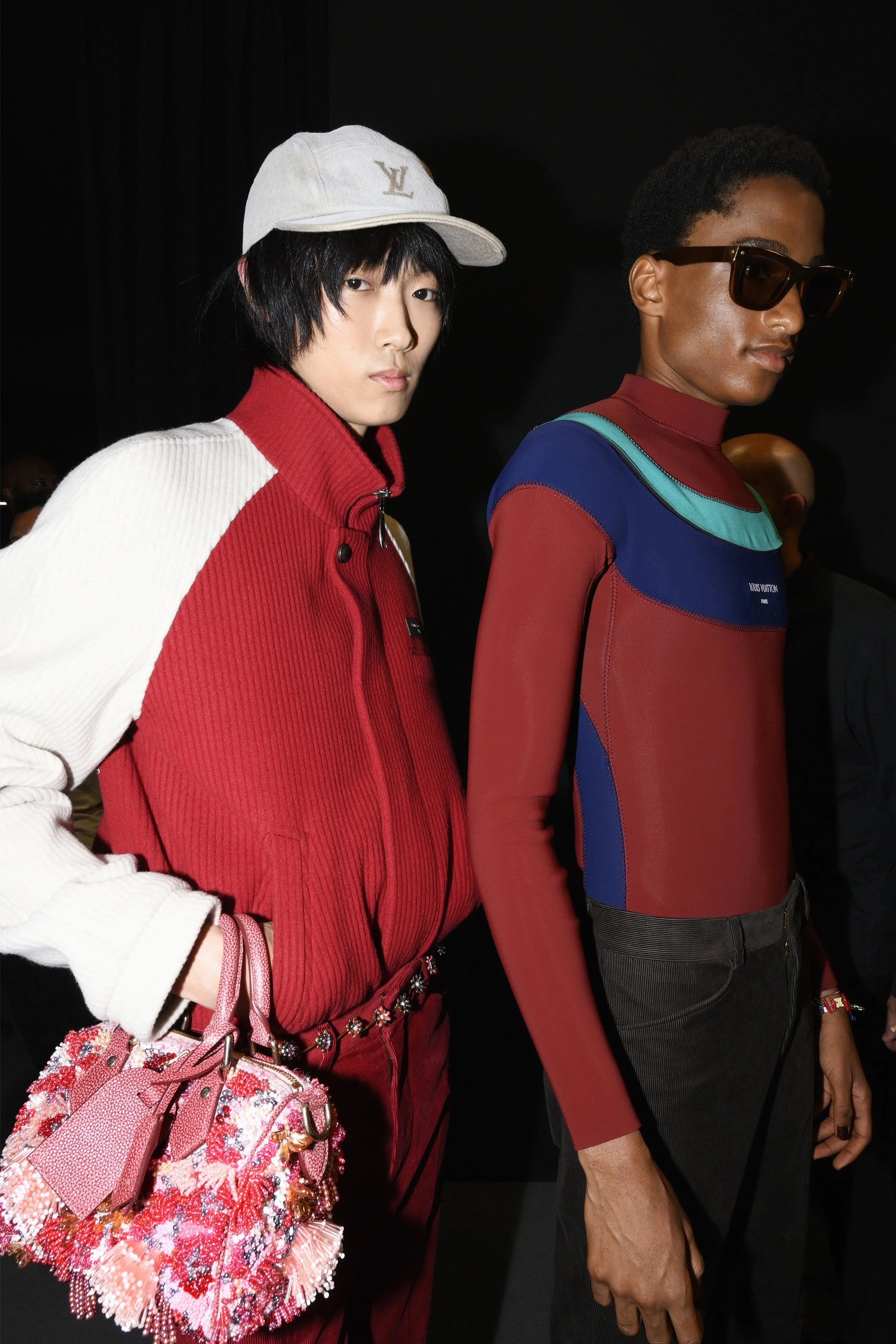
Louis Vuitton Men’s Spring-Summer 2027 by Pharrell Williams unfolds as a “Dandy Experience” shaped by the ocean as both metaphor and material reality—where the wave becomes a universal equaliser, drawing together coastlines, cultures, and ways of living. Set against a hyper-sensorial staging in Paris, the show channels surfing as a global language of movement and belonging, with water imagined as a force of life, connection, and return.

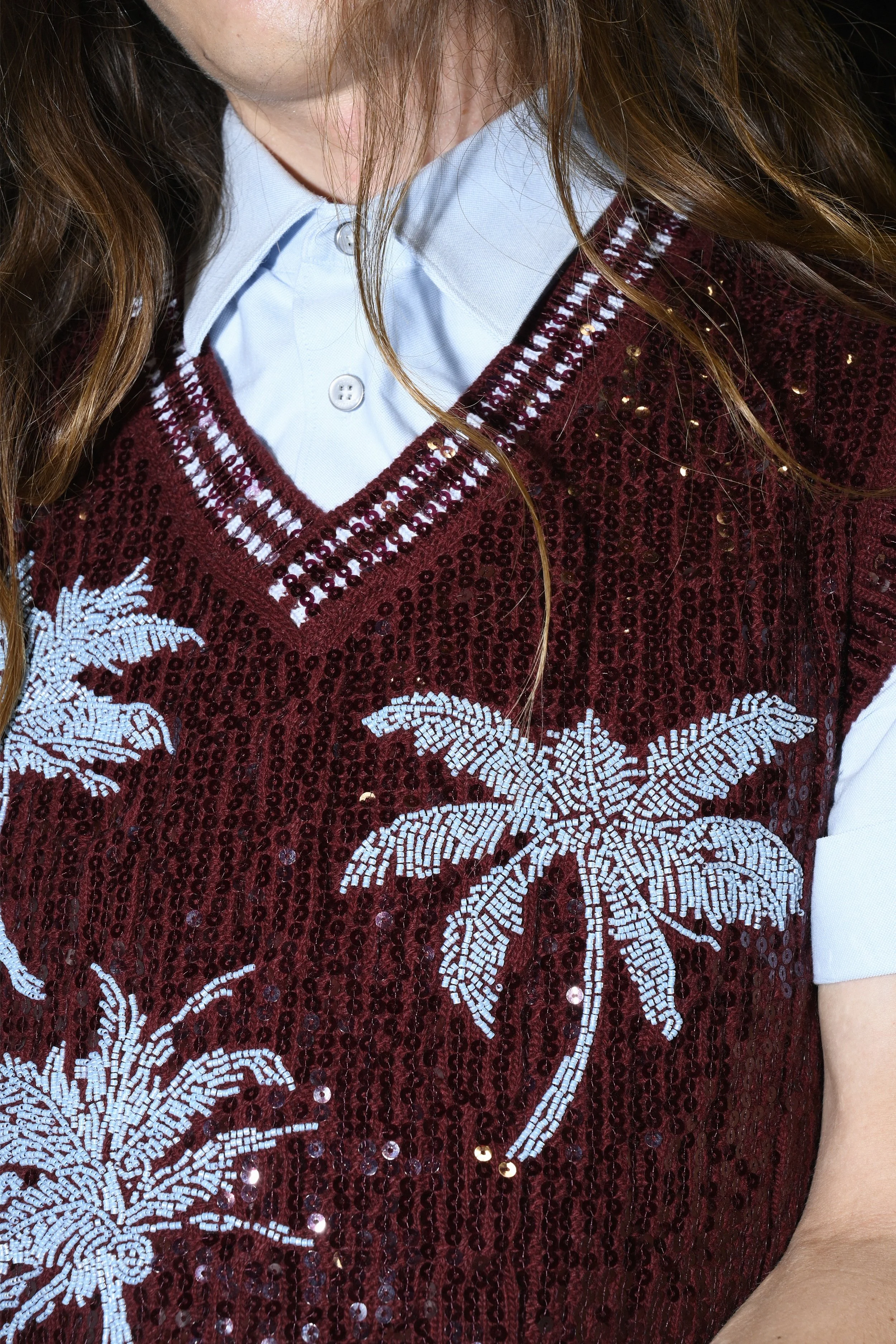
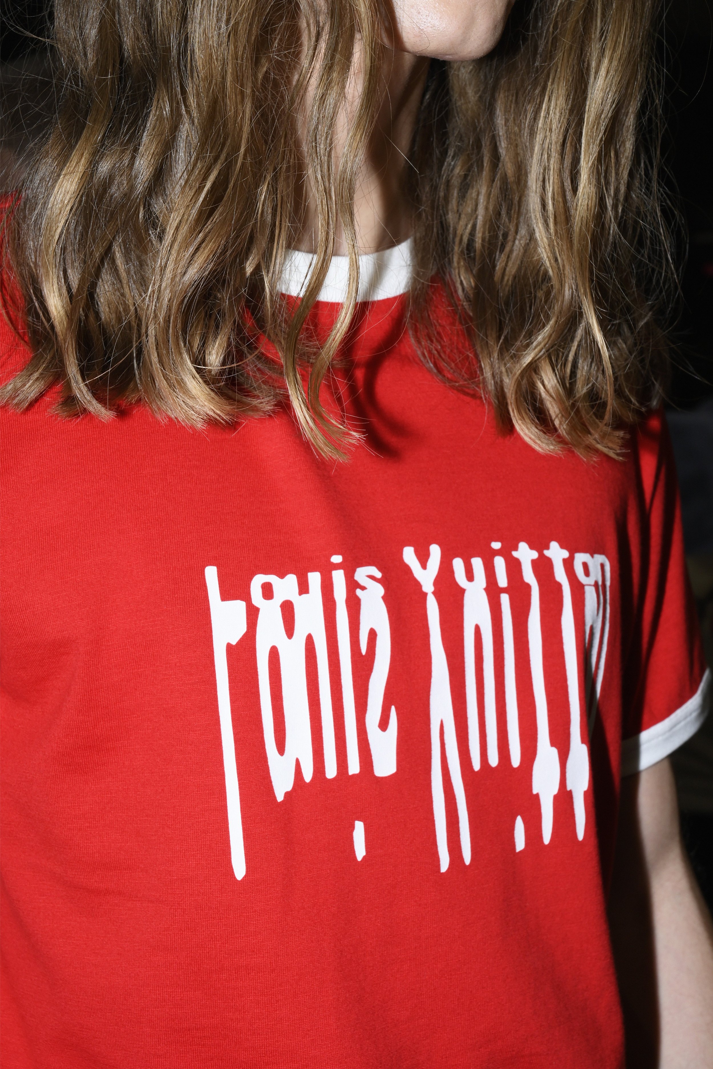
As the moon—the wavemaker—rises over the Parisian sky, the collection emerges from a monumental wave, dissolving the boundary between city and shoreline. Pharrell Williams extends his signature dandy silhouette into this coastal vocabulary, fusing unconventional elegance with the tactile codes of surf culture: hand-spun textures, weathered finishes, and bohemian ease translated through Louis Vuitton’s technical savoir-faire. Wetsuits and tailoring are placed in dialogue, while trompe l’oeil surfaces and surf-inspired graphics blur the line between illusion and touch.

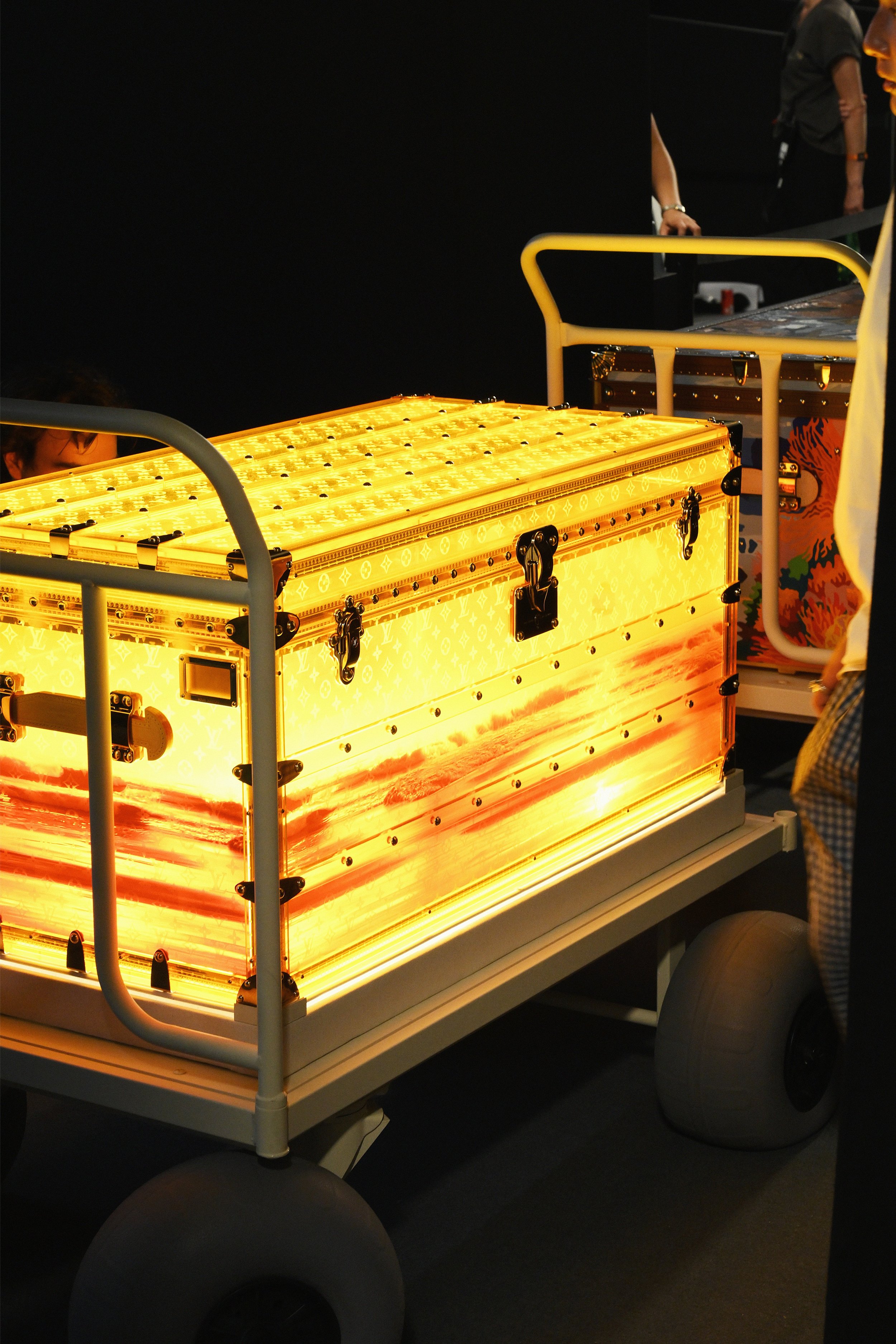
Parked beside the dunes of the set, a silver camper reimagined in the House’s future-facing design language anchors the narrative—like a suspended drop within an elemental landscape, placing the nomadic dandy in direct contact with nature’s rhythm. A cinematic prelude featuring surfers Mikey February and Julian Wilson sets the tone, as the sound of crashing water merges with an original score recorded in Pharrell’s Louis Vuitton studio.

Extending beyond the runway, the collection connects to Louis Vuitton’s Regeneration 2030 initiative in partnership with Coral Gardeners, supporting reef restoration in French Polynesia—out-planting 1,000 corals and restoring 250 square metres of reef habitat at the Tiaia site in 2026. In this context, the show frames the ocean not only as aesthetic inspiration, but as a living system to be preserved and regenerated.

Details: Prada Spring/Summer 2027 Menswear Show Inside The Deposito at Fondazione Prada, Milan

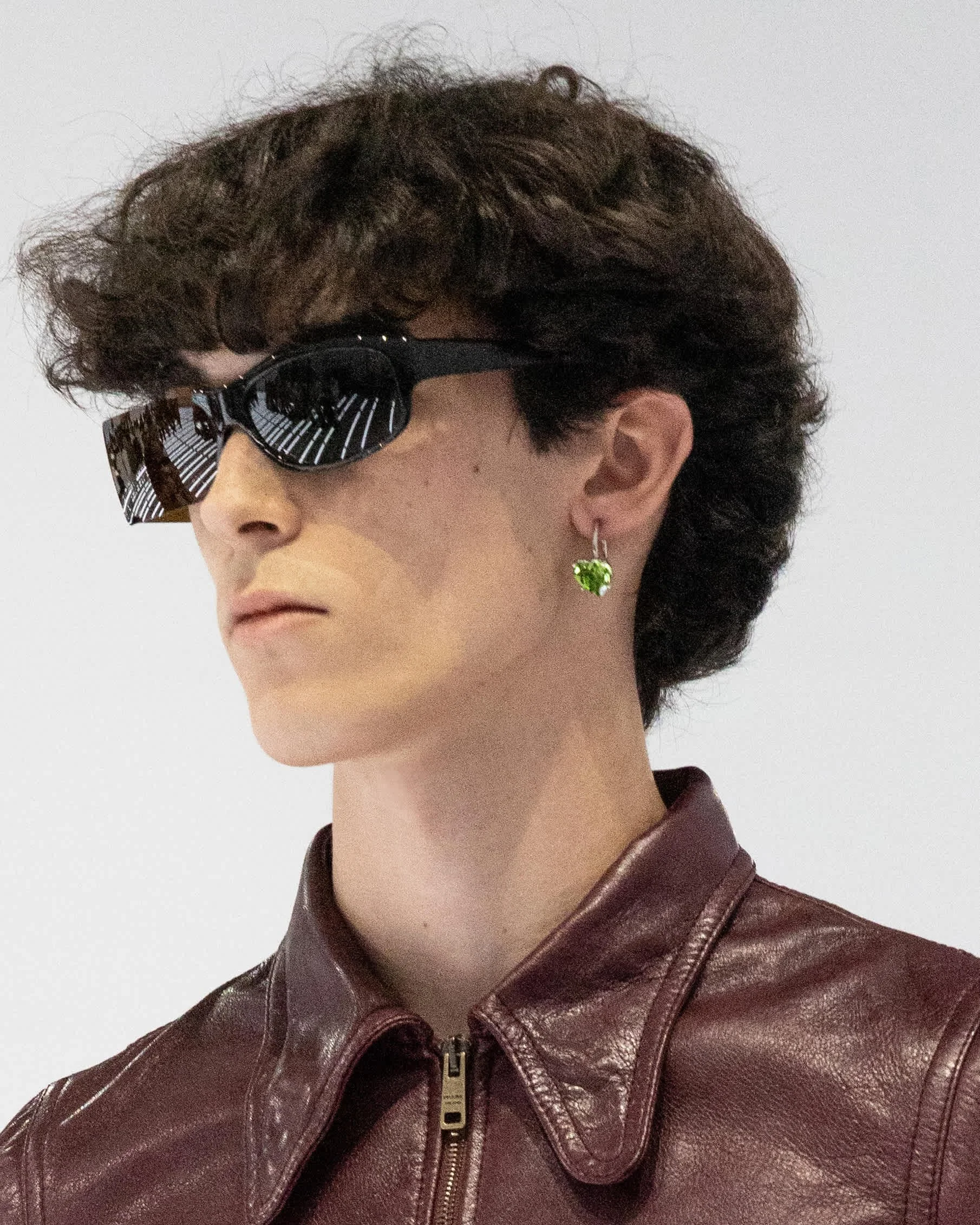
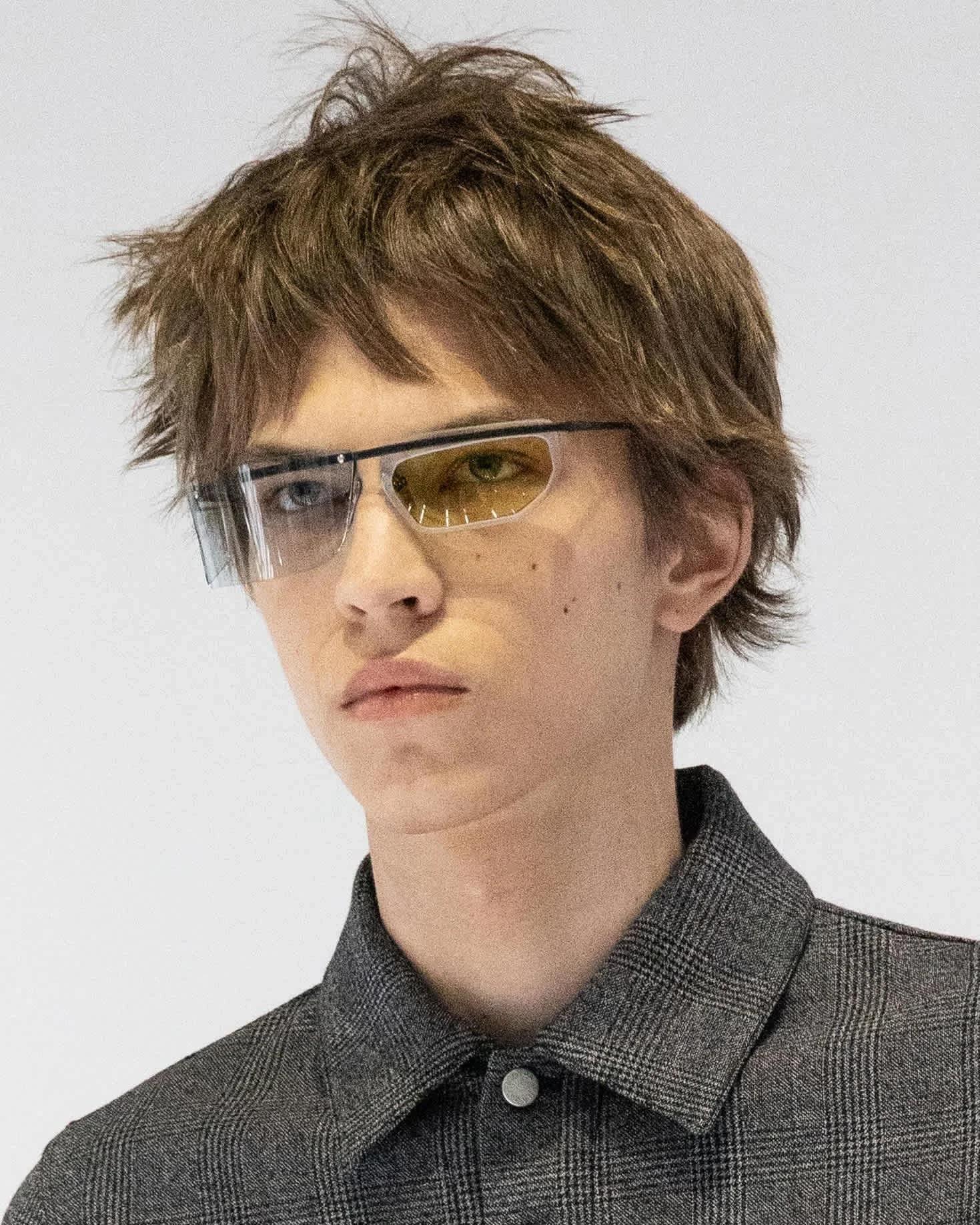
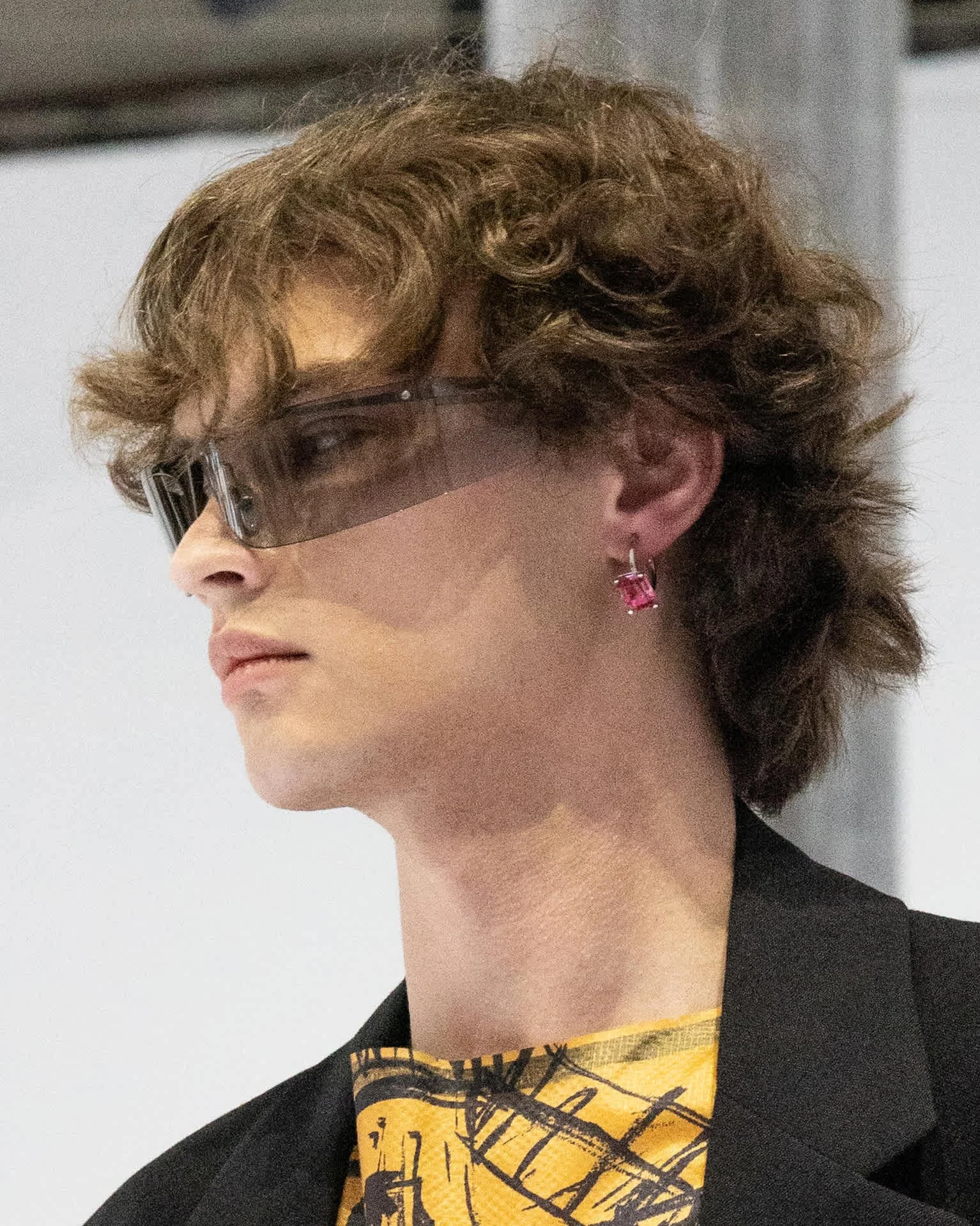
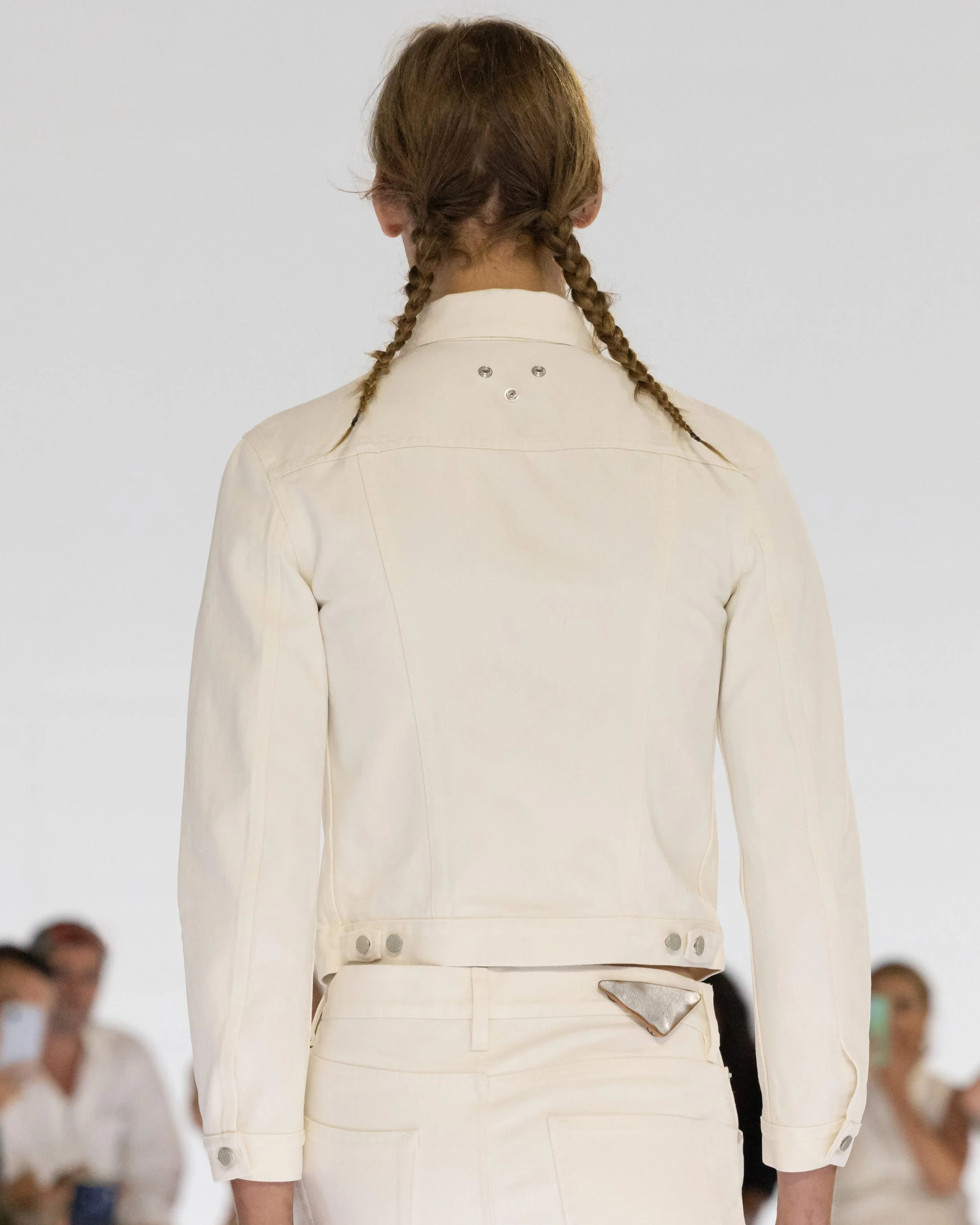
Precision, concentration, the reactive act—Miuccia Prada and Raf Simons approach Spring/Summer 2027 menswear through the idea of choice: what is kept, what is removed, and what becomes clearer in the process. It is not about reduction, but distillation—bringing clothes back to what feels fundamental and exact. Everyday garments like jeans, denim jackets, and T-shirts are re-examined and refined, not reinvented, but re-seen. Familiar things, adjusted just enough to shift their meaning. The silhouette is controlled and linear, consistent throughout, with accessories absorbed into the system rather than sitting on top of it. Everything is tightened into a quiet logic where function and form are almost indistinguishable. What emerges is a kind of clarity built from restraint. Not absence, but focus. A way of looking at the same things with a different level of attention.

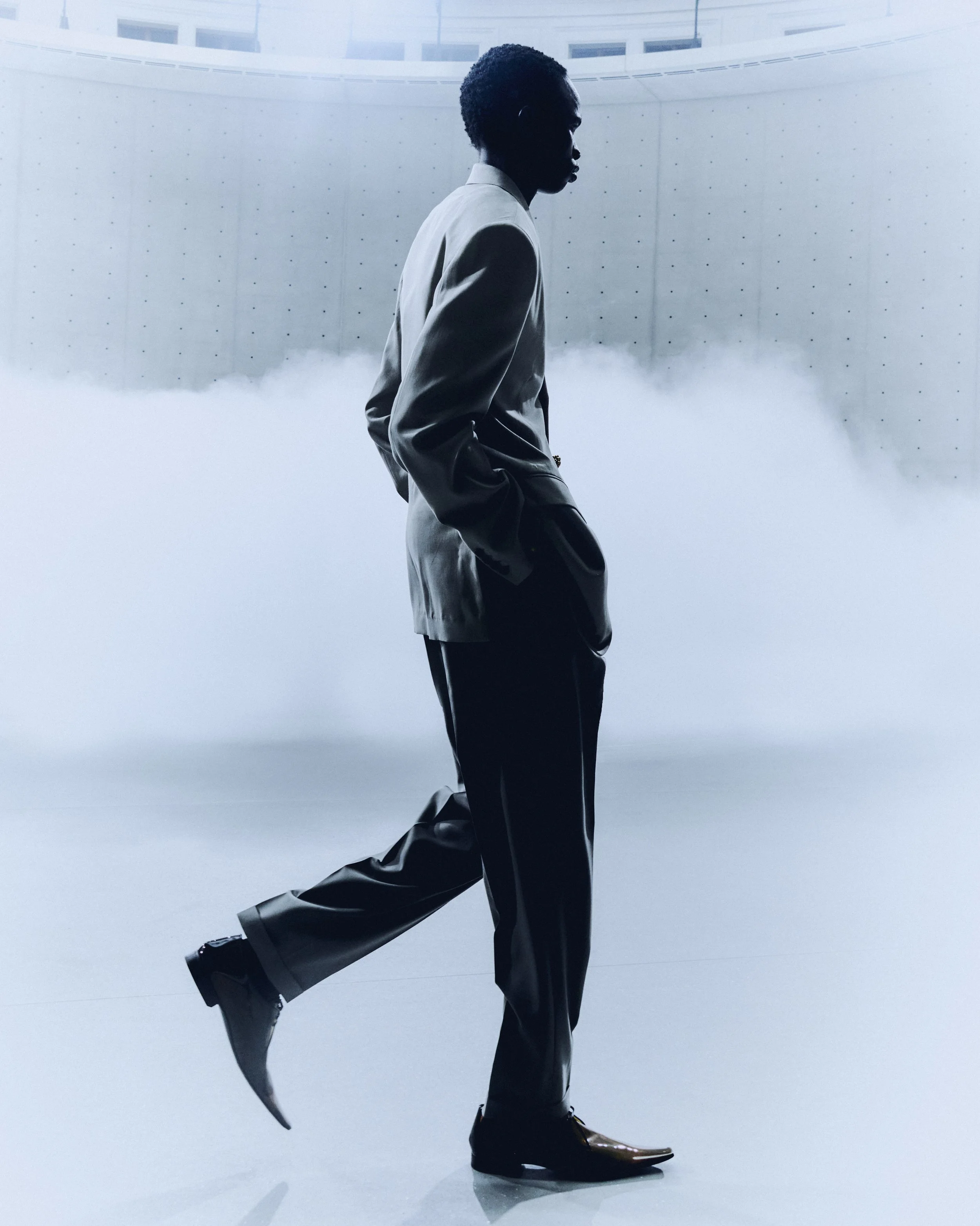
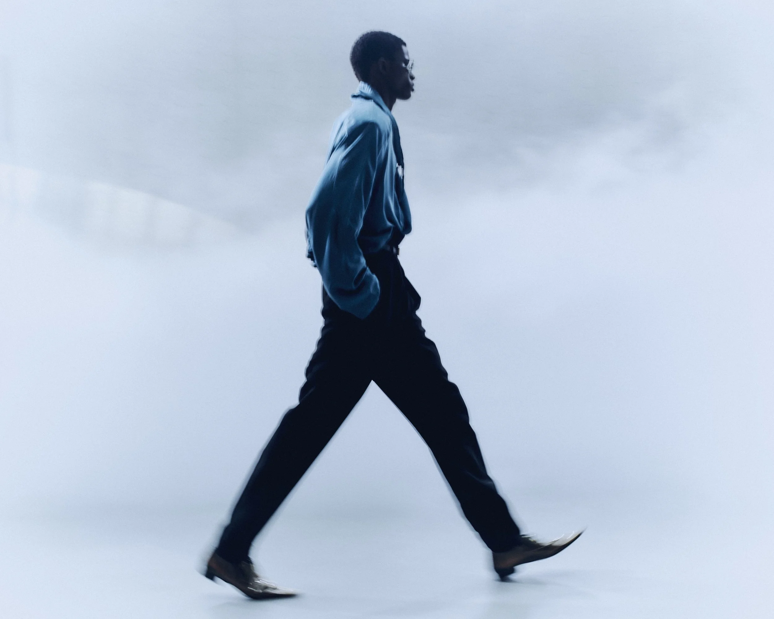
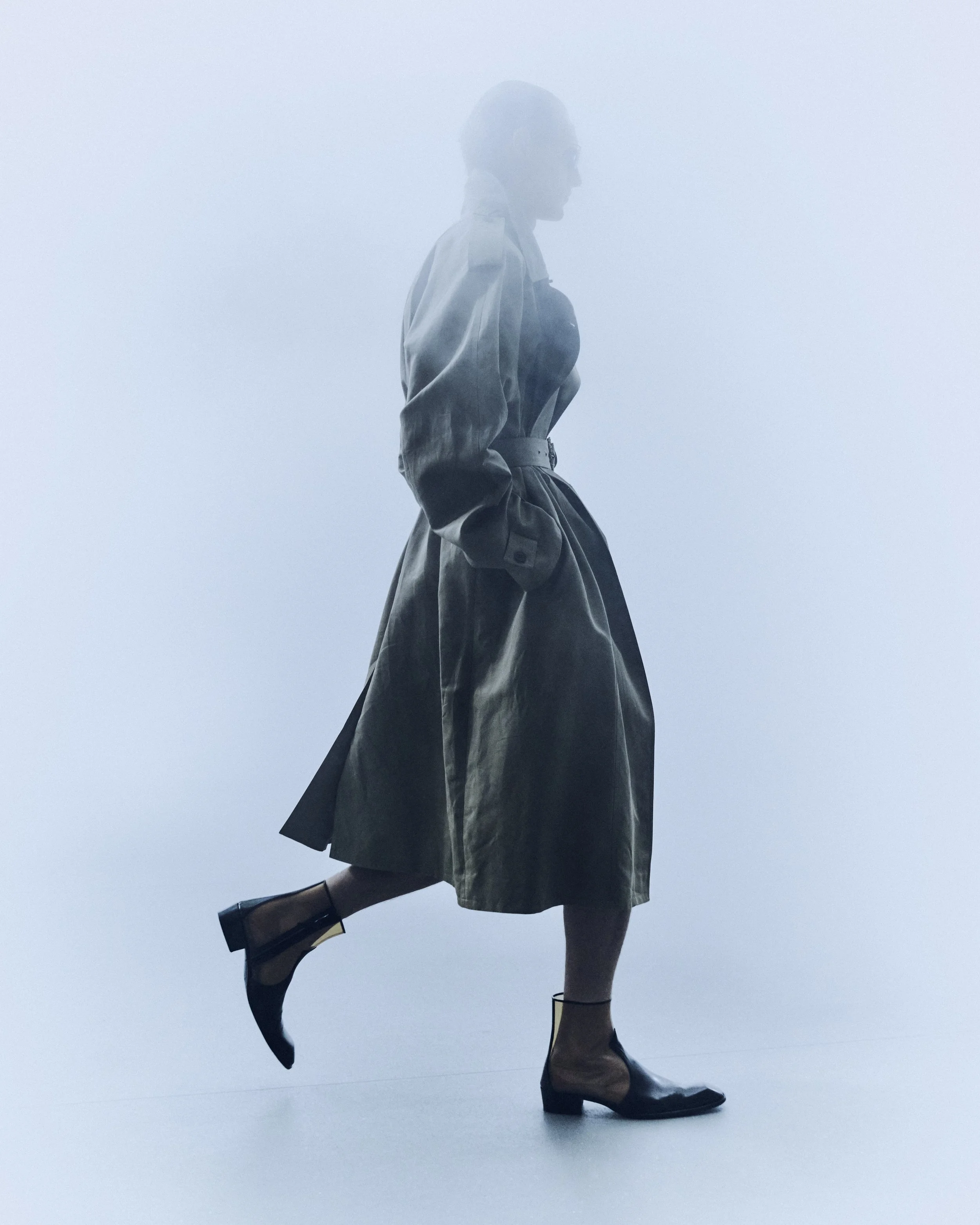
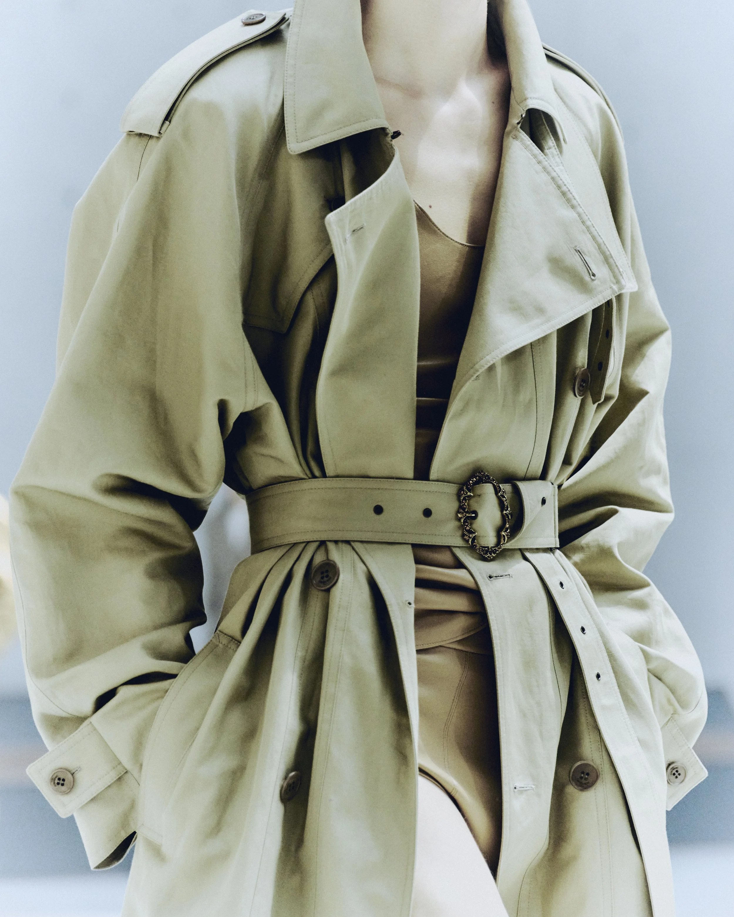
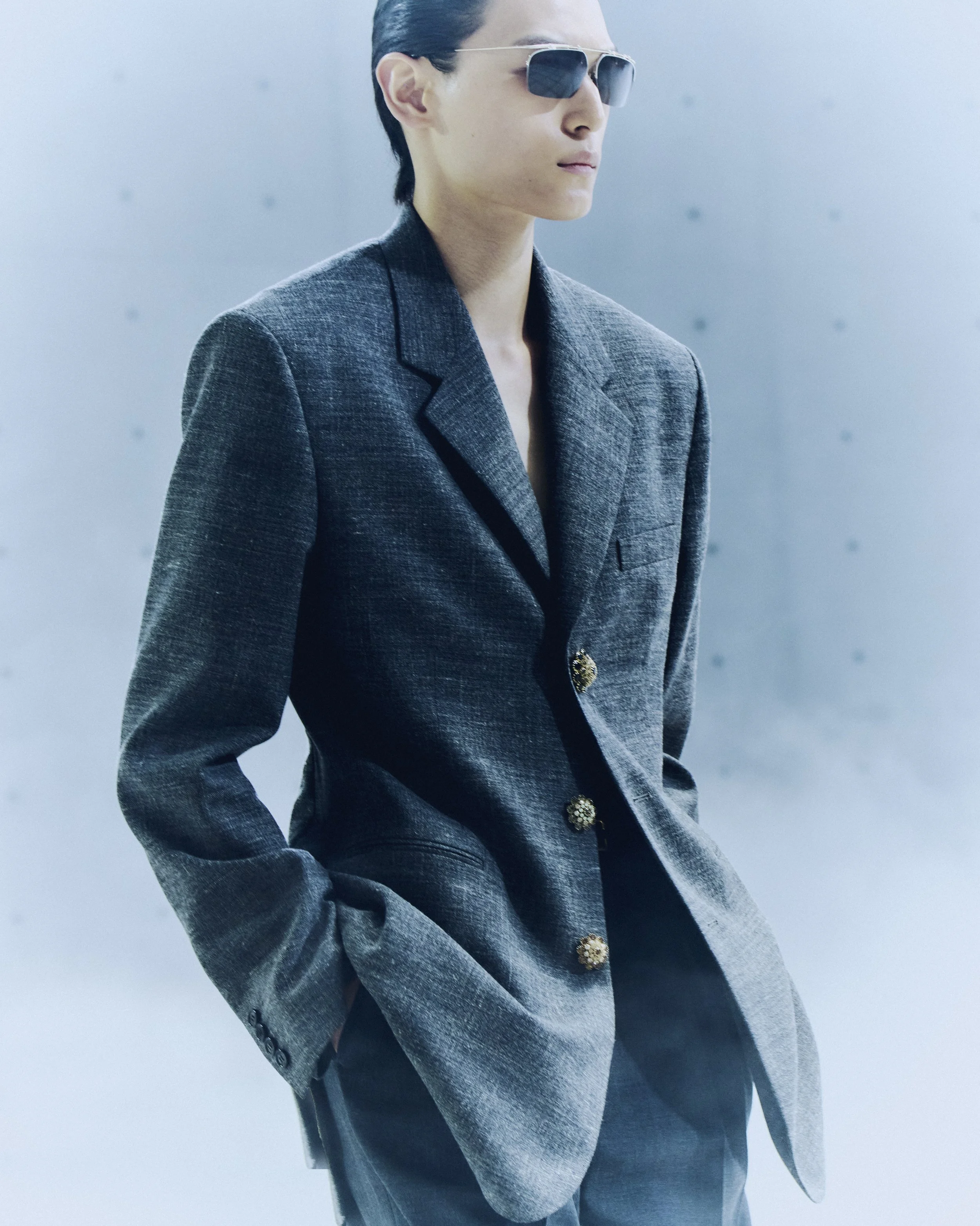
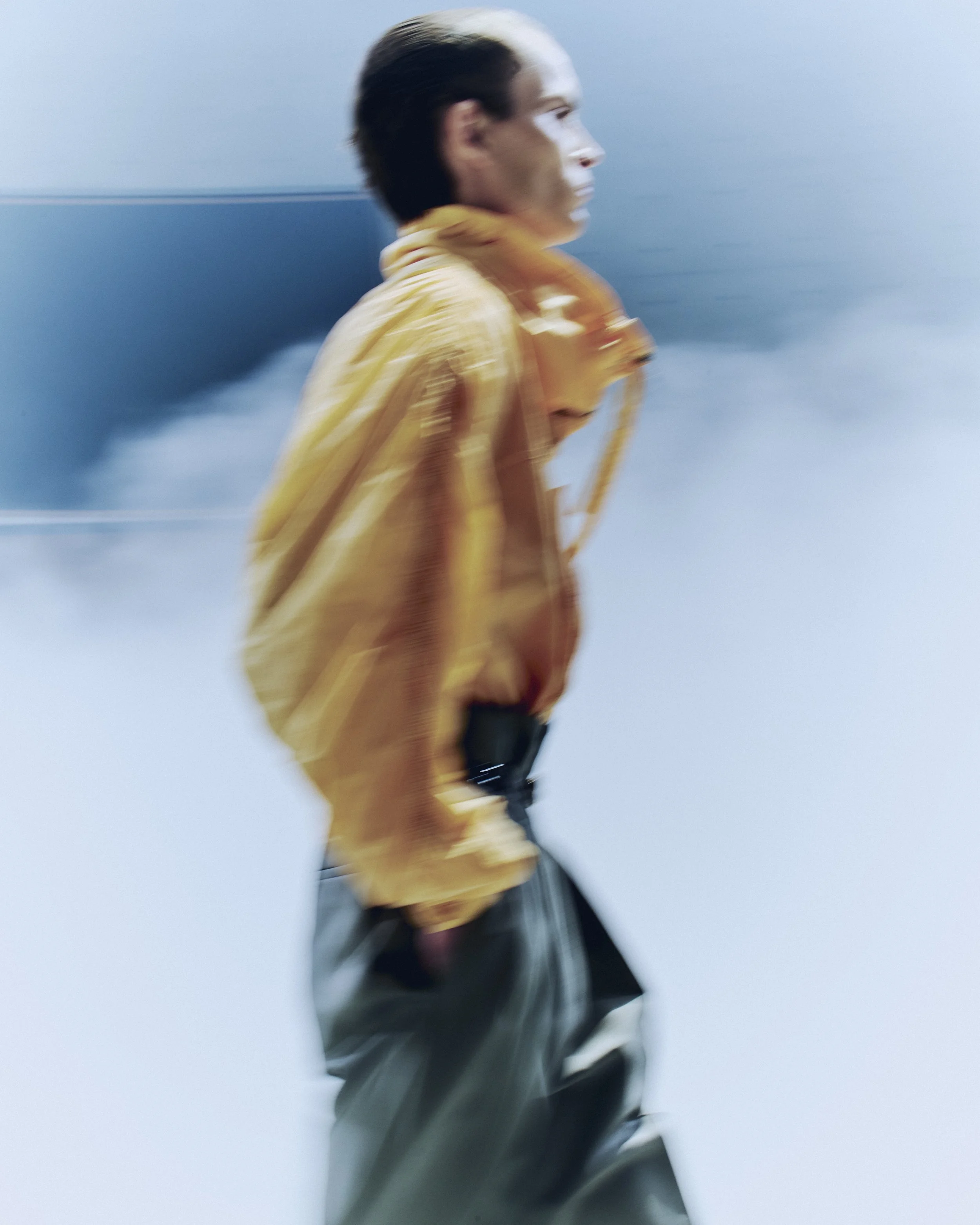
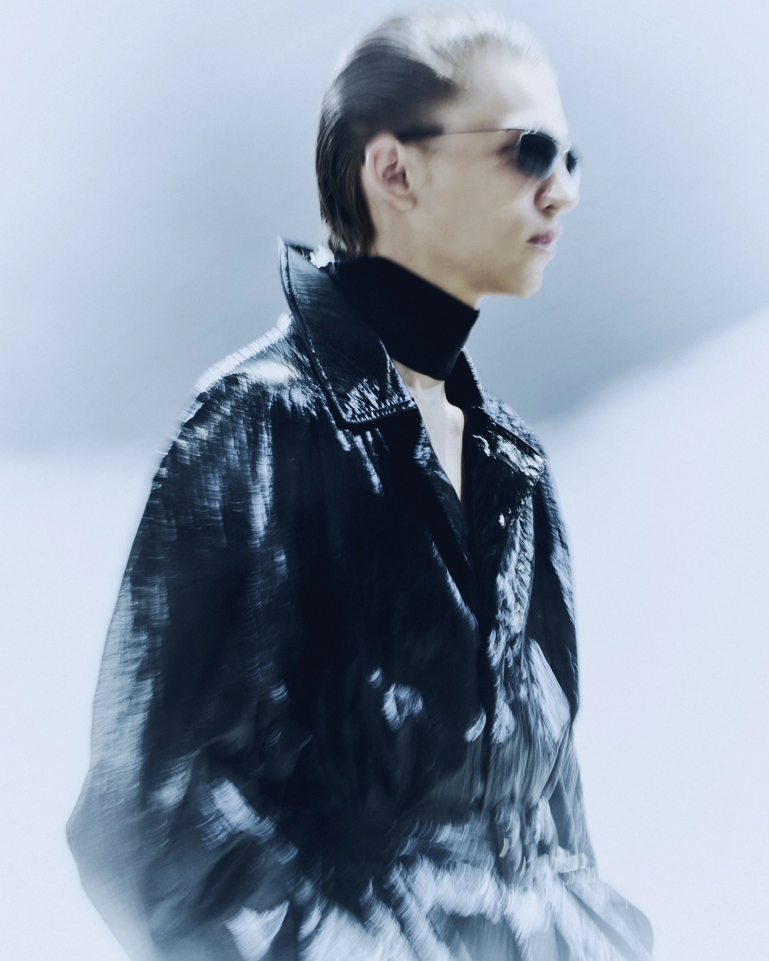
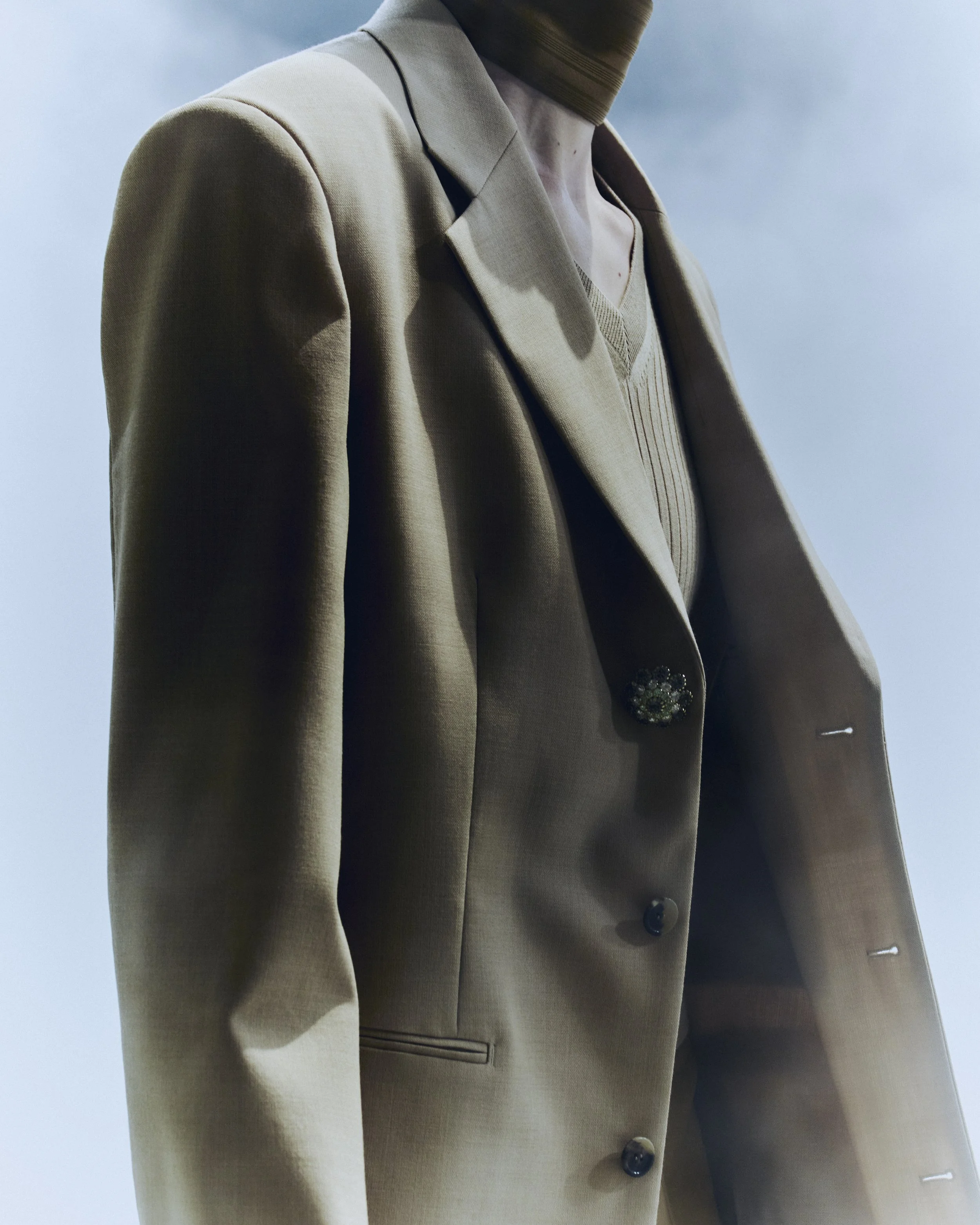
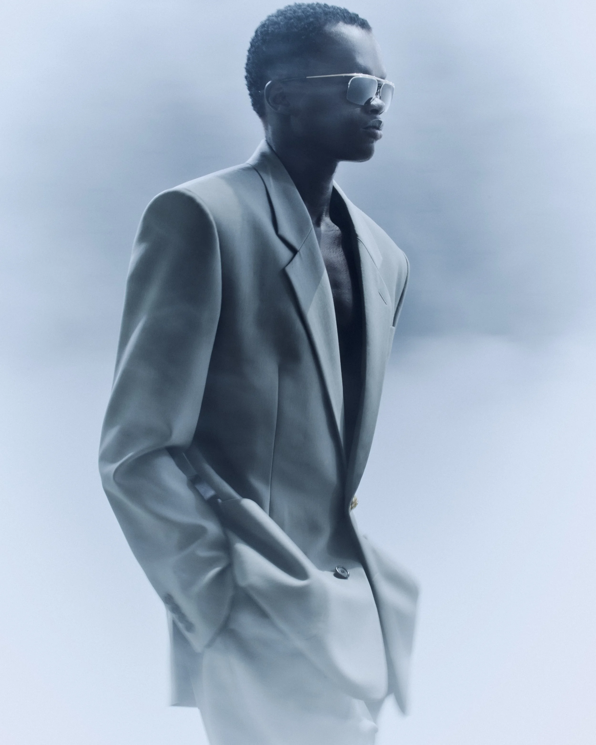
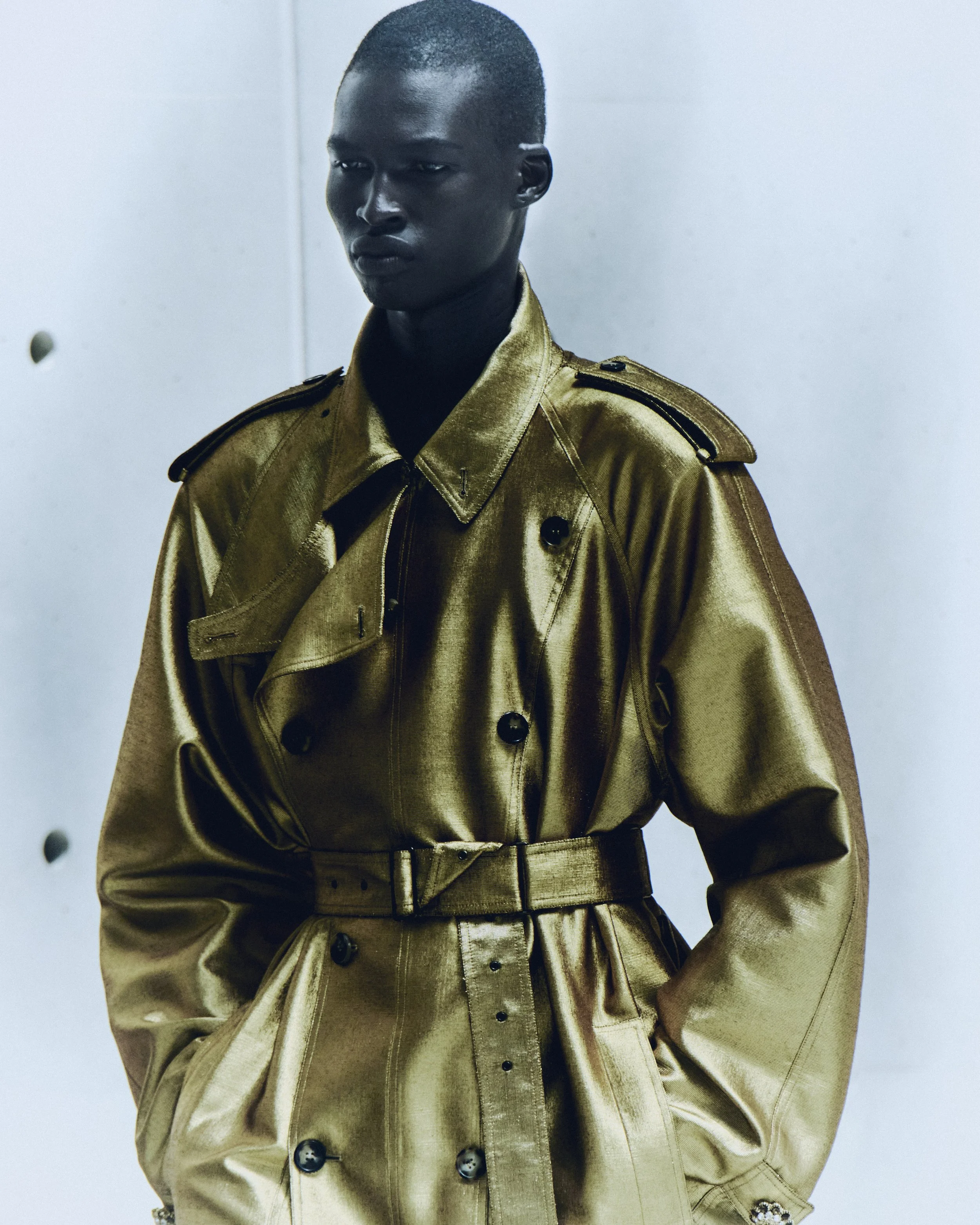
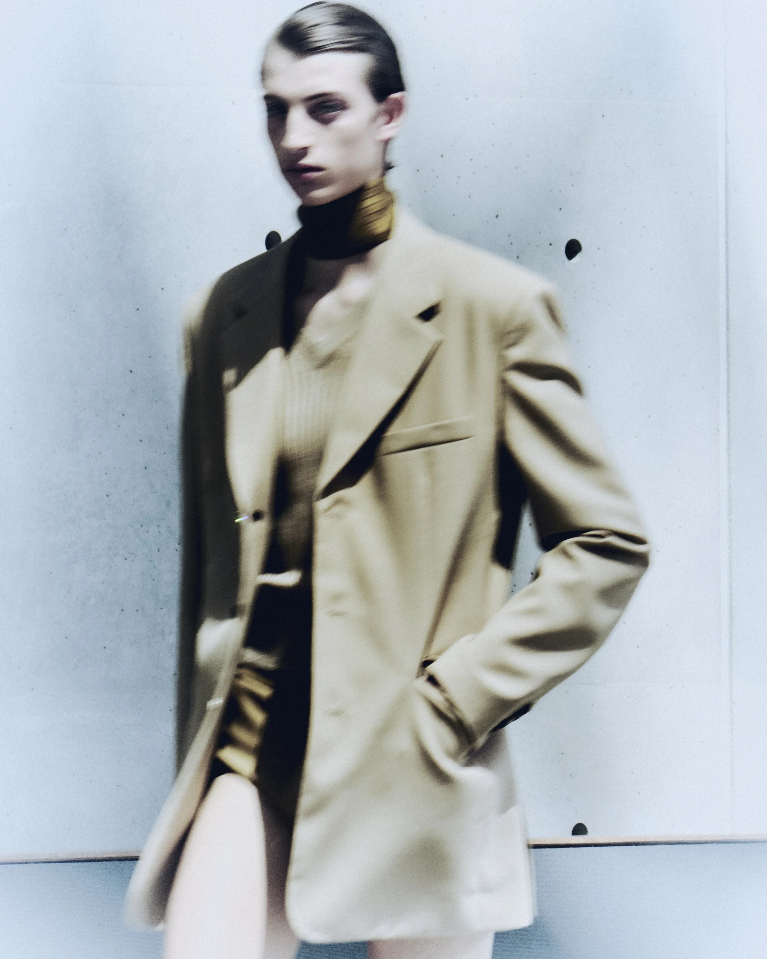
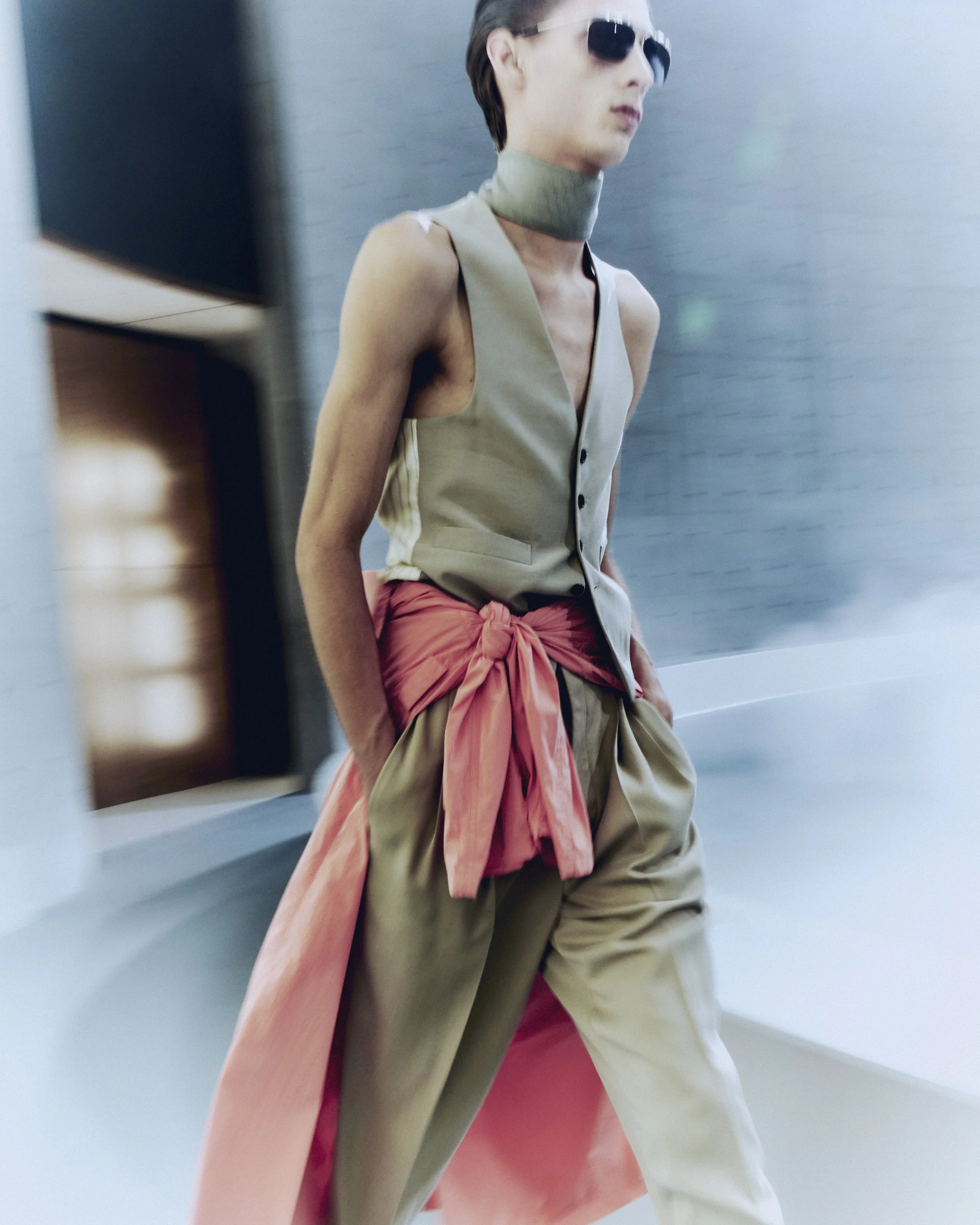
Saint Laurent Men's Summer 27 by Anthony Vaccarello Presentation At Bourse de Commerce

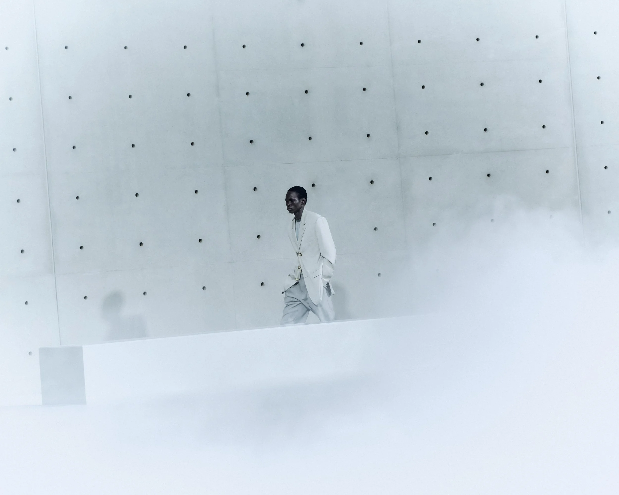
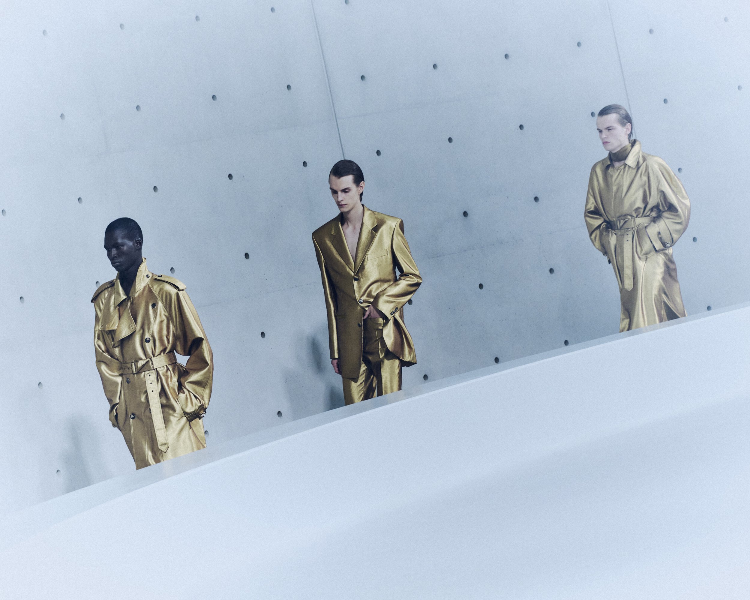
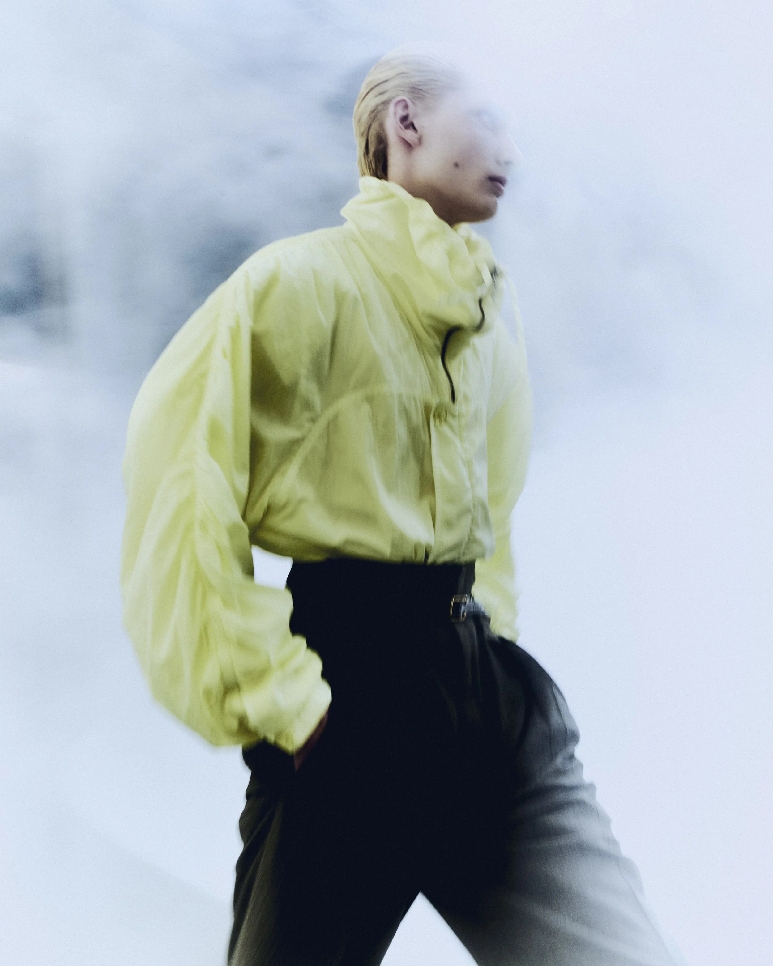
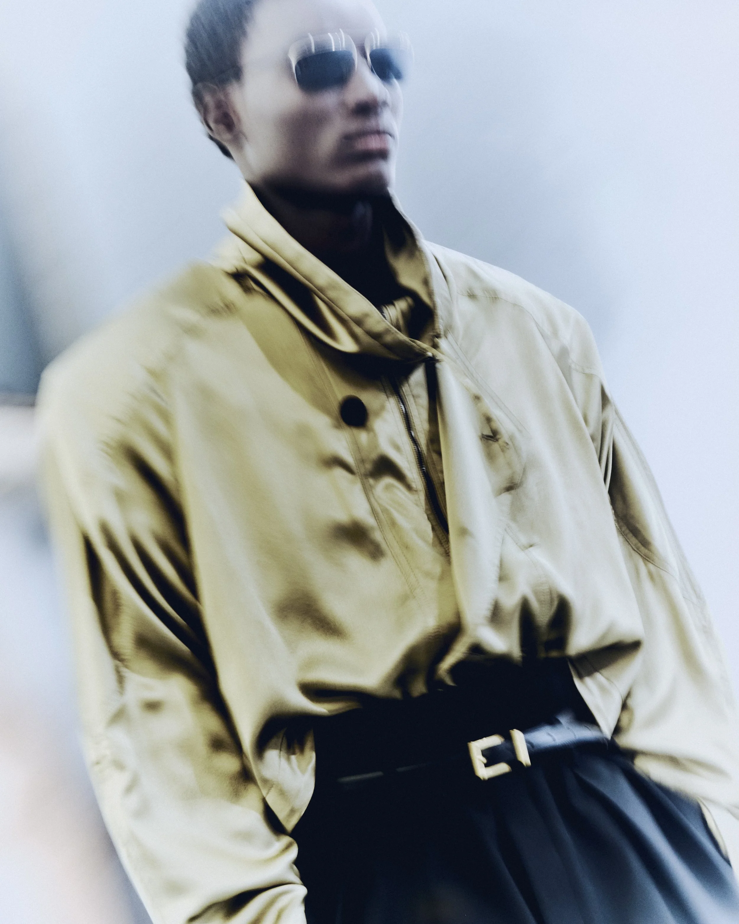
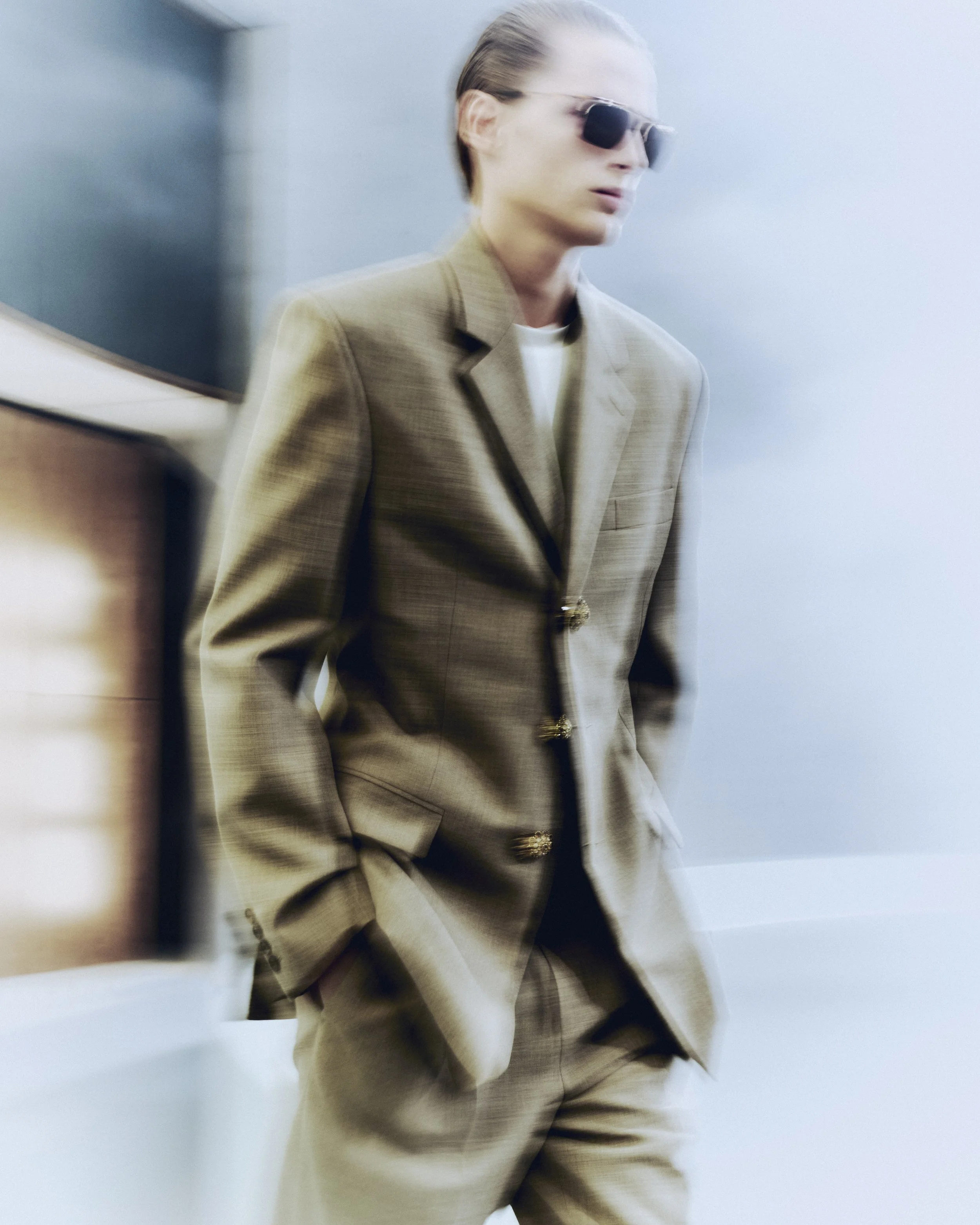
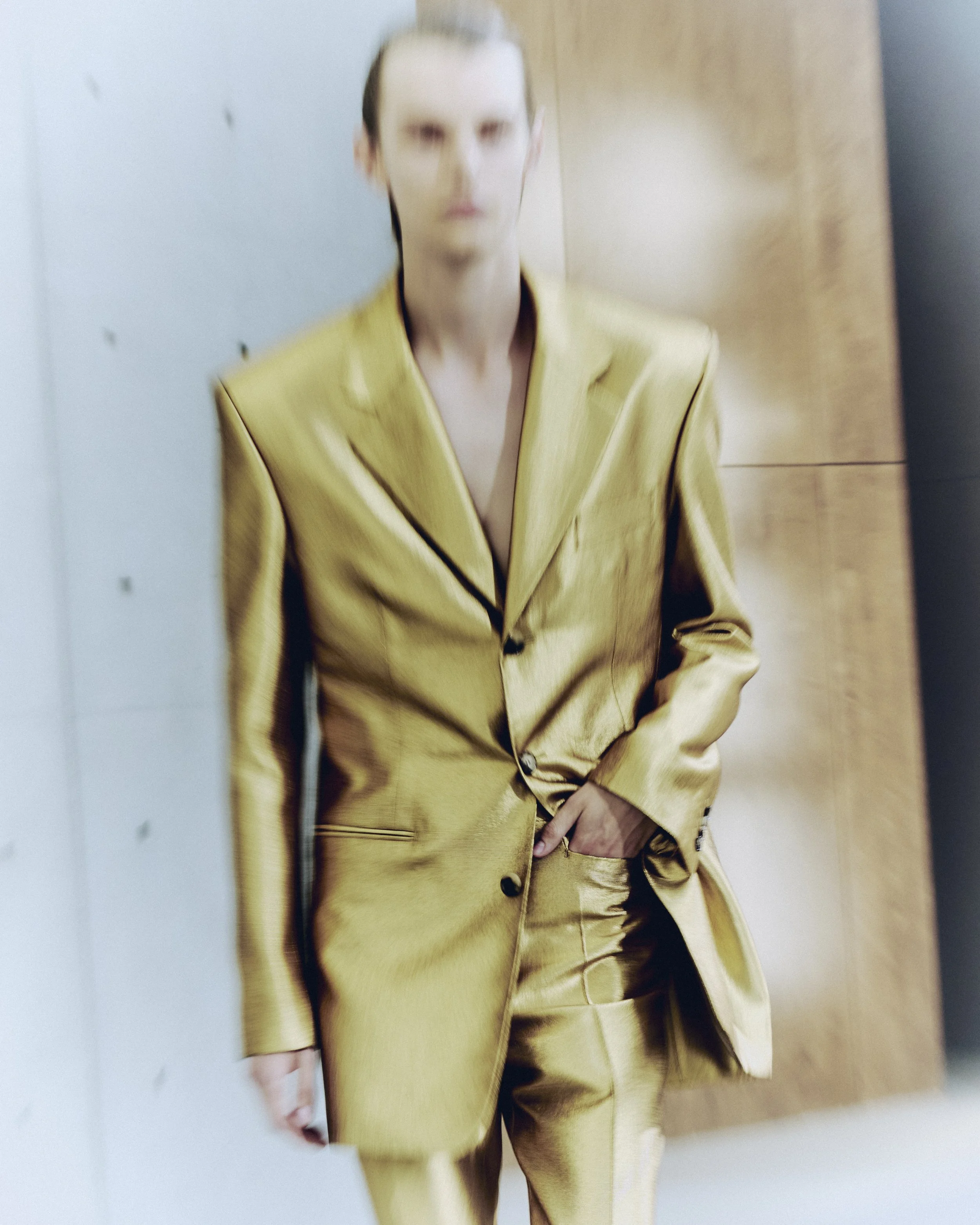
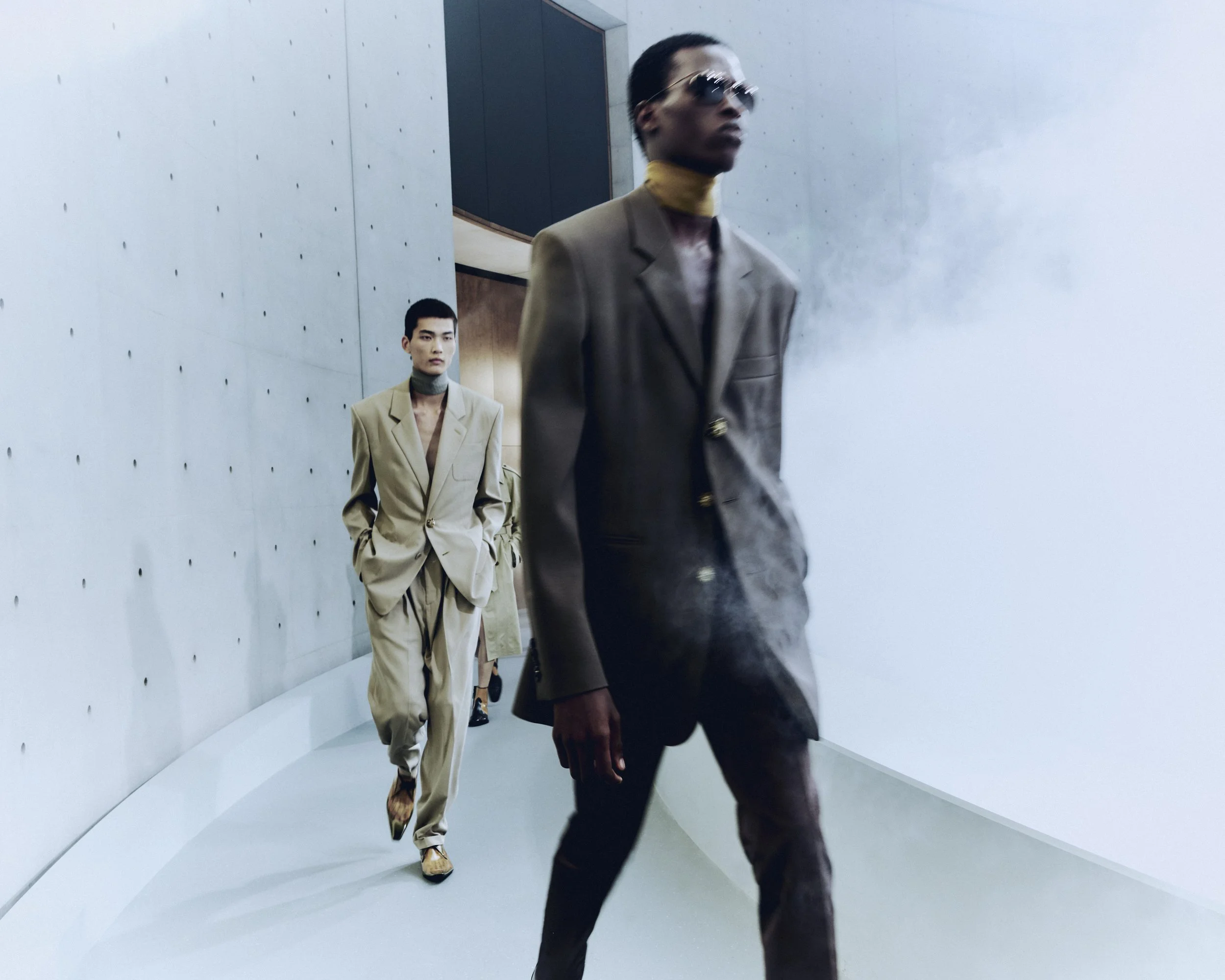
Saint Laurent’s Summer 2027 Men’s collection by Anthony Vaccarello unfolds inside the Bourse de Commerce — Pinault Collection, where architecture, atmosphere, and absence become inseparable from the clothes themselves. The circular structure—designed by Tadao Ando Architect & Associates, Niney et Marca Architectes, and Agence Pierre-Antoine Gatier—grounds the presentation in a language of restraint: concrete, proportion, and light forming a silent, continuous frame for what is revealed within it.

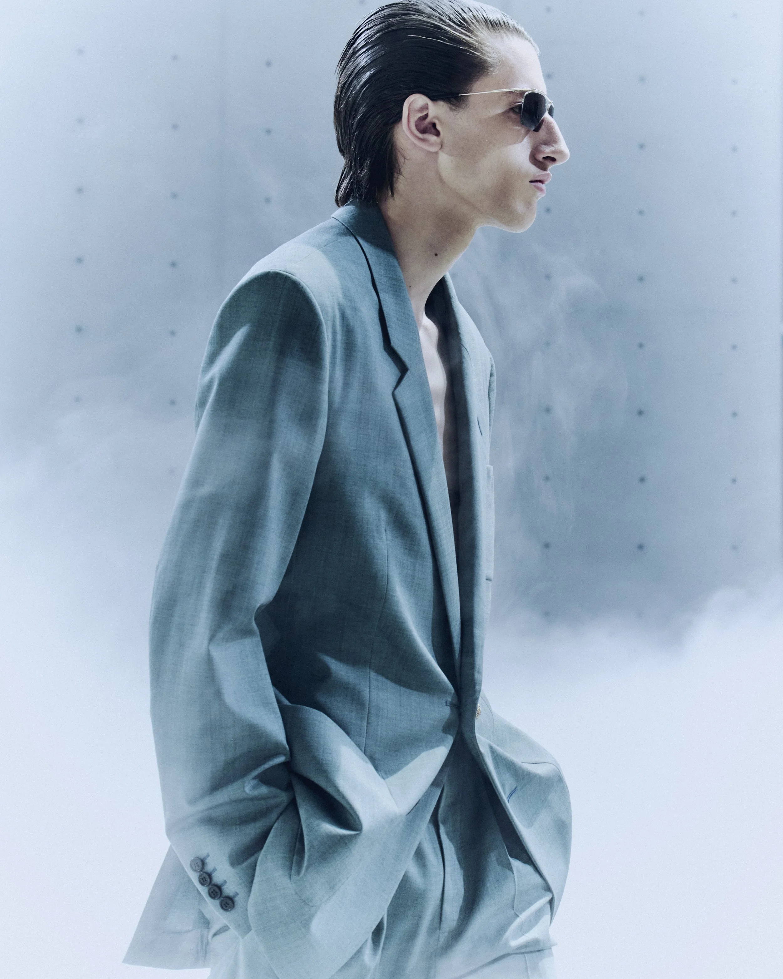
At the center of the experience is Fujiko Nakaya’s Cloud #07156 (2026), an immersive fog installation that transforms the rotunda into a shifting field of visibility and disappearance. As mist fills the space, the building ceases to function as a static container and instead becomes a breathing environment—one in which bodies and garments appear, dissolve, and re-emerge like fragments of thought.

Vaccarello’s collection is anchored in a provocation: “Nobody is trying to seduce you. What makes them seductive is that they do not need to.” From this premise, the show considers desire not as accumulation but as withdrawal—what happens when drama, noise, and excess are withheld rather than amplified. Across 40 looks, restraint becomes its own form of intensity.

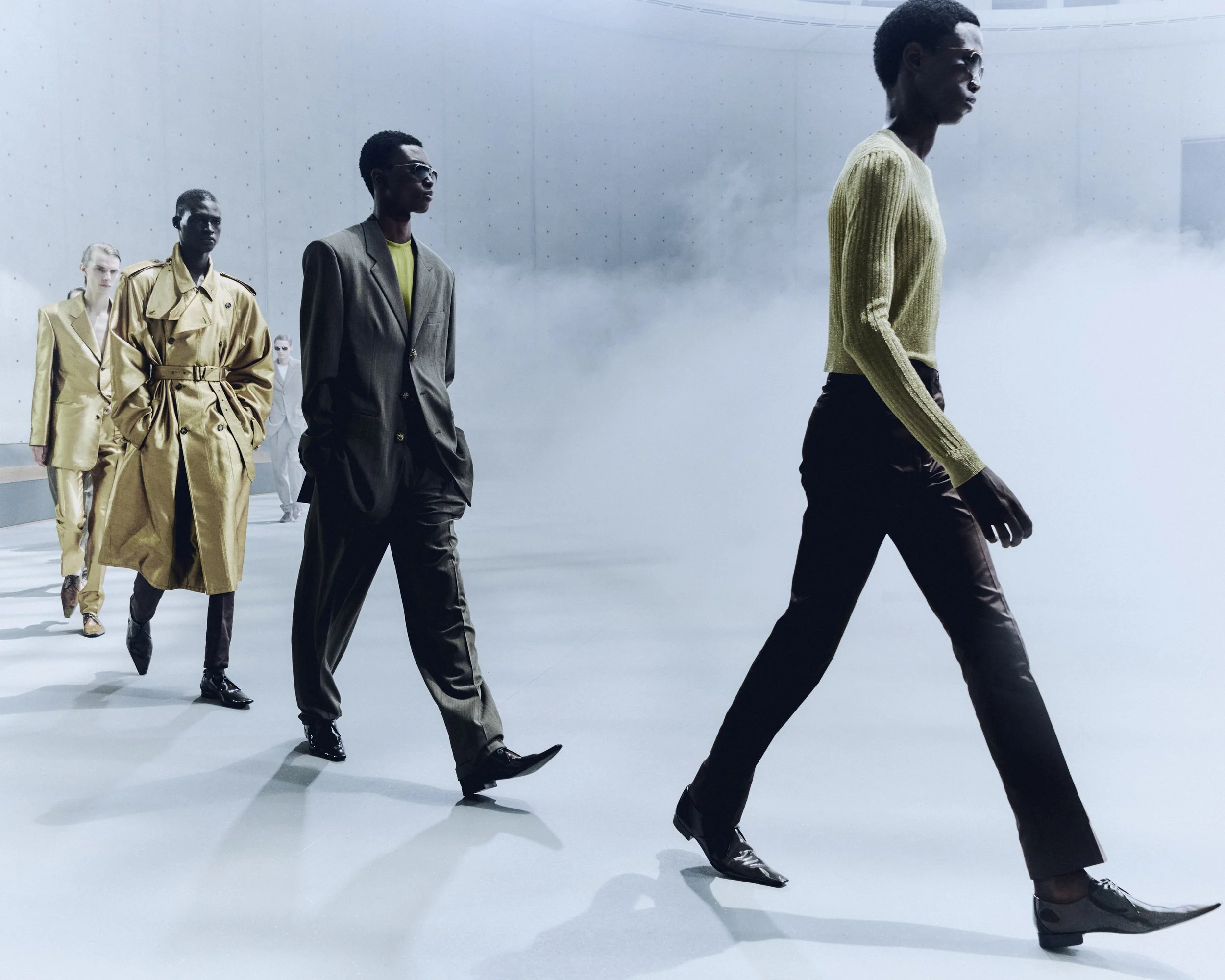
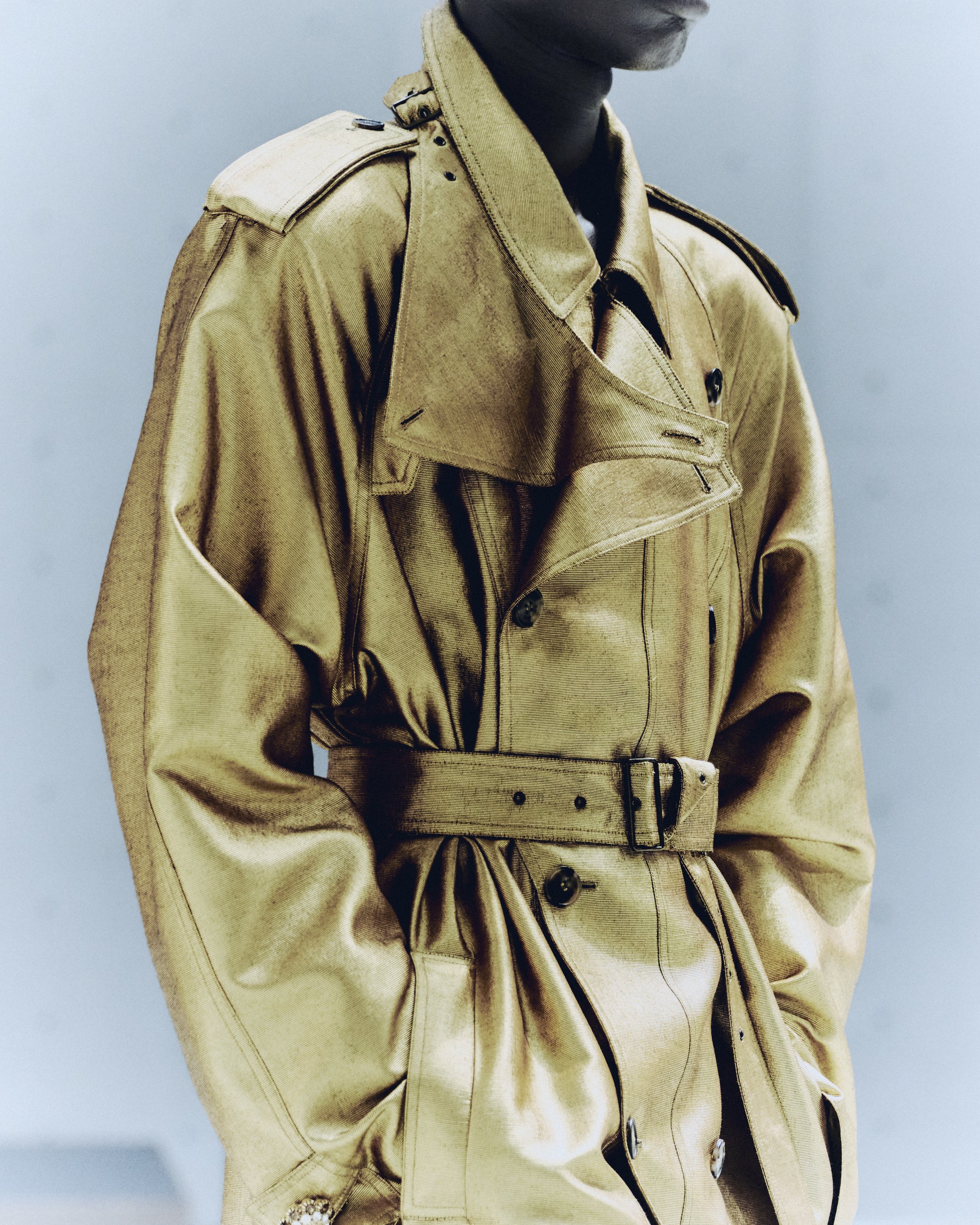
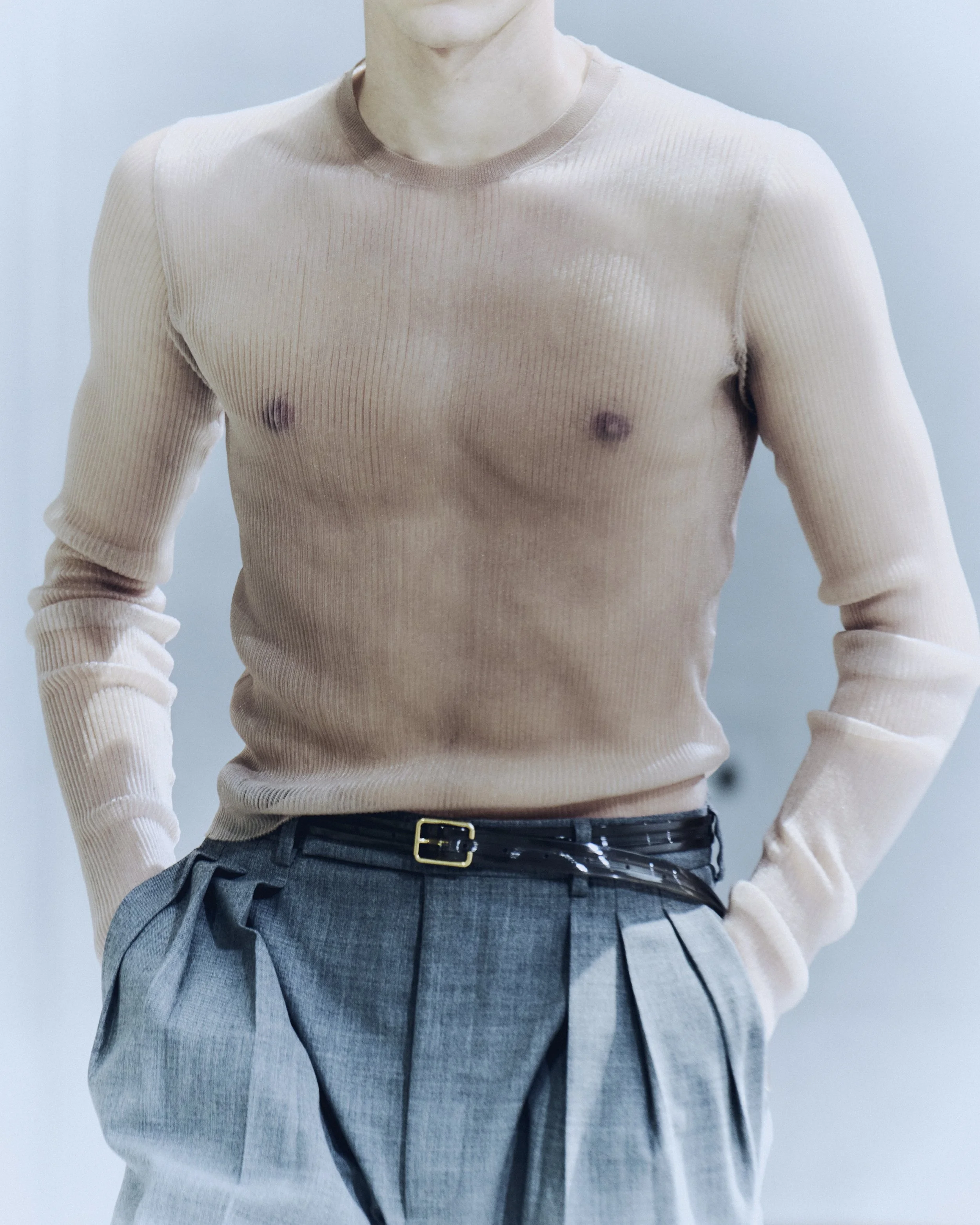
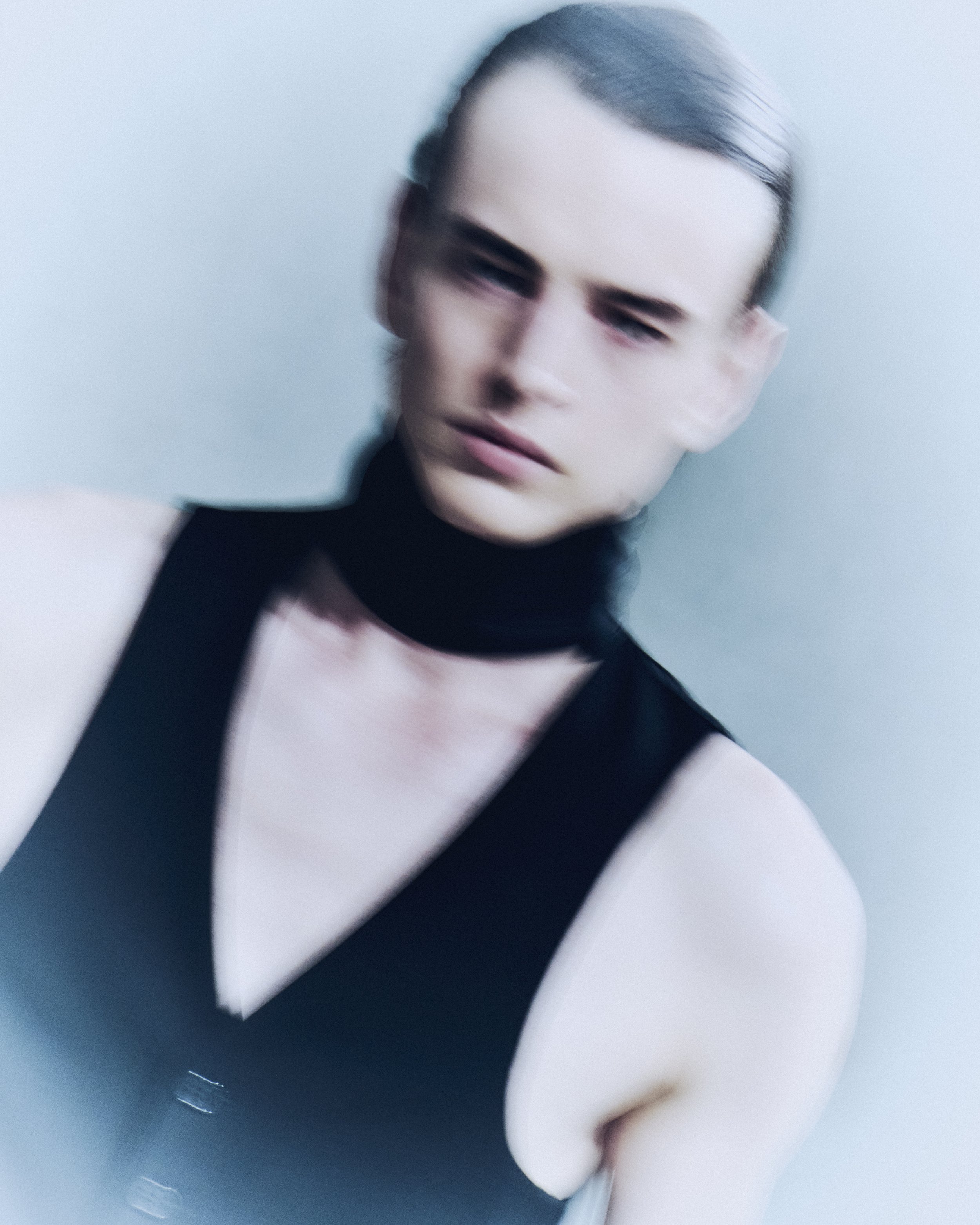
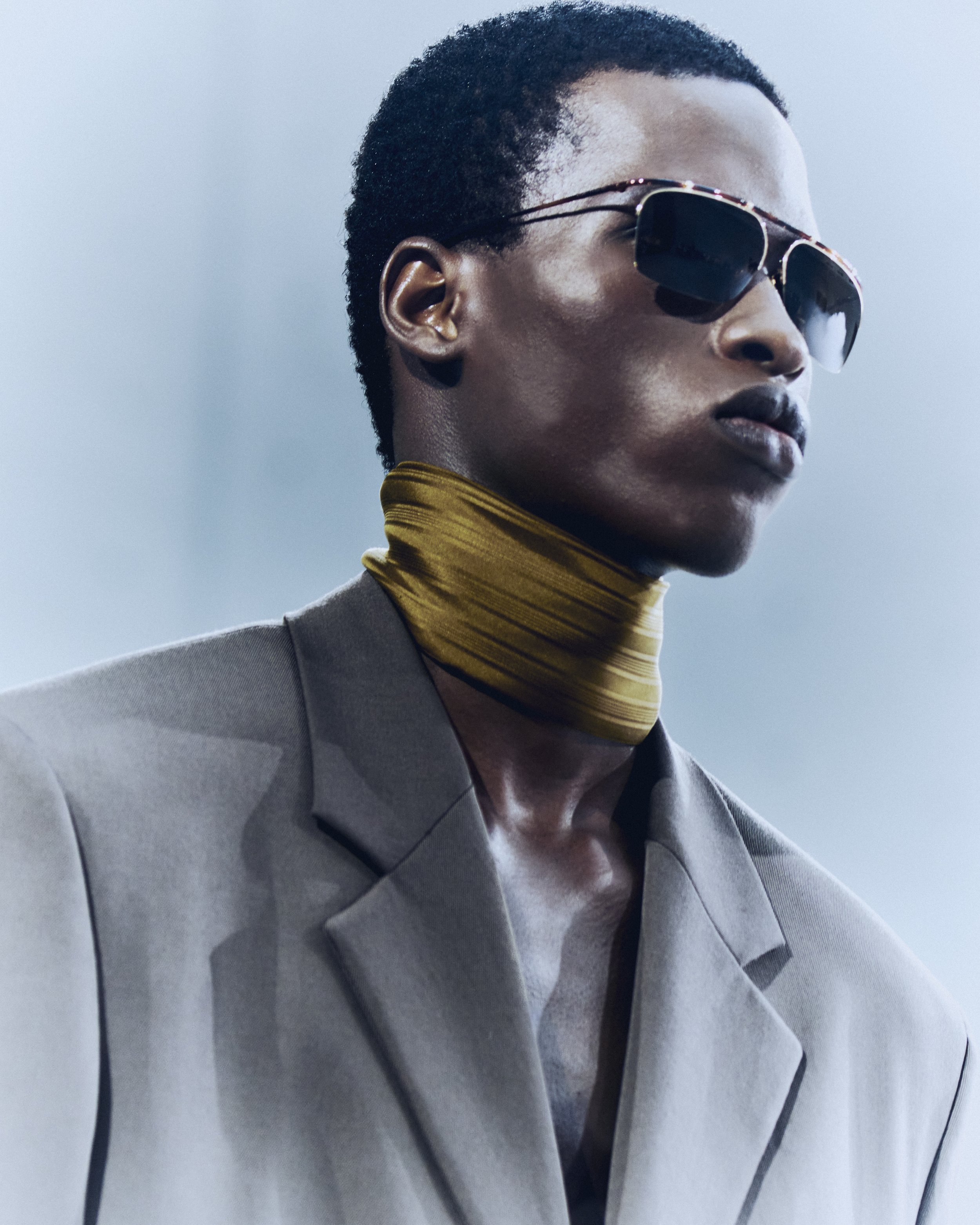
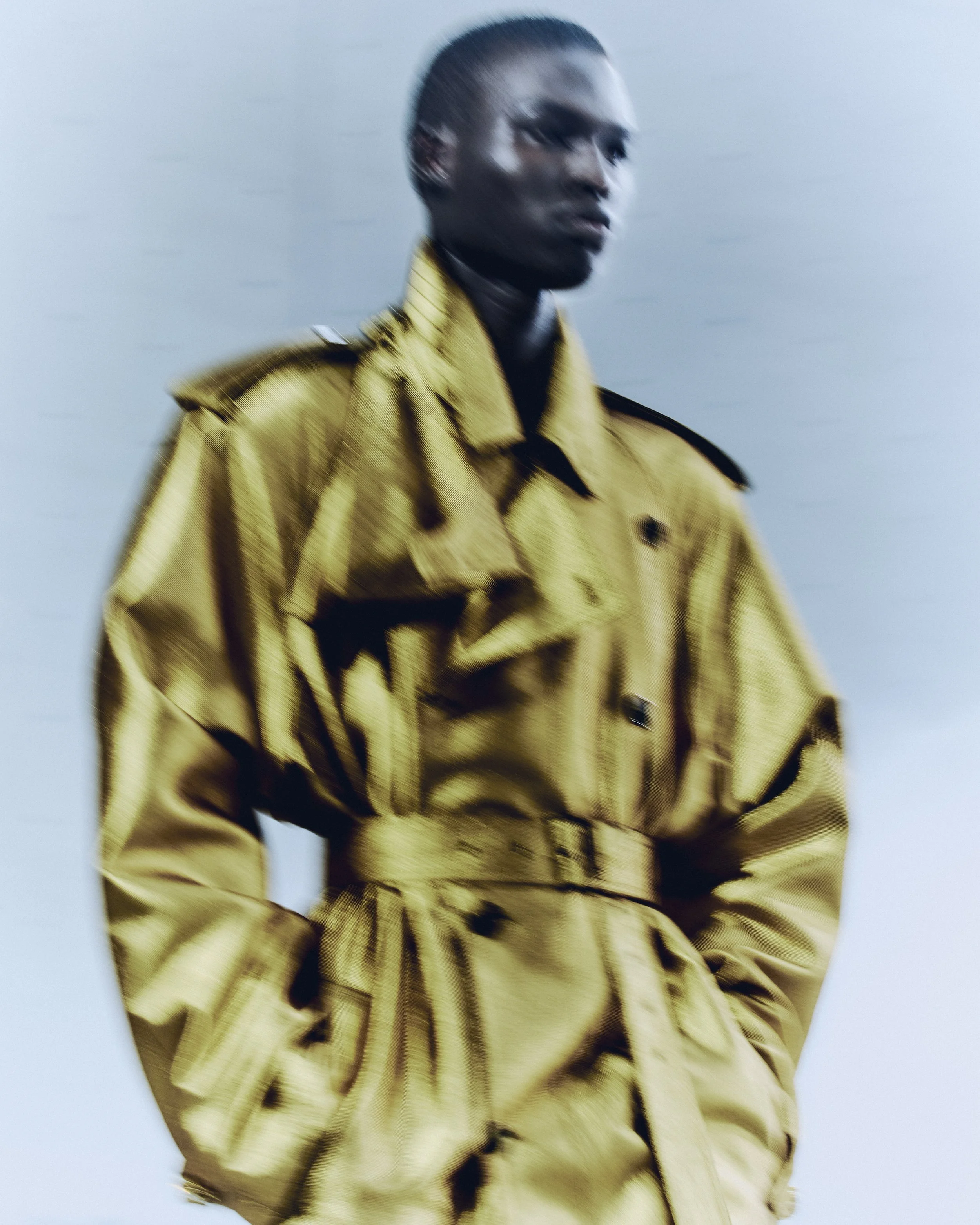
Tailoring is sharpened into new proportions: a three-button jacket cut higher on the body, paired with narrow flat-fronted or softly pleated trousers; familiar Saint Laurent codes—the waistcoat, the ribbed V-neck sweater—recalibrated through precision rather than reinvention. Even athletic blousons appear refined, rendered in unexpectedly delicate technical taffeta. Gold threads through the collection not as ornament but as transformation, turning the utilitarian trench into something heightened yet still functional. The palette remains grounded—grey, brown, black, beige—punctuated by flashes of orange, ochre, claret, lime, powder blue, and shimmering gold.

The collection is informed by figures who treated restraint as a form of expression: Marguerite Duras, Tina Chow, and the fictional Mr. Ripley. Each, in different ways, embodies Vaccarello’s central idea that omission can be more powerful than declaration. As the notes frame it: “It is refusal, perhaps, that most powerfully fuels desire.” And further: “We have forgotten the pleasure of the unknown, the unseen and the unspoken.”

The presentation extends this philosophy into space and choreography. Models move through Cloud #07156 in a sixteen-minute sequence, emerging and dissolving within Nakaya’s fog. Here, clothing is never fully fixed in view. Instead, it becomes part of an atmosphere where presence is temporary, and disappearance is designed. The installation is not a backdrop but an active force—another articulation of absence, restraint, and desire in motion.

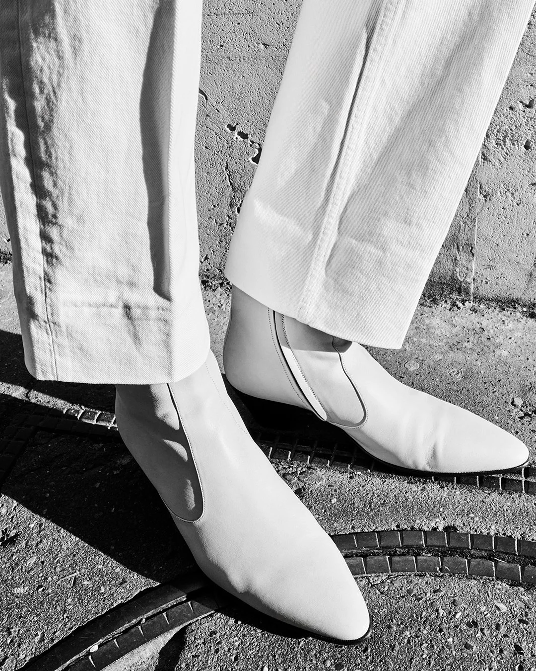
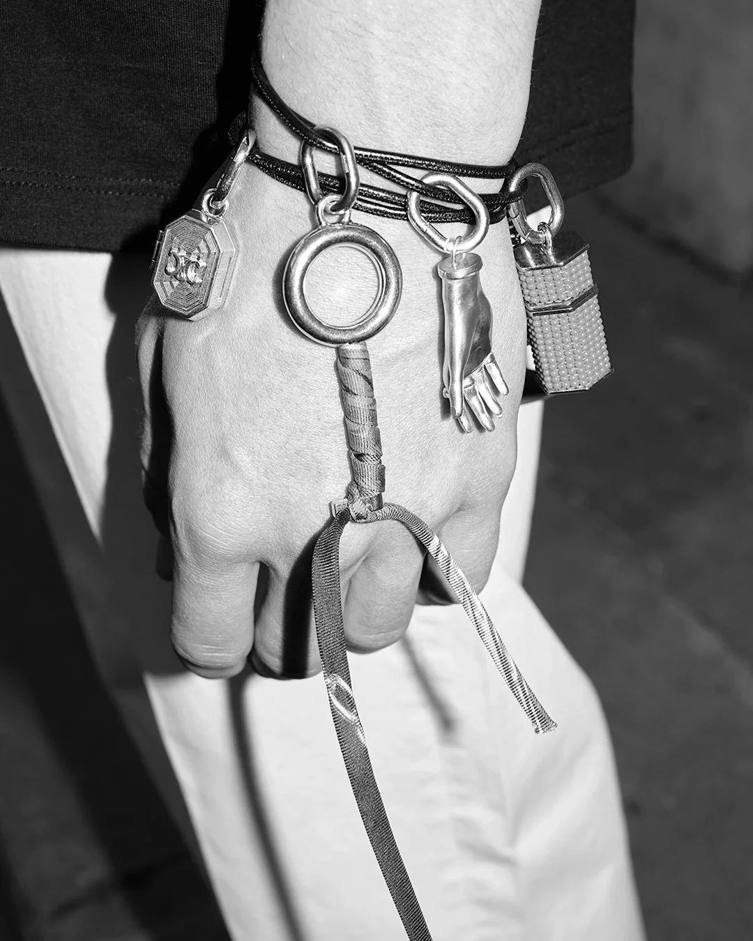
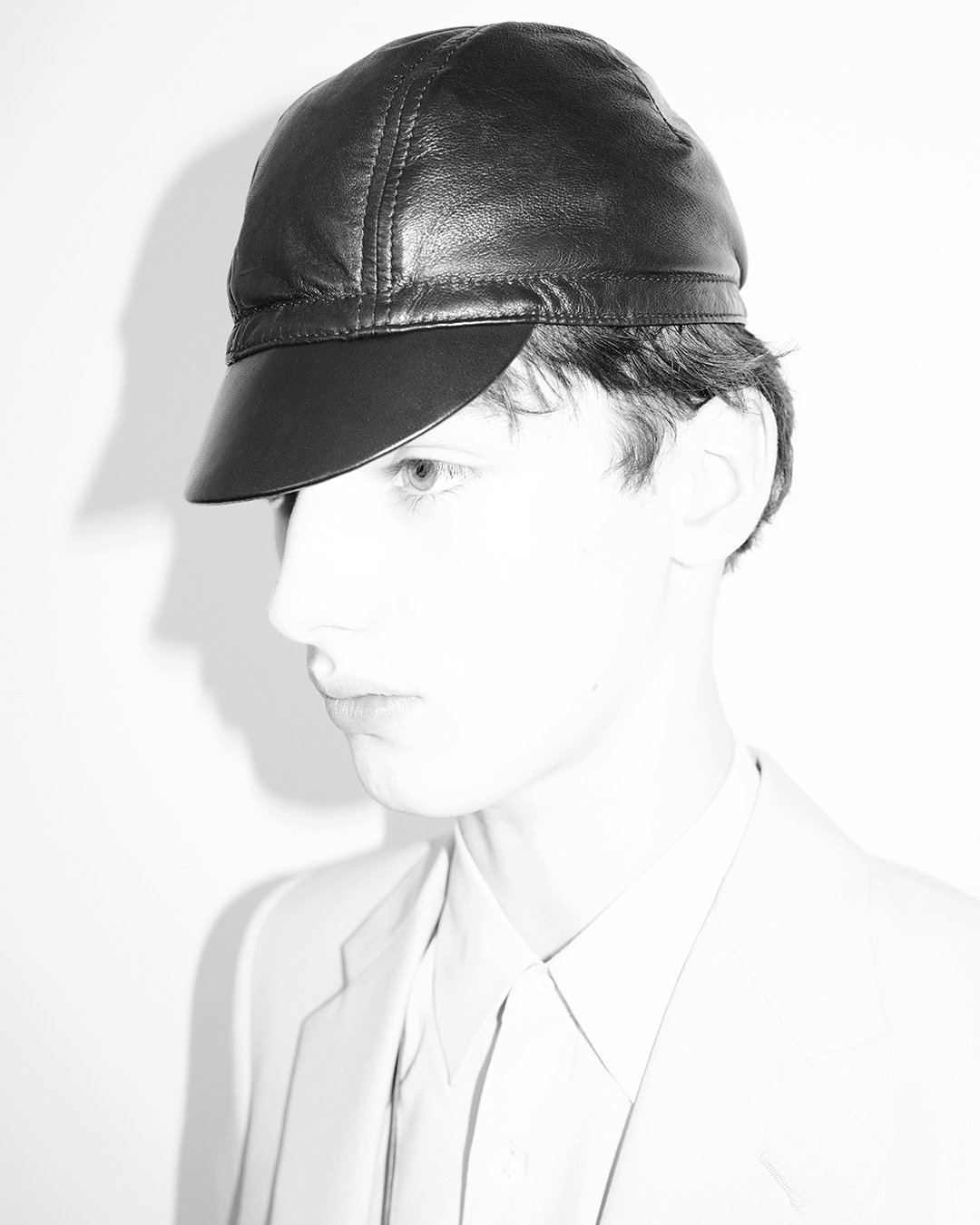
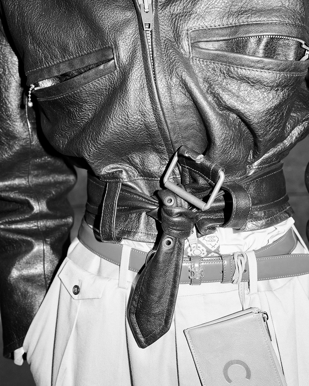
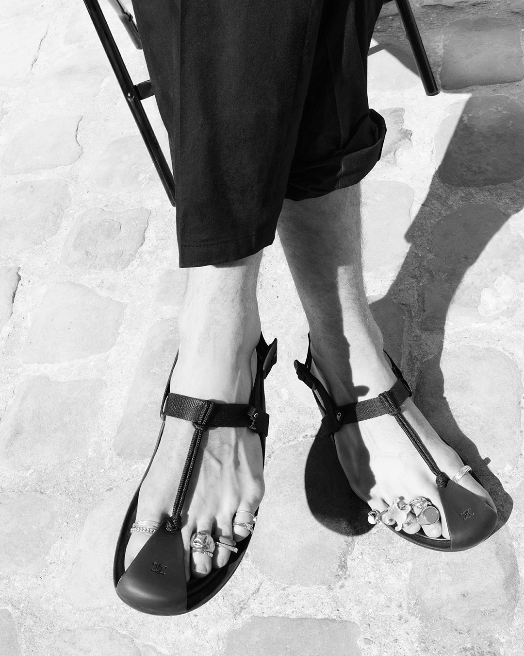
Campaign: CELINE Autumn/Winter 2026 Collection by Michael Rider

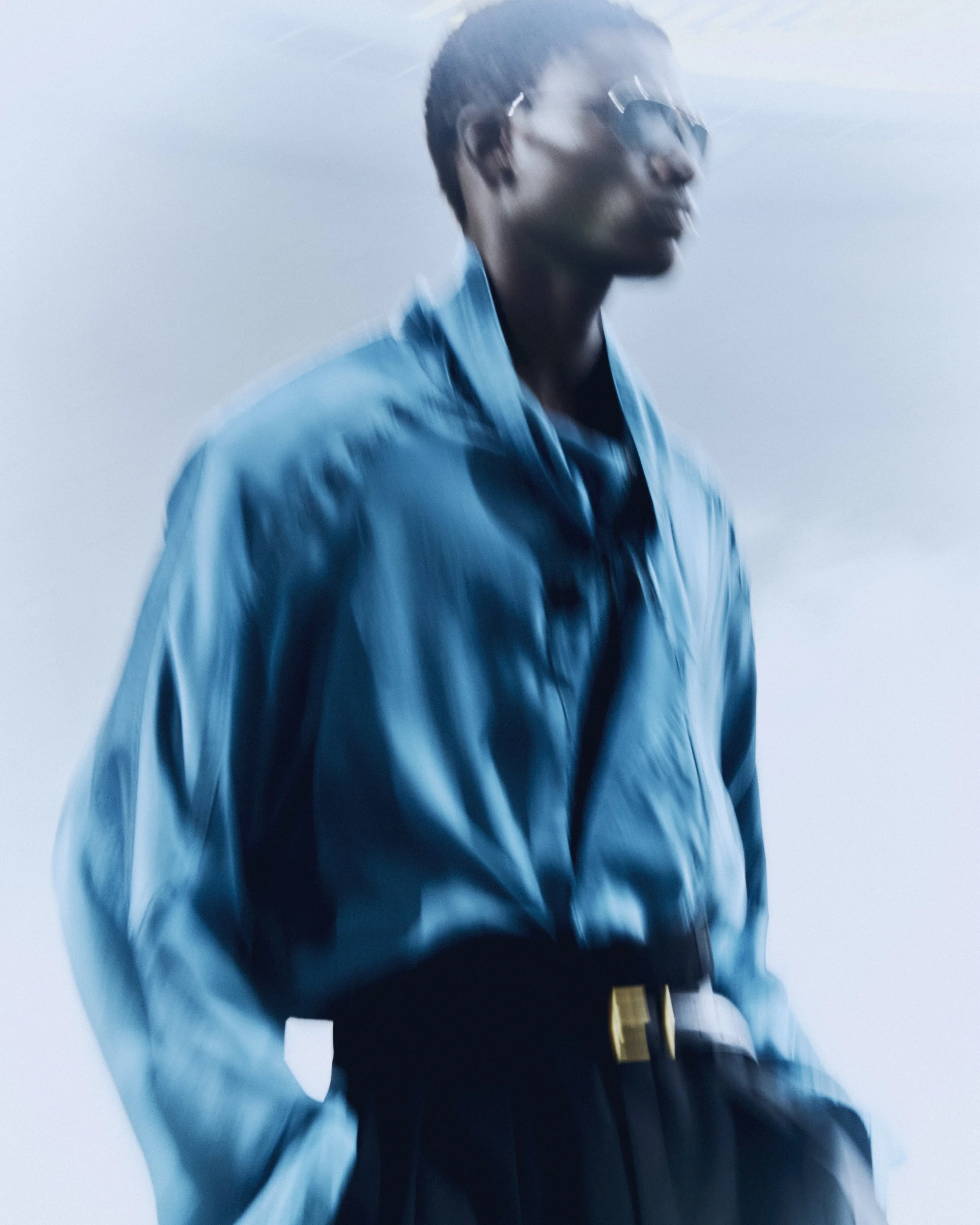
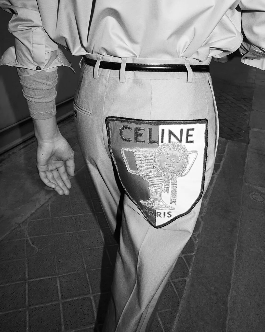
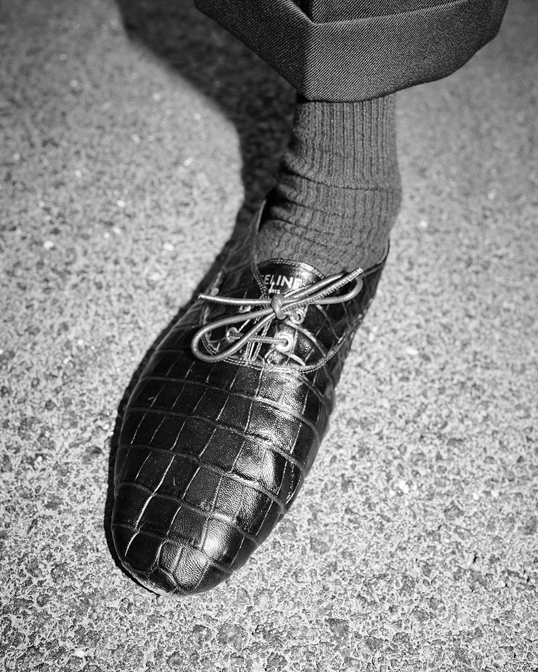
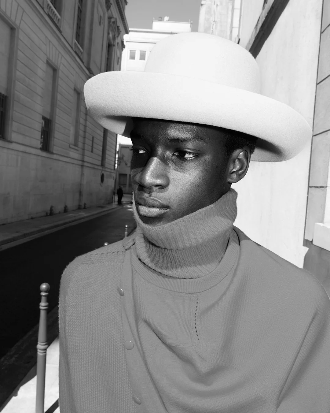
CELINE’s Autumn/Winter 2026 campaign under Michael Rider builds from the frame of menswear and what CELINE stands for, filtering it through the energy of the here and now. As Rider puts it, “We took the frame of menswear, and what CELINE stands for, and then talked a lot about the energy of today, the here and now, the way people live and want to look.” At its core is a shift from performance to presence: “Character over costume.” The collection resists excess in favor of clarity, positioning dressing as something grounded, instinctive, and personal. It’s about a wardrobe that doesn’t overwrite identity but refines it.

CELINE becomes, in Rider’s words, “a place to come and get dressed, for all sorts of days and nights and moments in life,” where clothing is meant to be lived in rather than staged. The invitation is open-ended—“inviting everyone to find the best pieces and then to appropriate them into their lives, their rhythms, their style.” Everything resolves into utility and emotion at once: “Everything you could need,” expressed through garments that feel necessary, personal, and made in beautiful fabrics that endure. The attitude is quiet but precise—“classics with bite,” where “discretion and restraint make the right kind of noise.”

photographs by Andrea Spotorno

Backstage: Dries Van Noten Men's Spring/Summer 2027 Collection

“We started the collection with the desire to make something that feels light and delicate.” From its earliest sketches, the project unfolds like a memory half-remembered, shaped by creative director Julian Klausner’s reading of L’Après-midi d’un faune, Stéphane Mallarmé’s 1876 poem where a dreamlike creature drifts between waking and sleep, caught in “the haziness the verses depict” and the constant slipping between the real and the imagined.

That same suspended state defines the collection’s sensual grammar. “The idea of sensuality guided many of our choices,” Julian notes, as wardrobe staples dissolve into something intimate and unstable—“like a dream that vanishes upon waking up.” Lingerie suggestions run through the silhouettes: charmeuse silks, spaghetti straps as drawstrings, tank tops woven with hints of undress, and a cosmetic palette of blush and earthy tones lifted by nature’s greens and blues. The masculine wardrobe is seen “through hazy eyes that just woke up from an afternoon nap,” where tailoring flows and flutters, sequins shimmer like sun on water, and familiar forms are softened into garments that feel “loose, delicate, easy to remove, ready to fly away.”

photographs by Leon Prost

Aesop's Queer Library Returns to Celebrate the Transformative Power of Queer Storytelling

Aesop's Queer Library returns for its sixth year in partnership with the American Civil Liberties Union Foundation, transforming select stores into spaces dedicated to queer literature. Visitors are invited to take home a complimentary book by an LGBTQIA2S+ author, continuing a global initiative that has distributed more than 115,000 books worldwide. Rooted in Aesop's longstanding commitment to literature, this year's edition celebrates writing that expands visibility, challenges convention, and affirms the power of storytelling to foster empathy, community, and joyful resistance. Stop by an Aesop store until Sunday, June 28 to receive a complimentary book or click here to redeem a free audiobook.

Skirting on the Border: Salim Green's "Paintings" @ François Ghebaly


Salim Green
Untitled, 2025
Oil on wool felt on wood panel
9 x 9 inches (23 x 23 cm)
Courtesy of the artist and François Ghebaly, Los Angeles, New York


text by Arlo Kremen
photos by Brad Farwell

Tucked away in a commercial complex on Grand Street, Ghebaly’s New York location holds two modest-sized rooms. In a departure from his expansive LA show this past fall, Salim Green showcases nine felt-on-wood paintings, each measuring 9 x 9 inches, in a series he has broadly titled Paintings. Simple and to the point, the exhibition’s name is a perfect descriptor. With each piece given plenty of space to breathe, the intimate gallery space is opened up into extended swaths of pure white paint, only to be ruptured by boxed contentions of felt and paint.

At first glance, Untitled, the show’s welcome team, sets a false tone. A melting and misshapen face in red, this painting is uniquely anthropomorphic. Cartoonish yellow geometries pool around black pupils. A nose, ear, and jaw might also be found in darker red protrusions jutting out of the head. The same might be said for the black formation at the top of the head, mirroring what could be the shadows of a mouth. But, whatever it is, its setting is evident. The left edge bears terse dark strokes, mimicking the ringlets of a notebook, and, when considered alongside the white and grey stuccoed background, Untitled’s allusion to doodling feels nearly certain. A notebook’s stark emptiness provides a decontextualized surface for discreet drawings, either spackled across a single page or as a processional flipping of figures and scenes. Untitled offers a curious reversal of Green’s predominant method of this set of paintings that results in similar ends. He utilizes figurative abstraction to reveal the complex legibility of the blank surface of notebook paper. A blank surface with remarkable similarity to that of the gallery wall. Although far from notebook drawings, Green’s Paintings revel in the negative space, like portals to new visions.


Salim Green
Untitled, 2025
Oil on wool felt on wood panel
9 x 9 inches (23 x 23 cm)
Courtesy of the artist and François Ghebaly, Los Angeles, New York


Another curious use of representation is figured in another untitled work that utilizes yellow and orange oil paints smeared within an unctuous brown. A black bifurcating line splinters the work just to the right of its perfect center, where nine orange circular blobs pair off across the divide with an abandoned marigold floating at the bottom-right. The work has an unmistakable resemblance to Portrait of Alfred Stieglitz, scored by Marius de Zayas in 1913. De Zayas’s absolute caricature bears a bifurcating line in the dead center of the composition with ten circles on either side—the middle pair are colored in dark, a nod to Stieglitz’s eyeglasses. Both works also include a frame within a frame that is subsequently intruded upon by the artwork. De Zayas’s line and top-most and bottom-most circles stretch beyond the confining rectangle he drew up to hold his caricature. Green seems to have done something similar, only in reverse. The brown border is smeared above, thus partially obfuscating yellow strokes. The bifurcating line extends into the outer border, as do three black marks on the left-end of the composition, mimicking de Zayas’s use of line in her visual lexicon. De Zayas’s idea behind his ‘absolute caricatures’ was a way of representing someone internally, capturing their spirit through line and shape, leaving visual codes readable to a knowledgeable viewer. Thus, much like Green, his absolute caricatures sit on the border of legibility, entirely abstract to an unknowing eye who has not seen or heard of Alfred Stieglitz.

Green might continue his allusion to the publishing of Portrait of Alfried Stieglitz in the quarterly Journal edited by Alfred Stieglitz, Camera Work, with the black shape in the bottom-right corner—a shadow behind a flipping page, prefiguring the left-to-right movement of its viewer. A painting registering its own serial status, just one of several paintings. 

Salim Green, in another work, slathered above the usual felt and paint, oil and acrylic, bedding of beeswax. Although a degree of the shielded painting comes through the white wax, hole punctures shore up bits and pieces of what lies below. Three dark craters rupture the surface, and a volcanic glob of paint bubbles up into a hard crust. There is something unmistakably alive in this work’s absence. Layering organic material, stippled with holes and surface texture holding faint colors from whatever it is underneath, the painting has a tryptophobic effect. That, at any point, something, or somethings, might crawl out. But, in the same breath, it is also topographic. Small ripplings and cracks in the wax forge mountain ranges, colors produce a sense of scale differentiation. The painting oscillates between these two extreme perspectives, the organic and up-close and the aerial and cartographic.

Something similar is accomplished with another untitled painting, where, white paint is used to cover up earlier surfaces rather than beeswax. Here, an aerial perspective is also felt, melting snow over farmland, although hardly affirmed. The felt texture protrudes in and out of fields of material, underscoring the layering process central to the making of this work. Obscurity is revealed as a core tenant of Green’s methodology.


Salim Green
Untitled, 2025
Oil on wool felt on wood panel
9 x 9 inches (23 x 23 cm)
Courtesy of the artist and François Ghebaly, Los Angeles, New York


Both works feel as though they had been cut out of a larger composition, just a peephole into what was there before. A sense dramatized by the mystifying expanse of the gallery wall surrounding it. A fourth painting seems to literalize this feeling, where two color stories sit in contradiction. In a painting consisting of a grassy green field and some orange ground with a thick red curve, the edge of the work is a slick layer of purple and then white paint. It is difficult to ascertain whether a layer of wool felt is squeezed between the visible composition and the palimpsested one, but, regardless, the hidden paint comes to the viewer as a sickly icing mushed in between layers of days-old cake. Where is the rest of the cake? Who can say? But its absence makes it all the more present.

Salim Green’s Paintings is on view through June 20 @ François Ghebaly, 391 Grand Street, New York City.

Monet and the Floating World

text by Perry Shimon

“It’s too beautiful to be painted,” Monet is said to have remarked, in a prominently placed quotation opening the thoughtfully conceived exhibition at the de Young Museum, co-organized with the Brooklyn Museum, on Monet’s late visit to Venice. The period under review was a challenging time in the artist’s development, a moment of intense frustration with his water lilies, and an encounter with a city so beautiful—and so beautifully rendered—that he felt overcome. We are told that the subsequent late lilies painted back home in his Giverny garden—some exceptional examples of which are on display in the exhibition—were largely a result of this Venetian journey.

One of the more interesting, if not entirely surprising, curatorial gambits of the exhibition suggests the extent to which much of Monet’s output resulted from pressure exerted by his dealers to produce for the market. This detail makes the rather uninspired and repetitive suite of Venetian paintings appear something of a capitulation to those imperatives. That Monet was captivated by Venice seems clear, though the works on view betray an ambivalent practice distinctly disenchanted by market pressures and anxiety before tradition.

San Biagio, James McNeill Whistler

Santa Maria della Salute, John Singer Sargent

The Piazzetta, Palazzo Ducale (Doge's Palace), J.M.W. Turner from 1840

The show contextualizes Monet’s engagement within a lively milieu of contemporaries, each endeavoring to make a mark on the flowing city. Whistler produced a series of fine etchings depicting working-class Venetians in the shadowy crevices of the city; Sargent offered a shimmering eruption of watercolor scenes rendering its excitement and affluence; and Turner created a suite of watercolors and gouaches that barely coalesce into legible scenes, rather more as ambient moods of light on water.

Venice, the Grand Canal looking East with Santa Maria della Salute, Canaletto around 1740

Canaletto’s formidable paintings, frighteningly beholden to the grid, impose a stately grandeur and insistent rigidity diametrically opposed to Monet’s intuitive transience. They render administrative power, mercantile prestige, and Grand Tour spectacle, produced amidst the political decline of the Republic and in the wake of the sumptuous and suffocating Christianity of Bellini, Titian, and Tintoretto.

A little over a decade before Monet’s visit, Venice inaugurated the Biennale di Venezia, a cultural super-event descending from the Crystal Palace exhibitions and world’s fairs and growing into a nationalistic arena, a watery Colosseum, in which power and culture compete on a global stage. Today, Venice exists as a year-round spectacle of art, finance, soft power, and attentional economies. In the current edition, Austrian artist Florentina Holzinger orchestrated a number of performances, which she describes as “highly complex compositions with a short duration, important material studies, and a peak intensity.” Her SEAWORLD VENICE features a cast of naked performers engaged in activities such as riding Jet Skis in circles inside a small gallery and sitting in tanks filled with water filtered from portable toilets that visitors are encouraged to use.

Florentina Holzinger: SEAWORLD VENICE, 2026, Austrian Pavilion, 61st International Art Exhibition – La Biennale di Venezia

Abbas Akhavan: Entre chien et loup, 2026, Canada Pavilion, 61st International Art Exhibition – La Biennale di Venezia

Montreal-based Abbas Akhavan, representing Canada in this edition, offered Entre chien et loup (Between Dog and Wolf), reimagining the Canadian Pavilion as a Wardian case—an early terrarium used to transport, among many other things, giant water lilies endemic to South America, favored by British colonial elites during the Victorian era and named after the Queen.

The exhibition concludes with a small photograph—a “selfie” avant la lettre—of Monet’s own reflection in a floating lily garden, a thoughtful curatorial gesture invoking the coming age of photography, already at work unsettling a painting tradition infused with broader cultural influences and beset by the epochal unrest of the industrial age, with its many social and ecological dislocations. Beside the photograph hangs a late painting: an animated limning of floating lilies suspended in a harmonious balance of water, light, and space.


If you should take a ferry from Honshu or Shikoku to Naoshima, the art-revitalized, postindustrial former fishing island, and on through the now rather overcomplicated app-based pilgrimage to see the monumentalized installations of artists from East and West proffering syncretic concepts of impermanence, quotidian beauty, and commodified spectacle, you’ll arrive, after walking through a shimmering water garden, at the Chichu Museum, where Tadao Ando has built a naturally lit subterranean den of white marble and luminous, softly curving walls for its collection of large, late Monet lilies. You’ll be invited to remove your shoes, walk into the cool cavern, and observe the ongoing transformation and relational becoming.

Chichu Art Museum, Monet Room, Yurika Kono

Monet and Venice is on view through July 26, 2026 at the de Young Museum

Prada Mode Takes Over Hotel Chelsea

Bard Room at Hotel Chelsea

text by Emma Grimes


Before even walking into Hotel Chelsea last week, Prada Mode already began. Outside, taxis branded with the iconic Prada logo embellished their tops, while striking, handsome employees dressed in chromatic spacesuits were busy checking guests in and handing out brochures.

For its 14th annual cultural experience, Prada Mode visited New York City with Satellites II, a mesmerizing, immersive installation curated by Danish filmmaker Nicolas Winding Refn and Japanese video game creator Hideo Kojima. Reviving their earlier installation in Tokyo last year—known as Prada Aoyama—the two friends and partners transformed the historic Hotel Chelsea into a retrofuturist dreamscape. The multi-day experience featured moderated panel discussions, live musical performances, and delicious offerings of food and drinks.

The first two days were only open to a select group of invitees, and the activities ranged from conversations about UFO sightings in New York City to a performance by experimental pianist Precious Renee Tucker. A discussion featuring Refn, Kojima, and actress Sophie Thatcher delved into the changing entertainment industry, while later in the day, Maya Hawke hosted her own story time. Later that evening, guests continued the festivities further downtown at the iconic Katz Delicatessen, which was partially cleared to make room for a dance floor and included their famous pastrami sandwiches. Among those in attendance were Hunter Shafer, Louis Partridge, Allison Williams, and more.

Back at the hotel, the Bard Room hosted engrossing performances by the Velveteers, Lydia Lunch, Sophie Thatcher, and Miho Hatori. Each night ended with a live DJ set by William Benton, alongside impressive kendama performers.

Among the event’s most popular attractions were the conspicuous, silver vending machines stationed around every corner of the hotel. Emblazoned with Prada imagery, the machines attracted crowds who patiently waited their turn to select a row and column before receiving a metallic, mystery box. Inside were Prada branded keepsakes, ranging from glitter pens to a decorative cassette tape, allowing attendees to take a small piece of the party home with them.

Otherwise Part VIII: Quotidian beauty, hospitality, and artful life in relation

by Perry Shimon

I live in a small village, both alike and not alike from other small villages. Within it, there are many artful relations. Many mornings, I bicycle to the bluffs overlooking the ocean. Along the crumbling promenade, people have hospitably installed and dutifully maintain simple benches and chairs, made from wood, where one may rest and take in the sensuous abundance of each day.

The roads in this village, in the areas where most people live, are unpaved by design, ensuring everyone moves slowly, lessening the fear and danger of speeding automobiles. The coastline where we live is designated public and accessible to everyone, in one of the greatest and most appreciated acts of art and hospitality that colors my life. 

In the winter months, when the days are more precious and the sky more abundant with clouds, I watch the sun rise from one of several beloved benches. I’ll often continue to my friend Peter’s home, perhaps bringing a book, a song, or a thought to share. Peter has said in the past, in his offhand and friendly way, that all he wants is to live in a world where friends come over to visit unannounced. He is often learning a piece of music from the past, making small, thoughtful changes, and then sharing the inherited and reimagined songs. He types up his poetic thoughts with an old rusty typewriter on thin onionskin paper sheets, which he collects neatly in a wooden box he stores beneath the bed in his small cabin.

In the food cooperative where he is a part of the collective, he arranges small quotidian objects of pleasant and curious character into small shrine-like assemblages that bring feelings of peace, friendliness, and welcome. The cooperative, limited as it may be by the constraints from which it emerges, suggests an alternative conception and social organization of work. Most people work five-hour shifts a few times a week, there is no firm hierarchy or boss, and by and large, colleagues treat each other with dignity and respect, if not friendly and familial warmth.

The cooperative sits in a small plaza, free of automobiles and protected from the wind, where the community gathers, doing the maintenance of understanding itself with quotidian conviviality. Opposite the food cooperative is a community kitchen, attached to a community center, and connected to a beloved public library. Between the food cooperative and the community center is a small building the size of a bedroom, affectionately called the ‘Freebox,’ where the community deposits things that are no longer of use or desired by one person but could be useful or desirable to another. On the remaining side of the plaza is a house that is collectively shared and protected through a local organization from the cruel, dislocating forces of the real estate market. Within, an intergenerational group of people live together amicably and tend to these common spaces. Each week there are events, classes, seasonal gatherings, rituals, performances, plays, food banks, and community meals.

From the food cooperative and farm stands, I collect vegetables and bread and bring them to my small home or to the kitchens of friends. We often eat from vessels made by Carey, a local potter and friend, who has been making beautiful ceramics for longer than I’ve been alive. His pots bring me great happiness every day while I use them. I visit him often, mostly to sit quietly, sometimes talking a little, and our dogs play together in the yard he shares with Patricia, another skillful potter and artist who makes everything around her quietly shimmer with quotidian beauty.

My daughter Agnes makes bowls and cups from clay as well. When I use them, or wash them, I feel the contours and echoes of her hands. I can almost feel her small fingers in mine when I move them around the vessel, and they provide me a great sense of love and appreciation. I use them every day, and often to hold some other object of importance and regular use.

My companion lost her mother, suddenly, at a tragically young age and she has a collection of plates and bowls that her mother made for her. These earthen objects, made with her hands, are great treasures that we use and care for daily and keep her present in our lives.

Each day, a slow, contemplative walk yields more beauty in relation than could fit into an art gallery. Each day, I notice the play of light on water, the weather on the ridge, the seasons of plants, birdsong, smiles on my neighbors’ faces, the laughter of children, wisdom of elders, the many migrations, passings, and renewals. I notice falling and fallen leaves like brush marks, each with their own changing beauty, small artful unfoldings.

My friend makes paintings and prints that resemble the becomings we encounter during our walks on the mountain, in the forest, and along the ocean. Like other dear friends, we became so with a mutual love and openness towards the possibilities of art. As much as I enjoy her paintings and prints, I enjoy watching her cut mushrooms and ginger, turning them over in oil, inside a pleasantly patinated copper pot with a rough-hewn wooden spoon. We often sit by the fire, reading aloud or talking, while the flickering light animates the beautiful objects, often found as they are, assembled on shelves and in alcoves around her home.

The Japanese philosopher Soetsu Yanagi, who in the early twentieth century helped found the Mingei movement dedicated to the beauty which resides in the life of everyday objects used by ordinary people, suggested that beauty knows no borders and mingles where you can hear voices speaking in friendly tones.

There are many friends and neighbors who make my world artful and pleasurable through their words, expressions, vocations, and diverse practices. This open and becoming notion of art-in-relation has developed my senses and sense of what is beautiful and important. This capacious, friendly, welcoming, and abundant sense of art accompanies me through the quotidian, and I offer that art’s greatest gift is its capacity to occasion friendship.

Otherwise Part VII

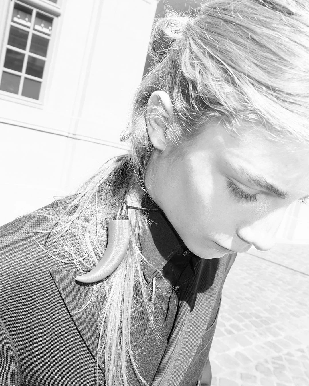
Proportions by Chiara Bottin & Debora Brune


dress by TIMSTO
ballerina by Rombaut
tights by Wolford
wool brief by Lou de Betoly


text, styling & creative direction by Chiara Bottin
photographs by
Debora Brune
talent
Pauline Anna Gudet
hair by
Alan Antoineh
makeup by
Jennifer Le Corre
assistant
Emma Obermann
styling assistant
Ana Elena Uscatu


dress by Lina Nix
heels by Bottega Veneta
tights by Wolford

bralette by Lou de Betoly
gloves by Squillace1923
mesh brief by Her Senses 
wool brief on top by Colombe de Naes
tights by Wolford
heels by r.l.e


I’m always trying to feel the right proportions. Not in my head, but in my body. How much tension I can hold before it turns into something else? Stretching, yoga, bending myself into strange shapes — it’s how I stay connected when things get too loud. Balance never stays. The moment I think l’ve found it, it slips away. I drift. 


My body folds into awkward positions, pauses too long, leans too far. It doesn’t look right, but it feels necessary. Sometimes being weird is the only way I can breathe. Most of this happens when no one is around. Almost invisible moments. Naked or half dressed, a cigarette between my fingers, stretching without knowing why. My favourite boots on the floor or still on my feet, grounding me. I’m just listening — to my weight, to gravity, to what I can carry and what I need to drop.

puffer jacket by Alessandro Santi
ballerina by Rombaut
corsage & brief by Her Senses

jacket by Cem Cinar
skirt by Colombe de Naes
hook mules by Sia Arnika
hat by Polyhedron

Outside, things soften. I hug a tree, let my legs hang from a branch, give in instead of holding myself together. Nature doesn’t ask for balance. It allows imbalance. 

The story moves between inside and outside — apartment, studio, open space. 

Each place shifts something in me.

dress by Ottolinger
heels by r.l.e
tights & transparent socks by Wolford

full look by Sia Arnika
bracelet by Laruicci 

mini knit cardigan by Colombe de Naes
knit bra & brief by Lou de Betoly
wheel skirt by TIMSTO
heels by r.l.e
tights by Wolford

The same body, but different proportions, depending on how exposed I feel. Balance isn’t calm. It isn’t clean. It’s fragile and messy and personal. I don’t find it by being correct. I find it by letting myself be off.


dress & brief by Ottolinger
boots by Rombaut
tights: Wolford


body by Polyhedron
knit floral hat by Colombe de Naes
heels by r.l.e
transparent socks by Wolford


Arming the Mind: Nina Hartmann's "Actualization Machine" @ Silke Lindner

Nina Hartmann
Hypnosis Tracking, ESP Research (Wilderness of Mirrors) (Diagram 4), 2026
Encaustic medium, pigment, inkjet print on wood panel
73 x 93 x 1 inches
Courtesy of the artist and Silke Lindner, New York

text by Arlo Kremen
photos by Chris Herity

Former State Department officer John Marks brought light to CIA operations involving LSD experiments, truth serums, mind control, brainwashing, and other paranormal and psychoactive practices in his meteoric 1979 book, The Search for the “Manchurian Candidate.” The attempts to discover and utilize supernatural psychological abilities were another part of this operation, which also involved the study of hallucinogenic properties and practices of hypnosis. Under the name of MKUltra, the US government spurred the program out of fear that the Russians had beaten them to the punch, already researching mind control methods to brainwash US operatives and arming soldiers with supernatural abilities. There was also Project Stargate, which aimed to advance forms of psychic espionage. These covert projects were launched shortly after videos of telekinetic and mind-reading demonstrations in the USSR began circulating in the West. A psychic militarism ensued, and mountains of money funded these parapsychological programs in the hopes of results that were never proffered. Nina Hartmann’s Actualization Machine at Silke Lindner features sculptural paintings, lightboxes, and resin reliefs that support diagrammatic images of ESP training and mind control techniques. Hartmann turns her head toward this uncovered history, swollen with conspiracy, faith, and mysticism, seeking to rethink the ways in which choice and free will are rendered in a social landscape saturated with suggestive words and images.

In her recontextualizing of found imagery, there is a smoothness that, in its diagram background, appears nearly propagandistic. Using images she came across while sifting through declassified documents, her work in creating instructive connections and relationships between previously hidden photos presents a counter-propaganda seeking to elucidate systems of power and social influence. This propagandistic quality of her work, however, is complicated by the general anonymity of her found images. Although they likely could be traced to the collection of files from this period of psychological and psychedelic experiments, the many faces, bodies, and scenes are presented with titular context alone. This effect is particularly felt in Trickery and Deception Star (Destabilization Diagram) (Diagram 3), where the title manages to accentuate this work’s uniquely dislodged images. The seven-point star’s images are unclear but have an atmosphere of violence. Its central image is burning, radiating reds, oranges, and yellows off of a nude man. Possibly a bodily experiment, possibly just an action of harm. (Potential) LSD <-> Mind Control Connections (Diagram 2) is similarly obfuscated. A black-and-white image of a hunched-over man caught in the central hexagon is surrounded by a second hexagon with images of people and places that imply a causal relation, but both the cause is and the people’s identities come up against another blockade.

ESP Star (Diagram I), on the other hand, bears a very recognizable figure and scene as its centerpiece—Nina Kulagina. It was images and videos of Kulagina, a self-professed psychic and psychokinetic housewife from Leningrad, that propelled the US into psychomilitary research. Another star figuration, this time a five-point star, colored blue with red-tinted images, Kulagina is pictured moving what seems to be a watch with her mind. She claimed these abilities, tested them on video, and then underwent experiments by a herd of scientists looking to validate her self-professed skills, even being asked to stop the heart of a living frog floating in solution, which, according to her researchers, she did. Although many have disputed her abilities, commenting on the uncontrolled testing environments and the simplicity of her feats in the context of sleight-of-hand magic tricks, films of her accomplishments inspired many around the world to begin researching psychic abilities. A person of global fascination, the found imagery of this work is less than esoteric; it is practically a relic of pop culture, having allegedly inspired the character of Eleven in Netflix’s Stranger Things. But, in fairness, it was Kulagina who inspired it all—MKUltra, Project Stargate, and every other government research project for psychoactivity during the Cold War. Crucially, however, it was not her feats that triggered the development of these research programs, but the disseminated photographic and filmic documentation of her feats. The strength of her images launched a number of senselessly abusive and exploitative research methods into existence. Kulagina may not have had the psychic powers or skills she claimed, but the images of her surely did.


Nina Hartmann
Remote Viewer I (Diagram 5) (PL Logick), 2026
Resin, UV print
24 x 17.5 x 1.25 inches
Courtesy of the artist and Silke Lindner, New York


In Hartmann’s use of mind control and parapsychological experiments, she attends to the image’s function as a tool of influence. Hartmann’s Remote Viewer I (Diagram 5) (PL Logick) culminates in Actualization Machines' questioning of the social operations of the image. The work is shaped out of resin and is much smaller than the larger sculptural paintings. Remote Viewer is a jumble of the US seal’s symbols. Now a circle with human legs merged with a hexagram, Hartmann appears to nod toward systems of statecraft. The upside-down aspect of the hexagram boasts small triangular embellishments depicting a military submarine, and the circle contains another set of three identical images of a hand holding a knotted string. The central image is an older woman with a hand to her head, perhaps being hypnotized, with her eyes blurred into nonexistence. This act of, if not mind control, identity erasure, is imposed on a Frankensteined national seal. The phrase, “Architecture as a way of undoing choice," repeats around the circle and the five-point star in which the central image sits. 

Images may not be architectural by themselves, but since advertisements have become the sides of skyscrapers, architecture has absorbed the image. Images of clothing brands, food delivery apps, streaming services, fast food joints, and any other business with enough money to slather its branding on any surface available for rent. Ads have become an integral segment of built space. Digitally, images are everything. Whether encased in a scrolling grid or not, all there is to online life are images and pictures and logos. Words, too, are images, fixed to look a certain way, which further standardizes what might pass for an ‘o’ versus a ‘0,’ which regulates people’s mental conception of the two characters. Technology has always had this kind of effect on human psychology, but changes to digital culture have been uniquely forceful, with companies coding addictive platforms to maintain usage or provide AI models with conversational abilities, driving many into what has been colloquially termed ‘AI psychosis.’ And although these images are sourced from companies, the distinction between private commerce and the government is negligible when many of these companies lobby government officials and aid in weapons development, like OpenAI. Images of the current era might be described as having the mind-controlling powers of the projects Hartmann engages with in Actualization Machine. If images could be considered a form of mind control, perhaps it is time to recognize MKUltra as an incidental success.

Nina Hartmann’s Actualization Machine is on view through May 30 @ Silke Lindner, 350 Broadway, New York City.
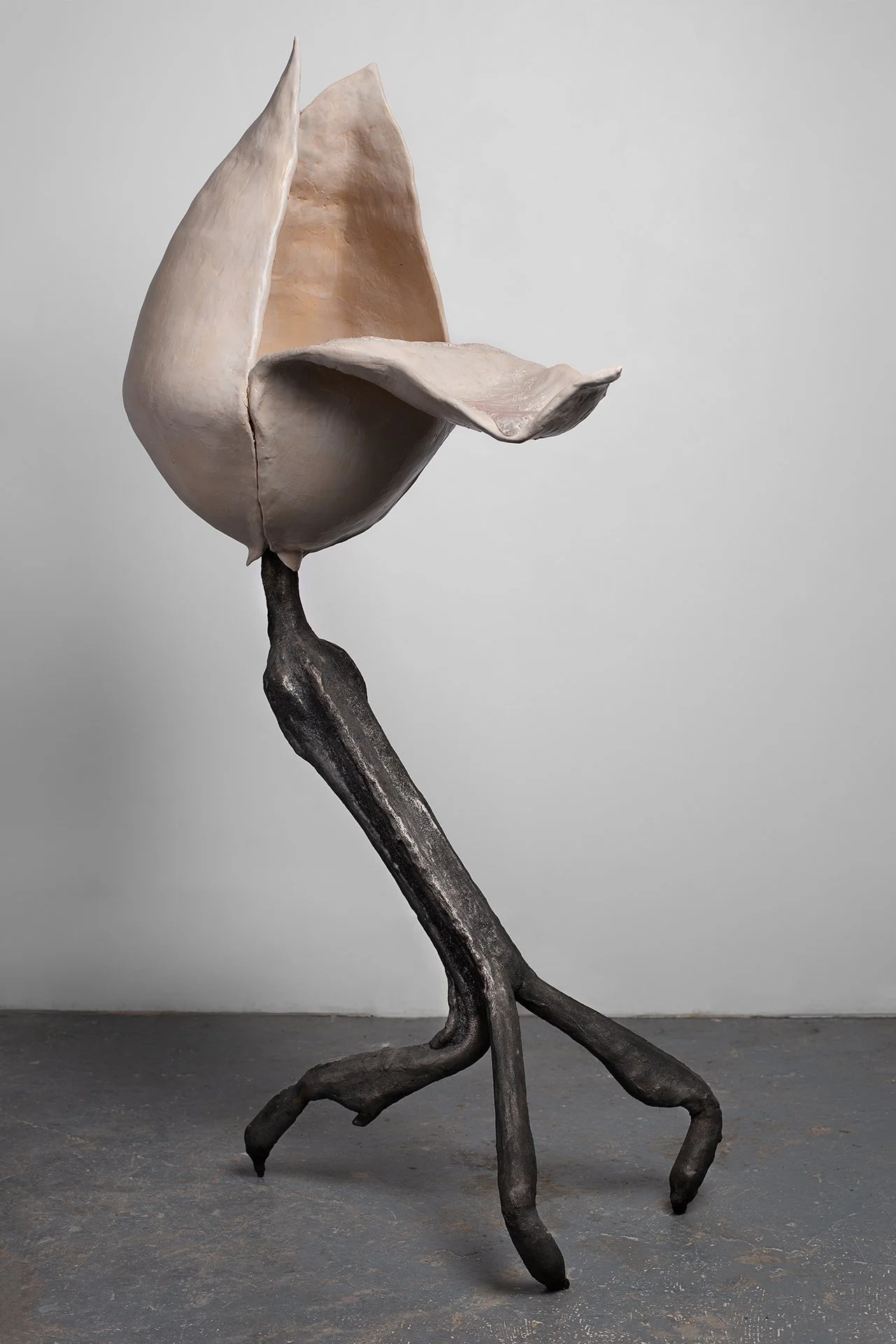
Marc Newson Crafts The Horizon Aluminum Suitcase For Louis Vuitton; A Revolution In Luggage Design

For more than a decade, the collaboration between Louis Vuitton and Marc Newson has represented a meeting of two worlds: the House’s long-standing mastery of travel and the designer’s relentless pursuit of innovation. By the time Newson first partnered with Louis Vuitton, he had already established himself as one of the most influential industrial designers of his generation, celebrated for works that ranged from furniture and transportation design to luxury objects. Yet one of the most ambitious projects born from the partnership was not a limited-edition collectible, but a reimagining of the suitcase itself.

Introduced in 2016, the Horizon suitcase distilled travel to its essential form. Defined by clean lines, lightweight construction, and meticulous engineering, it reflected Newson’s belief that the most elegant designs are often the most technically demanding. Over the years, the Horizon evolved into a contemporary Louis Vuitton icon, available in canvas and leather and adaptable to the House’s seasonal expressions.

Now, on the tenth anniversary of the collaboration, Louis Vuitton introduces a new chapter: the Horizon Aluminum, the House’s first aluminum suitcase.

The choice of material is both practical and symbolic. Long valued for its strength, lightness, and recyclability, aluminum has been a signature element throughout Newson’s career. It also echoes a lesser-known chapter of Louis Vuitton history, when the House produced aluminum trunks for explorers at the end of the nineteenth century. The Horizon Aluminum draws from both legacies, merging historical craftsmanship with contemporary engineering.

Its construction demanded a radical rethink of conventional luggage design. Sheets of aluminum are stamped and laser-cut to create the shell’s distinctive rounded form while preserving structural integrity. Rather than relying on the grooves typically found on aluminum luggage, Louis Vuitton embosses the Monogram directly into the shell, transforming one of the House’s most recognizable motifs into a functional element that reinforces rigidity.

Newson’s pursuit of visual purity extends to every detail. Traditional rivets have been eliminated entirely, replaced by an ultra-thin frame system attached directly to the shell. Concealed hinges, integrated within the suitcase rather than mounted externally, preserve the uninterrupted silhouette. The result is believed to be the first rivet-free aluminum suitcase on the market.

Inside, functionality is equally refined. An external trolley system maximizes packing space, while a flat interior compartment offers exceptional capacity. Oversized wheels, an extra-wide telescopic handle, TSA-certified locks, and leather-trimmed details underscore the balance of performance and luxury.

Engineered for decades of travel and designed to age with character, the Horizon Aluminum embodies Louis Vuitton’s enduring vision of travel: innovative, elegant, and built to accompany a lifetime of journeys.

The Horizon Aluminum suitcase will be available at select Louis Vuitton Stores and online

Julie Mehretu’s Cryptic Paintings Challenge Our Impulse to Classify @ Marian Goodman

Julie Mehretu
Black Monolith (after Atopolis: For Édouard Glissant by Jack Whitten), 2024-2026
Ink and acrylic on canvas
144 × 180 in (365.8 × 457.2 cm) (overall), 144 × 90 in (365.8 × 228.6 cm) (each)

text by Emma Grimes


Our Days, Like a Shadow (a non-abiding hauntology) is a replete showcase of Julie Mehretu’s latest paintings. All of the works on view are made in two of Mehretu’s familiar styles: her large-scale, abstract canvases and her three-dimensional paintings mounted on metal fixtures (made by Nairy Baghramian), which Mehretu refers to as her TRANSpaintings.

The first work visitors encounter is a striking, 144-by-180-inch black canvas invigorated by abstract dashes and marks that activate every inch of the surface. Its title, Black Monolith (after Atopolis: For Édouard Glissant by Jack Whitten), references a 2014 monumental painting by Jack Whitten. Both formally and conceptually, this work, alongside the exhibit more broadly, revisits themes that have long captivated Mehretu, but it all feels especially urgent and renewed in today’s political climate.
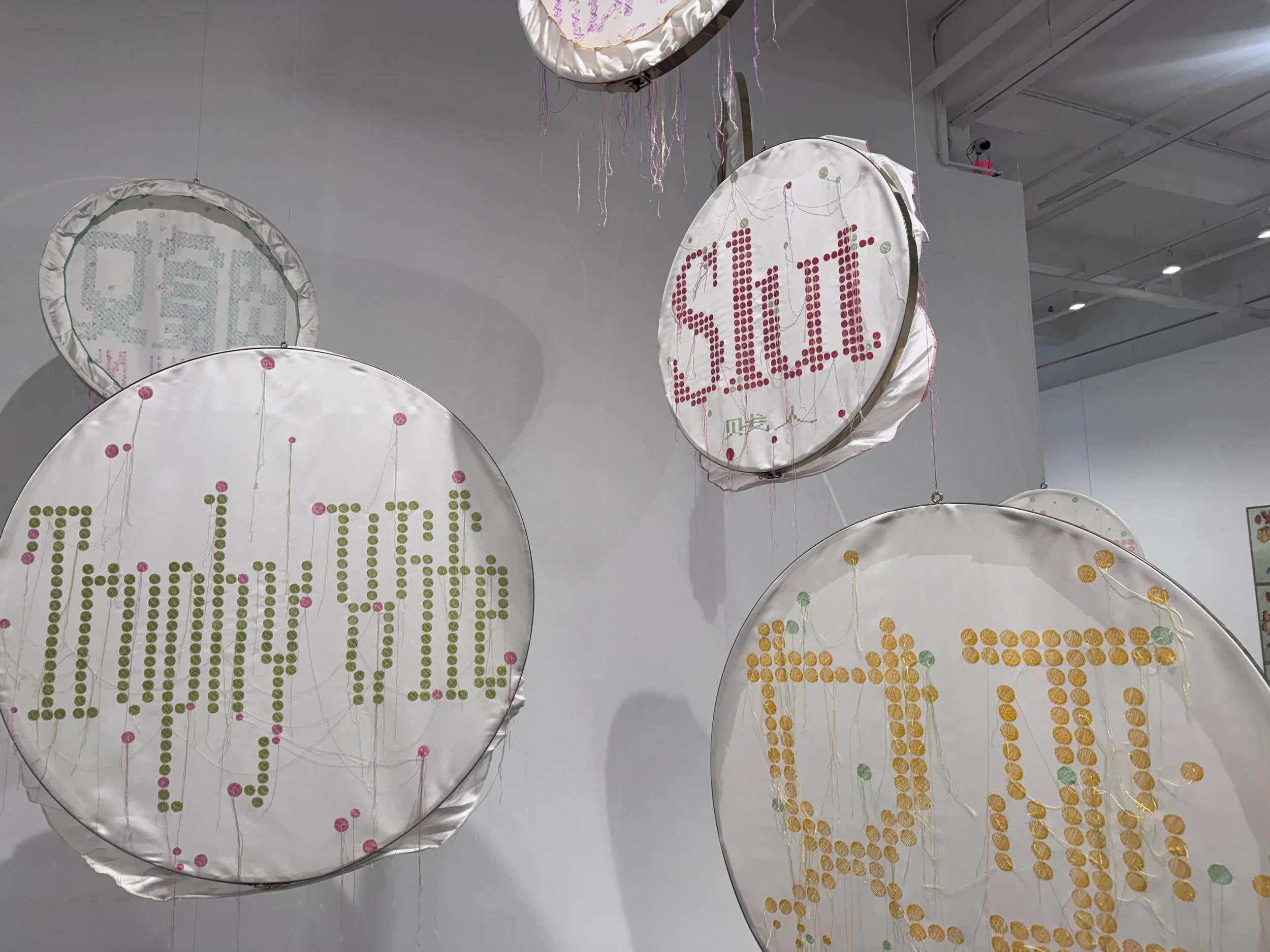
The word “monolith,” referenced in the title, recalls Glissant’s ideas about the right to opacity, specifically his conviction that no person, including oneself, can be fully grasped. Writing in a postcolonial context, Glissant argued that the West had presumed to understand certain people, and viewing anyone as transparent inherently reduces the human.

It’s this refusal of transparency that fiercely resonates throughout Mehretu’s latest body of work. Every canvas in the show changes as one moves around it. Light, streaming in from the floor-to-ceiling windows and ceiling fixtures, hums across the surface. As you move your eyes across, certain strokes glimmer like shooting stars; one would not be far off, even, in describing the experience as cinematic. The paintings are never entirely complete hanging on the wall or staged in their metal fixtures. They require the gaze of the viewer to be stimulated, and their mutability is an intrinsic part of their nature.

Julie Mehretu / Nairy Baghramian
TRANSpaintings (blue) / Upright Brackets, 2024
Ink and acrylic on monofilament polyester mesh in an aluminum sculpture
Painting: 72 × 60 in (182.9 × 152.4 cm)

Mehretu’s TRANSpaintings embody this ethos even more directly. Upon first encounter, they seem transparent: if one waves their hand behind the canvas, its shadow appears from the other side. But this first impression is almost a trick, as they are not really transparent at all. While they are more porous than the typical canvas, they’re still largely opaque and refuse to be seen through clearly. They also, like the wall canvases, transform as one walks around them. They depend on the changing conditions of the light and your eyes, which alter the moment-by-moment manifestation of the painted material.

The second floor contains numerous, a near overwhelming amount, TRANSpaintings in varying colors and configurations. By the time one reaches the third floor, which holds many wall canvases done in a similar shade as Black Monolith, one has the sense that the exhibit is testing your desire to categorize and generalize. There are simply so many works that resemble each other within such a confined space that you intuitively think about them as a monolith, and it’s precisely this human tendency to classify and group together, which fundamentally eliminates difference and diversity, that the show’s arrangement ends up drawing attention to. The paintings themselves, meanwhile, are reminders of the imperative to refrain from trying to totally understand. They whisper not to be grasped fully, but to be respected in their opacity.

Our Days, Like a Shadow (a non-abiding hauntology) is on view through June 6 at Marian Goodman Gallery, 385 Broadway, New York.