6 Things We Learned About Artist Justin Adian From His Talk During His Exhibition at Skarstedt Gallery

photograph by James McKee


Artist Justin Adian titled his recently closed show at Skarstedt Gallery ‘Fort Worth’ after his hometown. The show features Adian’s bold organic paintings created by stretching oil enamel-painted canvases around foam cushions then mounted on wood. Some people would argue that Adian’s work is abstract, and they’d be right most of the time. But Adian also engages in pop culture iconography; one painting references Raymond Pettibon’s infamous Black Flag logo. Adian doesn’t so much mash-up high and low as he does reject high-low as a concept. Good art is good art.

What is a major influence on the show is the Texan town that it is named after. Not only in its referencing of Texan Minimalism but there is a mellow vibe to Adian’s paintings in the show. Looking at them almost strips back your inhibitions and stresses more than they force the viewer to ponder the meanings in their minds. There are references to design and architecture, and it appears like Adian is perfectly fine with his work being seen as something of an interesting object in the background of a space.

On Wednesday night in October, Adian sat down with art historian Alex Kitnick to discuss some of these concepts. What was interesting is that Kitnick, a tried and true art historian, seemed to have difficulty relating to Adian and his huge breadth of pop cultural influences. As a result, the conversation never really took off like it could have. Nevertheless, here are six things we learned about Justin Adian at his discussion of ‘Fort Worth.’


1. He considers his work to be paintings, but they usually start as drawings

“They start as drawings. I think of the final products as paintings, but as the material grows they increase in lines and negative space.”


2. Raymond Pettibon is everything to him, and he loves referencing Pettibon in the work.

“One of the artists that I loved before I ever got into art was Pettibon. I wanted to make an homage to the Black Flag bars but in pink. It’s called ‘Slip it In,’ after my favorite Black Flag record.”

3. He utterly rejects the delineation between high and low art.

“Everything in the work is just stuff that is in my head whether it be minimalism, counter-culture, or music. I’ve never grown out of any of my interests, my interests just grow.”


4. When working for a “White Cube” exhibit, his work comes out a bit more slick than usual.

“These works are pretty slick for me. When it comes to these Chelsea shows I tend to make these slicker and more gentle pieces.”


5. He uses boat paint, as in paint that you use to decorate your boat.

“This is all boat paint, so it’s really shiny. It elicits weirdly northern European commercial colors.”


6. His next show will be far less slick.

“I am working on stuff that will entail much more aggressive gestures, like two panels on a face, so it will be coming out at you and pushing back at the piece.”


Justin Adian's "Fort Worth" has closed, but you can check out images from the exhibition here. Text by Adam Lehrer. Follow Autre on Instagram: @autremagazine

A Fond Farewell to the Legendary Raf Simons and Autre's Educated Predictions On Who Might Take Over At Maison Dior

When it was announced that Alexander Wang would be leaving his position as creative director at Balenciaga, no one was immensely surprised: critics scoffed at collections and more importantly, sales were down. Raf Simons’ decision to leave Dior comes as much more of a shock. The brand has stated that Raf is leaving due to “personal reasons,” including desire to further grow his menswear brand and do other things with his life. Fair enough. Running two brands has to be one of the most emotionally and physically draining lifestyles a human could possibly lead (with all the Raf Simons and Dior collections, Raf was doing a whopping 10 collections a year). But if you have seen ‘Dior and I’ you might have noticed Raf also had early difficulty adjusting to the atelier of the house. When working with his own brand, and to a lesser extent at Jil Sander, Raf probably grew accustomed to having an idea and then having his team do everything in their powers to bring forth that idea into fruition. The film shows Raf angry over things like finding out that his Dior pattern cutter had flown to New York on a couture trip when he is on a three week deadline to unleash his first Dior collection to the world. Though the film eventually portrays Raf and the Dior atelier coming to terms and celebrating a magnificent first collection, it stands to reason that this wouldn’t be the last time that the designer would find himself annoyed over the stifling big business-minded practices of Dior.

I would have liked to see much more Raf Simons at Dior. His departure is made all the more surprising when you watch this video from the Business of Fashion: Raf seemed like he was all in https://www.youtube.com/watch?v=YCkpCPZ59l8. But there’s no point in lamenting. Instead, let’s celebrate the wonderful Raf Simons X Dior moments: Fall 2012 Haute Couture, FW 2013, SS 2014, Resort 2015, and so much more.

All and all, I’d argue that in only thee years Raf Simons established himself in the lineage of the great Dior creative directors along with Yves Saint Laurent, Marc Bohan, John Galliano, and Christian Dior himself.

So who the hell is going to be able to fill the Raf Simons-sized hole in the middle of Dior’s womenswear department? Here's a few educated predictions by Autre's trusty fashion editor-at-large, Adam Lehrer.

Christopher Kane:

When Scottish designer Christopher Kane founded his namesake label in 2006, the tight fitting silhouette was at the forefront of fashion. Kane revived a looser fit, allowing billowy and loose-fitting garments to hang from the body that remained effortlessly elegant. That effortlessness would be ideal for Dior, a label that prides itself on putting out clothes that women feel both beautiful and comfortable in. His color palette, full of blood reds and powerful blues, would feel right at home in the context of Dior ready-to-wear collections. On top of all that, Kane seems to have a true understanding of quality, and has always known how to price his garments accordingly. If you pair that knowledge of quality with the limitless resources and powerful atelier of Dior, Kane might be able to match the success of his predecessor in a role as creative director at the label.


Phoebe Philo:


Considering how successful, even revolutionary, Phoebe Philo has been in her role as creative director of Céline, it’s unlikely that LVMH would encourage the designer to leave her role and take on a new one at Dior. Philo has always had the remarkable ability to leave her mark on a house while paying respects to its ethos as she has done in her roles leading Chloé and Céline. She is very often thought of as something of a minimal designer (as was Raf), but minimal can be such a reductive term when describing what she does (and what Raf does). I would better describe it as restrained. Restrained fashion can be interpreted as effortless, and effortless is central to the mission of Dior. She also is not given enough credit for her penchant for feminine opulence; take a look at her FW 2015 collection that featured zebra patterns and pom poms. And with Dior always claiming to be ground zero for discovering knew ways for women to dress, isn’t it about time they let a woman decide those new ways?


Gareth Pugh:

My personal wild card. As unlikely as seeing Gareth Pugh enlisted to a house as commercial as Dior is, you have to admit that the idea is interesting. Pugh would most likely be hard pressed to accept a position at Dior, considering this is the man who squatted to be able to afford his runway shows before his clothes actually sold anywhere. But Raf was once a designer that people best thought of for making male noise rockers and Goths look luxurious, granted his successful tenure at Jil Sander. The point is: a conceptual designer isn’t out of place at a house like Dior. Raf is conceptual. Galliano is certainly conceptual (the dude set a haute couture show to the Stooges, one of the best fashion shows ever by the way). Yves was definitely conceptual. I am very interested in seeing what Pugh would be able to do if he was given the constraints that Dior places on him. In his own label, he’s proved that he can do whatever he wants and he’s done so wonderfully. But what would his clothes look like if he knew he had to hit certain sales figures? Pugh’s SS 2016 collection felt like a new direction for his brand where he seemed openly interested in high society and it was one of his best shows to date. I guarantee that anyone with Pugh’s talent level could be a commercial juggernaut; it’s just about honing that vision into something relatable.

Alber Elbaz:

According to WWD, Alber Elbaz has just exited Lanvin. At first, I was pretty taken aback. Elbaz, at this point, IS Lanvin: the Israeli designer is coming up on his 15th year at the label and has enjoyed immense success peddling an unabashed feminine aesthetic, revolutionizing the fashion sneaker (along with Lanvin menswear designer Lucas Ossendrijver), and seeing his garments worn by Kate Moss, Chloe Sevigny, and Sofia Coppola. So why would he leave now? There was apparently tension between him and Lanvin majority shareholder Shaw Lin-Wang, but it appears that that tension has existed for a while. Us industry folks will most certainly speculate on this being a power move for Elbaz, seizing the opportunity that Raf left open at Dior. Though Raf did wonderfully at Dior, his pension for futurism and conceptual ideas assumedly put him at odds with the atelier and shareholders. That tension can yield some amazing collections but isn't a built-to-last situation. Elbaz was a frontrunner to step in for John Galliano at Dior in 2011. Perhaps Dior is looking at a top-shelf designer that is unabashed about his love for feminine classicism. Raf did well at re-defining Dior, but Elbaz should do excellent at defining Dior. Exciting fashion stuff folks!


Adam Lehrer is a writer, journalist, and art and fashion critic based in New York City. On top of being Autre’s fashion and art correspondent, he is also a regular contributor to Forbes Magazine. His unique interests in punk, hip hop, skateboarding and subculture have given him a distinctive, discerning eye and voice in the world of culture, et al. Oh, and he also loves The Sopranos. Follow him on Instagram: @adam102287

FOLLOW AUTRE ON INSTAGRAM TO STAY  IN TOUCH: @AUTREMAGAZINE


The Year of The Zine: Autre's Picks For the Top Ten Zines of 2015

2015 is when the zine went mainstream. Some of our fave artists dabbled in the fine craftsmanship of the stapled chapbook that many people think dates back to the early days of punk, but it actually can be dated all the way back to 1776 when Thomas Paine published his famous pamphlet, Common Sense, which rifled enough feathers for thirteen colonies to declare war and independence from the British. Fancy that. However, the modern zine, which is shorthand for fanzine – not magazine as many believe – was a photocopied, hastily stapled together collection of appropriated imagery and art school angst. In 2015, the zine has held true to its DIY Xerox aesthetic, with a few surprising contributions – and of course some obvious contributors from the likes of one of our favorite photographers working today, Sandy Kim, and from one of our favorite new Los Angeles queer-cult collective, Gurt. Here are ten of our favorite zines that came out in 2015, so far.  

Sandy Kim LA XXX

When we interviewed Sandy Kim in May, we described her pictures as a “neon-hued punk diary of her life.” Her most recent project LA XXX, calls the artist a “Busy Petite Exotic Korean Treasure” at the bottom of the newsprint-style zine. The artist’s background in shooting for the band Girls alongside post-sex portraits of her boyfriend lends its gritty feel to her new photos. Published by SFAQ[Projects], the 20 pages cover everything from penises made out of pills to nude self portraits. The limited run of 250 copies can be purchased on the SFAQ[Projects] website or you can check out more images from the run on her Instagram.

Jonathan Leder A Study in Fetishisms Vol. 2

Jonathan Leder’s second volume of A Study In Fetishisms dives into the American captivation with blondes, and their various accompanying reputations. Curated by Amy Hood, the 64-page zine explores the timeless idea of if “blondes really have more fun” in text, and through Leder’s film photography. Featuring blondes with a girl-next door as well as early Playboy look, the zine can be purchased through Imperial Publishing.

Chloë Sevigny No Time For Love

No Time For Love is almost like finding and reading Chloë Sevigny’s diary that a child with a sticker collection was in possession of before you. The zine is a compilation of photos of Sevigny’s past loves, both platonic and romantic. To preserve their identities (for the most part), Sevigny placed stickers over their faces. In addition, she also included clippings from 90s tabloids about her which provides an intimate and at the same time outsider feeling to the zine. The 28-page zine can be purchased through Innen Zines, in Euros of course.

Tom Sachs Satan Ceramics

Shhh, this zine actually came out in 2014, but we had to include it in this list, because it's so good. The artist collective Satan Ceramics is composed of artists Tom Sachs, Pat McCarthy, JJ PEET,  and Mary Frey. The sculptors use a variety of different mediums including clay in their symbolic works. As a result of their weekly art gatherings, Satan Ceramics, the 64 page black and white zine, is comprised of images of their show at Salon 94 and can be purchased on Tom Sachs’s website. Ranging from images of Tom Sachs’s Cyclops, a porcelain and bamboo stereo to Pat McCarthy’s tonal reductions fired on porcelain, the zine will make you wish you had gone, or feel smug about going to their installation at Salon 94.

Brad Elterman No Dogs On Beach

Brad Elterman’s archive of photos is a gold mine. Lucky for you, he’s put the best of them into a zine in his new publishing venture No Dogs On Beach. The iconic rock’n’roll and pop culture photographer started his career as a 16-year-old photographing Bob Dylan in concert and escalated to taking photos of names such as David Bowie and Michael Jackson backstage. After taking a hiatus from photography, he’s back to capturing images of today’s biggest influencers, and just put out his 80-page zine No Dogs On Beach which can be purchased on Smoke-room’s website.

The Fifth Goal 1998-2003: Transcendental Graffiti Zine (aka Freight Train Graffiti Zine)

Although The Fifth Goal 1998-2003: Transcendental Graffiti Zine is a book, the eight zines that the book is composed of speak to the true nature of what a zine was at its original conception years ago. The black and white, photocopy, cut and paste construction of the late Blake Donner’s work documents freight train graffiti art from 1998 to 2003. In The Fifth Goal, one can see the development of Donner’s passion for the unique art form through the way his zines shift in content ranging from spiritual questions to interviews of graffiti artists to drawings of train workers. The 436-page book has been created as a tribute to Donner by his friends and will be released at Printed Matter’s 2016 LA Art Book Fair on January 29th through February 2nd. It can also be purchased here

Deanna Templeton They Should Never Touch the Ground

Deanna Templeton and her skateboarder husband Ed Templeton have been described as “the godparents of zine culture,” it’s easy to understand why once you look at their work. Deanna Templeton’s history in street photography has led her to publish numerous works, her most recent zine being They Should Never Touch the Ground. Published by Deadbeat Club Press, Deanna got inspiration for the images from a trip to Europe where she noticed a lot of people sporting American flags. They Should Never Touch the Ground examines the different ways that the American flag is used and portrayed in society today in the U.S.A. and can be purchased on Deadbeat Club’s website.

James Concannon Machismo

“MACHISMO is a collection of self shot/self starring unedited “dick pics” taken around the country with an iPhone” reads the back of James Concannon’s new zine. Open the pages, and you’ll find Concannon’s interpretation of the 21st century sexual revolution driven by technology and vanity. Taken all over the United States, with different backgrounds, and at different points in masturbation, it gives the dick pics relatable, real life feeling. The artist launched MACHISMO at a gay bar, and the limited edition run of 40 copies was printed by Girlfriend Gallery. It's currently sold out, but you can try here

GURT the Zine – Issue 2: Gurtrasia

This little zine hails from the land of Los Angeles from of a collective of queer rebels who know how to party and how to put together an incredible zine. Last week saw the release of issue two of Gurt, aptly named Gurtrasia, at Bad Reputation and then the after party at Bar Marmont on the sunset strip. Issue two is described as such: "The Gurts have created a whole new world for all of #US to thrive in, but is it really any different from the Gurt they left behind?" Who knows, we say. Issue two includes work by the likes of Dan Savage, Marcel Alcala Christopher Argodale Brendan Cameron and more. You can find Gurt here.  

Sarah Piantadosi Milk Jagger

Through her new zine Milk Jagger, Sarah Piantadosi, a well known fashion photographer, breaks out of the limiting editorial photography world. There’s a dichotomy between the beautiful and the sleazy in the images, which is echoed between the contrast of the black and white images and their bright tie-dye like border. The pictures in the zine are based off the “Milk Jagger” immoral cop alter-ego of Michael B. Wallace, a musician. Her photos from Milk Jagger are also being exhibited at Doomed Gallery in London starting October 27th. You will be able to find a copy of the zine there. 


Text by Madeline Guyette and Oliver Maxwell Kupper. Follow Autre on Instagram: @AUTREMAGAZINE


[AUTRE PLAYLIST] Motorcity Soul Rebels

Text by Adam Lehrer

Whenever I get the proverbial gun to the head and am asked if I could only listen to one genre of music forever, I go with soul and funk. Why? Because it's everything: amazing lyrics, amazing singing, political, emotional, makes you dance, makes you cry, makes you sex.

Motown Records in the '60s and '70s was a supercharged inferno of creativity. For every icon there's an under-praised equally deserving hero. For every Diana Ross, there's a Gladys Knight. I mean, FUCK, Gladys Knight, the power of that voice pre-dated the energy of punk and the heartbreaking candor of R&B.

You get guys like Stevie Wonder (my undeniable number one all-time favorite artist) and Marvin Gaye, and Jr. Walker all swinging to the music, fighting the power, and making beautiful jams under one roof. Now, that would be like Kanye, Beyoncé, and Frank Ocean all in the same studio at the same time with a unified front of hope and glory. That was Motown Records. It was a movement. There are no corporate labels like it and there never will be again. Something like that honestly can't exist. People don't love music in the same way that they did in those days.

Lots of people start thinking that MDMA came into popular recreational use during the days of Detroit Techno and Chicago House, but there are rumors that Temptations producer Norman Whitfield was copping love fizz since 1971. That makes total sense. Any fan of Motown would agree that all of those records have a physical buzz that just floods your body, pulsates within it. I'm an electronic music fan, but I can honestly say no music feels like Motown. 

A Beautiful Bouquet of Rebelliousness: Ten Things You Need To Know About Artist and Former Andy Warhol Superstar Brigid Berlin

Brigid Berlin Untitled (Self-Portrait Double Exposure), ca. 1971-1973

Brigid Berlin is an American legend. Deranged and beautiful, her life is a head on collision between high society decadence, urine soaked carpet fibers and methamphetamine filled veins, forming a beautiful bouquet of rebelliousness. On view now at Invisible Exports, an exhibition explores the life and ephemera of this strange specimen, from her polaroid’s of Andy Warhol’s factory and the New York avant garde to her obsessive audio recordings to her wonderful tit paintings that make for fine framed prints on any discernable gentleman or gentlewoman’s desk. Just who is Brigid Berlin? – She is a rebel in the purest form. She is an artist and a documentarian. She was once a part of Andy Warhol’s circle and entourage. Today, Berlin is alive and well and, no doubt, as weird as ever. Here are ten things you need to know about Brigid Berlin.

1. Her Parents Were Socialites and She Grew Up In A World Of Manhattan Privilege

Polaroid of Gerard Malanga and Brigid Berlin by Andy Warhol

Her mother was Muriel Johnson "Honey" Berlin – on her deathbed she was still ordering outfits from Saks. Her father was Richard E. Berlin – chairman of the Hearst Media empire for 32 years. Sometimes she would pick up the phone and Richard Nixon would be on the line. On one occasion, Lyndon B. Johnson accompanied the young Berlin to a rehab in Mexico. 


2. She Rebelled Against High Society By Over Eating

Brigid Berlin Untitled (Self-Portrait Double Exposure with Refrigerator), ca. 1971-1973

Her mother tried to give her a dollar for every pound she lost. Honey Berlin would also take her young daughter to get shots of amphetamines and dexedrine from various doctors around New York city to speed up her metabolism. Brigid was also sent to a school in Switzerland to lose weight, but she would steal other girls’ money and go on pastry binges. 


3. Brigid Meets Andy Warhol and Becomes A Central Figure of His Entourage

In 1964, curator Henry Geldzahler tok Brigid to meet Andy Warhol at his silver factory. Berlin would wind up collaborating with Warhol on multiple projects. She starred in Andy’s films Chelsea Girls and Ciao! Manhattan. Brigid also worked at the front desk of the factory well into the 80s taking phone calls and transcribing interviews for Interview Magazine. 

3. Brigid Berlin Becomes Brigid Poke After Giving Out Doses of Meth and B12

Gerard Malanga & Brigid Polk - 1969

Around the time that Berlin met Warhol, she was living in various rooms of the Chelsea Hotel. It is there that she earned the name Brigid Poke because of her habit of doling out “pokes,” which are simply injections of B12 and methamphetamine. In the quasi documentary film Ciao! Manhattan, directed by Warhol, Berlin can be seen shooting up whilst giving an interview. 

4. Brigid Found A Blank Diary Notebook and Turned It Into The "Cock Book"

Berlin’s “cock book” is one of the most famous pieces of ephemera from the sixties. After finding a blank notebook, she would go around to places like Max’s Kansas City and Andy Warhol’s factory and had some of the most famous artists and figures of the time draw phalluses. Jasper Johns, Robert Rauschenberg, Peter Beard, Basquiat, Leonard Cohen and more contributed. Artist Richard Prince bought the cock book at auction for $175, 000. 

5. Andy Warhol Once Told Everyone That His Works Were Actually Made By Brigid

In one of Andy Warhol’s famous practical jokes, he tells Time magazine in an interview that his paintings were actually made by Brigid. People took it very seriously and the value of Warhol’s work decreased significantly. Both Warhol and Brigid were forced to retract their statements. 

7. She Would Obsessively Document Her Life and The People In It

From the sound of her own peeing in hotel rooms to polaroid portraits of some of the biggest names in art and the social scene, Berlin would capture everything. She also used reams of tape to record audio from the goings on inside Warhol’s factory. Some of those recordings were used in the Velvet Underground’s album Live At Max’s Kansas City. 

8. Brigid Became Known For Her Tit Paintings

Untitled (Self-Portrait as Mermaid), ca. 1971-1973

While Andy Warhol was using silkscreens to interpret pop culture, Berlin was dipping her breasts into ink and paint, and then transferring them to canvas and paper to create a unique series of “tit paintings.” Many of these tit paintings can be seen at Invisible Exports as part of the exhibition, It’s All About Me

9. Needlepoint Became A Medium That Brigid Would Use Later In Life

Installation view Glenn Horowitz Bookseller

Taken from the salacious and trashy covers of the NY Post and Daily News, with headlines like “I Snorted My Dad” and “Bad Heir Day,” Berlin would create amazing needlepoint pillows. They were the kind of thing you’d find in cheap craft shops and are typical of the time passing handiwork that members of the upper crust turn to during the twilight years. Ten years worth of Berlin’s needlework pillows were shown last year at Glenn Horowitz Bookseller.   

10. You Will Soon Be Able to Purchase A Book of Her Polaroids

Untitled (Self-Portrait with Eyes), ca. 1971-1973

Currently available for preorder, Brigid Berlin Polaroids captures a large selection of her personal collection of Polaroids for the very time. From the introduction by director John Waters, “Brigid was always my favorite underground movie star; big, often naked, and ornery as hell...The Polaroids here show just how wide Brigid's world was; her access was amazing. She was never a groupie, always an insider."


Brigid Berlin "It's All About Me," curated by Anastasia Rygle, will be on view until November 15, 2015 at Invisible Exports, 89 Eldridge Street, New York, NY. Follow Autre on Instagram: @AUTREMAGAZINE


[AUTRE PLAYLIST] An Ode to Amphetamine Reptile Records

When Nirvana blew up, the door was wide open for loud rock bands to be signed to lucrative major label deals, and of course, many bands did just that. It's still a testament to how crazy a time the early '90s was for the music industry that a band as bizarre as Royal Trux was signed to Virgin Records. Even then, there were still plenty of rock bands that wanted to be as weird as possible and wanted nothing to do with the majors. For them, record labels like the Washington State-based Amphetamine Reptile were blessings. 

Amphetamine Reptile was founded by a then-US Marine named Tom Hazelmyer. Hazelmyer needed a label to release the albums by his noisy garage rock band, Halo of Flies. The label has become known as something of a haven for Noise Rock, but that description is reductive. It was more or less a rock n' roll label, a really weird rock label, but rock nonetheless. A band like Cows that mixed aggressive punk with blues found a welcome home on AmRep. As did completely unrelated bands like the Space Rock-leaning Cosmic Psychos. In 1992, the label released the New York band Hemet's mega successful 'Meantime' record. Helmet was fairly conventional for AmRep, but the success of the album is credited by Hazelmyer as keeping the label afloat through the '90s, allowing completely uncommercial bands freedom to not worry about selling, sort of like how AMC uses 'Fear of the Walking Dead' to keep the brilliant but ratings averse 'Halt and Catch Fire'  going.

Hazelmyer was able to tap influential musicians from yore to put records out on AmRep. The Australian sludge punk band Feedtime and the former Chrome psych-punk guitarist Helios Creed both put out full-lengths on AmRep. Even the relatively big Olympia-based sludge band the Melvins have an AmRep credit. When you count in singles, bands as diverse as New York noise metal band Today is the Day, Japanese abstract noise weirdos Boredoms, and grunge gods Mudhoney all have put music out on the haven of creative freedom that was Amphetamine Reptile. 

[REVIEW] Greater New York Survey at MoMA PS1

Text by Adriana Pauly

On Sunday MoMA PS1 finally opened the doors to its awaited exhibition Greater New York and let anxious New Yorkers roam through the galleries. The exhibition has been co-curated by Peter Eleey, Douglas Crimp, Thomas J. Laz, and Mia Locks and encompasses the works of 150 New York based artists. Stepping away from the traditional focus on youth the fourth iteration of MoMA PS1’s landmark exhibition aims to balance our desire for the new and nostalgia for the past.

With a significant percentage of works dating before the 2000s, such as Henry Flynt’s 1979 documentary series of Jean-Michel Basquiat’s SAMO tags or Jimmy De Sana’s 1970 and 1980 documentation of the East Village punk and sex scene, the exhibition seems to seek to return to a grittier New York. Overall, there is a focus on documentary within the older works, bringing a loss of interest in durational investigations to light in todays New York art scene. The only exception are the moving photographs of Deana Lawson, shot over a number of years by correction officials at a prison in upstate New York, documenting same family’s visits.

Another constant in the exhibition is a focus on collections such as Nancy Shavers presentation of found objects or the tabletop sculptural installation by Liene Bosquê. Made out of hundreds of souvenir architectural miniatures the artist recreates an urban grid made purely out of kitsch objects. A more literal manifestation of a collection can be seen in the installation by the husband-and-wife duo Marco Romeny and Alisa Grifo called KIOSK.

One entire gallery of the old school building is dedicated to figurative sculptures. Tony Matelli’s male and female nude people are juxtaposed with more amorphous and indigenous works by Jeffrey Gibson as well as free interpretations of figurative sculptures such as Hayley Silverman’s noodle bowls. The landscapes created within each bowl are filled with various little figures, they are oddly grotesque and fall in line with a prevalence of kitsch notable in other works.   

Overall, the exhibition successfully gives a vast overview of the evolution of New York’s contemporary art scene, yet it is disappointingly shallow at times and fails to create a true impact on its visitors. Most works are easily consumed and do not reflect the struggle and tension that is involved in becoming an artist in New York.


Greater New York will be on view until March 16, 2016 at MoMA PS1, 22-25 Jackson Ave, Long Island City, NY. It will accompanied by a series of performances and video screenings. Photographs and text by Adriana Pauly. Click here to see more photos of the survey.  


[AUTRE PLAYLIST] Second Wave of Black Metal

Text by Adam Lehrer

Before I continue, I should mention that I really don’t listen to extreme music with the same regularity that I once did. When I was about 20 to 22 years old (2009 to 2011 or so) I was living in Tucson, studying creative writing, and carrying a major chip on my shoulder. I was wearing black exclusively (even in punishing Arizona heat), watching horror films, reading Anton Lavey, using hard drugs, and listening to the most extreme forms of music that I could find: harsh noise, death metal, power electronics, power violence, dark ambient, and lots and lots of black metal. It was fun for a while, but I lacked the pervasive sense of unhappiness to really commit to that lifestyle. So I moved on, or back, to other forms of music that I loved: hip-hop, dance music, psychedelic rock, jazz, punk, etc.. But an appreciation for the explorers of extreme sound has persisted.

So, while introducing this new playlist, “Second Wave of Black Metal,” I would like to talk about neo black metal band Deafheaven and their new record, ‘New Bermuda.’ Metal traditionalists have called this band a slew of ugly names largely consisting of barbs aimed at their hipsterdom or perceived upper middle class backgrounds. Not only is the assertion that these guys are rich kids false, it’s also ridiculous. To say that only certain types of people can make certain types of music is classist and beneath us. I despise when people tell me that they hate Drake because he isn’t “hard enough.” What does his hardness have to do with his music? To say only people that grew up poor and in gangs can make hip-hop is beyond reductive and would have robbed us of a great pop music talent. Drake is a monumental talent, and I am glad he makes music. Good music is good music, regardless of who is making it and where they are from.

That being said, I don’t think Deafheaven is that solid of a band, period. Black metal in 2015 feels boring regardless of its creators. The world has moved past double bass kicking drums and agonized screams. These guys may love the music, but it’s just not as powerful as it once was when black metal was new. The second wave of Norwegian black metal was a fiercely experimental and exciting wave of new music. My belief in this fact has nothing to do with the makes of this music actually burning churches. It is that the music excites me. That is what we judge artists by: their art. Not their backgrounds or their authenticity as perceived by you.


Adam Lehrer is a writer, journalist, and art and fashion critic based in New York City. On top of being Autre’s fashion and art correspondent, he is also a regular contributor to Forbes Magazine. His unique interests in punk, hip hop, skateboarding and subculture have given him a distinctive, discerning eye and voice in the world of culture, et al. Oh, and he also loves The Sopranos. Follow him on Instagram: @adam102287FOLLOW AUTRE ON INSTAGRAM TO STAY  IN TOUCH: @AUTREMAGAZINE


[FASHION REVIEW] Paris Fashion Week Round-Up

This is now the third Fashion Week round-up intro I have had to write. Again, I will have to touch upon what makes this particular round unique to the industry and important for fashion. But honesty, do I actually need to make an argument concerning Paris and its total domination of conceptual fashion? OK, here’s an argument for you: Raf Simons, Rick Owens, Rei Kawakubo, Yohji Yammamoto, Dries Van Noten, Martin Margiela, Junya Wattanabe, Olivier Rousteing, and need I continue? A lot happens at Paris: some bad, some good, and some utterly transcendent. It’s too much to write about really. It’s the longest of the fashion weeks and it can be easy to forget about incredible shows mere days after they happened. Today as I am baffled yet excited over the announcement of Demna Gvasalia of Vetements being named creative director to Balenciaga while former Balenciaga godhead Nicolas Ghesquiere continues to alter the fabric of what we know to be Louis Vuitton, I almost forgot that Rick Owens put on the funniest and most conceptual collection of the week. So another season is over, and the buying begins. See you at the menswear shows.

ADAM LEHRER'S PICKS

Dries Van Noten

There have been times when Dries Van Noten has gone over my head. He is a highly conceptual and independent designer, but more than that, I don’t always feel connected to the clothes. But I was in Opening Ceremony last week (browsing, not buying) and came across a huge rack of Dries FW menswear stuff and all one can say is wow. His clothes have a physical touch that is vibrantly unique. You want to wear it, all of it, even the stuff that doesn’t in anyway line up with your own style.

So I keep the fact that I’m looking through a screen in mind when I watch Dries Van Noten’s SS 2016 collection come down the runway. Dries is a wonderfully referential designer, and this collection seemed like it was in the same ball field as Marc Jacobs’s New York stunner a couple weeks ago; a look back at the beauty, ugliness, glamour, and tragedy of old Hollywood.

When you think of “elegant fashion” you probably conjure up something glitzy or couture-ish, but Dries has totally created his own version of elegance. His color palette; often marked by shiny hues of green and bright magenta; always look slightly off allowing the garments that much more of a statement. Only Dries could send a huge printed satin dinner jacket right before a bright pink robe. The looks started to get more brutal after about 20 models culminating in a stunning black flared out skirt. And as chic as this collection is, Dries wants women to wear these garments. I can tell just by looking at them that they would probably feel very special to wear.

Rick Owens

Some might wonder when Rick Owens, if ever, will not use some kind of conceptual gesture within his runway shows. It has to be said, wondering what Rick will do has become one of the premiere talking points at Paris Fashion Week. Not only did the man completely invent an entire look (Health goth or grunge chic or street goth whatever the fuck you want to call it), but he also has a knack for generating enormous buzz in a way that feels smart, thoughtful, and funny. Rick Owens, the Dark Lord of High Fashion, is the funniest motherfucker in the whole game. For the last menswear show, garments revealed penises. The clothes in the SS 2016 womenswear show were, in some cases, models themselves. And somewhere backstage, Rick was grinning.

Rick had models’ legs hanging from the necks of models while other models cradled models like babies. Who knew there was this much you could do with a model? Rick was commenting on the strength of women (not a “strong woman"). Rick sees that women are able to shoulder the burden of others peoples’ pain as if it were their own, which reaches its metaphorical realization during childbirth. It felt like Rick was saying to his own mom, “Mom, I know things aren’t always perfect, but I love you. You are amazing.” By that stretch, the show was both funny AND poignant, and even made me want to call my own mom.

Some of the garments; cropped and grungy bomber jackets, black and white cloaks, asymmetrical tunics; felt like good old Rick. But as he’s done more of in recent seasons, there were some risks taken here with both color palette and shape. The introduction of orange and light pinks did not feel at all out of place within the collection, and transitioned nicely to the more brutal looks.

So, once again, Rick nails his show with equal parts theatrics and the fashion design chops to back it all up. Here’s to the last independent 100 million dollar man in fashion!

Vetements

I am amending this review upon learning that the leader of the enigmatic design collective that is Vetements, Demna Gvasalia, is taking over for Alexander Wang at Balenciaga. Wang’s Balenciaga show was one of his strongest, melding the coture looks and streetwear aesthetics that he often tried too hard to keep apart from one another. But it was clear that he never made the stamp on the house that we all hoped for when hearing of his appointment. With that, I thought that the Kering group would aim for a Balenciaga designer that had a firmer grip on tailoring and true luxury. Early thrown around names like Chitose Abe and Paco Rabanne creative director Julian Dossena both made perfect sense to me. Both designers have brilliant flourishes for elegant luxury, extreme silhouettes, and experimental fabrics. But Kering and Balenciaga instead go with another designer, Gvasalia, who is once again known for grungy takes on streetwear classics. But unlike Wang, Vetements has a design aesthetic that is truly unique and considered in both their shows and the clothes that they retail. They recycle fabrics and their garments are all instantly recognizable without overt branding. They have become street style favorites of cool kids everywhere. And most of all, people are excited, with even Cathy Horyn praising Gvasalia’s appointment at Balenciaga. Gvasalia worked with Martin Margiela for eight years, and that commitment to progressing design could bring Balenciaga their first push towards the future since Nicolas Ghesquiere left years ago.

And about the Vetements SS 2016 show, well, it kicked ass. I’ve been loving this brand for a while, with their gigantic bombers and sweatshirts that fall on women just so and their denim made of random pieces of recycled jeans. No brand on earth is nailing how style-minded people want to dress so well. Really want them to start doing menswear. But anyways…

Staged in a Chinese Restaurant (the FW 2015 was in a gay club, they are the best at finding random amazing places to stage shows) and with street and Instagram-casted models walking alongside professionals, the SS 2016 show was worthy of any and all hype. Always featuring dude and girl models wearing the clothes, The first model to near-run down the runway was none other than other weird dude designer Gosha Rubinchinsky wearing a standard open short sleeve black shirt, yellow t-shirt and cropped leather pants, a simple opening making way for more extreme but always wearable looks. Stand outs were lime green blazer and mini-skirt over a chopped up tank top worn by a beautiful long legged athletic girl, big blazers worn over argyle sweaters with sharp cut leather knee highs, and dudes wearing huge smocks. Gvasalia also introduced some new dresses that still spoke to his gallery girl following with everything looking just perfectly off. New hoodie designs were introduced as was a ‘Star Wars’ poster re-imagined as wide legged trousers. Perhaps the most Vetements-defining look was the final: a Chinese collar trench coat with top buttons buttoned, no shirt worn underneath, studded leather belt, cut off denim mini-skirt, and thigh-high black leather boots. Vetements is a brand for the creative people that are so successful they can wear whatever the fuck they want whenever they want: Kanye West, Lorde, etc.. The brand is intimately aware that the modern artist with Internet access is a little into everything: from the lowest forms of pop culture to the most head scratchingly avant-garde, from big t-shirts to couture. Balenciaga, bring it on.

Yang Li

The former Raf Simons apprentice Yang Li doesn’t get his due credit. Paris is saturated with talent, and perhaps his all black everything feels a bit overdone to some of the style set. But if the Swans-referencing SS 2016 presentation is any indication, few designers understand brutal fashion like Yang Li.

Dan Thawley’s take on the collection for Vogue was interesting; that Yang Li’s punk girl is returning from her years of rebellion to her bourgeoisie past and creating a new identity for herself. In that, you will find traditionally elegant garments cloaked in references to dark post-punk music and dingy clubs full of unsavory behavior. The girl can change her life, but those memories brand her and build her. In a flourish certainly reminiscent of his teacher Raf, Li introduced beautiful overcoats sewn with patches emblazoned with lyrics by the mighty Michael Gira of Swans (I actually really really want one). Asymmetric coats covered black dresses embellished with elongated skirts. Li stretches out minimalism and though he references some of the key conceptual designers of the last 10 years (Rick, Raf, Rei), it feels like he is really carving out a new identity in fashion.

Yohji Yamamoto

Yohji’s SS 2016 menswear collection saw the designer apply his own artwork to his garments, and his womenswear collection was soundtracked by Yohji’s music. At 72, the designer continues to find himself re-invigorated creatively. We are lucky to have him.

In some ways, Yohji went to his all-black roots with this collection, but the flourishes spoke to concepts for the future. The excess fabrics coming out in all directions in the dresses and the near tye-dye looking color splashes looked so wild that there was absolutely no way Yohji didn’t consider every angle. His experimentation with denim was like nothing I’ve ever seen using the fabric to embellish an avant-garde dress. The clothes looked quality and made for Bjork’s next runway excursion. The final dress deviated from the all-black concept in a deep blood red. This was Yohji’s statement of vitality. Leading avant-garde fashion through four decades now, he is here to stay.

Maison Margiela

Though John Galliano once again opted out of the bow for the SS 2016 collection in respect to Martin Margiela’s house codes, he certainly wasn’t hidden. Galliano’s stamps were all over this collection for Margiela feels all the better for it. His first couple collection saw him playing with Margiela ethos with his takes on the masks and such. But Galliano has always been a punk designer even when working at the biggest houses. In that, he’s not so out of place at Margiela as some editors speculated he might be. On the contrary, the house feels new again, but it’s still Margiela.

The “Lo-fi, sci-fi” titled collection saw Galliano introduce dozens of products to the Margiela arsenal including huge cumbersome looking bags (maybe not so successful) and some really interesting shoes marked by ankle bracelets and stockings brought over the shoes. The collection moved deftly through color, styling, and theme: geishas in Navy jackets and skirts, Margiela-recalling minimalist lime green and white all-over coats, guys in black chest-exposing dresses. Galliano is surely happy to be able to design anywhere, let alone at a house as coveted as Maison Margiela. With this collection, he looks poised to bring Margiela into the future.

Dior

You know I’m going to write about Raf Simons. Like Khaleesi (Emilia Clarke of ‘Game of Thrones’) said before the show, “I get to wear some beautiful costumes on the show, but on the street few things feel like wearing Dior). Raf redefined menswear luxury countless times, but now at Dior he seems to specifically tap into what exactly is luxury in womenswear. His clothes bring out the innate beauty of a woman without cloaking her in an abundance of fashion.

Raf is rightfully thought of as a conceptual designer, but at Dior he has relished the ability to take on commercial appeal as a concept. I love records like the Beach Boys’ ‘Pet Sounds,’ Janet Jackson’s ‘The Velvet Rope,’ or most recently the Weeknd’s “Beauty Behind the Madness.’ These are big and bold experimental records that apply adventurous sound techniques to music that never veers from pop sensibilities. I see Raf’s Dior in the same way. The SS 2016 looks were pretty breezy: black and white dresses, power suits, minimal pops of royal blue and red. Raf looks as comfortable in his position at Dior as he does wearing his Raf Simons X Sterling Ruby paint splattered shirt that he wore taking his bow.

Paco Rabanne

Honestly I knew nothing of Paco Rabanne creative director Julian Dossena until Olivier Zahm interviewed him for the most recent issue of Purple Fashion. From then, I was intrigued. Dossena worked at Balenciaga with Nicolas Ghesquiere until the latter quit four years ago. With him, went Dossena. He was quickly snatched up by the Puig Group to consult for Paco Rabanne to revive the futuristic image of the label that was cultivated by its namesake designer in the 1960s. He earned the creative director role eight months later and now it is safe to consider that futuristic image revived.

Paco Rabanne’s SS 2016 collection feels both retro-futuristic and regular futuristic with a line of sportswear that utilizes progressive fabrics as well as an overall vibe of attractive sleaziness. Pleather fabrications come in gold and look breathable and wearable. A tracksuit top looks on par with what menswear label Cottweiler does with its re-thinking of fabrics for the future. Sleeveless shirts carried prints with Native American motifs reminding the viewer that progression must first come in the form of thoughtfulness. Julian Dossena was being tossed around as a name to take over Balenciaga, but honestly, I’m so much more excited to see what else he has in store for the Paco Rabanne label.

Sacai

Chitose Abe, the other design name thrown around as a Balenciaga recruit, has an extremely popular aesthetic. Because of her brand’s recognizability, people seem to forget that she is also just an amazingly complex designer. Her clothes all reek of design. There isn’t one color or shape that isn’t 100 percent considered.

Her SS 2016 collection was filled to the brim with conceptual layers and interesting construction choices.

Abe has her touchstones with the vintage vibes and exotic looking blankets, but she seems to take it into new realms with each collection. Like her SS 2016 menswear collection, Abe referenced ‘80s LGBT friendly New York club Paradise Garage with the collection in the form of t-shirt prints. And like that club, the SS 2016 womenswear collection is full of chaos and nonsense. But within the chaos lies a well-planned and executed political statement.

Louis Vuitton

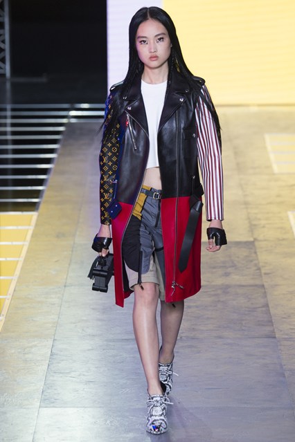
I know it might be early to say, but I am finding Nicolas Ghesquiére’s version of Louis Vuitton way more interesting than I ever found Marc Jacobs’s to be. Ghesquiére has always been an avant-garde designer, but he has managed to tailor his vision to brands with well-established house codes and re-create those codes over and over. Louis V is a travel brand, and Ghesquiére looks towards the future of traveling. The SS 2016 collection references ‘Tron’ and the sci-fi movies of Ghesquiére’s truth as an army of globetrotting cyberpunks marched down the runway. The clothes here were really crazy: opulent and luxurious in equal measures.

It’s hard to imagine anyone not wanting to buy pieces like the leather moto jacket printed with Lou Vuitton logos and American stripes. I also loved the color-blocked pieces. Ghesquiére speaks to a very specific customer: his own. Those who love the house of Vuitton will have to progress their tastes because Ghesquiére drastically moves Louis Vuitton forward. Fashion is barely able to catch its breath to keep up with this man’s imagination.

JULIANNA VEZZETTI'S PICKS:

Comme Des Garçons

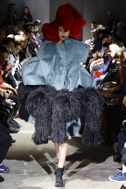
The elegant birds of paradise flew at the Comme des Garçons SS16 showcase. The conceptual practice of adornment was living and breathing in this collection: the oversized ostrich laced collars and the rose-like crown hair designs. I believe the spectacle of it all actually helps one focus on the tailoring and design rather than overpower it. Rei Kawakubo forever draws the connections between fashion and art. The dresses here appear to hide certain aspects of the female frame and then radiate new life from the garment itself. The oversized button holes in the tweed peacoats give a fairytale ending to a seamless collection of wit and glamour.

Loewe

Ice queens gallivanted down the runway at JW Anderson’s second collection for Loewe. The SS 2016 collection featured drool-worthy trousers made from plastic to the embossed metallics and a silver high waisted pleated pant. The theory of less is more would be better categorized as giving more in the right places. JW Anderson has mastered that tact. The collection had an asymmetrical balance to each look; one mirror shard earring would be paired with black patent lizard embossed trouser and a tan suede jacket. Though I’m slightly appalled by the “put a bird on it” brooch but the rest of the accessories make up for it. I loved the shimmery long bracelets and the oversized Koi fish necklaces (I have vintage versions of the real thing!). I detected referencing to Japanese atelier; note the slight resemblance to Issey Miyake “Pleats Please” collection. The monogrammed pieces brought a sporty component to the collection without losing its “Posh Spice” elegant simplicity. J.W. Anderson can be a mood ring changing colors but stays true to his style DNA.

Céline

When we reminiscence about past Céline by Phoebe Philo collections, we often think about smooth lines marked by a casual chic but twisted by a pervasive surrealism. That is not what we think of when faced with the SS 2016 collection. In this collection there was a subliminal sexuality expressed with white sultry silks and black tailored lace. The woman is a housewife preparing her escape to the concrete jungle. The elegant ribbed knits with the high chalk tailored waists accompanied by safety pin necklaces appear safe but sharply drawn out. The palette of burnt oranges, pastel purples and army greens are complimentary to a woman that may be harboring a secret lover. The optical illusion within the disappearing waist in the finely tailored long blazer coat is design at its truest.

Haider Ackerman

I am caught inside the net of Haider Ackermann. The SS 2016 collection’s hidden detailing in the soft exposures of fishnets and candy colored hair veils leaves you feeling intertwined and in love. I couldn’t take my eyes away from the electric array of colors and textures. It was obtuse to his latter collections of dark blacks and greys. This would prove to be a challenging transition for some but not for Haider. Each drop-crotch trouser adds a new intermixture of color, sheen or a classic black. The SS 2016 look is very punk as well poetic and romantic. The long duster cover ups are luxurious silks and velvets that transcend the effortless quality of a Haider woman.

Miu Miu

Cohesive chaos is the body of work that Miu Miu presents eloquently time in and time out. I’m in love with the layered and tailored looks of tulle skirts and see thru apron dresses that populate the SS 2016 collection. The color story of rich purples and soft greens paired with a plaid laidback slack. The whimsical dark beauties race the runway like witches from Stepford. The oversized jackets and collars are a fatal sight; the collection of tobacco browns, colorful patterns and winter whites. The clash of Victorian silks with the strong dexterity of the leathers make an effortless collaboration. The eclectic style of art deco shapes and argyle patterns make a style reference to this timeless era. The Fred Perry-esque polo shirts make it a tangible line to collect and covet. The subtleties of the anklet lace ballet slippers and embellished boots w will be dancing in my head until the ever hopeful sale season.

Saint Laurent

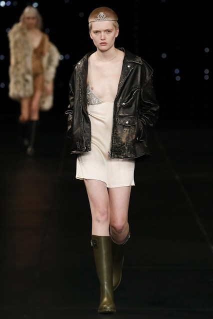
The Saint Lauren SS 2016 collection felt a little different than previous ones. Hedi Slimane’s collection embodied maturity. Models wore long draping embodying a rigorous elegance. There were not many baby dolls here. This is a look I love and will wear with my Adidas campus sneakers. The women adorned crowns like princesses of the runway. They looked unfazed and too cool. The Wellington boots reminded me of a festival fairy with tousled hair smoking a cigarette while kissing your rocker beau. No one does leather like Hedi; it has become a staple piece for every season. This season’s leather jacket is slightly more slouchy and oversized than his classic perfecto. There is an honesty in the models that Hedi casts and the way he styles them. His ideal woman just woke up from a bender, had some morning sex and ran to another show. I adore the tenacity of it all. Bring on the texture and bring on the lush lifestyle.


Text by Adam Lehrer (Autre Fashion Editor) and Julianna Vezzetti


[AUTRE PLAYLIST] Praise Jah: The Best of Dub and Reggae

Once in a while I find myself pulling out my dub and reggae records: Lee “Scratch” Perry’s ‘Ape-ology,’ The Congos’ ‘Heart of the Congo,’ Augustus Pablo’s ‘King Tubby Meets Rockers Uptown,’ and even that glory hogging egomaniac Bob Marley, who just couldn’t live without the toe (I’ll quantify soon). I don’t listen to these records for the same reasons that hippie stoner burnouts do, which is primarily for the sake of wearing Birkenstocks and drug rugs to more occasions. I have always loved the music’s textures: the melodies swirling into one another all tied together through one very simple and elegant beat. It is very heady music, indeed, but it’s also very musical music.

Some people don’t understand the difference between dub and reggae music so I’m going to put it down for you. Reggae was a music that combined traditional Jamaican elements with the pop and rock music coming from the States. Dub borrows its name from the practice of dubbing instrumental, rhythmic versions of reggae songs to the B sides of 45 rpm singles. Basically, reggae requires a band and dub needs studio wizards. Reggae mostly has singing dub mostly doesn’t. That process of dubbing over reggae bands led to some of 1970s Jamaica’s best releases like ‘King Tubby Meets the Rockers Uptown’ and Keith Hudson’s ‘Rebel Dub.’

Dub is experimental music at heart. It requires the producer to sit in the studio for days on end searching for new sounds and precious rhythms. That sonic joie de vivre can be felt in every aspect of the sound if you really let yourself dive into this music. On the flip side, there was nothing experimental about Bob Marley. In fact, I had grown disdainful of Bob Marley; he had been ruined by the legions of frat boys playing “No Woman, No Cry” at keg parties when all of a sudden the white guy with dreadlocks deciphering Marley’s lyrics pukes all over your Nikes (True story). But last year I read a brilliant and violent book, Jamaican American novelist Marlon James’s ‘A Brief History of Seven Killings.’ The book follows Bob Marley’s attempted murderers in the days leading up to their assassination attempt on his life. It got me thinking about Marley again. Here was a guy who just loved having fun, loved soccer, loved women, and loved playing music being elevated to the status of a deity, certainly in his home country and even in the U.S. in some respects. But he was up to the task, and when you hear some of his songs you realize why he was the musical ambassador of Jamaica to the U.S. The man had the gift of connecting. There is concert footage of Bob on Youttube that will still make you feel like he’s singing right to you.  Few have ever been able to command a stage and elicit that kind of joy from an audience. But the pressure that man felt must have been intense. It would be like if Kanye West was born in a third world country and was tasked with not just being a symbol of hope for his people, but immediately being forced to become a political figure. Bob Marley literally woke up one day to find that the weight all of Jamaica was sitting on his shoulders, and he just wanted to play.


Adam Lehrer is a writer, journalist, and art and fashion critic based in New York City. On top of being Autre’s fashion and art correspondent, he is also a regular contributor to Forbes Magazine. His unique interests in punk, hip hop, skateboarding and subculture have given him a distinctive, discerning eye and voice in the world of culture, et al. Oh, and he also loves The Sopranos. Follow him on Instagram: @adam102287

FOLLOW AUTRE ON INSTAGRAM TO STAY  IN TOUCH: @AUTREMAGAZINE


[FASHION REVIEW] Autre's Favorites from Milan Fashion Week

Oh, Italy. The land of luxury behemoths. Young fashion people scoff at Milan, but Milan is planting itself once more at the forefront of conceptual fashion. Versace and Prada will always be doing their thing. Damir Doma decided to leave the herd of Paris and create his architectural garments in Italy. Arthur Arbesser is injecting youth and idea-driven fashion into the city revitalizing Iceberg and launching his own brand. And, less we forget, Alessandro Michele is the hottest designer in fashion at Gucci. It feels like people are ready for Italian fashion again, and they certainly want Gucci to be relevant again. We’ve had so many years of “cool” and “arty” brands out of Paris and London that maybe the coolest thing to do right now is to pay heed to the luxury giants of Italy. It’s hip to be square, motherfuckers. – Adam Lehrer


Adam Lehrer's Picks

Gucci

And just like that, people give a shit about Gucci again. Italy has a new king, and his name is Alessandro Michele. It was only nine months ago that this guy was on the tip of no editor’s tongue and then three months and a women’s and a men’s collection later his influence has been felt radically at the house of Gucci and has reverberated throughout the fashion kingdom. The gender bending, fey dudes, and tomboy girls has been going on in fashion for a long time, but now as the standard at a house like Gucci it can be said to be the norm. Michele’s FW 2015 collection had a lot going on. It was as if Michele had bottled all these ideas up for years and was just waiting to be able to unleash them upon the world. The SS 2016 collection felt more singular. These clothes felt influenced by the ‘70s but at the same time they were insanely beautiful. There were fucking 66 looks in this collection and every piece has a different print! That is unbelievable in and of its self. I also like that Michele, while he does “bend” gender norms, still seems aware that a man’s body looks best in man’s clothes and ditto a women. The women’s looks were dresses and the men’s clothes were suits. I’m not going to say much about Michele other than that it speaks to the speed of the fashion system that a man can go from an accessories designer at a fading luxury house to one of the most important designers in the world at a hot luxury house in two seasons. Tom Ford’s takeover of Gucci was legendary. Michele’s will be radical.

Versace

 Fuck it, I’m going for it: VERSACE VERSACE VERSACE VERSACE! Versace is eternal. Even at its most irrelevant, Versace reigns supreme. Case in point: the Versace SS 2016 show saw Donatella reaching out to the women of the world. The message was clear: be yourself and conquer, ladies!

I think people have this bias against Italian brands that they are stuffy, overly traditional, and classist. In some cases, this might be true. But Donatella Versace is a woman of the world. The soundtrack, entitled “Transition” by Violet and friends, called on for women to stop listening to the shit people say about them. Women can really run the world, and Donatella wants to help you.

Versace is also intimately connected to American hip-hop culture, dating back to Biggie Smalls up to today with Nicki Minaj and the previously quoted Migos. Donatella embraces this connection, and her runway was the most multi-cultural of Milan Fashion Week. There is something so beautifully unpretentious about Donatella Versace, whether it’s the unabashed sexiness of her shows, her embracing of celebrity culture, or her support of younger designers like JW Anderson and Anthony Vacarello. That lack of class warfare has allowed Versace to remain relevant in the modern fashion sphere.

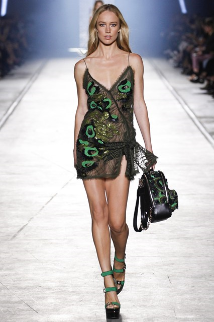
Speaking of the unabashed sexiness of her clothes, it has to be said: the girls in the Versace SS 2016 show looked HOT. Sorry to let my more base boring straight male instincts take over, but it has to be said. All the garments, smashingly luxurious, were slitted everywhere: legs, torsos, hips, necklines, and breasts are all well displayed. Street influences met couture and it all looked great. May Donatella reign.

Bottega Veneta

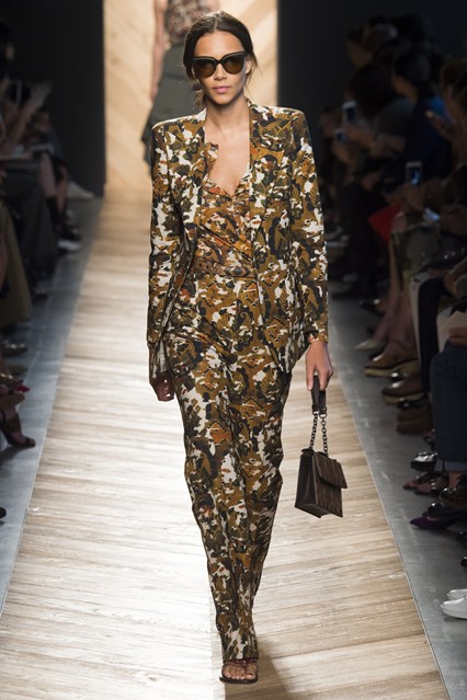
On the menswear end of things, I love Bottega Veneta. Its suede Chelsea boots are literally my favorites boots in the world (made popular by Kanye’s grungy dressed down wearing of the $1200 statement boots, I’m rather poor so I have wear the Top Man suedette versions). Creative director Tomas Maier has been a little more on the nose when it comes to womenswear, however. Bottega Veneta’s whole thing, super luxurious versions of everyday staple pieces, doesn’t always translate to great womenswear shows. The SS 2016 show felt particularly realized then. Maier was inspired by the open country, and presented some dazzling outerwear pieces. The tracksuits with cropped pants didn’t look anything close to sporty, but certainly could be worn for sport. It was almost a rebellious look. Coming back to the city though, a beautiful pantsuit emblazoned with a camo print was eye grabbing and kept to the theme despite it certainly not being outerwear. Maier is really coming owning his role at Bottega Veneta.

Marni

Of all the Italian brands, Marni perhaps feels the most like one of the Paris-based brands in its embracing of contemporary art and harsher aesthetics. Despite that though, the collections offer tons of colors and print. Marni can be abstract and accessible in equal measures. The Sonic Youth of fashion labels? Sure, why not.

Consuelo Castiglioni’s SS 2016 saw an apron-like shape emerge in various forms on the runway: in tunics, in dresses, and wool structures.  This collection had mystery to it. With all the shapes and layers draped upon the women, I couldn’t help but wonder what was underneath. It’s like when I was in middle school and girls started looking so painfully beautiful but also so utterly alien. I didn’t know what I wanted, but I knew that I wanted it.

The color palette of Marni SS 2016 is all over the place but cohesive. Hunter greens meld into browns and bright reds meld into blues. Marni still feels smaller than it should be, but maybe that is why it works. It’s a big Italian brand that holds its aura of the austere.
 

Damir Doma

Damir Doma, in his second Italian outing since moving his brand from Paris to Milan, was smart to leave the City of Lights. In Paris, he is just one of dozens of young designers taking on brutal, conceptual, abstract, and “arty” fashion. In Milan, however, he is practically the only one. He stands out in Italy.

Doma works closely with his manufacturers, and perhaps that is why he decided to move to Italy. In any case, his unique relationship to fabric stands out in the SS 2016 collection. In strictly monochromatic colors, Doma plays around with the proportions of pantsuits, cloaks, dresses and jackets. I particularly enjoyed the elegant dresses that were then slashed to shreds at the bottom. It reminded me of old Rei Kawakubo. Also, in the vein of Rick Owens, there was a kind of sexy unsexiness to this collection, with wide and loose garments falling upon the models in such a way that only hinted at eroticism.
 

Arthur Arbesser


If there has been a moment of, “This designer has arrived!” this season, ala with Alessandro Michele at Gucci last season, it has been Arthur Arbesser. Arbesser released his debut collection as creative director for knit brand Iceberg as well as his first line for his namesake brand. Both collections were different and great in their own ways.

Arbesser brought bohemian sensibilities to Iceberg, with pin stripe satin bomber jackets worn over cropped pants. The clothes were very casual but cool and effortless. No one has thought of Iceberg for some time, but with Arbesser designing the ready-to-wear and Olivier Zahm heading the campaigns, it could be the new heritage thing. Wait to see what Arbesser does with the knits for a winter collection.

Balthus inspired everything. Arthur Arbesser paid attention to that notion with his SS 2016 collection under his namesake brand, installing a giant Balthus cat in the middle of his floor. The girls walking in the show looked painfully young; both in their facial features and in their little school girl mini skirts and also the Nikes and pajamas. I so often hate this sort of pubescent fashion that I am even more impressed with Arbesser that I like this. He’s searching for a romance in youth and I have to say he’s found it. And those blue leather pieces, hot damn.


Julianna Vezzetti's Picks

Prada

Prada didn’t leave any angle un-textured or un-embellished; metaphysical in the truest sense of the word. The collection created layers of content that could make you hiccup. The SS 2016 collection is seemingly a working girl on acid. The elongated silhouettes allow dimensions to be layered with additional accessories and patterns. Muted metallic and electric lace bibs offer the idea that we are just visiting this planet. The tailored samurai skirt with matching blazer eludes a strict rhetoric lifestyle. The wispy hair and drop waist dresses spark ‘40 and ‘50s-era inspirations; like Tim Burton doing Casablanca. Color accents were strategically placed with socks, gloves and earrings proving leverage to draw the eye out to see it as a whole identity.

Fendi

Fendi SS 2016 opened with a fiery red to ambre shade of dusty salmon and cool white. All of the trimmings manifest a vision of a Swiss girl with a militant edge. The braiding of leather and fabric accent the large well pockets in the dresses giving a sense of utility. The garments also relish a fashion functionality with the “skort” like design and culotte wide legged pants. Belief in this theory allows you two ideas within one singular collection. Flowing printed prairie dresses and billowing sleeves give the feminine tone to the masculine tailored structures. If all is fair in love and war then what are we fighting for.

Jil Sander

Will you drink the Kool-Aid of the country cult leader draped in silks and sanctity? The Jil Sander SS 2016 collection offered tweed hats acting as a protection barrier to shield unwanted followers in your direction. The ominous sounds and designs paint a very surreal vision of religion. It has a fine tuned reference point that can almost be read as boring, but with ample contingency to the presentation. The repetition off the shoulder design highlighted a consistent design. The cable cord belts create a restrictive and controlled energy much like a cult counterpart. The layering aspect has been all over the runway but Rodolfo Paglialunga embodies a comfort and effortless perspective at Jil Sander. He recognizes the DNA Jil created to carry on the legacy of the brand, but has played down some of the brutality and harshness that Sander was beloved by many for using.

MSGM

The opening sounds of dance punk band Le Tigre at the MSGM SS 2016 were electric. The models matched the intensity of the boisterous music by charging full speed down the runway. The energy created by the caustic music and fast-moving models was emblematic of the color palette of MSGM’s SS 2016 collection’s shocking ultraviolet hues. The layering in this collection offered a femininity to what was a slightly Tomboy-ish presentation. I was struck with a sense of nostalgia for my coveted JNCOs and chain wallet I would rock in the late ‘90s. The pastel ruffles paired with wide-legged short trousers exuded hues of that bygone era. The bondage of punk was presented in a very pop art manner with flowing chain dresses and chest pieces. This grunge girl is a skater who also happens to play with textural design. Using billowing fabrics at the hips, she communicates the source of her power.


Text by Autre Fashion Editor Adam Lehrer and contributor Julianna Vezzetti


[ART REVIEW] Kamil Franko At New Release Gallery

by Adam Lehrer

I went to Paris for the first time when I was 16-years-old on a student trip. It was my first time in Europe, and the whole time I was in something of a transcendental lull. I was already heavily into art, music and history, and I remember the whole time being taken into a state that wasn’t quite awake but certainly wasn’t sedated either. I did the Eiffel Tower and the Louvre. I ate baguettes and drank booze for the first time. It was one of those experiences when the reality lines up perfectly with your imagination and a specific tranquil state is elicited. And then, I was on the subway when all of a sudden my eyes burst with tears and I fell to the floor violently ripped out of the bliss. I later found out that the police used tear gas to stop a thief. This is all coming to mind as I am looking at the formidable paintings by Copenhagen-based artist Kamil Franko at the opening of his show ‘Love and Violence’ at Erin Goldberger’s new gallery New Release Gallery. Franko’s paintings appear to be marked by tranquility as they are moments of sharp violence.

The lovely and brilliant Goldberger is best known amongst the New York art world as director of Bill Powers’s Half Gallery. The opening was packed with young art kids in a way that I haven’t seen in New York in years. It feels like Goldberger found the perfect time and the perfect Chinatown location to open a downtown gallery that could serve as a new Ground Zero for the new generation of artists in the city.

Kamil Franko’s work, while paying heed to the traditions of great painters, has a style that feels explosive and fresh. Franko piles paint on top of one another forming a thick and physical void separating the viewer from the imagery. The imagery contained within those paintings is at times both tranquil and violent. “I don’t think it’s about being between good and evil,” says Franko. “I think it’s a borderland between two polarities.”

Franko’s paintings are as much about creation as they are about destruction, and that dichotomy lives within his technique as much as it shows within his content. “I added paint carefully in creating the canvas, and at the same time I demolish it or remove it,” he says. “The motif is in the method. For example, I took a drone as a symbol for some destructive elements with an ominous presence of both beauty and ugliness.”

Franko is, for lack of a better term, a “painter’s painter.” He created the works contained with ‘Love and Violence’ during a period of isolation he underwent for three months in Budapest. He wasn’t even creating these paintings for the sake of a show, as there was no such show to be making them for. He literally paints just to paint. How many artists are like that are out there these days? Goldberger then contacted him via email to discuss putting together a show for her brand spanking new gallery. Franko credits that isolation with propelling his work forward. “After three weeks you’re asking yourself what the fuck are you doing here,” he says. “When you are alone in your head it seems to calibrate clearer ideas. You can focus when not disturbed by your environment.”

Franko’s work, at times both dark and hopeful, speaks to a bright future for art and proves a most appropriate show to open Goldberger’s new gallery. The time is right for a young gallerist to show off work by young artists, and I think I can speak for all of the young art community of New York when I say, “We are ready for this.”


Adam Lehrer is a writer, journalist, and art and fashion critic based in New York City. On top of being Autre’s fashion and art correspondent, he is also a regular contributor to Forbes Magazine. His unique interests in punk, hip hop, skateboarding and subculture have given him a distinctive, discerning eye and voice in the world of culture, et al. Oh, and he also loves The Sopranos. Follow him on Instagram: @adam102287

FOLLOW AUTRE ON INSTAGRAM TO STAY  IN TOUCH: @AUTREMAGAZINE


[AUTRE PLAYLIST] The History of Rock N' Roll

Traveling this week with limited access to WiFi, so I have decided to upload a pre-existing playlist, the Best Rock Playlist Ever, in accordance with my world view anyways. To me, everything about these bands capture the attitude that has made rock music a major part of my life since I was a kid. Everything from obvious rock n' roll gods like The Stones and Hendrix to '80s British stuff like Joy Division and yup, the Smiths, to farther out stuff like Columbus, OH-based freak rock band Vertical Slit and the sadly overlooked Pink Reason (whose 2007 Siltbreeze release "Clean the Mirror" got me through some tough and druggy times). A lot of this stuff has pretty much soundtracked my life. Rock n' roll has a way of accenting the high points and combating the low points. Have a nice weekend.


Adam Lehrer is a writer, journalist, and art and fashion critic based in New York City. On top of being Autre’s fashion and art correspondent, he is also a regular contributor to Forbes Magazine. His unique interests in punk, hip hop, skateboarding and subculture have given him a distinctive, discerning eye and voice in the world of culture, et al. Oh, and he also loves The Sopranos. Follow him on Instagram: @adam102287

FOLLOW AUTRE ON INSTAGRAM TO STAY  IN TOUCH: @AUTREMAGAZINE


[FASHION REVIEW] The Best of London Fashion Week

Photo by Jason Lloyd-Evans

London Fashion is Autre Fashion - if that makes any sense. Basically, the fashion coming out of London is on-brand with the message that we are trying to set forth at Autre: the contrast of high and low culture, freedom, expression, sexuality, and you know, being fucking weird. It’s been a pleasure to watch these young designers grow into their roles as international arbiters of taste. It’s not hard to imagine JW Anderson’s brand growing into Yves Saint Laurent levels of label endurance while he simultaneously re-brands Loewe into an ultra desirable fashion label. Simone Rocha is bringing a romance back to fancy clothing that has been missing for some time. KTZ is still killing it. Burberry puts on a very fun show for a juggernaut mega money brand. And the best part is, there is always a new crop of Central Saint Martin’s graduates looking to enter the fashion system and re-shape it in their visions.

So, yeah we love London. Obviously we get excited about Paris, too, but there is such a youthful vitality going on in London fashion at the moment made all the more exciting by its defiance of the city’s astronomical living rates and housing costs. These designers express their creativity in any way they can or they starve trying. Literally. So, I (Adam Lehrer, fashion editor at Autre Magazine) teamed up with new fashion correspondent Julianna Vezzetti to discuss the SS 2016 London collections.

Christopher Kane

I dress pretty minimally. I like tight jeans, big shirts/t-shirts/knits, boots or sneakers, and a cool coat. It’s easy, and it’s a look that I’ve committed to. It makes me feel good. Imagine then the esteem that I have for Christopher Kane as a designer that he makes me want to change my whole thing up and maximize my shit. He makes intricate patterns and colorful prints feel very effortless, and yes, luxurious.

Kane is the type of designer who is able to hold together ideas in continuity in both his men’s and women’s collections while keeping his menswear masculine and his womenswear feminine. The colorful near-painted on looking graphics could be the visual representation of walking on cloud 9, and Kane looks as confident in his concepts as he ever has, maybe more so. The show introduced some classy uses of bumblebee yellow, such as a dress underneath an over-sized grungy cardigan (boyfriend cardigan to be sure), before introducing some black and white monochrome looks, and then he manages to brilliantly fuse the yellow with the black. So many of Kane’s choices feel like they should be tacky, but they always look great.

Claire Barrow

There is so much innovative and genius fashion coming out of London right now. Even the biggest and most publicized young designers (JW Anderson, Marques Almeida, Simone Rocha) feel firmly anti-establishment in a way. That might be why a truly underground designer like Claire Barrow might not be getting the write-ups that she deserves. Her SS 2016 collection felt like a maturation of her palette.

Barrow is one of the few designers who also might not take issue with being described as an artist. She has gained fame for her dark and striking illustrations emblazoned onto beautifully made leathers and dresses. SS 2016 had illustrations in spades, but the clothes that they are printed on have grown more elevated. There are printed skin-tight leather dresses, jacquard power suits, shredded white knits, etc.. I think what is great about the prints is that they don’t look immediately “fashion,” they look very authentic. I think Barrow’s design philosophy is as fresh as anyone’s. She’s also unapologetically political, which I appreciate.  SHOWstudio agrees: https://www.youtube.com/watch?v=Ha_em0YFx54

KTZ

I’ve been finding designer Marjan Pejoski’s KTZ collections pretty dull for some time. His trek to New York for the FW 2015 collection possibly led to him re-grouping, because the KTZ SS 2016 collection, while not terribly original, is everything that people dig about KTZ. Pejoski, as always, references the club cultures that he loves, but there is some seriously apocalyptic urban warrior vibes here too. Maybe this is a bit of a hackneyed observation, but I can’t help but think that Pejoski was really really into Mad Max: Fury Road (that film is easily the fashion moment of 2015).  Part of the collection feels like the warriors were left on Earth to fend for themselves: beige colored trenches and military-inspired tops with these sort of futuristic kneepad shoes. The other part of the collection looks like the haute people who were able to secure a spot on the space ship: mega expensive black leathers and linen with cyberpunk styling. Another film reference that comes to mind is Snowpiercer, where the rich live on the opulent front of the train and the poor are forced to starve in the back of the train. Sorry, I’m writing this late. Bear with me.

MM6 Maison Margiela

Every part of me wants to hate what John Galliano is doing at Margiela. Margiela is one of those brands that is hard to accept now that it is no longer designed by its namesake. It’s the same with something like Raf Simons. Who the fuck could design Raf Simons other than Raf Simons? But Galliano’s penchant towards extremism in couture has proved not only right for the house, but also has taken Margiela towards its future.

That injection of vitality that Galliano brought to Maison Margiela couture is perhaps even more on display in the brand’s offshoot, MM6 Maison Margiela. Showing both men’s and women’s looks, Galliano elevated gender-bending street looks to the umpteenth degree and did so with his ever-present sly sense of humor. Who else would send his first model down the runway in a baggy lime green t-shirt, arm-length silver gloves, with a bra over the t-shirt? Not many, and Galliano makes this stuff look good. The red, thigh-high socks were absolutely decadent, and the space dresses and coats were detailed just so.

It’s interesting that Galliano has actually adhered to the Margiela ethos, remaining relatively quiet in his public persona. Of course this could be a PR strategy so that he doesn’t say something disgusting again, but it is very exciting to see him take on this house and touch it up in his own image. It shows humbling. Martin might be nodding in approval at this one. Great show.

Thomas Tait

There are few garments more satisfying to wear than a pair of denim pants with tastefully applied knee slits. Thomas Tait appears to agree in his SS 2016 collection, which debuted some fantastic new jeans with the knees removed and replaced with a see-through grid structure of sorts. Details like these are what make Tait fun to watch. His clothes seem kind of boring at first, but as the models make their way down the runway your eyes find themselves glued to myriad design flourishes.

Tait won the first LVMH prize last year and had his brand injected with a cool $300,000 euros in capital. That capital looks like it’s paying off: the clothes in Thomas Tait SS 2016 look quality. The looks in the show define a powerful woman that will be noticed. Though the style of the clothing could be defined as masculine, these clothes aren’t at all masculine. They radiate a tough femininity, such as the elongated printed knit over a white shirt and orange and black trousers. However, Tait’s SS 2016 collection is not for women who demand attention, but rather for women who command presence. Tait is minimal only when he’s not.

JW Anderson

J.W. Anderson took the viewer to another planet of dream-like ambiguity. He playfully used lines and textures to convey an alternate universe. This female odyssey shined light on the right areas of the body to express. Using expressive lines to contour the neck and collarbone, the knotted ties on the ankles created a seal of design. This woman jumps from galaxy to galaxy while making a statement with Keith Harring-esque prints and linear lines. J.W. has the ability to create living illustrations with emphasis on modular inspiration.

Mary Katrantzou


Mary Katrantzou has the ability to dance between everyday beauty and nighttime glamour. Her products can be intimidating visually but are balanced by lightweight mobility. She opens up dialog about construction and the layers of content we use to articulate ourselves. The volume is seen in the tooled Spanish ruffles, ribbed sweaters, and quilted sweater dress paired with a snakeskin ankle boot to create an ensemble defined by context. The sequined pieces are subdued but casually tactful. The Kantranzou girl is beautiful but approachable. The enchantment between the client and the designer is an integral one that you observe in Mary’s work and the presentation.

Gareth Pugh

What’s black and white and red all over? Gareth Pugh’s SS 2016 presentation took eccentric glamour to task. The combination of fish scale sequins and leather corset dresses mark this collection as something of performance via dressing. These garments present a stage for you to make every moment monumental. The tone was set with the Leigh Bowery-esque masks with makeup design akin to the classic ‘80s film Liquid Sky. The swooping collars were accented by luxurious Himalayan sheepskin. Pay attention to the high necklines contrasting with deep necklines standing in as metaphor for the range of radical desire. There are secrets in this collection, but Gareth’s message is loud and right there for the interpreting. It’s a glamour circus and anyone fabulous enough is invited if one woman can perform her best sideshow.

Joseph

Uniformly speaking, Joseph has a way of creating a lasting impression without overtly yelling it out. The subtle tones of yellows, creams and whites allow the viewers to comfortably envision themselves in the clothes. The elongated silhouettes direct the eye to the right frame of focus: the subject. The knotting of the skirts and shirts create a point of reference and texture. The artful stripes feel very on-trend. The finely tailored dress shirts are minimalist with a direct agenda: everyday to evening. The subtle metallic colors communicate that this Joseph woman is mysterious and aware of herself. Smart accessories like white paper bag-like clutches and vinyl-wrapped belts speak to this woman being able to go from the office to the dojo and battle anything that comes into her protected sphere.

Simone Rocha

What a dream it would be to live in the world of Simone Rocha. Something like a Sci-Fi version of Alice in Wonderland. The clothing is ethereal and whimsical as if the Rocha girl is restrained in an alternate universe and all she has to ponder is freedom. The cross-body roping and textural accessories offer weight to this point. The fantasy of glitter tights and candy-coated strappy heels bring imagination to the Rocha girl. She has a casualty to her; the layering of dresses on top of pants allow her to be multi-faceted and dimensional.  The billowing sleeves and skirts create a volume of intent and dexterity of the manufacturing. The earthly tones and playful floral patterns extenuate the aspiration for freedom. Truly a dream within a dream.


Text by Adam Lehrer and Julianna Vezzetti. Follow Autre on Instagram: @AUTREMAGAZINE


Beautiful Vagabond: A Glimpse Into the Turbulent Life of the Late Edwige Belmore

Edwige Belmore, “the queen of punk” has died at the age of 58 in Miami. A great many things can be said of the nightlife maven, musician and model, and yet it seems that the complexity of her journey through life remains all too mysterious. What we do know is that she touched the lives of the twentieth century’s greatest cultural influencers, from Helmut Newton, to agnès b., to Andy Warhol, and many more. We also know that her life was a long, beautiful, rags-to-riches-and-back-to-rags-again tale of heartbreak and obscurity. Starting with her familial abandonment, to her discovery by the world of high fashion and art, and ending with her final chapter as resident artist and landscaper of the Vagabond Hotel in Miami—her LinkedIn account lists “landscaping hobo” and “palm tree studies” as her duties. Little is known about her sojourn in Japan or the years that she spent at a Hindu ashram in India, and few would want to sit through the documentary that recounts her years as tastemaker to the Starck Club in Dallas. However, these are the chapters that defined her as an icon whose flame burned white hot, then flickered indefatigably, only to be extinguished prematurely by a blood-borne illness while few aside from her inner circle were looking.

“Edwige Will Die, and Edwige Will Be Born”

Abandoned by her parents and raised in a Parisian convent, Belmore came into her formative years with an unwavering determination to forge her own path. In 1976, at nineteen years old, she saw the Sex Pistols perform live for the very first time. Mind blown and loins roused, she was changed completely, telling everyone that on November 6, 1979, “Edwige will die, and Edwige will be born.” Friends assumed she was planning her suicide, but what she had in mind was more like what later generations would call a re-brand. She burned all of her clothes, and bought one outfit that was definitively hers. “I had completely this amazon look: riding pants, high heels, white shirt with a skinny tie, with a big old beaten leather jacket that’s so cool, shaved head … I was some kind of alien, amazon, dominatrix or something.”

Edwige is dubbed the “Queen of Punk”

Photograph by Farida Khelfa

Springing into the Parisian punk circuit like an androgynous bat out of hell, Belmore was approached by two girls in a club who asked if she would play drums in their band. Having never played a musical instrument, she accepted, and their band, L.U.V. (for Ladies United Violently, or Lipsticks Used Viciously) was born. As the punk movement started to gain recognition in the media, she was asked to do interviews for Vogue, Elle, Nouvel Observateur and the like. Within no time she became the leader of a movement and was crowned the “Queen of Punk.”

A Foray into Modeling

Photograph by Philippe Morillon

Due to the perpetual stream of press, her notoriety grew rapidly and Edwige found herself unwittingly shepherded into the inner circles of haute couture. Catching the eye of Helmut Newton at a party chez Paloma Picasso, the louche photographer followed her incessantly throughout the night begging to take her picture. Without any experience or ambition for modeling, the gender-bending ingénue made history posing for everyone from Helmut Newton, to Pierre et Gilles, Maripol, Andy Warhol, et al.

Cover of Façade Magazine with Andy Warhol

Photograph by Alain Benoist

As a symbol of counterculture, establishment-fucking fracas, as well as muse to the fulcrums of the art and fashion worlds, Belmore was the perfect companion to Andy Warhol for the cover of Façade. It was an underground, paper magazine that sought intriguing binaries to juxtapose on their covers, and this one would go down in art publication history with the headline: Pope of Pop Meets the Queen of Punk.

Walking for Jean-Paul Gaultier and Thierry Mugler

Edwige never called herself a model, and didn’t want anybody else to, which is why asking her to walk had to be approached delicately. “Jean-Paul Gaultier came to me and said, ‘You look amazing. Do you want to be in my show?’ … he was like ‘do you want to be in my SHOW,’ which is whole different meaning.” Gaultier was curating looks from the street (a practice unheard of at the time), and putting street kids on the runway. Belmore drank champagne and got high throughout the entire presentation, yet she still managed to finish the show in a pair of towering stiletto heels singing Sid Vicious’s reprise of “My Way.”

A Hop Across the Pond to Studio 54

Edwige Belmore, Maripol & Bianca Jagger @ Studio 54, photograph by Duggie Fields

Having taken Paris by storm within the span of a single year, Warhol was anxious to introduce Belmore to the elite influencers of New York—or rather, he took it upon himself to introduce New York to the Queen of Punk. Approaching the illustrious nightclub, swaths of partiers parted like the Red Sea as she entered the club for her very first time, arm-in-arm with her regal, rebel counterpart. She was suddenly a member of the elite New York underground with contemporaries such as Bianca Jagger, Keith Haring, Debbie Harry, Kenny Scharf, and Jean-Michel Basquiat.

Ambiance creator to Le Palace in Paris

Upon her return to Paris, Belmore was approached by ‘The Prince of the Night,’ Fabrice Emaer, and asked if she would work the door at his new nightclub, Le Palace. It was the Studio 54 of Paris, and Edwige made the perfect doorman. She was a 20-year-old Amazonian punk with six bodyguards facing hoards of anxious scenesters. Belmore claimed that she would look them in the eyes and feel immediately whether or not they were right for that evening’s ambiance. She once refused the King of Sweden because “obviously, he must have been an asshole.” It was during this chapter that she married her friend Jean Louis Jorge, a Dominican filmmaker fifteen years her senior, because in the age of free love, getting married was the most punk thing to do. Her wedding dress was a mock Chanel gown made from white terrycloth towels stitched by a friend who worked for the heritage house.

Music and Film

Cover image by Pierre et Gilles

From 1978-1988 Edwige acted in seven short and feature-length films, the first of which was a role in Jean-Marie Perier's 1978 film, Sale Rêveur with Lea Massari and Jacques Dutronc. She also played herself in the 2011 feature film Des Jeunes Gens Mödernes or Kids of Today. In 1979, Claude Arto introduced Belmore to the exhilarating sounds of the synthesizer and they started their Parisian Cold Wave band (referred to as New Wave by the Anglophones), Mathémathiques Modernes. Throughout the ‘80s she traveled back and forth between Paris and New York singing and playing sax with her lesser-known band, Jungle Geisha.

‘Maitresse de Maison’ at agnès b., New York

Photograph by Pierre et Gilles

Edwige met agnès back in 1976 when at the opening of agnès b. in Paris. Years later, when agnès opened the very first gallery/boutique in New York City, she asked Belmore to be the lady of the house. It was her job to fuse the worlds of fine art and fashion so that the crowd would flow seamlessly from one side to the other without any sense of awkwardness or separation. agnès hung an enormous photograph of Edwige (taken by Pierre et Gilles) that she had bought years prior behind the cash register, and placed a much smaller photo of herself below it to the right. In the early ‘80s, Belmore met the mellifluous, Nigerian-born, British singer Sade and the two engaged in a passional tryst. It is rumored that her hit single “Sweetest Taboo” was inspired by the Queen of Punk.
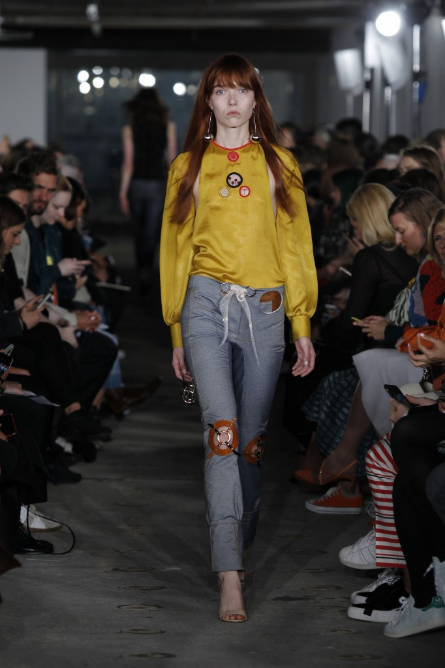
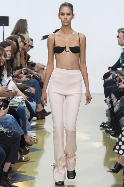
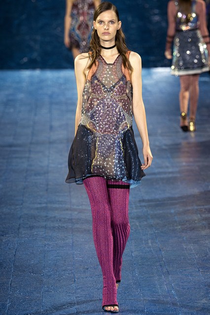
Photograph by Maripol

Edwige Finds Photography

Photograph by Edwige Belmore

In the final years of her life, Edwige created a photographic series called The I Within Your Imagination, which she planned to present in a group show called 7 Deadly Sins. The location of the intended exhibition and whether or not it happened is unknown. The series comprised 500 photographs taken of the same mysterious object at various different angles with varying sources of light. The effect seems a perfect representation of who she was to the myriad worlds in which she interacted. Having absolutely no training as a model, actress, singer, musician, or any of her other assorted professions, she seamlessly assumed those roles without any hesitation or fear of failure—she simply did and was everything that was asked of her.


Edwige never did finish the coffee table book that she and Maripol had hoped to publish, which would encompass photographs from the 75 artists and photographers who called her their muse. There are undoubtedly countless stunning photographs held in private collections that the world has never seen and we can only hope that these lost treasures will surface in the coming years. text by Summer Bowie


Photograph by Ellinor Stigle

[REVIEW] Bettina WitteVeen "When We Were Soldiers...Once and Young" Art Installation at the Brooklyn Navy Yard

text by Adam Lehrer

German-born artist Bettina WitteVeen, a self-described “Buddhist and pacifist,” believes that war and violence are not the innate genetic traits that we are so often led to believe that they are. On the contrary, she believes that human violence is an aberration of the human spirit. “I’m a very strong believer that we are not actually hard-wired towards war,” says WitteVeen. “I believe we need to understand war to abolish it and that we can.”

WitteVeen’s new public art installation, ‘When We Were Soldiers… once and young,’ features dozens of inflated photographs carefully placed within an abandoned hospital in the Brooklyn Navy Yard that served as an infirmary for soldiers from the Civil War to World War II. The photos, some of which are characterized by natural beauty and others that are marked by brutality and dread, find a fitting spiritual home within the hospital. The abandoned hospital is full of history and ghosts of yore. Even without the photographs it carries a pervasive sense of existential dread. The photographs then provide a vivid illustration as to why this old facility gives you that sense of fear.

The exhibition is broken into two parts. The upstairs part focuses on the soldiers and their physical recoveries, offering vivid details of the ravaging that the human body endures during war: photos of men without limbs, men hanging on barbed wire in the trenches, explosions and more. WitteVeen deliberately avoided shocking imagery, “Because shocking imagery forces people into their fight or flight reflexes,” she says. But despite that notion, there are quite a few brutal images displayed amongst the installation.

Much of the installation has to do with war’s corruption of the human spirit. WitteVeen talked about what she calls the “Bezerker Mode.” She believes this is when the soldier has lost his capacity for patriotism and wanting to honorably defend his country and instead has grown to enjoy the killing and the violence. How does this happen? “This state is generally brought about when a soldier loses a comrade in battle,” she says, “The bezerker state is elicited when the vengeance instinct kicks in.”

Moral degradation in its many forms goes hand in hand with war. Curiously, beautiful images of poppy flowers are shown in the installation. Poppies and opium to WitteVeen are extremely loaded motifs in this scope. “I wanted to contrast the beauty of nature but also show the violence when war collides with nature,” she says. “Opium kills the pain, and it is for the killing of the pain that we go to war, which we then need more opium for.”

The downstairs part of the installation focuses on the persistent mental effects of war, “I wanted to focus on the long-term plights of the citizens,” says WitteVeen. One room is extremely bright, with the centerpiece image featuring a young woman of an undefined era. WitteVeen tells a harrowing story of the girl, who she elects not to give the name of. This girl was raped when she was 12-years-old, and though she found happiness and marriage, the trauma never left her. She developed a light allergy that would eventually lead to her suicide. Though the story is not directly related to war, WitteVeen comments on the use of traumatic violence (such as rape) and its use as a weapon. This brutality completely destroys the individual, and every individual contributes to society.

WitteVeen is not a Christian but she is interested in the idea of the cross as emblematic of sacrifice and redemption, and there are crosses in many of the images and even in WitteVeen’s own sculpture work. One such sculpture features a cross with a decayed human skull in the middle, images shot from the inside of a chapel, on the two sides, a red war image below, and a black abyss on the top. This room serves as a place of contemplation for the viewer.

The final room is “the room of redemption,” says WitteVeen. There are a few violent images, but she also photographed former battlegrounds and shows how nature has over-rooted the violent past. Thus, war can be ended, and it is in our nature to do so. “The wounds are healed,” she says.

There are a lot of ideas in the installation, and they don’t all seem to be immediately related. Throughout the preview of the installation, WitteVeen annotated many of these ideas with her own interpretations of her work. As a viewer, one almost wishes there was more room to create your own idea of the work. When asked if she worries that someone who didn’t have her to annotate the work for him/her might miss the redemptive aspect of the work and take a more nihilist view, WitteVeen says, “Of course not, this is art and not a documentary. But I only know what my intentions were.”

WitteVeen is an optimist and a humanist. It took her five years to put together this installation, and she is clearly excited with the results. There will be an essay that she wrote accompanying the exhibition, and I would suggest reading it. But I would also suggest creating your own conception of the exhibition. We all feel something when it comes to war. Whether or not you believe that war can actually be ended is irrelevant, but WitteVeen’s installation will force you to ponder the notion of war in a way that you might be uncomfortable with. That discomfort is understanding. 

Bettina WitteVeen "When We Were Soldiers... once and young" will be on view until October 24, 2015 at the Brooklyn Navy Yard Hospital in Brooklyn. Text and images by Adam Lehrer


Adam Lehrer is a writer, journalist, and art and fashion critic based in New York City. On top of being Autre’s fashion and art correspondent, he is also a regular contributor to Forbes Magazine. His unique interests in punk, hip hop, skateboarding and subculture have given him a distinctive, discerning eye and voice in the world of culture, et al. Oh, and he also loves The Sopranos. Follow him on Instagram: @adam102287

FOLLOW AUTRE ON INSTAGRAM TO STAY  IN TOUCH: @AUTREMAGAZINE


Hear the First Track From John Malkovich's Plato-Inspired New Album In Collaboration with Yoko Ono and More

John Malkovich is releasing a concept album entitled Like A Puppet Show in collaboration with producer Sandro Miller, famous for the series of photographs featuring Malkovich in recreations of the some of the most iconic photographs. The album features Malkovich reading Plato’s Allegory Of The Cave over a score composed by Eric Alexandrakis. Musicians including Yoko Ono, Sean Lennon, Dolores O’Riordan, Ric Ocasek, and Zappa, Dweezil, were invited to collaborate on a track. (Like A Puppet Show will also feature exclusive photos of Malkovich performing the reading to really flesh out the experience.) The album will premiere exclusively on vinyl for Record Day on November 27th – it will also be available for download by Christmas

[ART REVIEW] Wolfgang Tillmans "PCR" At David Zwirner In New York

text by Adam Lehrer

Multi-disciplinary artist and photographer Wolfgang Tillmans got signed to David Zwirner and has been living in New York for a month up until his current exhibition. By all accounts, he seems to be having a fucking blast. He’s been out at clubs, DJing Fire Island parties, and making a ton of art, according to a David Zwirner employee. But judging from his massive new David Zwirner exhibit, PCR (aka polymerase chain reaction), Joie de Vivre is a quality propelling the essence that makes Tillmans’s work fantastic. To him, people going out to dance, party, and express themselves is the ultimate form of protest.

“What I love about music more than anything is that by all measures, music is useless,” he says at a press preview of the exhibit. “This exhibition has an insistence on clubbing and playing. Take Glastonbury Festival for example, in some sense it’s very political, and in another sense it’s five days of absolute nonsense and fun. That is connected. “

Fun and politics need not be separate within Tillmans’s visual language. On the contrary, the two concepts are parallel to one another, a notion exemplified in the work displayed at PCR. The exhibit reads as a comprehensive look into the major themes that define his work: political progress, the exuberance of the nightclub, the power of music, and universal progress.

Numerous photographs line the walls of Zwirner depicting various artists and activists. The surroundings they exist within are different but their message is inherently similar. There are familiar faces from American pop culture like Patti Smith and MC Ride of Death Grips, artists that use their massive platforms to unleash their messages of revolution unto the world. But there are also activists that don’t have the platform that a media figure has, but nevertheless engage in protest whether they believe they are or not. The nightclub, to Tillmans, is a “sanctuary of free expression.” “Many of the photographs depict men having fun at gay clubs in Russia,” says Tillmans. “There are only two gay clubs in Moscow, and these places are the only places that these people can go and fully express themselves.

Despite Tillman’s exuberant outlook on life, he is a diligent curator, and was involved with every aspect in the development of this show. “He’s extremely thorough,” says David Zwirner Special Projects coordinator and artist Young Sun Han. “When he first came to Zwirner he gave us a presentation with a rundown of his entire career.”

Tillmans has always engaged with the curatorial aspect of his exhibitions as another form of expression, and not a burden. Within the PCR exhibit, every angle at which the work is displayed is meticulously thought out, even with some of the photographs that hang 15 feet in the air above the normal line of sight. “My mother always gets angry,” says Tillmans with a grin, “Why do you need to put it all the way up there?”

A table installation in the gallery’s back room, TSC (Time Mirrored), combines photographs of architecture and telescopes with statements considering the massiveness of time, and a sculpture, I Refuse to be Your Enemy, consists of black paper laid out along several tables. These structures act as a kind of element to focus the attention on, as a reprieve from the visual stimuli. These structures allow the viewer to consider the messages relayed from the content within the imagery.

The final item of the gallery is a brand new video piece, entitled Instrument. In the video, you see human figures dancing in the shadow in the right screen, while a man gyrating needlessly appears with his back to the screen on the left. While the video seems to be message-less, In Tillmans’s view there is never any expression that is left devoid of subtext. “The politics are never far out,” says Tillmans. There is sexuality in Tillmans’s work, but it is not racy or even sexual. It’s more about freedom. “I always want to show sexuality but never show sex or any one idea of sexual identity,” he says. “I just want people to achieve comfort with their bodies.”

PCR appears to emphasize living as the ultimate means of expression. Not just the idea of breathing and having a pulse, but to live life to the fullest of your own definition of the term. We as a people can set an example for generations to come by living how we wanted to live. That is how society will continue its journey forward.

See more photos from the opening here. Wolfgang Tillmans "Polymerase Chain Reaction" will be on view until October 24, 2015, at David Zwirner gallery, 525 and 533 West 19th Street in New York.


Adam Lehrer is a writer, journalist, and art and fashion critic based in New York City. On top of being Autre’s fashion and art correspondent, he is also a regular contributor to Forbes Magazine. His unique interests in punk, hip hop, skateboarding and subculture have given him a distinctive, discerning eye and voice in the world of culture, et al. Oh, and he also loves The Sopranos. Follow him on Instagram: @adam102287

FOLLOW AUTRE ON INSTAGRAM TO STAY  IN TOUCH: @AUTREMAGAZINE


[FASHION REVIEW] New York Fashion Week Round Two: The Good, The Bad and the Ugly

And so it continues. Save for a few massive outings from Alexander Wang and Givenchy and some surprisingly inventive collections from newcomers like Baja East, the first few days of NYFW are always a bit slower than the days to come. And then WHAM! It’s like your internet browser is getting assaulted Battlestar Galactica premiere style with the endless updates of amazing collections from the best fashion labels that the US has to offer. It feels like it’s been a particularly strong year, all things considered. Here is what I’ve liked. And by extension, what Autre has liked.

September 13

Edun

Edun designer Danielle Sherman is one of the few designers working that honestly can make the claim that she is applying an eco-conscious mindset to the highest levels of fashion. Other than Vivienne Westwood, there is nary a designer you could think of that is using environmental materials in collections that could be described as anything less than high fashion. It’s commendable, and the SS 2016 collection took cues from dance costumes of the Kuba Kingdom in Central Africa for an overall look that was bright and atmospheric.

The collection was minimal but rich. The models looked sexy as hell, as if the cuts of the garments revealed just the right amount of leg or neckline. Usually I find the models to be sexier in their day-to-day garb, as the collections are more about the designer’s statement than sexual stimulation. But even though the message was clear in Sherman’s collection, there was something assaultingly beautiful about the models’ looks in this show.

Nicopanda


Designer Nicola Formichetti is not afraid to bend reasonable expectations of taste and his Spring 2016 collection proved no different. What was different is that he imagined what his art-damaged junkie punks would dress like if these people ever decided to get married. That’s right, there was a serious bridal aspect to this collection.

Formichetti is best known as artistic director for Diesel. While I don’t know if there are any sales figures supporting the notion that Diesel is on the up and up, it has at least given Formichetti the capital to offer some wildly avant-garde fashions under his Nicopanda label. While his work at Diesel usually features hyper-masculine tattoo dudes, his Nicopanda label has hyper-masculine tattoo dudes wearing oversized bomber jackets over a white dress. You tell me which label he has more fun with.

Opening Ceremony

Opening Ceremony’s sample sales are the two times of the year that I can afford to get a taste of the REALLY good stuff (at the last one I managed a Komakino camo oversized bomber jacket marked down from $1500 to $350, bung bung!) so I can’t help but feel indebted to them as a brand. But in reality, Opening Ceremony is so much more than a fashion label. Everything around the brand has become something of a safe place for the New York City creative community. Carol Lim and Huberto Leon are patrons of ALL of the arts, from Hollywood big wigs like Spike Jonze and Jonah Hill, to down and dirty rock n’ roll bands, to the ballet dancers that walked in the show for the Spring 2016 collection. Their influence on New York fashion cannot be understated. The influence for this collection was Frank Lloyd Wright’s daughter, who was a modern dancer, with her dad designing much of the sets that she danced upon. As such, the clothes were elegant, in subtle shades of beige, black and white, but loose and moveable. Subtle choreography allowed the garments to breathe and move, and garment-wise alone it was one of their best collections in seasons. Though I have never been overly enamored with their work at Kenzo, I’m happy to have Carol and Humberto serve as New York creative ambassadors to the world. Their world is tight-knit, but inclusive. Everyone’s allowed in (and with price points that are fairly accessible in terms of high fashion, you don’t need to go broke to sign up). Long live Opening Ceremony.

Let down of the day: Public School

As a young guy working in a creative field living in New York with a taste for high fashion and hip-hop, I’m supposed to be totally enamored with Public School. But I don’t get it. Their menswear collections have always looked like a cleaned up version of Yohji (cleaned up, in my opinion, means boring) and they are definitely still finding their footing in womenswear. Their inspiration for the SS 2016 collection was travel, the dullest of all fashion archetypes. The guys have a crazy knack for tailoring, and one wonders maybe if they’d be better off applying their tactile skills to something that ditched the street influences for something even more inaccessible. I am curious to see what they do for DKNY.

September 14:

Phillip Lim

I’ve always thought that in the way that Public School misses the mark for me, Phillip Lim totally nails it every time. He’s now been offering his accessible high-low mash-up for 10 seasons, and to celebrate his SS 2016 collection was presented with mounds and mounds of dirt dumped all over the runway. That dirt was, in fact, created by months of food compost thrown away by the 3.1 team.


The collection wasn’t mind-blowing, but it was totally Phillip Lim. Lim was pretty early on in the whole masculine attire re-conceptualized in a sexy, girlish way. These aren’t tomboyish clothes, even if a guy wouldn’t look particularly out of the ordinary wearing some of them. Sporty materials with floral prints, short shorts, baggy biker jackets, you know the drill. Good stuff.


Jeremy Scott

Man, I feel like I’m just rifling off the designers that one would expect me to rifle off, and I almost didn’t include Jeremy Scott because of this. I mean, between the documentary he has coming out, designing Katy Perry’s Superbowl looks (that surprisingly didn’t take second stage to her ever-famous bust), creative directing the ridiculous VMAs, and Moschino, he is everywhere. But moments like these are for a reason, generally, and Scott has become master of his own B-movie drenched, low culture-infused universe. His SS 2016 collection references Doo-Wop singers from the 1960s up from the extravagantly bright printed dresses to the Bee-Hive hairdos, and the men’s looks looked like a Saved by the Bell high school formal. These clothes will sell, and Jeremy will reign as king.


Can’t tell whether it’s good bad or bad good: Thom Browne


Thom Browne’s SS 2016 menswear collection shown in Paris caught a lot of flack for co-opting oriental culture without using enough Asian models. I can’t tell if there is a similar lack of over-sight going on in his SS 2016 womenswear collection. The models looked freakish, to be sure, with their black lipstick pursed into a small circle in the middle of their faces and hair pulled into demon horns sticking straight to the sky, but the clothes were interesting. As usual, there were a lot of suits, but there was crazy patchwork going on and wild prints. Browne has always made formalwear subversive and, yes, cool. He’s a fucking genius, yes. I just never know what to make of that genius. Maybe that’s the point.

September 15

Eckhaus Latta

Mike Eckhaus and Zoe Latta, of the prestigious Rhode Island School of Design, are a fashion label seemingly tailor made for us at Autre. Along with kindred brands like Gypsy Sport, Vejas, and a juggernaut like Hood By Air, Eckhaus Latta is churning out fashion that serves as a kind of conceptual art project just as much as it does a clothing manufacture. As a reaction to the fashion vanguard, or maybe not, there was no historical context to this collection. There was only an emotion: horniness.

These clothes, while minimal and chic, were racy. Elbows, thighs, knees, hips and other skin areas were properly displayed. And with Autre friends like Alexandra Marzella, Dev Hynes, Bjaarne Melgaard, and Julianna Huxtable, walking in the show, this was a sure thing to make the list. We love this brand.

Rodarte

Kate and Laura Mulleavy put on their best Rodarte show in seasons for the brand’s 2016 collection, equally informed by Emily Dickinson's poetry and Electric Light Orchestra's prog pop cheese (disclaimer, I love ELO).

The clothes looked really spectacular, to the point where they are hard to write about. But basically, if I saw a woman dressed like the models in this show, I’d be in love with her. Glam rock sparkles set to neon light, the cheesiness of the materials lent itself to an elevated romance. Rodarte is a master at taking things that could be cheesy, and yet comes off as not cheesy at all. Miguel was at the show, and his style could be read as Rodarte man if it existed: psychedelically conceptualized effortlessness.


Adam Lehrer is a writer, journalist, and art and fashion critic based in New York City. On top of being Autre’s fashion and art correspondent, he is also a regular contributor to Forbes Magazine. His unique interests in punk, hip hop, skateboarding and subculture have given him a distinctive, discerning eye and voice in the world of culture, et al. Oh, and he also loves The Sopranos. Follow him on Instagram: @adam102287

FOLLOW AUTRE ON INSTAGRAM TO STAY  IN TOUCH: @AUTREMAGAZINE


[AUTRE PLAYLIST] Ambient, Drone, and Chilled Out IDM

The last two weeks have been madness for those of us amongst the art and fashion media. Who ever decided that New York Fashion Week and Art Gallery Back to School should fall on the same week is a terrible person. Perhaps there wasn't as much overlap in the art and fashion worlds when this was decided?

In any case, I'm fucking exhausted. I've written over 10 pieces for Autre and Forbes in the last week. Considering I live in South Brooklyn, that's a lot of running around. I need to get some sleep. And I have the perfect playlist to catch some Zs.

Once in a while, I'll pop in some ambient, drone, and chilled out '90s IDM to let the Ambien take hold and lull myself into blissful unconsciousness. Brian Eno's ambient work is unfuckwithablle, his ear for tone is as strong as his ear for melody. Aphex Twin is massively important to me, as much as Lou Reed or Hendrix. '#1' off of his 'Selected Ambient Works Vol. 2' has the most beautiful dripping tones that kick it off. I also included some choice William Basinski, an artist that I don't listen to much of but very much appreciate. There is  from the underrated drone duo Stars of the Lid, a group so dreamy they could send an epileptic on a speed binge into a restful 10 hour snooze.


Adam Lehrer is a writer, journalist, and art and fashion critic based in New York City. On top of being Autre’s fashion and art correspondent, he is also a regular contributor to Forbes Magazine. His unique interests in punk, hip hop, skateboarding and subculture have given him a distinctive, discerning eye and voice in the world of culture, et al. Oh, and he also loves The Sopranos. Follow him on Instagram: @adam102287

FOLLOW AUTRE ON INSTAGRAM TO STAY  IN TOUCH: @AUTREMAGAZINE