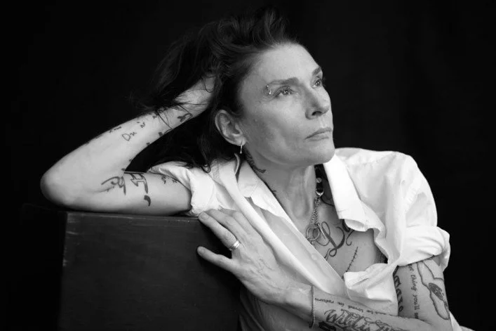
[ART REVIEW] Kamil Franko At New Release Gallery

by Adam Lehrer

I went to Paris for the first time when I was 16-years-old on a student trip. It was my first time in Europe, and the whole time I was in something of a transcendental lull. I was already heavily into art, music and history, and I remember the whole time being taken into a state that wasn’t quite awake but certainly wasn’t sedated either. I did the Eiffel Tower and the Louvre. I ate baguettes and drank booze for the first time. It was one of those experiences when the reality lines up perfectly with your imagination and a specific tranquil state is elicited. And then, I was on the subway when all of a sudden my eyes burst with tears and I fell to the floor violently ripped out of the bliss. I later found out that the police used tear gas to stop a thief. This is all coming to mind as I am looking at the formidable paintings by Copenhagen-based artist Kamil Franko at the opening of his show ‘Love and Violence’ at Erin Goldberger’s new gallery New Release Gallery. Franko’s paintings appear to be marked by tranquility as they are moments of sharp violence.

The lovely and brilliant Goldberger is best known amongst the New York art world as director of Bill Powers’s Half Gallery. The opening was packed with young art kids in a way that I haven’t seen in New York in years. It feels like Goldberger found the perfect time and the perfect Chinatown location to open a downtown gallery that could serve as a new Ground Zero for the new generation of artists in the city.

Kamil Franko’s work, while paying heed to the traditions of great painters, has a style that feels explosive and fresh. Franko piles paint on top of one another forming a thick and physical void separating the viewer from the imagery. The imagery contained within those paintings is at times both tranquil and violent. “I don’t think it’s about being between good and evil,” says Franko. “I think it’s a borderland between two polarities.”

Franko’s paintings are as much about creation as they are about destruction, and that dichotomy lives within his technique as much as it shows within his content. “I added paint carefully in creating the canvas, and at the same time I demolish it or remove it,” he says. “The motif is in the method. For example, I took a drone as a symbol for some destructive elements with an ominous presence of both beauty and ugliness.”

Franko is, for lack of a better term, a “painter’s painter.” He created the works contained with ‘Love and Violence’ during a period of isolation he underwent for three months in Budapest. He wasn’t even creating these paintings for the sake of a show, as there was no such show to be making them for. He literally paints just to paint. How many artists are like that are out there these days? Goldberger then contacted him via email to discuss putting together a show for her brand spanking new gallery. Franko credits that isolation with propelling his work forward. “After three weeks you’re asking yourself what the fuck are you doing here,” he says. “When you are alone in your head it seems to calibrate clearer ideas. You can focus when not disturbed by your environment.”

Franko’s work, at times both dark and hopeful, speaks to a bright future for art and proves a most appropriate show to open Goldberger’s new gallery. The time is right for a young gallerist to show off work by young artists, and I think I can speak for all of the young art community of New York when I say, “We are ready for this.”


Adam Lehrer is a writer, journalist, and art and fashion critic based in New York City. On top of being Autre’s fashion and art correspondent, he is also a regular contributor to Forbes Magazine. His unique interests in punk, hip hop, skateboarding and subculture have given him a distinctive, discerning eye and voice in the world of culture, et al. Oh, and he also loves The Sopranos. Follow him on Instagram: @adam102287

FOLLOW AUTRE ON INSTAGRAM TO STAY  IN TOUCH: @AUTREMAGAZINE


[AUTRE PLAYLIST] The History of Rock N' Roll

Traveling this week with limited access to WiFi, so I have decided to upload a pre-existing playlist, the Best Rock Playlist Ever, in accordance with my world view anyways. To me, everything about these bands capture the attitude that has made rock music a major part of my life since I was a kid. Everything from obvious rock n' roll gods like The Stones and Hendrix to '80s British stuff like Joy Division and yup, the Smiths, to farther out stuff like Columbus, OH-based freak rock band Vertical Slit and the sadly overlooked Pink Reason (whose 2007 Siltbreeze release "Clean the Mirror" got me through some tough and druggy times). A lot of this stuff has pretty much soundtracked my life. Rock n' roll has a way of accenting the high points and combating the low points. Have a nice weekend.


Adam Lehrer is a writer, journalist, and art and fashion critic based in New York City. On top of being Autre’s fashion and art correspondent, he is also a regular contributor to Forbes Magazine. His unique interests in punk, hip hop, skateboarding and subculture have given him a distinctive, discerning eye and voice in the world of culture, et al. Oh, and he also loves The Sopranos. Follow him on Instagram: @adam102287

FOLLOW AUTRE ON INSTAGRAM TO STAY  IN TOUCH: @AUTREMAGAZINE


[FASHION REVIEW] The Best of London Fashion Week

Photo by Jason Lloyd-Evans

London Fashion is Autre Fashion - if that makes any sense. Basically, the fashion coming out of London is on-brand with the message that we are trying to set forth at Autre: the contrast of high and low culture, freedom, expression, sexuality, and you know, being fucking weird. It’s been a pleasure to watch these young designers grow into their roles as international arbiters of taste. It’s not hard to imagine JW Anderson’s brand growing into Yves Saint Laurent levels of label endurance while he simultaneously re-brands Loewe into an ultra desirable fashion label. Simone Rocha is bringing a romance back to fancy clothing that has been missing for some time. KTZ is still killing it. Burberry puts on a very fun show for a juggernaut mega money brand. And the best part is, there is always a new crop of Central Saint Martin’s graduates looking to enter the fashion system and re-shape it in their visions.

So, yeah we love London. Obviously we get excited about Paris, too, but there is such a youthful vitality going on in London fashion at the moment made all the more exciting by its defiance of the city’s astronomical living rates and housing costs. These designers express their creativity in any way they can or they starve trying. Literally. So, I (Adam Lehrer, fashion editor at Autre Magazine) teamed up with new fashion correspondent Julianna Vezzetti to discuss the SS 2016 London collections.

Christopher Kane

I dress pretty minimally. I like tight jeans, big shirts/t-shirts/knits, boots or sneakers, and a cool coat. It’s easy, and it’s a look that I’ve committed to. It makes me feel good. Imagine then the esteem that I have for Christopher Kane as a designer that he makes me want to change my whole thing up and maximize my shit. He makes intricate patterns and colorful prints feel very effortless, and yes, luxurious.

Kane is the type of designer who is able to hold together ideas in continuity in both his men’s and women’s collections while keeping his menswear masculine and his womenswear feminine. The colorful near-painted on looking graphics could be the visual representation of walking on cloud 9, and Kane looks as confident in his concepts as he ever has, maybe more so. The show introduced some classy uses of bumblebee yellow, such as a dress underneath an over-sized grungy cardigan (boyfriend cardigan to be sure), before introducing some black and white monochrome looks, and then he manages to brilliantly fuse the yellow with the black. So many of Kane’s choices feel like they should be tacky, but they always look great.

Claire Barrow

There is so much innovative and genius fashion coming out of London right now. Even the biggest and most publicized young designers (JW Anderson, Marques Almeida, Simone Rocha) feel firmly anti-establishment in a way. That might be why a truly underground designer like Claire Barrow might not be getting the write-ups that she deserves. Her SS 2016 collection felt like a maturation of her palette.

Barrow is one of the few designers who also might not take issue with being described as an artist. She has gained fame for her dark and striking illustrations emblazoned onto beautifully made leathers and dresses. SS 2016 had illustrations in spades, but the clothes that they are printed on have grown more elevated. There are printed skin-tight leather dresses, jacquard power suits, shredded white knits, etc.. I think what is great about the prints is that they don’t look immediately “fashion,” they look very authentic. I think Barrow’s design philosophy is as fresh as anyone’s. She’s also unapologetically political, which I appreciate.  SHOWstudio agrees: https://www.youtube.com/watch?v=Ha_em0YFx54

KTZ

I’ve been finding designer Marjan Pejoski’s KTZ collections pretty dull for some time. His trek to New York for the FW 2015 collection possibly led to him re-grouping, because the KTZ SS 2016 collection, while not terribly original, is everything that people dig about KTZ. Pejoski, as always, references the club cultures that he loves, but there is some seriously apocalyptic urban warrior vibes here too. Maybe this is a bit of a hackneyed observation, but I can’t help but think that Pejoski was really really into Mad Max: Fury Road (that film is easily the fashion moment of 2015).  Part of the collection feels like the warriors were left on Earth to fend for themselves: beige colored trenches and military-inspired tops with these sort of futuristic kneepad shoes. The other part of the collection looks like the haute people who were able to secure a spot on the space ship: mega expensive black leathers and linen with cyberpunk styling. Another film reference that comes to mind is Snowpiercer, where the rich live on the opulent front of the train and the poor are forced to starve in the back of the train. Sorry, I’m writing this late. Bear with me.

MM6 Maison Margiela

Every part of me wants to hate what John Galliano is doing at Margiela. Margiela is one of those brands that is hard to accept now that it is no longer designed by its namesake. It’s the same with something like Raf Simons. Who the fuck could design Raf Simons other than Raf Simons? But Galliano’s penchant towards extremism in couture has proved not only right for the house, but also has taken Margiela towards its future.

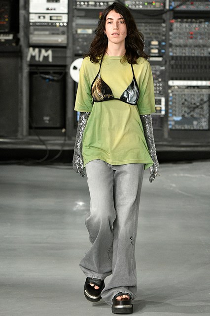
That injection of vitality that Galliano brought to Maison Margiela couture is perhaps even more on display in the brand’s offshoot, MM6 Maison Margiela. Showing both men’s and women’s looks, Galliano elevated gender-bending street looks to the umpteenth degree and did so with his ever-present sly sense of humor. Who else would send his first model down the runway in a baggy lime green t-shirt, arm-length silver gloves, with a bra over the t-shirt? Not many, and Galliano makes this stuff look good. The red, thigh-high socks were absolutely decadent, and the space dresses and coats were detailed just so.

It’s interesting that Galliano has actually adhered to the Margiela ethos, remaining relatively quiet in his public persona. Of course this could be a PR strategy so that he doesn’t say something disgusting again, but it is very exciting to see him take on this house and touch it up in his own image. It shows humbling. Martin might be nodding in approval at this one. Great show.

Thomas Tait

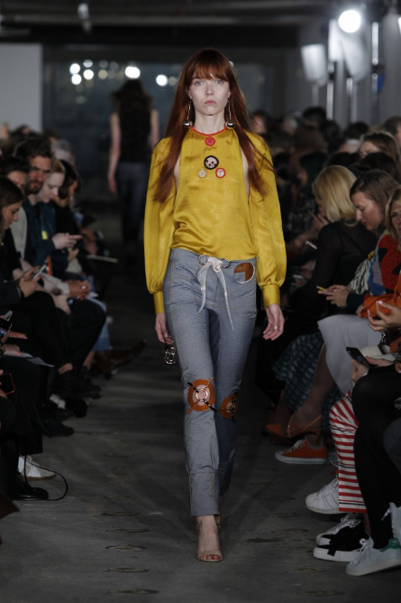
There are few garments more satisfying to wear than a pair of denim pants with tastefully applied knee slits. Thomas Tait appears to agree in his SS 2016 collection, which debuted some fantastic new jeans with the knees removed and replaced with a see-through grid structure of sorts. Details like these are what make Tait fun to watch. His clothes seem kind of boring at first, but as the models make their way down the runway your eyes find themselves glued to myriad design flourishes.

Tait won the first LVMH prize last year and had his brand injected with a cool $300,000 euros in capital. That capital looks like it’s paying off: the clothes in Thomas Tait SS 2016 look quality. The looks in the show define a powerful woman that will be noticed. Though the style of the clothing could be defined as masculine, these clothes aren’t at all masculine. They radiate a tough femininity, such as the elongated printed knit over a white shirt and orange and black trousers. However, Tait’s SS 2016 collection is not for women who demand attention, but rather for women who command presence. Tait is minimal only when he’s not.

JW Anderson

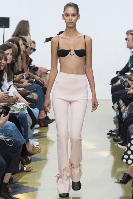
J.W. Anderson took the viewer to another planet of dream-like ambiguity. He playfully used lines and textures to convey an alternate universe. This female odyssey shined light on the right areas of the body to express. Using expressive lines to contour the neck and collarbone, the knotted ties on the ankles created a seal of design. This woman jumps from galaxy to galaxy while making a statement with Keith Harring-esque prints and linear lines. J.W. has the ability to create living illustrations with emphasis on modular inspiration.

Mary Katrantzou


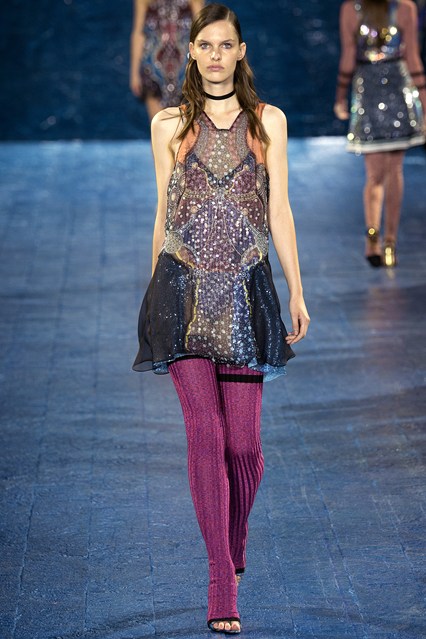
Mary Katrantzou has the ability to dance between everyday beauty and nighttime glamour. Her products can be intimidating visually but are balanced by lightweight mobility. She opens up dialog about construction and the layers of content we use to articulate ourselves. The volume is seen in the tooled Spanish ruffles, ribbed sweaters, and quilted sweater dress paired with a snakeskin ankle boot to create an ensemble defined by context. The sequined pieces are subdued but casually tactful. The Kantranzou girl is beautiful but approachable. The enchantment between the client and the designer is an integral one that you observe in Mary’s work and the presentation.

Gareth Pugh

What’s black and white and red all over? Gareth Pugh’s SS 2016 presentation took eccentric glamour to task. The combination of fish scale sequins and leather corset dresses mark this collection as something of performance via dressing. These garments present a stage for you to make every moment monumental. The tone was set with the Leigh Bowery-esque masks with makeup design akin to the classic ‘80s film Liquid Sky. The swooping collars were accented by luxurious Himalayan sheepskin. Pay attention to the high necklines contrasting with deep necklines standing in as metaphor for the range of radical desire. There are secrets in this collection, but Gareth’s message is loud and right there for the interpreting. It’s a glamour circus and anyone fabulous enough is invited if one woman can perform her best sideshow.

Joseph

Uniformly speaking, Joseph has a way of creating a lasting impression without overtly yelling it out. The subtle tones of yellows, creams and whites allow the viewers to comfortably envision themselves in the clothes. The elongated silhouettes direct the eye to the right frame of focus: the subject. The knotting of the skirts and shirts create a point of reference and texture. The artful stripes feel very on-trend. The finely tailored dress shirts are minimalist with a direct agenda: everyday to evening. The subtle metallic colors communicate that this Joseph woman is mysterious and aware of herself. Smart accessories like white paper bag-like clutches and vinyl-wrapped belts speak to this woman being able to go from the office to the dojo and battle anything that comes into her protected sphere.

Simone Rocha

What a dream it would be to live in the world of Simone Rocha. Something like a Sci-Fi version of Alice in Wonderland. The clothing is ethereal and whimsical as if the Rocha girl is restrained in an alternate universe and all she has to ponder is freedom. The cross-body roping and textural accessories offer weight to this point. The fantasy of glitter tights and candy-coated strappy heels bring imagination to the Rocha girl. She has a casualty to her; the layering of dresses on top of pants allow her to be multi-faceted and dimensional.  The billowing sleeves and skirts create a volume of intent and dexterity of the manufacturing. The earthly tones and playful floral patterns extenuate the aspiration for freedom. Truly a dream within a dream.


Text by Adam Lehrer and Julianna Vezzetti. Follow Autre on Instagram: @AUTREMAGAZINE


Beautiful Vagabond: A Glimpse Into the Turbulent Life of the Late Edwige Belmore

Edwige Belmore, “the queen of punk” has died at the age of 58 in Miami. A great many things can be said of the nightlife maven, musician and model, and yet it seems that the complexity of her journey through life remains all too mysterious. What we do know is that she touched the lives of the twentieth century’s greatest cultural influencers, from Helmut Newton, to agnès b., to Andy Warhol, and many more. We also know that her life was a long, beautiful, rags-to-riches-and-back-to-rags-again tale of heartbreak and obscurity. Starting with her familial abandonment, to her discovery by the world of high fashion and art, and ending with her final chapter as resident artist and landscaper of the Vagabond Hotel in Miami—her LinkedIn account lists “landscaping hobo” and “palm tree studies” as her duties. Little is known about her sojourn in Japan or the years that she spent at a Hindu ashram in India, and few would want to sit through the documentary that recounts her years as tastemaker to the Starck Club in Dallas. However, these are the chapters that defined her as an icon whose flame burned white hot, then flickered indefatigably, only to be extinguished prematurely by a blood-borne illness while few aside from her inner circle were looking.

“Edwige Will Die, and Edwige Will Be Born”

Abandoned by her parents and raised in a Parisian convent, Belmore came into her formative years with an unwavering determination to forge her own path. In 1976, at nineteen years old, she saw the Sex Pistols perform live for the very first time. Mind blown and loins roused, she was changed completely, telling everyone that on November 6, 1979, “Edwige will die, and Edwige will be born.” Friends assumed she was planning her suicide, but what she had in mind was more like what later generations would call a re-brand. She burned all of her clothes, and bought one outfit that was definitively hers. “I had completely this amazon look: riding pants, high heels, white shirt with a skinny tie, with a big old beaten leather jacket that’s so cool, shaved head … I was some kind of alien, amazon, dominatrix or something.”

Edwige is dubbed the “Queen of Punk”

Photograph by Farida Khelfa

Springing into the Parisian punk circuit like an androgynous bat out of hell, Belmore was approached by two girls in a club who asked if she would play drums in their band. Having never played a musical instrument, she accepted, and their band, L.U.V. (for Ladies United Violently, or Lipsticks Used Viciously) was born. As the punk movement started to gain recognition in the media, she was asked to do interviews for Vogue, Elle, Nouvel Observateur and the like. Within no time she became the leader of a movement and was crowned the “Queen of Punk.”

A Foray into Modeling

Photograph by Philippe Morillon

Due to the perpetual stream of press, her notoriety grew rapidly and Edwige found herself unwittingly shepherded into the inner circles of haute couture. Catching the eye of Helmut Newton at a party chez Paloma Picasso, the louche photographer followed her incessantly throughout the night begging to take her picture. Without any experience or ambition for modeling, the gender-bending ingénue made history posing for everyone from Helmut Newton, to Pierre et Gilles, Maripol, Andy Warhol, et al.

Cover of Façade Magazine with Andy Warhol

Photograph by Alain Benoist

As a symbol of counterculture, establishment-fucking fracas, as well as muse to the fulcrums of the art and fashion worlds, Belmore was the perfect companion to Andy Warhol for the cover of Façade. It was an underground, paper magazine that sought intriguing binaries to juxtapose on their covers, and this one would go down in art publication history with the headline: Pope of Pop Meets the Queen of Punk.

Walking for Jean-Paul Gaultier and Thierry Mugler

Edwige never called herself a model, and didn’t want anybody else to, which is why asking her to walk had to be approached delicately. “Jean-Paul Gaultier came to me and said, ‘You look amazing. Do you want to be in my show?’ … he was like ‘do you want to be in my SHOW,’ which is whole different meaning.” Gaultier was curating looks from the street (a practice unheard of at the time), and putting street kids on the runway. Belmore drank champagne and got high throughout the entire presentation, yet she still managed to finish the show in a pair of towering stiletto heels singing Sid Vicious’s reprise of “My Way.”

A Hop Across the Pond to Studio 54

Edwige Belmore, Maripol & Bianca Jagger @ Studio 54, photograph by Duggie Fields

Having taken Paris by storm within the span of a single year, Warhol was anxious to introduce Belmore to the elite influencers of New York—or rather, he took it upon himself to introduce New York to the Queen of Punk. Approaching the illustrious nightclub, swaths of partiers parted like the Red Sea as she entered the club for her very first time, arm-in-arm with her regal, rebel counterpart. She was suddenly a member of the elite New York underground with contemporaries such as Bianca Jagger, Keith Haring, Debbie Harry, Kenny Scharf, and Jean-Michel Basquiat.

Ambiance creator to Le Palace in Paris

Upon her return to Paris, Belmore was approached by ‘The Prince of the Night,’ Fabrice Emaer, and asked if she would work the door at his new nightclub, Le Palace. It was the Studio 54 of Paris, and Edwige made the perfect doorman. She was a 20-year-old Amazonian punk with six bodyguards facing hoards of anxious scenesters. Belmore claimed that she would look them in the eyes and feel immediately whether or not they were right for that evening’s ambiance. She once refused the King of Sweden because “obviously, he must have been an asshole.” It was during this chapter that she married her friend Jean Louis Jorge, a Dominican filmmaker fifteen years her senior, because in the age of free love, getting married was the most punk thing to do. Her wedding dress was a mock Chanel gown made from white terrycloth towels stitched by a friend who worked for the heritage house.

Music and Film

Cover image by Pierre et Gilles

From 1978-1988 Edwige acted in seven short and feature-length films, the first of which was a role in Jean-Marie Perier's 1978 film, Sale Rêveur with Lea Massari and Jacques Dutronc. She also played herself in the 2011 feature film Des Jeunes Gens Mödernes or Kids of Today. In 1979, Claude Arto introduced Belmore to the exhilarating sounds of the synthesizer and they started their Parisian Cold Wave band (referred to as New Wave by the Anglophones), Mathémathiques Modernes. Throughout the ‘80s she traveled back and forth between Paris and New York singing and playing sax with her lesser-known band, Jungle Geisha.

‘Maitresse de Maison’ at agnès b., New York

Photograph by Pierre et Gilles

Edwige met agnès back in 1976 when at the opening of agnès b. in Paris. Years later, when agnès opened the very first gallery/boutique in New York City, she asked Belmore to be the lady of the house. It was her job to fuse the worlds of fine art and fashion so that the crowd would flow seamlessly from one side to the other without any sense of awkwardness or separation. agnès hung an enormous photograph of Edwige (taken by Pierre et Gilles) that she had bought years prior behind the cash register, and placed a much smaller photo of herself below it to the right. In the early ‘80s, Belmore met the mellifluous, Nigerian-born, British singer Sade and the two engaged in a passional tryst. It is rumored that her hit single “Sweetest Taboo” was inspired by the Queen of Punk.

Photograph by Maripol

Edwige Finds Photography

Photograph by Edwige Belmore

In the final years of her life, Edwige created a photographic series called The I Within Your Imagination, which she planned to present in a group show called 7 Deadly Sins. The location of the intended exhibition and whether or not it happened is unknown. The series comprised 500 photographs taken of the same mysterious object at various different angles with varying sources of light. The effect seems a perfect representation of who she was to the myriad worlds in which she interacted. Having absolutely no training as a model, actress, singer, musician, or any of her other assorted professions, she seamlessly assumed those roles without any hesitation or fear of failure—she simply did and was everything that was asked of her.


Edwige never did finish the coffee table book that she and Maripol had hoped to publish, which would encompass photographs from the 75 artists and photographers who called her their muse. There are undoubtedly countless stunning photographs held in private collections that the world has never seen and we can only hope that these lost treasures will surface in the coming years. text by Summer Bowie


Photograph by Ellinor Stigle

[REVIEW] Bettina WitteVeen "When We Were Soldiers...Once and Young" Art Installation at the Brooklyn Navy Yard

text by Adam Lehrer

German-born artist Bettina WitteVeen, a self-described “Buddhist and pacifist,” believes that war and violence are not the innate genetic traits that we are so often led to believe that they are. On the contrary, she believes that human violence is an aberration of the human spirit. “I’m a very strong believer that we are not actually hard-wired towards war,” says WitteVeen. “I believe we need to understand war to abolish it and that we can.”

WitteVeen’s new public art installation, ‘When We Were Soldiers… once and young,’ features dozens of inflated photographs carefully placed within an abandoned hospital in the Brooklyn Navy Yard that served as an infirmary for soldiers from the Civil War to World War II. The photos, some of which are characterized by natural beauty and others that are marked by brutality and dread, find a fitting spiritual home within the hospital. The abandoned hospital is full of history and ghosts of yore. Even without the photographs it carries a pervasive sense of existential dread. The photographs then provide a vivid illustration as to why this old facility gives you that sense of fear.

The exhibition is broken into two parts. The upstairs part focuses on the soldiers and their physical recoveries, offering vivid details of the ravaging that the human body endures during war: photos of men without limbs, men hanging on barbed wire in the trenches, explosions and more. WitteVeen deliberately avoided shocking imagery, “Because shocking imagery forces people into their fight or flight reflexes,” she says. But despite that notion, there are quite a few brutal images displayed amongst the installation.

Much of the installation has to do with war’s corruption of the human spirit. WitteVeen talked about what she calls the “Bezerker Mode.” She believes this is when the soldier has lost his capacity for patriotism and wanting to honorably defend his country and instead has grown to enjoy the killing and the violence. How does this happen? “This state is generally brought about when a soldier loses a comrade in battle,” she says, “The bezerker state is elicited when the vengeance instinct kicks in.”

Moral degradation in its many forms goes hand in hand with war. Curiously, beautiful images of poppy flowers are shown in the installation. Poppies and opium to WitteVeen are extremely loaded motifs in this scope. “I wanted to contrast the beauty of nature but also show the violence when war collides with nature,” she says. “Opium kills the pain, and it is for the killing of the pain that we go to war, which we then need more opium for.”

The downstairs part of the installation focuses on the persistent mental effects of war, “I wanted to focus on the long-term plights of the citizens,” says WitteVeen. One room is extremely bright, with the centerpiece image featuring a young woman of an undefined era. WitteVeen tells a harrowing story of the girl, who she elects not to give the name of. This girl was raped when she was 12-years-old, and though she found happiness and marriage, the trauma never left her. She developed a light allergy that would eventually lead to her suicide. Though the story is not directly related to war, WitteVeen comments on the use of traumatic violence (such as rape) and its use as a weapon. This brutality completely destroys the individual, and every individual contributes to society.

WitteVeen is not a Christian but she is interested in the idea of the cross as emblematic of sacrifice and redemption, and there are crosses in many of the images and even in WitteVeen’s own sculpture work. One such sculpture features a cross with a decayed human skull in the middle, images shot from the inside of a chapel, on the two sides, a red war image below, and a black abyss on the top. This room serves as a place of contemplation for the viewer.

The final room is “the room of redemption,” says WitteVeen. There are a few violent images, but she also photographed former battlegrounds and shows how nature has over-rooted the violent past. Thus, war can be ended, and it is in our nature to do so. “The wounds are healed,” she says.

There are a lot of ideas in the installation, and they don’t all seem to be immediately related. Throughout the preview of the installation, WitteVeen annotated many of these ideas with her own interpretations of her work. As a viewer, one almost wishes there was more room to create your own idea of the work. When asked if she worries that someone who didn’t have her to annotate the work for him/her might miss the redemptive aspect of the work and take a more nihilist view, WitteVeen says, “Of course not, this is art and not a documentary. But I only know what my intentions were.”

WitteVeen is an optimist and a humanist. It took her five years to put together this installation, and she is clearly excited with the results. There will be an essay that she wrote accompanying the exhibition, and I would suggest reading it. But I would also suggest creating your own conception of the exhibition. We all feel something when it comes to war. Whether or not you believe that war can actually be ended is irrelevant, but WitteVeen’s installation will force you to ponder the notion of war in a way that you might be uncomfortable with. That discomfort is understanding. 

Bettina WitteVeen "When We Were Soldiers... once and young" will be on view until October 24, 2015 at the Brooklyn Navy Yard Hospital in Brooklyn. Text and images by Adam Lehrer


Adam Lehrer is a writer, journalist, and art and fashion critic based in New York City. On top of being Autre’s fashion and art correspondent, he is also a regular contributor to Forbes Magazine. His unique interests in punk, hip hop, skateboarding and subculture have given him a distinctive, discerning eye and voice in the world of culture, et al. Oh, and he also loves The Sopranos. Follow him on Instagram: @adam102287

FOLLOW AUTRE ON INSTAGRAM TO STAY  IN TOUCH: @AUTREMAGAZINE


Hear the First Track From John Malkovich's Plato-Inspired New Album In Collaboration with Yoko Ono and More

John Malkovich is releasing a concept album entitled Like A Puppet Show in collaboration with producer Sandro Miller, famous for the series of photographs featuring Malkovich in recreations of the some of the most iconic photographs. The album features Malkovich reading Plato’s Allegory Of The Cave over a score composed by Eric Alexandrakis. Musicians including Yoko Ono, Sean Lennon, Dolores O’Riordan, Ric Ocasek, and Zappa, Dweezil, were invited to collaborate on a track. (Like A Puppet Show will also feature exclusive photos of Malkovich performing the reading to really flesh out the experience.) The album will premiere exclusively on vinyl for Record Day on November 27th – it will also be available for download by Christmas

[ART REVIEW] Wolfgang Tillmans "PCR" At David Zwirner In New York

text by Adam Lehrer

Multi-disciplinary artist and photographer Wolfgang Tillmans got signed to David Zwirner and has been living in New York for a month up until his current exhibition. By all accounts, he seems to be having a fucking blast. He’s been out at clubs, DJing Fire Island parties, and making a ton of art, according to a David Zwirner employee. But judging from his massive new David Zwirner exhibit, PCR (aka polymerase chain reaction), Joie de Vivre is a quality propelling the essence that makes Tillmans’s work fantastic. To him, people going out to dance, party, and express themselves is the ultimate form of protest.

“What I love about music more than anything is that by all measures, music is useless,” he says at a press preview of the exhibit. “This exhibition has an insistence on clubbing and playing. Take Glastonbury Festival for example, in some sense it’s very political, and in another sense it’s five days of absolute nonsense and fun. That is connected. “

Fun and politics need not be separate within Tillmans’s visual language. On the contrary, the two concepts are parallel to one another, a notion exemplified in the work displayed at PCR. The exhibit reads as a comprehensive look into the major themes that define his work: political progress, the exuberance of the nightclub, the power of music, and universal progress.

Numerous photographs line the walls of Zwirner depicting various artists and activists. The surroundings they exist within are different but their message is inherently similar. There are familiar faces from American pop culture like Patti Smith and MC Ride of Death Grips, artists that use their massive platforms to unleash their messages of revolution unto the world. But there are also activists that don’t have the platform that a media figure has, but nevertheless engage in protest whether they believe they are or not. The nightclub, to Tillmans, is a “sanctuary of free expression.” “Many of the photographs depict men having fun at gay clubs in Russia,” says Tillmans. “There are only two gay clubs in Moscow, and these places are the only places that these people can go and fully express themselves.

Despite Tillman’s exuberant outlook on life, he is a diligent curator, and was involved with every aspect in the development of this show. “He’s extremely thorough,” says David Zwirner Special Projects coordinator and artist Young Sun Han. “When he first came to Zwirner he gave us a presentation with a rundown of his entire career.”

Tillmans has always engaged with the curatorial aspect of his exhibitions as another form of expression, and not a burden. Within the PCR exhibit, every angle at which the work is displayed is meticulously thought out, even with some of the photographs that hang 15 feet in the air above the normal line of sight. “My mother always gets angry,” says Tillmans with a grin, “Why do you need to put it all the way up there?”

A table installation in the gallery’s back room, TSC (Time Mirrored), combines photographs of architecture and telescopes with statements considering the massiveness of time, and a sculpture, I Refuse to be Your Enemy, consists of black paper laid out along several tables. These structures act as a kind of element to focus the attention on, as a reprieve from the visual stimuli. These structures allow the viewer to consider the messages relayed from the content within the imagery.

The final item of the gallery is a brand new video piece, entitled Instrument. In the video, you see human figures dancing in the shadow in the right screen, while a man gyrating needlessly appears with his back to the screen on the left. While the video seems to be message-less, In Tillmans’s view there is never any expression that is left devoid of subtext. “The politics are never far out,” says Tillmans. There is sexuality in Tillmans’s work, but it is not racy or even sexual. It’s more about freedom. “I always want to show sexuality but never show sex or any one idea of sexual identity,” he says. “I just want people to achieve comfort with their bodies.”

PCR appears to emphasize living as the ultimate means of expression. Not just the idea of breathing and having a pulse, but to live life to the fullest of your own definition of the term. We as a people can set an example for generations to come by living how we wanted to live. That is how society will continue its journey forward.

See more photos from the opening here. Wolfgang Tillmans "Polymerase Chain Reaction" will be on view until October 24, 2015, at David Zwirner gallery, 525 and 533 West 19th Street in New York.


Adam Lehrer is a writer, journalist, and art and fashion critic based in New York City. On top of being Autre’s fashion and art correspondent, he is also a regular contributor to Forbes Magazine. His unique interests in punk, hip hop, skateboarding and subculture have given him a distinctive, discerning eye and voice in the world of culture, et al. Oh, and he also loves The Sopranos. Follow him on Instagram: @adam102287

FOLLOW AUTRE ON INSTAGRAM TO STAY  IN TOUCH: @AUTREMAGAZINE


[FASHION REVIEW] New York Fashion Week Round Two: The Good, The Bad and the Ugly

And so it continues. Save for a few massive outings from Alexander Wang and Givenchy and some surprisingly inventive collections from newcomers like Baja East, the first few days of NYFW are always a bit slower than the days to come. And then WHAM! It’s like your internet browser is getting assaulted Battlestar Galactica premiere style with the endless updates of amazing collections from the best fashion labels that the US has to offer. It feels like it’s been a particularly strong year, all things considered. Here is what I’ve liked. And by extension, what Autre has liked.

September 13

Edun

Edun designer Danielle Sherman is one of the few designers working that honestly can make the claim that she is applying an eco-conscious mindset to the highest levels of fashion. Other than Vivienne Westwood, there is nary a designer you could think of that is using environmental materials in collections that could be described as anything less than high fashion. It’s commendable, and the SS 2016 collection took cues from dance costumes of the Kuba Kingdom in Central Africa for an overall look that was bright and atmospheric.

The collection was minimal but rich. The models looked sexy as hell, as if the cuts of the garments revealed just the right amount of leg or neckline. Usually I find the models to be sexier in their day-to-day garb, as the collections are more about the designer’s statement than sexual stimulation. But even though the message was clear in Sherman’s collection, there was something assaultingly beautiful about the models’ looks in this show.

Nicopanda


Designer Nicola Formichetti is not afraid to bend reasonable expectations of taste and his Spring 2016 collection proved no different. What was different is that he imagined what his art-damaged junkie punks would dress like if these people ever decided to get married. That’s right, there was a serious bridal aspect to this collection.

Formichetti is best known as artistic director for Diesel. While I don’t know if there are any sales figures supporting the notion that Diesel is on the up and up, it has at least given Formichetti the capital to offer some wildly avant-garde fashions under his Nicopanda label. While his work at Diesel usually features hyper-masculine tattoo dudes, his Nicopanda label has hyper-masculine tattoo dudes wearing oversized bomber jackets over a white dress. You tell me which label he has more fun with.

Opening Ceremony

Opening Ceremony’s sample sales are the two times of the year that I can afford to get a taste of the REALLY good stuff (at the last one I managed a Komakino camo oversized bomber jacket marked down from $1500 to $350, bung bung!) so I can’t help but feel indebted to them as a brand. But in reality, Opening Ceremony is so much more than a fashion label. Everything around the brand has become something of a safe place for the New York City creative community. Carol Lim and Huberto Leon are patrons of ALL of the arts, from Hollywood big wigs like Spike Jonze and Jonah Hill, to down and dirty rock n’ roll bands, to the ballet dancers that walked in the show for the Spring 2016 collection. Their influence on New York fashion cannot be understated. The influence for this collection was Frank Lloyd Wright’s daughter, who was a modern dancer, with her dad designing much of the sets that she danced upon. As such, the clothes were elegant, in subtle shades of beige, black and white, but loose and moveable. Subtle choreography allowed the garments to breathe and move, and garment-wise alone it was one of their best collections in seasons. Though I have never been overly enamored with their work at Kenzo, I’m happy to have Carol and Humberto serve as New York creative ambassadors to the world. Their world is tight-knit, but inclusive. Everyone’s allowed in (and with price points that are fairly accessible in terms of high fashion, you don’t need to go broke to sign up). Long live Opening Ceremony.

Let down of the day: Public School

As a young guy working in a creative field living in New York with a taste for high fashion and hip-hop, I’m supposed to be totally enamored with Public School. But I don’t get it. Their menswear collections have always looked like a cleaned up version of Yohji (cleaned up, in my opinion, means boring) and they are definitely still finding their footing in womenswear. Their inspiration for the SS 2016 collection was travel, the dullest of all fashion archetypes. The guys have a crazy knack for tailoring, and one wonders maybe if they’d be better off applying their tactile skills to something that ditched the street influences for something even more inaccessible. I am curious to see what they do for DKNY.

September 14:

Phillip Lim

I’ve always thought that in the way that Public School misses the mark for me, Phillip Lim totally nails it every time. He’s now been offering his accessible high-low mash-up for 10 seasons, and to celebrate his SS 2016 collection was presented with mounds and mounds of dirt dumped all over the runway. That dirt was, in fact, created by months of food compost thrown away by the 3.1 team.


The collection wasn’t mind-blowing, but it was totally Phillip Lim. Lim was pretty early on in the whole masculine attire re-conceptualized in a sexy, girlish way. These aren’t tomboyish clothes, even if a guy wouldn’t look particularly out of the ordinary wearing some of them. Sporty materials with floral prints, short shorts, baggy biker jackets, you know the drill. Good stuff.


Jeremy Scott

Man, I feel like I’m just rifling off the designers that one would expect me to rifle off, and I almost didn’t include Jeremy Scott because of this. I mean, between the documentary he has coming out, designing Katy Perry’s Superbowl looks (that surprisingly didn’t take second stage to her ever-famous bust), creative directing the ridiculous VMAs, and Moschino, he is everywhere. But moments like these are for a reason, generally, and Scott has become master of his own B-movie drenched, low culture-infused universe. His SS 2016 collection references Doo-Wop singers from the 1960s up from the extravagantly bright printed dresses to the Bee-Hive hairdos, and the men’s looks looked like a Saved by the Bell high school formal. These clothes will sell, and Jeremy will reign as king.


Can’t tell whether it’s good bad or bad good: Thom Browne


Thom Browne’s SS 2016 menswear collection shown in Paris caught a lot of flack for co-opting oriental culture without using enough Asian models. I can’t tell if there is a similar lack of over-sight going on in his SS 2016 womenswear collection. The models looked freakish, to be sure, with their black lipstick pursed into a small circle in the middle of their faces and hair pulled into demon horns sticking straight to the sky, but the clothes were interesting. As usual, there were a lot of suits, but there was crazy patchwork going on and wild prints. Browne has always made formalwear subversive and, yes, cool. He’s a fucking genius, yes. I just never know what to make of that genius. Maybe that’s the point.

September 15

Eckhaus Latta

Mike Eckhaus and Zoe Latta, of the prestigious Rhode Island School of Design, are a fashion label seemingly tailor made for us at Autre. Along with kindred brands like Gypsy Sport, Vejas, and a juggernaut like Hood By Air, Eckhaus Latta is churning out fashion that serves as a kind of conceptual art project just as much as it does a clothing manufacture. As a reaction to the fashion vanguard, or maybe not, there was no historical context to this collection. There was only an emotion: horniness.

These clothes, while minimal and chic, were racy. Elbows, thighs, knees, hips and other skin areas were properly displayed. And with Autre friends like Alexandra Marzella, Dev Hynes, Bjaarne Melgaard, and Julianna Huxtable, walking in the show, this was a sure thing to make the list. We love this brand.

Rodarte

Kate and Laura Mulleavy put on their best Rodarte show in seasons for the brand’s 2016 collection, equally informed by Emily Dickinson's poetry and Electric Light Orchestra's prog pop cheese (disclaimer, I love ELO).

The clothes looked really spectacular, to the point where they are hard to write about. But basically, if I saw a woman dressed like the models in this show, I’d be in love with her. Glam rock sparkles set to neon light, the cheesiness of the materials lent itself to an elevated romance. Rodarte is a master at taking things that could be cheesy, and yet comes off as not cheesy at all. Miguel was at the show, and his style could be read as Rodarte man if it existed: psychedelically conceptualized effortlessness.


Adam Lehrer is a writer, journalist, and art and fashion critic based in New York City. On top of being Autre’s fashion and art correspondent, he is also a regular contributor to Forbes Magazine. His unique interests in punk, hip hop, skateboarding and subculture have given him a distinctive, discerning eye and voice in the world of culture, et al. Oh, and he also loves The Sopranos. Follow him on Instagram: @adam102287

FOLLOW AUTRE ON INSTAGRAM TO STAY  IN TOUCH: @AUTREMAGAZINE


[AUTRE PLAYLIST] Ambient, Drone, and Chilled Out IDM

The last two weeks have been madness for those of us amongst the art and fashion media. Who ever decided that New York Fashion Week and Art Gallery Back to School should fall on the same week is a terrible person. Perhaps there wasn't as much overlap in the art and fashion worlds when this was decided?

In any case, I'm fucking exhausted. I've written over 10 pieces for Autre and Forbes in the last week. Considering I live in South Brooklyn, that's a lot of running around. I need to get some sleep. And I have the perfect playlist to catch some Zs.

Once in a while, I'll pop in some ambient, drone, and chilled out '90s IDM to let the Ambien take hold and lull myself into blissful unconsciousness. Brian Eno's ambient work is unfuckwithablle, his ear for tone is as strong as his ear for melody. Aphex Twin is massively important to me, as much as Lou Reed or Hendrix. '#1' off of his 'Selected Ambient Works Vol. 2' has the most beautiful dripping tones that kick it off. I also included some choice William Basinski, an artist that I don't listen to much of but very much appreciate. There is  from the underrated drone duo Stars of the Lid, a group so dreamy they could send an epileptic on a speed binge into a restful 10 hour snooze.


Adam Lehrer is a writer, journalist, and art and fashion critic based in New York City. On top of being Autre’s fashion and art correspondent, he is also a regular contributor to Forbes Magazine. His unique interests in punk, hip hop, skateboarding and subculture have given him a distinctive, discerning eye and voice in the world of culture, et al. Oh, and he also loves The Sopranos. Follow him on Instagram: @adam102287

FOLLOW AUTRE ON INSTAGRAM TO STAY  IN TOUCH: @AUTREMAGAZINE


[REVIEW] Dover Street Market's Open House During Fashion Week

There always seems to be two distinct groups of so-called “fashion people.” One set of people is attracted to the glitz and the glamour of it all, they can be found throughout fashion week at galas and luxury boutiques. The other set is attracted to fashion through the creativity and possibly the weirdness of it all, and can be found throughout Fashion Week at exclusive downtown parties, shops carrying Hood By Air, and very often, New York’s Dover Street Market. Dover Street Market not only carries the best high fashion that the industry has to offer, it also has become something of a Ground Zero for our city’s creative types. Much of this has to do with the shop’s ability to display fashion in myriad creative ways through the use of concept installations.

At DSMNY’s Fashion Week Open House on Thursday, the store introduced some amazing installations. A ground floor installation designed by exciting new Gucci creative director, Alessandro Michele introduces Gucci’s Cruise 2016 collection, while longtime Raf Simons collaborator and photographer Willy Vanderperre was hanging out signing copies of his new IDEA book ‘636.’ London heritage label Labour and Wait launched its first US shop within the walls of DSMNY, designer Jeanne Signoles was in store celebrating the US launch of her luxe-meets-function bag brand L/Uniform, and John Galliano’s first collection for Maison Margiela was commemorated with a visual installation calling back to Martin Margiela’s famous experiments with paint. All of these installations and appearances were fantastic; Rei Kawakubo accepts no less. But it was particularly heart-warming to see one of my favorite artists (and full disclosure, good friend) JK5, aka Joseph Ari Aloi, giving birth to his installation on DSMNY’s 5th floor.

JK5, who found footing as a tattoo artist and has branched out into a more multi-disciplinary approach, found himself with a monumental opportunity when he found out that Rei Kawakubo was interested in using his work in some capacity in the FW 2015 Comme des Garcons Homme Plus collection. To his astonishment, that capacity was some of his extremely distinct letter forms being featured ALL OVER that collection in mega skinny suits, tights, and leathers.

Aloi has a keen ability to recognize opportunity when he sees it. He is also an avid fashion lover, and particularly enthralled with the world of CDG. He sought to nurture the new creative and business relationship. The lines of dialog stayed open, eventually leading up to this installation.

An open galactic space serves as the backdrop of the installation, true to Aloi’s themes. He is interested in the Force and in the interconnectivity of the universe. When he speaks, he is always looking to connect the dots between events in his life and around him. For him, everything that has happened in his existence has led up to this moment, “It’s all coming around full-circle in exciting ways,” says Aloi. 

For the installation, JK5 lent his creative language to an arsenal of CDG wallets, perfume boxes, and DSM Converse sneakers. Also included were his Rizzoli book, art works, and his new jewelry collection made in conjunction with jewelry designer, Asher Hoffman. The rings and jewels interpret the galactic visual style of JK5 extremely well, and they are really heavy and well-made; they’ll look stylish on your fingers and would also have the (probably) unintentional benefit of being really useful in a bar fight.

Aloi is interested in business and the idea of branding, and it stands to evidence that his visual language translates as well to a variety of products as it does standalone art works. Where he will go from here is wherever his destiny dictates he will go. “The world’s getting the story, and it’s a good one,” says Aloi over text. “Truly lucrative new opportunities. I want to art direct my own brand, that’s the goal.”


Adam Lehrer is a writer, journalist, and art and fashion critic based in New York City. On top of being Autre’s fashion and art correspondent, he is also a regular contributor to Forbes Magazine. His unique interests in punk, hip hop, skateboarding and subculture have given him a distinctive, discerning eye and voice in the world of culture, et al. Oh, and he also loves The Sopranos. Follow him on Instagram: @adam102287

FOLLOW AUTRE ON INSTAGRAM TO STAY  IN TOUCH: @AUTREMAGAZINE


[FASHION REVIEW] New York Fashion Week Round Up Part One: The Good, The Bad and The Ugly

photograph by Kevin Tachman

Here are some collections that I deem to be excellent, and a couple that I found to be quite a letdown, from the first four days of New York Fashion Week.

Wednesday, September 9

VFiles

VFiles has been influential in retailing exciting young designers. There have been numerous cases of it carrying brands that I personally would never have heard of otherwise. This year, the retailer featured five young new designers, each offering an entirely different design aesthetic: the Beijing born newly graduated Feng Chen Wang, the London-Based David Ferreira, Design duo Namilia, Japanese Central Saint Martins and Parson-educated Kozabura Akasaka, and New York-based trio Moses Gauntlett Cheng.

Wang’s collection was birthed from her experience learning of her father’s cancer diagnosis. She sought to find the beauty in the ugliness of the deterioration of the human being, and the designs in her section of show recall the strength found within human organs.

Of the five designers, it feels as if Akasaka might be the big seller out of all of them. He has a knack for menswear and womenswear, and though his silhouettes are avant-garde, they also have a real slickness to them. His Japanese heritage is a huge part of the collection, as if filtering his Yohji influences into his country’s obsession with high quality denim.

Moses Gauntlett Cheng is the hometown favorites. I actually met 1/3 of the trio at that Alexandra Marzella performance that I wrote about here, but had no idea that I was speaking to a talented new fashion designer. In any case, the trio fearlessly plays with gender in a manner that is not played out, and is neither masculine nor feminine.

September 10

Creatures of the Wind

The idea that the most stylish ladies out there wear a little bit of everything to accentuate their own uniqueness is firmly implanted in the design aesthetic of Creatures of the Wind’s design duo Christopher Peters and Shane Gabier. The brand’s SS 2016 collection felt like a lineup of different cool girls throwing together various COTW pieces to meet their respective moods. There were a few motifs that showed up throughout the collection in a variety of different styles; blue floral prints, studded black satin, army jackets, and more. Gabier and Peters don’t seem interested in creating a tribe, instead they offer beautifully made garments that any fashion conscious girl could make work for her. The brand’s identity feels inclusive and refreshing.


Adam Selman

Adam Selman’s approach to high fashion feels simultaneously kitschy AND subversive, a description that may have been bestowed upon a young Jeremy Scott all those seasons ago. I don’t mean to compare the two designers, as it would be unfair to label Selman anything akin to derivative. He’s a monumental talent, and his work is everything that is great about a New York designer: unstuffy, loosely conceptual, and wearable.

His inspiration for this SS ‘16 collection was Taylor Camp, a ‘60s and ‘70s nudist colony established outside the beachfront property of Howard Taylor (brother of Elizabeth). In that, the clothes read like the garments that a nudist lady might wear in the situations that they were forced to put clothes on. Much of the collection is all black and all white, with some of the pieces featuring some well-placed sun-soaked prints. The collection was also influenced by American designer Todd Oldham, who’s own unpretentious approach from fashion to design makes him something of a Selman spiritual forebear.

September 11

Giulieta

One of the few shows that I was allowed access to was Giulieta, which is traditionally elegant, but in a good way. Designer Sofia Sizzi used a futuristic vision of tennis as her springboard. The collection begs the question, “What will hautey rich country club gals be dressed like when we’ve colonized Mars?” A soft and cerebral beauty permeated the collection.


Givenchy

Easily the biggest show of this year’s NYFW calendar: Kanye, Kim, Julia Roberts, Debbie Harry, Liv Tyler and more all came out to see Ricardo Tisci debut a new Givenchy collection for the first time ever in New York. The whole thing did feel very much like a gift to New York, an ode to its majesty on the day commemorating its tragedy, even if it was covert marketing for the new Givenchy store. The event was held outside the pier in Tribeca and art directed by Marina Abramovic. Tisci hardly needs to add more beauty to his shows, his clothes do the trick, but Abramovic’s inclusion of women climbing ladders, Serbian folk singers, cellists, grand pianos and even fucking llamas all made for the darkly surrealist glamour that has rightfully placed Tisci as one of the world’s leading fashion designers.

Between this show, and his recent SS 2016 menswear show in Paris, it feels like Tisci might be more on top of his game than he ever has been. Women draped in black and white satin with razor sharp tailoring lent gothic class to the eerie environment. Some have issues with men’s looks in women’s shows, but with Tisci it always feels right. The men’s look complimented the women’s, and the jet black suiting made me want to grow up, start pulling in $500K a year, and alter my wardrobe to rightfully take my place amongst the illuminati.

Saturday, September 12

Baja East


Scott Studenberg and John Targon entered the “loose luxury” trade in 2012 with their brand Baja East, and their SS 2016 collection was their best to date. This show took cues from ‘90s rave, and strobe light-akin shades of red, blue, and green were featured on ultra soft tunics and dresses. Men walked in the show too, but Studenberg and Targon are aware that their business is coming from women. It’s hard to imagine most men, especially other boring straight ones, getting in to clothes like this. But it’s a nice sentiment.

Alexander Wang

While other designers might be crushed after getting shit-canned from a brand like Balenciaga, the brand Alexander Wang is so beloved amongst its tribe that it may have even helped the designer. After all, Alexander Wang has always been more a high street than a high fashion brand, with Lykke Li saying it best, “His clothes seem made for that girl that you see and can’t help but notice how cool her shoes are, or how cool her jacket is.”

Alexander Wang has always been for confident casual New York cool types. That vibe felt on-point from the first look of a tank top and wide striped trousers. Wang also applied cool details like black fringe to cool girl staples like army jackets. The men’s looks, the first ever in an Alexander Wang show, were great too, particularly a long plaid shirt jacket with neoprene front pockets. The show ended with a video collage of the many successes of Alexander these last 10 years; let’s hope for many more.


Adam Lehrer is a writer, journalist, and art and fashion critic based in New York City. On top of being Autre’s fashion and art correspondent, he is also a regular contributor to Forbes Magazine. His unique interests in punk, hip hop, skateboarding and subculture have given him a distinctive, discerning eye and voice in the world of culture, et al. Oh, and he also loves The Sopranos. Follow him on Instagram: @adam102287

FOLLOW AUTRE ON INSTAGRAM TO STAY  IN TOUCH: @AUTREMAGAZINE


[ART REVIEW] Katherine Bernhardt "Pablo and Efrain" At Venus Over Manhattan

I find myself drawn towards artist Katharine Bernhardt’s work in spite of an inner resistance I feel towards work that could be described as “cute” in the most basic of ways. While I love some of the goofier performance artists doing kitschy work in the Midwest like Jaimie Warren, the aesthetic of cute is not something that I gravitate towards. So sue me, I’m affected (becoming a black clad heavily tattooed art writer was probably the only way for an untalented art geek to get girls). But Bernhardt’s work is made more wondrous by her demonstration of mathematics. Within her paintings, no matter how silly the imagery, there are real patterns and proportions made of a vivacious color field grid locking her imagery into place. It places the work in the middle of the war between our animal instincts and rational thinking (isn’t it weird that the part of our brain that sees things as “cute” is actually our inner apex predators identifying things as weak, but it’s our rationale that decided it’s ok that it’s weak, precious even, hence “cute”). Her word is a visually rich and fun tug of war.

Bernhardt’s new show, Pablo and Efrain, opened up last night at Venus Over Manhattan. Bernhardt’s imagery is often directly correlated to the imagery that she is absorbing and the objects that she is using: “Every residency that I’ve done, wherever I am, sub-consciously the imagery of the landscape always makes its way into my work.” During the creation of these new works, Bernhardt was in her beloved Puerto Rico. Therefore, much of the imagery living within the canvases reflects the colorful landscape of the island: sharks, various fruits, turtles, tropical birds and more blend seamlessly with some of Bernhardt’s fascination in mundane objects like cigarettes and sharpies. It’s like the imagery comes from a very unconscious and fluid aspect of her creative mind, while the planning and sequencing of the imagery on the canvas is totally mathematic and precise. With a huge mish-mash of imagery, she still manages to avoid overloading the viewer with sensory. Instead, it’s just a blast to look at her work.

Her interest in patterning also manifests in her fascination with the weaving traditions of the rural Berber women of Morocco. As such, Bernhardt lined the floors of the gallery with coffee bags sourced from Puerto Rico. The bags not only were nice and soft to walk on, but also helped make clear the influences that went into the show: the imagery of Puerto Rico and the precise lines needed to weave such bags

The show’s title, Pablo and Efrain, is an ode to the twin Puerto Rican artists behind the Poncilli Creacion, who Bernhardt met on her most recent trip to Puerto Rico. True to her unpretentious, self-effacing, and effortlessly charming manner, Bernhardt admits she knew nothing of the artists before meeting them. Only that she was completely taken with them when she did. “They’re just really fun and hilarious to be around,” she says while cracking herself up.

Bernhardt was at the opening with her family and son and having a great time. When Norwegian artist Bjaarne Melgaard was admiring one of her paintings, Bernhardt covertly snapped a photo of the intimidating fashionable artist. Unlike so many artists (and writers, admittedly) she adopts no pose. She just loves making art, and it shows in her work. Despite the lackadaisical attitude though, she is a real master of craft. That willingness to marry imagery that could be deemed silly with real technique makes for a unique viewing experience. “I just make the art, I let you guys come up with your own ideas about it,” she says. 

Katherine Bernhardt "Pablo and Efrain" will be on view at Venus Over Manhattan until October 24, 2015. Click here to see more photos. Text and photographs by Adam Lehrer.


Adam Lehrer is a writer, journalist, and art and fashion critic based in New York City. On top of being Autre’s fashion and art correspondent, he is also a regular contributor to Forbes Magazine. His unique interests in punk, hip hop, skateboarding and subculture have given him a distinctive, discerning eye and voice in the world of culture, et al. Oh, and he also loves The Sopranos. Follow him on Instagram: @adam102287

FOLLOW AUTRE ON INSTAGRAM TO STAY  IN TOUCH: @AUTREMAGAZINE


[ART REVIEW] Mike Kelley "Kandors" At Hauser and Wirth Explores Some of the Last Works of The Best Artist of His Generation

I try to not speak in absolutes, but I really believe that Mike Kelley was the best artist of his generation. His work demanded attention, and at times could be equally frightening, radical, revolutionary, and poignant. His Kandor project, that he started in 2009 and worked on up until his suicide in 2012, is one of the most aesthetically beautiful and emotionally powerful bodies of art created over the last 30 years. The Kandors are the primary focus of the new Hauser & Wirth exhibition, ‘Mike Kelley,’ that opened last night.

The exhibition combines Kelley’s deliriously ambitious sculptures, videos, and an installation consisting of manmade rock formations and a cave (the cave you can walk through, and it’s amazing). It’s hard to really sum up the feeling elicited walking through the exhibition, but to get the most out of it you really have to know what the Kandors actually represent and what they mean to Kelley.

Kandor is named for the city that stands as capital of Krypton, home planet to Superman. Kandor was stolen by Superman's nemesis, Brainiac, who stole cities throughout the galaxy and then froze them in time as an immoral means to the greater end of saving his own planet. Kelley’s interests in comic book archetypes go beyond an adolescent love of comic books. Kelley’s work often tackled huge, universal, emotional, heady themes: good, evil, love, loss, suffering, cultural preservation, youth, rebellion, establishment, nature, nurture, industrialization, labor, and the list could go on and on.

In Kandor, you could draw up any number of explanations that Kelley would find interesting about the concept. I tend to believe that Kelley was particularly drawn towards the moral dilemma behind Kandor. Brainiac may have been evil from our point of view, but in his, he was merely trying to save his own planet. It almost feels like a comment on the modern American city. Our cities utilize culture from around the world, but in stealing those cultures we are also preserving them and utilizing them as gestures of creating the American dream. This sort of dilemma would have been intriguing for Kelley, an artist who was in a constant state of rectifying his channeling of a variety of cultures. Kelley was himself not interested in Superman, but saw in it a universal communication. “I felt the popularity of the narrative would lead me to a large number of people who have a common interest,” says Kelley.

Kandor is represented in the exhibition by a group of illuminated sculptures made of tinted urethane resin on illuminated base. Each of the sculptures represents Kandor as depicted by different Superman illustrators. Each represents the vision of a futuristic city by decidedly futurist minds.

Brainiac didn’t destroy Kandor; instead he shrunk it down to miniature size. Later, Superman would retrieve the Kandor and place it in his ‘Fortress of Solitude’ where he would go to reflect on his life on Earth as a superhuman and his alienation because of it. Kandor symbolized a constant reminder that he was not from this world, and it’s hard not to believe that Kelley wasn’t reminded of himself in this notion. In the final room of the exhibition, you will find Kelley’s massive envisioning of the Fortress of Solitude, ‘Kandor 10B (Fortress of Solitude). Kelley literally created a grouping of rock formations, with the centerpiece displaying a gigantic cave that the viewer can walk through. Within that cave sits the shrunken city of Kandor. The cave represents a place of reflection and platitude, not only for Superman but also for Kelley. Considering how his life ended, it’s easy to argue that Kelley had grown weary of the chaos of the world and his place as a figurative “super artist” within it. Like Superman, his work represents a beacon of hope within a world that always seems to collapse on itself. But Kelley could go into this Fortress of Solitude and invite those that shared his optimistic beliefs: artists, performers, and art critics. Kelley’s film, ‘Extracurricular Activity Projective Reconstruction #36,’ that was shot using his ‘Fortress of Solitude’ as a set, is projected alongside the installation. The film features four fiends performing various acts of sadomasochism and hyper-violence on one another. It’s difficult to figure how this film moves along the idea of the rest of the exhibition, but I believe that the ‘Fortress of Solitude’ represented a place for Kelley to share his ideas with people he trusted, free from the archaic rule of the established order outside. It is a temple of artistic expression. Here he could make his art, makes his films, and most importantly, be himself. Superman had his Fortress of Solitude, and Kelley had his.

I know this review might be a bit all over the place, but that’s exactly how I feel after witnessing the exhibition. It elicited so many ideas, but it is painstaking to funnel one to completion. And I think that is the only way to evaluate Kelley’s work. Just use the theme of the work as a springboard and let ideas jettison through your skull. His work isn’t just emotional; it’s physical. It’s transcendental. 

Mike Kelley "Kandors" will be on view until October 24 at Hauser and Wirth, New York, 18th Street. text by Adam Lehrer. photograph by Tenlie Mourning


Adam Lehrer is a writer, journalist, and art and fashion critic based in New York City. On top of being Autre’s fashion and art correspondent, he is also a regular contributor to Forbes Magazine. His unique interests in punk, hip hop, skateboarding and subculture have given him a distinctive, discerning eye and voice in the world of culture, et al. Oh, and he also loves The Sopranos. Follow him on Instagram: @adam102287

FOLLOW AUTRE ON INSTAGRAM TO STAY  IN TOUCH: @AUTREMAGAZINE


[AUTRE PLAYLIST] Japanese Psych Noise Rock

No one seems to do psychedelic rock as joyously blistering as the Japanese. In this playlist, you'll find some of the most ear scorching psychonaut rock n' roll out there. Within this list is the progenitors of this whole thing, Les Rallizes Denudes, with their vampiric doo-wop stomper 'Night of the Assasins.' The immortal Kawabata Makoto is well-represented on this list, with his band Mainliner's 'M' and longstanding project Acid Mother Temple's 'Starless and Bible Black Sabbath." Kawabata's sound philosophies are a strong stand in for the philosophy of this blissful form of music. Equally influenced by Stockhausen as he is Hendrix, Makoto marries the most mind-altering textures from rock, noise, drone, and jazz to bring an aural onslaught that pummels as much as it enlightens. 


Adam Lehrer is a writer, journalist, and art and fashion critic based in New York City. On top of being Autre’s fashion and art correspondent, he is also a regular contributor to Forbes Magazine. His unique interests in punk, hip hop, skateboarding and subculture have given him a distinctive, discerning eye and voice in the world of culture, et al. Oh, and he also loves The Sopranos. Follow him on Instagram: @adam102287

FOLLOW AUTRE ON INSTAGRAM TO STAY  IN TOUCH: @AUTREMAGAZINE


[PHOTO ESSAY] Mike Krim Captures The Wild Beauty and Caribbean Pride at the 2015 West Indian Day Parade


Last time around, Mike Krim – founder of Brooklyn based publishing imprint Paperwork NYC – shared his striking and powerful images from the Freddie Gray protests in NYC. This time around, he captures the wild beauty and Caribbean pride of the West Indian Day Parade. Sure, there may be a lot of violence surrounding this annual parade that is held in Brooklyn, but Krim captures the beautiful side of the festivities, the reveling, the joy – all in one last gasp to mark the end of summer. 

CREDITS:

Photography: Mike Krim 

Location: Brooklyn

Learn more about Paperwork NYC

FOLLOW AUTRE ON INSTAGRAM: @AUTREMAGAZINE


[AUTRE PLAYLIST] Mid-90s Proto-Arena Techno

text by Adam Lehrer

Back in the mid-‘90s, when in the wake of Nirvana, major labels would literally sign anything that appeared remotely “alternative,” electronic music had a powerful but brief explosion in the mainstream. This is way before Skrillex ditched his emo band after frying at a Daft Punk show and almost a decade before EDC would congregate to try and avoid teen deaths. 

The summer of ’97 was an important one for me. I was OBSESSED with music. I was glued to MTV and would go with my mom to the grocery store so I could stay in the car and listen to alternative rock video. I was only nine, but I was getting exposed to the music that would shape me as a music fan: Smashing Pumpkins Siamese Dream, Nirvana Nevermind, Radiohead OK Computer, Wu Tang Enter the 36 Chambers. I’d log into a dial-in modem and wait for 10 minutes to get to the Spin Magazine website. My first issue of Rolling Stone had Marilyn Manson on the cover. Pop music was all I thought about.

One morning while watching MTV I came across what I correctly thought was a terrifying video of what I incorrectly defined as some sort of horrific agro metal band. The video was for The Prodigy’s ‘Breathe,’ the first single from their 1997 breakthrough The Fat of the Land. I didn’t know what to think at first, it was a little intense for me.

Later, Kurt Loder (AKA GOD) delivered an MTV news brief that The Prodigy was in fact an electronic dance music group from the UK and that they were part of a movement of electronic dance groups that were breaking through to the mainstream. Other groups and DJs included in this segment were actually already quite successful in the underground Orbital, the white trash meth tweakers Crystal Method, and the Chemical Brothers who were about to release their landmark record Dig Your Own Hole. I was immediately drawn to the Chemical Brothers’ release ‘Block Rockin Beats,’ it had a similar physical effect on me to the first time that I heard my favorite Wu Tang songs. The grooves just pulsate. I went to the mall with my grandmother who would often let me shop at Hot Topic. She spoiled me with copies of Dig Your Own Hole, Fat of the Land, and a navy blue Chemical Brothers t-shirt (really wish I still had that thing).

Within a year, this electronic music craze died down. The Chemical Brothers followed up with the successful Surrender, but they found themselves relegated to cult success. The Prodigy was never able to top Fat of the Land. Alternative rock radio moved on to nu-metal, and MTV moved on to to Britney and boy bands. But my love of electronic music endured and grew more far out. Soon enough, I was devouring Sonic Youth at the same rate that I was Aphex Twin and Autechre.

Now dance music is a multi-billion dollar business, and much of the music has dumbed down because of it. I don’t hold much resentment towards Skrillex and his ilk, but I do hold a little bit of resentment towards the culture that surrounds his music. At any rate, it took groups like The Prodigy and The Chemical Brothers, and later Daft Punk of course, to show that electronic music could be amped up to exist within a stadium context. They broke down the barriers.

Today I am going to see The Chemical Brothers headline the first night of EDC. I fear that I will be one of the oldest people there, but also that I might be one of the few Chemical Brothers fans in the audience. There is still so much amazing electronic music being made, but these festivals cater to the lowest common denominator of the genre. I’ll try and not care, fry my face off, and try and tap into that nine-year-old kid who wondered what getting, “lost in a K-Hole meant.”


Adam Lehrer is a writer, journalist, and art and fashion critic based in New York City. On top of being Autre’s fashion and art correspondent, he is also a regular contributor to Forbes Magazine. His unique interests in punk, hip hop, skateboarding and subculture have given him a distinctive, discerning eye and voice in the world of culture, et al. Oh, and he also loves The Sopranos. Follow him on Instagram: @adam102287

FOLLOW AUTRE ON INSTAGRAM TO STAY  IN TOUCH: @AUTREMAGAZINE


The Other Half of the Antwerp 6: Belgium’s Unsung Fashion Heroes

When it comes to Fashion, the Belgians will continue to be a driving, influential force. With a round of fashion weeks upon us in September, there will undoubtedly be a few references to these sartorial geniuses from this unlikely creatively kinetic country. Sure, the Martin Margiela and Raf Simons stars burn the brightest – especially at retrospectives like the one that is on view now at the Bozar Center For Fine Arts in Brussels – but the credit for laying the first fashion stakes belongs to a band of misfit outsiders known as the Antwerp 6. Here, our fashion editor-at-large,  Adam Lehrer, explores the life and works of the more unknown members of this fashion collective that may not be household names, but are just as influential and still worth talking about.


I get really obsessed with radical art collectives and movements. There is something so alluring about a group of likeminded weirdoes banding together to express a uniform idea and fucking up everybody’s pre-conceived notions about what art or music or cinema should be. I can rifle off some of said movements that have all held massive spaces in my Internet search history: the Fluxus movement of the 1960s, Warhol’s factory, Albert Ayler and the early ESP-Disk Free Jazz artists, late ‘70s Los Angeles Punk Rock, French New Wave Cinema, the literary Brat Pack, early New York graffiti, late 1970s New York No Wave, Motown Records, Wu Tang Clan, Lars Von Trier and Dogme95, and so much more. I love learning who the players were, and then seeing where the players ended up. It seems like in all of these movements, some of the people were able to translate their talents and creativity into massive successes, while others were never able to re-create their glory days of being in a badass art collective and waving big ol’ middle fingers to the system. Perhaps this is why in all my interest in fashion, I have never been able to live down my utter fascination with the Antwerp 6.

The Antwerp 6: Walter Van Bierendonck, Dries Van Noten, Ann Demeulemeester, Dirk Van Saene, Dirk Bikkembergs, and Marina Yee (Martin Margiela was not an official member, despite common belief). Six design students that all attended Antwerp’s Royal Academy of Fine Art, employed an avant-garde approach to fashion, and literally put Antwerp on the map as a fashion city to respect. The other influential fashion designer from Antwerp, Raf Simons, used a drapey black hoodie in his A/W 2001 ‘Riot’ collection emblazoned with the word “Antwerp” and a graphic depicting the Antwerp 6’s members in all of their youthful glory. The sweatshirt looks like a punk rock hoodie you could get on St. Mark’s and that is the point: the Antwerp 6 was one of the first group of fashion designers looking towards the more down-trodden sub-cultures (Rei Kawakubo, Yohji Yamamoto, and Issey Miyake were also doing this in Japan) to create high fashion. And they just happened to all be friends hanging out, doing drugs (probably, anyways, right?), listening to music, and borrowing clothes from one another.

But, as these things often turn out, only half of the Antwerp 6 achieved international success. Demeulemeester, Van Noten, and Van Bierendonck all translated their visions into massive brands, and the latter two are still designing their brands to this day. Does that mean they were more talented than their compatriots? Maybe, but I don’t think so. Let the rest of this piece be an ode to the ever-unsung talents of the forgotten members of the Antwerp 6: Dirk Van Saene, Dirk Bikkembergs, and Marina Yee.

Marina Yee showed her first collection in London in 1986 under the brand Marie five years after she graduated from university. Yee often re-designed and structured clothes that she found in flea markets, emphasizing a worry that she held concerning the wastefulness of fashion. Interestingly enough, it is Vivienne Westwood that we most often associate with the eco-conscious high fashion, but it was Yee who expressed concern with such issues as far back as the 1980s, when Westwood was still designing with Malcolm McLaren. Her visibility in fashion in the ‘90s was scarce; she designed with the Belgian brand Lena Lena and with her old friend Bikkembergs. She had a comeback of sorts in 1999 when she participated in the 400 Anniversary Antoon Van Dyck celebrations curating a selection of Van Dyck’s emphasizing fashion. In 1995, Yee briefly launched her MY label and showed 30 pieces at a private event in Paris, again recycling thrift materials to be fashioned into utterly elegant fashion. Yee’s talents are monumental, and her lack of success in comparison with some of her friends may have to do with her resistance to the fashion system. Countless designers now are placing importance on dismantling the fast fashion system. Hiroki Nakamura of the VISVIM label designs hoping people will wear his clothing for a lifetime. Stella McCartney is committed to green fashion. And of course, Westwood has been lauded for her commitment to fashion that has a positive impact. Yee’s output was small, but her impact was massive. In fact, Marina Yee is set to release a new line of scented candles and perfumes in the coming month. 

The Flemish Dirk Van Saene also avoided the fashion system. Though he participated in a group show in 1987 with his five friends, he mainly designed clothes out his small Antwerp boutique Beauties and Heroes. Van Saene’s lack of international recognition can be traced to two arguments. For one, Van Saene wasn’t interested in any one particular aesthetic that his brand could be recognized by. He employs the mindset of an artist: he makes whatever he wants to make. That attitude is admirable, but not exactly business-minded. The other is that he too also avoids the fashion system, and in some ways is downright disdainful of the fashion industry: “ I think there's currently nothing interesting in fashion. It is so boring. The designers never tire of repeating the 20s, 30s, 40s, 50s, 60s, 70s, 80s and 90s. So what? We've already seen everything. I can think of no designer collection, which I really like. And the worst thing is the press, which comes from a designer the next, as long as there is a bag for free.” Van Saene has started creating pottery, and a career as an artist might suit his incendiary talents more than fashion design.

Dirk Bikkembergs might be the most internationally recognizable name out of the “other members” of the Antwerp 6, but his career path is idiosyncratic to say the least. In fact, some people may not realize but his garments are still being produced and sold every day (his website is having a huge sale right now). Awarded the Golden Spindle award in 1985, Bikkembergs launched a shoe line in 1987 and a menswear line launched in 1988. When looking back at those old collections, it is immediately notable that he already was elevating sportswear to luxury long before Ricardo Tisci emblazoned a Givenchy t-shirt with a Rottweiler. But unlike his compatriots, Bikkembergs moved away from the brutal and deconstructed fashions that Antwerp was becoming famous for with the successes of people like Demeulemeester and especially, Martin Margiela. He moved towards soccer, Bikkembergs fascination with sports, and soccer in particular, made him extremely successful financially, but most likely hurt his artistic credibility. But that didn’t seem to matter to him. Bikkembergs continued to use professional football players as menswear models. In 2000, he launched Bikkembergs Sport and used a footballer as a logo. He even became the Sole Sponsor of Inter Milan, an amateur football club. Not exactly highbrow, I know. But one has to admire the strong “don’t give a fuck” attitude of an art school educated fashion designer turning around and designing soccer clothes. When your friends are selling shredded knit sweaters to be retailed at $800, it’s pretty punk to sell a hoodie with a soccer graphic for a quarter of that. I like to think Bikkembergs has fun taking the piss out of his art minded classmates.

So if you have to split the Antwerp 6 into two camps, perhaps you do so by looking at the fact that Van Bierendonck, Demeulemeester, and Van Noten all consciously decided to redefine the fashion system and progress the idea of fashion. But nevertheless, they all decided to exist within the fashion system. Yee, Bikkembergs, and Van Saene all did whatever the hell they wanted.  The Antwerp 6 was a rebel collective, but they weren’t all fashion rebels. 

Necessary reading: 6+ Antwerp Fashion (maybe the most comprehensive monograph on the Antwerp 6) and Belgian Fashion Design (a good history lesson). And make sure to see The Belgians: An Unexpected Fashion Story on view now until September 15, @ Bozar Rue Ravenstein 23, 1000 Bruxelles, Belgium


Adam Lehrer is a writer, journalist, and art and fashion critic based in New York City. On top of being Autre’s fashion and art correspondent, he is also a regular contributor to Forbes Magazine. His unique interests in punk, hip hop, skateboarding and subculture have given him a distinctive, discerning eye and voice in the world of culture, et al. Oh, and he also loves The Sopranos. Follow him on Instagram: @adam102287

FOLLOW AUTRE ON INSTAGRAM TO STAY  IN TOUCH: @AUTREMAGAZINE


[AUTRE PLAYLIST] Late 70s (and Some 80s) Art Damaged Punk Rock From Los Angeles

text by Adam Lehrer

For the first of Friday Autre playlists, I thought it most appropriate to highlight the quintessential Los Angeles-based punk rock bands of the late 1970s (and some '80s). Perhaps this is a cliché move, but Autre is of course a Los Angeles art magazine. The Hollywood punk bands were decidedly art leaning without exactly aspiring towards art. That is the Los Angeles art attitude; a sort of nonchalance that allows for the word to spin out of control and occasionally achieve the transcendental. In another cliché move, X's 'Los Angeles' kicks off the playlist, but c'mon, it''s X. Los Angeles's closeted junkie punk hero, Darby Crash, comes in next with the Germs' 'Communist Eyes.' Many people argue that the LA punk scene was way weirder and more punk than that of New York, and it's easy to see why. Prior to Lydia Lunch, James Chance, and the noise freaks of Brian Eno's No New York compilation, the earliest New York punk bands all had a musicality and professionalism running through the music that the LA bands largely did not (save for X, maybe). The Ramones mastered the few chords they were using, Television was downright groovy at times, and David Byrne is a musical genius. The LA bands devolve to art noise all the time. Take the Germs, who had as much influence on hardcore punk as they would noise rock bands of the 1990s like Harry Pussy and Sightings.

I purposefully left hardcore bands, save for the Middle Class who were on the edge, as they are for another playlist. Also, I love the Screamers and Angry Samoans but there are no good tracks of theirs on Spotify. Musically, there isn't a lot holding the LA bands together other than that they all listened to their own particular favorite types of music and filtered them through lack of musicianship and chaos. Enjoy!


Adam Lehrer is a writer, journalist, and art and fashion critic based in New York City. On top of being Autre’s fashion and art correspondent, he is also a regular contributor to Forbes Magazine. His unique interests in punk, hip hop, skateboarding and subculture have given him a distinctive, discerning eye and voice in the world of culture, et al. Oh, and he also loves The Sopranos. Follow him on Instagram: @adam102287

FOLLOW AUTRE ON INSTAGRAM TO STAY  IN TOUCH: @AUTREMAGAZINE


[ART REVIEW] Aki Sasamoto Food Rental Performance On The High Line In New York

New York-based Japanese artist Aki Sasamoto’s work affects the viewer on many levels. Her creations, sculptures that serve utilitarian and aesthetic purposes, are superb enough to warrant museum attention by themselves. But Sasamoto’s work really is about the performance. Her singularly silly performance style is underlined by real human truths. But aside from all the wisdom and beauty that is found in Sasamoto’s work, it’s also really funny. Perhaps that is why her public performance on the New York City Highline, ‘Food Rental,’ worked so well: though a certain art-centric crowd (including NY Mag art critic Jerry Saltz) was in attendance, there was also what seemed to be a gathering crowd of passing tourists. These people were perhaps not aware that they were witnessing the newest performance by one of the most important contemporary artists in the world, but they certainly laughed a lot.

Sasamoto provides catharsis to an audience in lieu of the audience’s art-savvy. Perched atop the High Line Rail Yards, a busy and loud touristy section, sat an actual wheeled food cart built by Sasamoto. I heard a spectator complaining about how “loud a place this is for performance art,” and I wanted to tell him to shut his mouth. The loudness was the whole point. Sasamoto wanted the experience to be as close to the actual food truck experience as possibles The performance began with Sasamoto asking the audience to pick from her menu. The first item picked was something to do with diseases. Sasamoto asked the audience to think of two diseases, and said, “Two diseased we are going to look at today: Charismatic Syndrome and Strategic Syndrome.” She laid out the symptoms, causes, preventions, etc of these diseases by making gestures out of two sets of mashed potatoes. Basically, she was discussing the nature of capitalism. She used an example of Martha Stewart, clearly someone suffering from Charismatic Syndrome, “Everyone has an aunt that plants thing,” said Sasamoto. But people with strategic syndrome who are obsessed with what’s going on in the word (media, PR, hipsters, financers) build people like Martha Stewart up. It was hilarious and full of truth.

Another menu off the item criticized critics, and was discussing a purported New Yorker article that was unfair to a pickpocketer. Pickpocketers, to Sasamoto, are the highest form of art.The performance veered between philosophical truths and personal memories and traumas that resonated nonetheless. One menu item saw Sasamoto strap on a pair of sandals elevated by sharp steak knives as she stood atop her food cart’s counter and cut oranges with her sandals. She did so while relaying a memory about having her mother visit when she spent the whole visit finding reasons to not tell her mother everything she always wanted to tell her. The story ended with her in the bathroom at the airport in a stall next to a woman with diarrhea. The story was sad and beautiful, but presented in a way that will surely be unforgettable to the viewer. And maybe that’s the point.

Sasamoto’s performances are really an elaborate and beautifully conceived form of communication. She has found a way to express herself by creating these performances. The performances are so distinct that the ideas and storied conveyed by Sasamoto remain buried into the viewer’s psyche. It’s like when you hear a certain song, and it takes you back to a time in your life. It triggers a memory. Sasamoto’s performances trigger memories, but they also create new ones. Now when I see mashed potatoes, I will remember the plague of Charismatic Syndrome. That, my friends, is genius. Sasamoto is not just one of the great contemporary artists; she’s one of the great contemporary storytellers.


Adam Lehrer is a writer, journalist, and art and fashion critic based in New York City. On top of being Autre’s fashion and art correspondent, he is also a regular contributor to Forbes Magazine. His unique interests in punk, hip hop, skateboarding and subculture have given him a distinctive, discerning eye and voice in the world of culture, et al. Oh, and he also loves The Sopranos. Follow him on Instagram: @adam102287

FOLLOW AUTRE ON INSTAGRAM TO STAY  IN TOUCH: @AUTREMAGAZINE


Five Of The Most Interesting Pieces from the David Zwirner/Paddle 8 Benefit Auction Organized by Marcel Dzama for 826NYC

Digital auctioneer Paddle 8, an agency that combines the high-octane excitement of an auction house with today’s most advanced technology, offered a dizzying selection of pieces last night at David Zwirner. Offering pieces by some of our favorite artists including Richard Prince, Chris Ofili, Oscar Murillo, Raymond Pettibon, Dustin Yellin, Dave Eggers, Enoc Perez, Suzan Frecon, and many more, A Benefit Auction for 826NYC drew a crowd of both powerful collectors looking to build on their collections as well as art students and lovers just looking for a reason to see a vast array of beautiful work.

Proceeds of the auction will benefit 826NYC; a non-profit organization that works to ensure that students aged six to 18 get a strong education in creative writing. Having been bestowed with a love of reading and writing by some amazing teachers myself, the philanthropy behind the auction is one that resonates with me more than most.

Winnipeg-based artist Marcel Dzama organized the event, having been a long supporter of 826NYC; his watercolor and ink paintings portray whimsical worlds each of which tells its own story. Dzama credits the power of storytelling with informing his career in the art: “When I was a kid, my parents bought me a Fisher-Price Camera for Christmas,” he said in an interview with Paddle8, “I made films to entertain my sister.”

You didn’t need to bid on anything to get the most out of the show, however. It was presented as a group exhibition, but with names so big in the art world that it’d be hard imagining getting these artists together in any other setting. Here are five of the most interesting pieces shown at A Benefit Auction for 826NYC. But believe, there are many more that would make your jaw drop.

Mamma Andersson, ‘Abstint’ (current bid $3,500)

Using triptych and paper, Swedish artist Mamma Andersson’s ‘Abstint’ was an example of the artist’s ability to portray landscapes that amount more to a feeling and mood than any specific location. Andersson is interested in Sweden’s clash of beautiful nature and industrialization, exploring how the two exist together. In ‘Abstint,’ we see rather bourgeois homes looking familiar, but in a world isolated from all that is outside of it. Bid here

Sue De Beer ‘Untitled’ (current bid $2,450)

New York-based artist Sue De Beer’s ‘Untitled” has previously been seen on the cover of fashion and culture magazine Flaunt and exhibited by Marianne Boesky Gallery. De Beer often uses photography, video, installation, and sculpture to explore the idea of time and memory, but in ‘Untitled’ we see a beautiful woman with her eyed blacked out surrounded by infrared light. The piece seems to suggest blocked self-perception. It is a striking image. Bid here.

Marcel Dzama and Spike Jonze ‘It is Time to Dance Again’ (current bid $2,800)

Marcel Dzama seems to be a favorite amongst prestige filmmakers: Gus Van Zandt, Bennet Miller, and none other than Spike Jonze are amongst his major collectors. Jonze interviewed Dzama for his book ‘Even the Ghost of the Past,’ and the two remained friends. Now, they are making art together. The pairing makes sense: within Dzama’s art and Jonze’s films exist an irreverent quality that offsets the human truths that exist within the work. In ‘It is Time to Dance Again,’ we see two costumed men lift a plainly dressed woman up cheerleader-style, while two creatures dance by both sides. Bid here

Oscar Murillo ‘game play #1’ (current bid $15,000)

London-based Columbian painter Oscar Murillo was the subject of a not positive New York Magazine piece last year, arguing that he has been a victim of the hype-driven contemporary art machine. He has also been called a “modern day Basquiat.” With so much contextualizing surrounding the artist, it’s easy to forget just how freaking talented Murillo actually is. His work, often made with broomsticks and haphazard found materials, breathes magnetic force into otherwise mundane imagery. ‘game play #1’ is an example of his singular technique. Piling various colors of oil onto newsprint and pasted onto paper, the work doesn’t look like much at first glance. But when you are breaths away, you see patterns and forming that is utterly fascinating. Murillo’s success is warranted. He’s one of the modern day greats. Bid here

Enoc Perez ‘Untitled’ (current bid $4,000)

New York-based Puerto Rican artist (and good friend of Autre) Enoc Perez has a choice piece at the auction. The untitled piece deconstructs a sexually charged portrait of a beautiful woman’s face with splashes of brown and orange color. Perez has an uncanny ability to transport lowbrow images of erotica to a new arena of highbrow aesthetics. And he always does it with a wink and a smirk. Bid here


The exhibition and auction will run until July 31, 2015 at David Zwirner Gallery in New York and you can bid online here. text by Adam Lehrer. Follow Autre on Instagram: @AUTREMAGAZINE