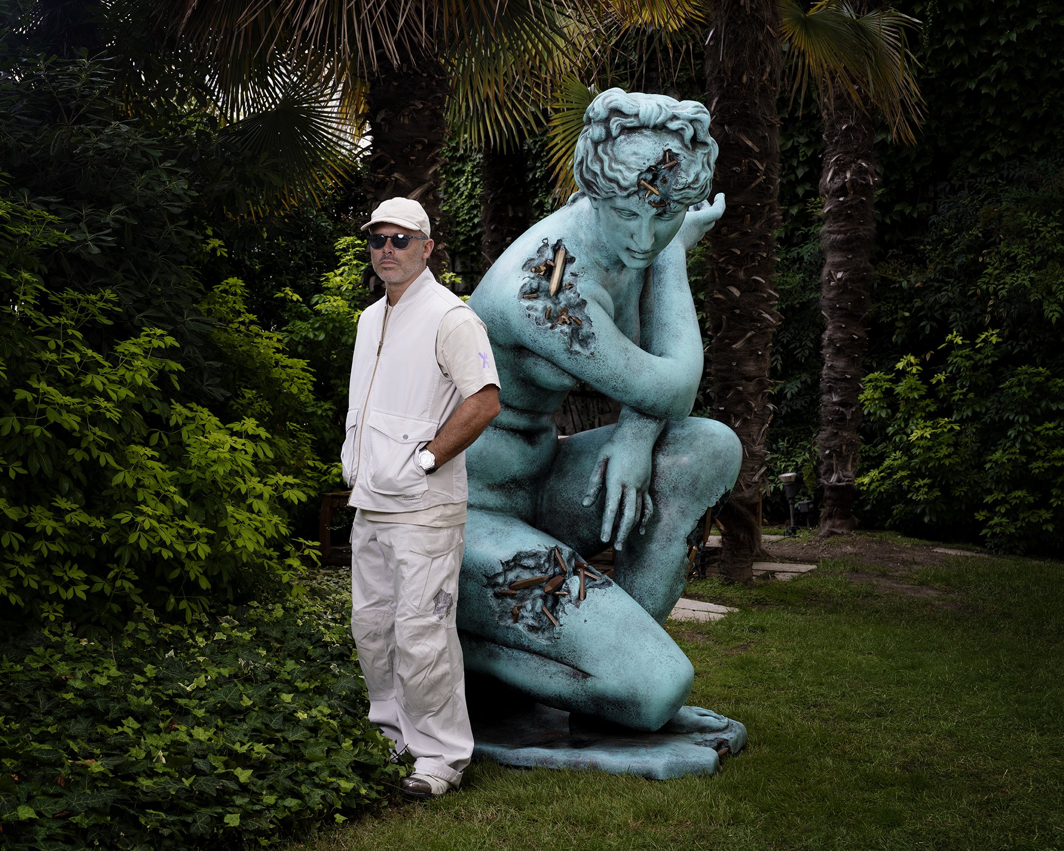
interview by Oliver Kupper
introduction by Chimera Mohammadi
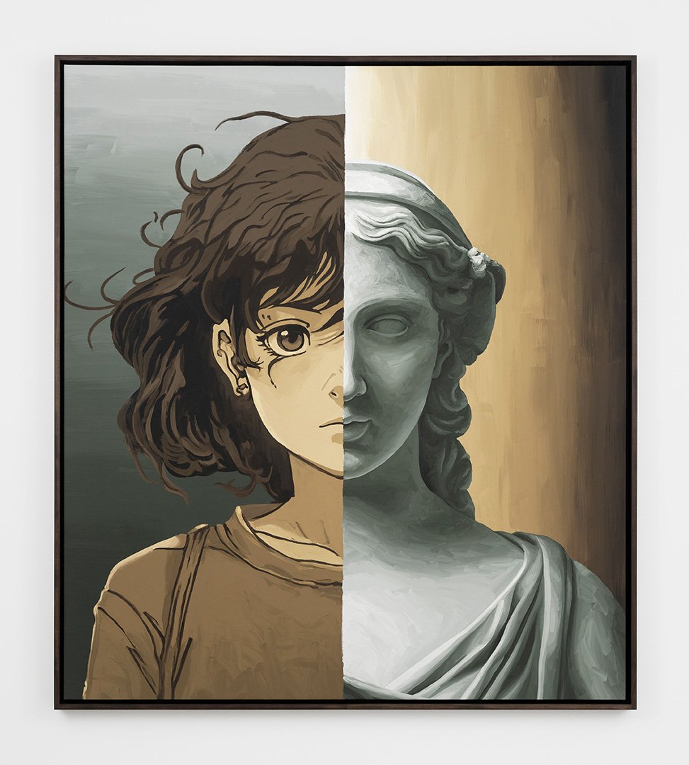
In the furnace of adolescence, Jason Boyd Kinsella’s world fell apart into the neat building blocks of identity that make up the Myers-Briggs personalities. Thirty years later, he’s finding new ways to put the pieces back together again in geometric patterns. In his portraits, smooth, inorganic shapes against flat backgrounds become vivid, abstracted bodies, occupying startling emotional space. The tension between inhuman and intimate is amplified by the contrast between his clear reverence for the Old Masters and his own unique brand of decidedly modern cubism. Kinsella’s exploratory practice responds to the deterioration of visual truth in the Internet era by seeking the psyche of each sitter. Melding cool modernity with rich intuition, Kinsella’s ever-evolving expressions of personhood have enkindled the excitement of an international audience.
OLIVER KUPPER: It would be great to start with your later-in-life career as a fine artist and your 30-year hiatus. How long have you been painting, and what was the initial impetus to leave your previous career and dedicate yourself to fine art full-time?
JASON BOYD KINSELLA: Fine art has always been the primary compass in my life. After graduating from university with my Fine Arts degree, I got a job in advertising, which was a fun way to use my creativity. I sharpened my creative tools across multiple mediums and I got to work with some incredibly talented people who taught me a lot about craft, ideation and creative discipline. In many ways, it was a creative masterclass.
While I was working in advertising, I still painted and drew in my home studio, but I never showed that work. I just created for myself.
In 2019, my artwork took a very surprising shift. Almost overnight, my painting began to take on a deeper personal meaning and purpose. The intersection between my studies of the Old Masters, my fascination with psychology and MBTI, and my work experience suddenly collided on the canvas. I knew intuitively that something special was happening, so I threw myself into it completely and never looked back.
KUPPER: You describe your works as psychological portraits. What is it about psychology versus physical attributes that interests you more?
KINSELLA: We live in a world where you can’t completely trust what you see or hear. A person’s true likeness can be altered with Photoshop, digital filters, or even plastic surgery. People can hide who they really are behind an augmented version of who they want to be. This is the undependability of a portrait of the flesh. My practice is concerned with discovering the most authentic depiction of the self by way of the psychological portrait, where everything is laid bare.
KUPPER: When did geometry enter the field in your oeuvre of psychological portraits?
KINSELLA: After university, I developed a deep passion for modern art. Once I discovered artists like Jacques Lipchitz, Henri Laurens, Picasso, and Henry Moore, a light suddenly switched on in my mind. I couldn’t resist the art of subtraction because of its sober directness. I didn’t set out to incorporate geometry into my work, but I guess it makes sense that it would become a central element in my oeuvre.
KUPPER: You received the Myers-Briggs Type Indicator book as a child, which would have a profound influence on your work—what was it about this book that fascinated you so much and who originally gifted it to you?
KINSELLA: It’s funny how the mind works. My mother gave me a book when I was a teenager called, Please Understand Me, which was a book about the Myers-Briggs personality indicator. It included a self-test which I took, I quickly learned everything about the building blocks of my personality (INFJ), and it was a startlingly accurate self-portrait. I couldn’t believe that I could be reduced to these psychological building blocks and then assembled into 1 of 16 personality types. I remember feeling a bit disillusioned that there were only 16 different personality types on a planet with billions of people.
From that day forward, I don’t think I thought about people the same way. It took many years for that experience to manifest itself in my artwork, but there’s no question that it had – and continues to have – a profound effect.
KUPPER: What do you think you have brought from the world of advertising to painting and what have you left behind?
KINSELLA: There is no question that, without my experience in advertising, I couldn’t do what I am doing today. I worked with some incredibly creative people that taught me how to get the most out of my ideas. I also learned a lot about psychology and self-discipline. It was those twenty-five years of preparation that enabled me to get the most out of what I do today. I took some great memories and lessons, and I don’t feel that I left anything behind. It was a very natural and necessary progression into my creative journey.


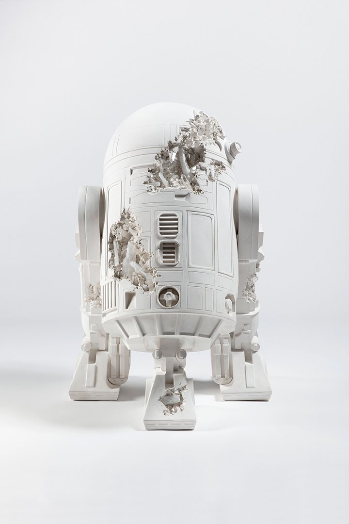
KUPPER: Your sculpture is really interesting—what is your approach to sculpture versus painting?
KINSELLA: Some people are surprised to learn that my sculptures always begin as paintings. I find this to be the most intuitive way to flesh out an idea. I really enjoy the interactivity and exploration that a sculpture offers the viewer. Every vantage point of the sculpture offers new insights into the subject's personality. It’s no surprise to me that some of my biggest influences are sculptors, furniture designers and architects (Moore, Lipchitz, Juhl, and Hadid, Gehry, Picasso, Wegner etc…)
KUPPER: Where do you start with a portrait—is it a jumble of imagined geometry, or do you have specific visages in mind?
KINSELLA: When I start a portrait, I don’t think visually. I just focus on the feeling about a person and then I let my hand interpret that feeling. The results are always surprising and unexpected.
KUPPER: How do the Old Masters and other influences play into your work?
KINSELLA: My formative influences have a big range. My schooling was primarily the Old Masters. That’s where I developed a strong affinity with portraiture, especially with the work of Rembrandt, Dürer, Jan van Eyck, Hans Holbein and Caravaggio. Their work was always loaded with mystery and emotion. I also was drawn to the work of Singer Sargent and Anders Zorn – more for the elegance and simplified palettes.
KUPPER: What role does color play in your paintings?
KINSELLA: Color is very important to my work. It is a key element in conveying a sitter’s emotions.
KUPPER: How do you navigate the tension between creativity as a personal outlet versus art as a means of communication with an audience?
KINSELLA: I am in a quiet conversation with each painting while I make it. It’s a highly personal and intimate process that doesn’t include anyone other than myself and the subject. When I paint I never think about the audience because I am making the work for myself.
But sculpture is different. I definitely consider the audience when I am making a sculpture because I want the work to be accessible for everyone. Things like scale and the point of view are important to consider so as to enable people to interact with the work in the most personal way possible.
Digital is also different. Often I will think about how people can interact with the work on digital platforms to potentially take ownership over a piece. (Especially on mobile phones).


KUPPER: Your work has been received with enormous positivity—not only amongst an art audience, but also collectors. How has your perception of success in art changed over your career?
KINSELLA: I am deeply grateful that my work resonates with people. That positivity really energizes me. A big part of my life has been spent visiting museums, galleries and reading art books, so it is very fulfilling to see that my work has found a place alongside the people and places that I venerated for so long. It fills me with a lot of joy. I just continue to make the work for myself, while continually pushing into the unknown to see what I can find.
KUPPER: In your latest exhibition at Perrotin, Emotional Moonscapes, your paintings existed on multiple floors and within multiple mediums—where do you see the future of your paintings? Any unexplored mediums?
KINSELLA: Over the past five years my work has evolved in craft, medium and narrative. It’s hard to say for sure what things will look like in the future, but finding new and relevant ways to express my visual language is central to energizing my practice, and I will continue to lean into that everyday.