Atlanta has long been a cultural capital, and few figures have been more central to that rise than Kevin “Coach K” Lee. As co-founder of Quality Control Music, he helped launch the careers of Migos, Lil Yachty, City Girls, and Lil Baby, building one of the most influential music rosters of the past decade. Designer Ami Sueki, through her studio Zoo as Zoo, has worked at the intersection of fashion, art, and design with collaborators ranging from Nike to Coca-Cola.
Together, the two have future plans for EXIT, a new 5,000-square-foot space at Atlanta’s Goat Farm arts campus. Set to be designed by Berlin-based architect Daryan Knoblauch, EXIT will be a flexible, multi-use hub—part gallery, studio, concept shop, and event space—intended to address Atlanta’s lack of artist-first “third spaces.” Programming in its first year will include capsule fashion collections, installations, a twelve-track album released monthly with accompanying films, and an inaugural Nike collaboration sneaker.
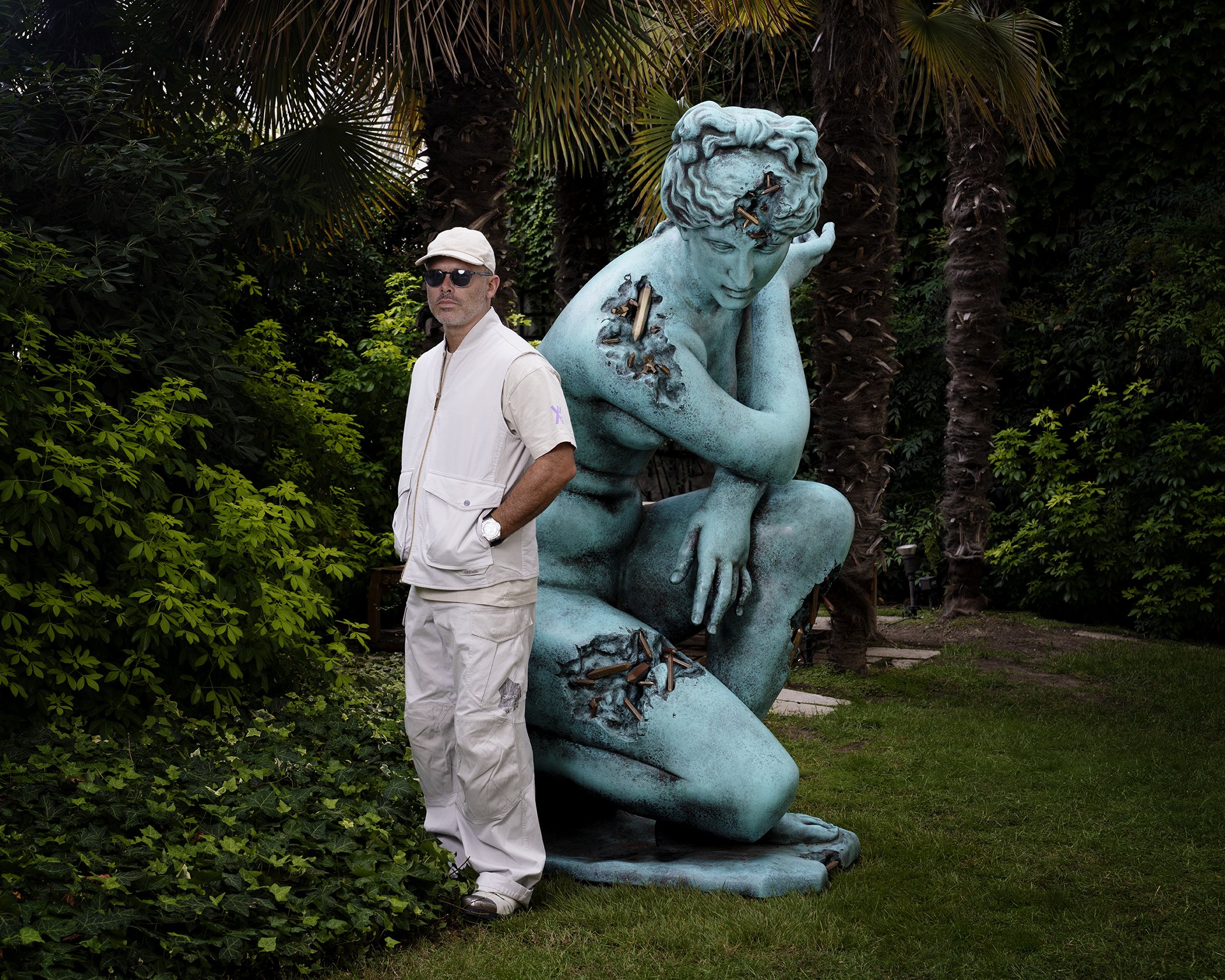
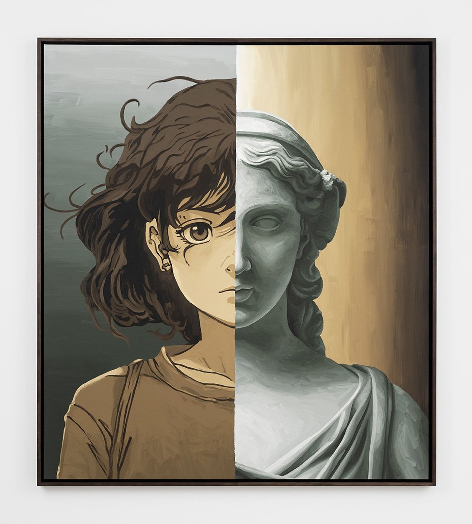
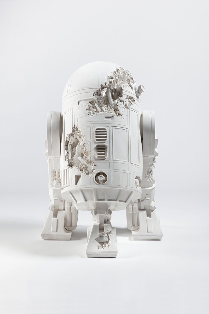
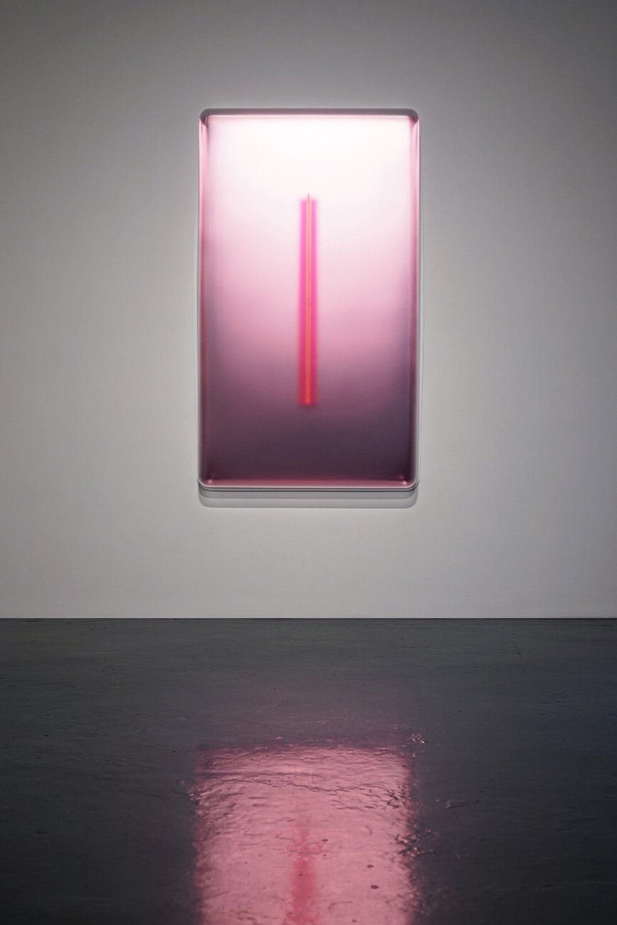
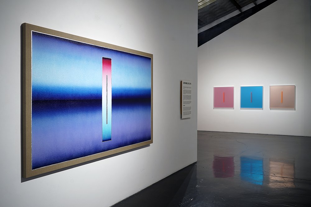
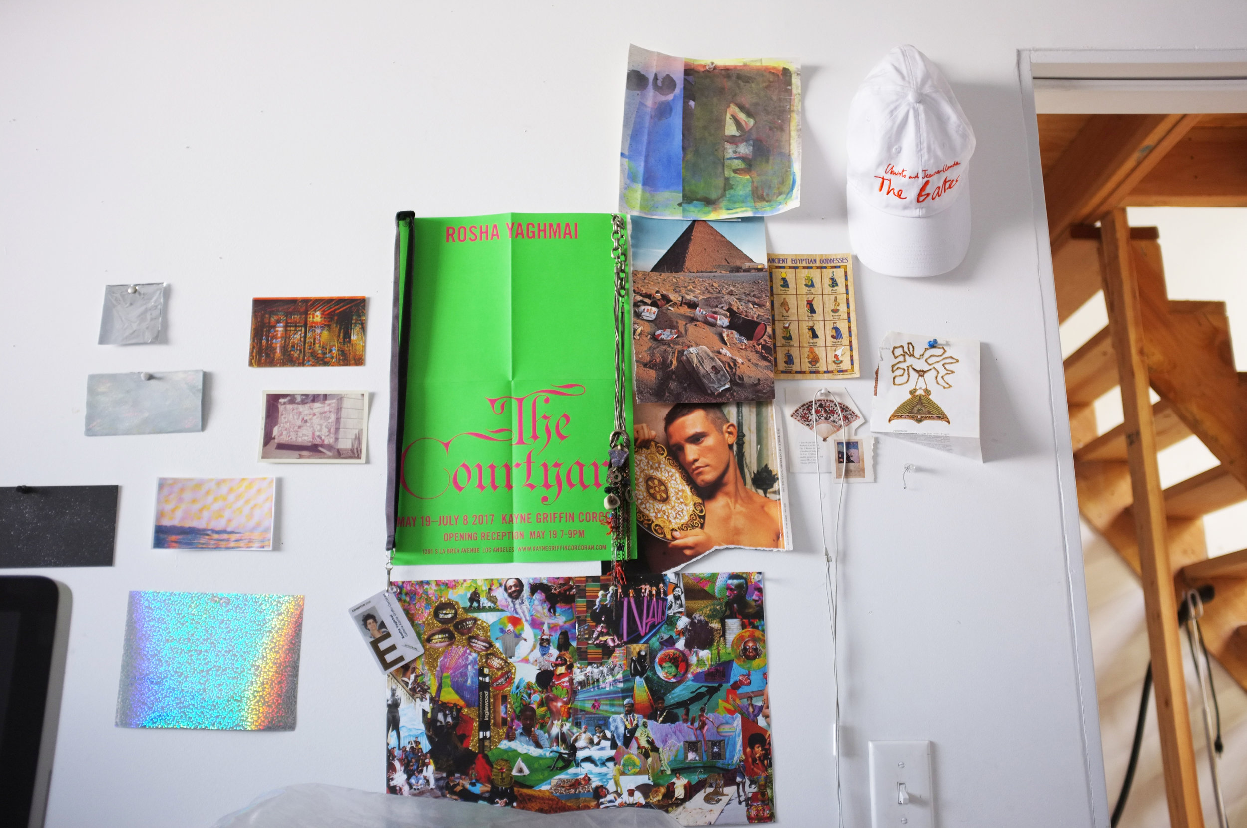
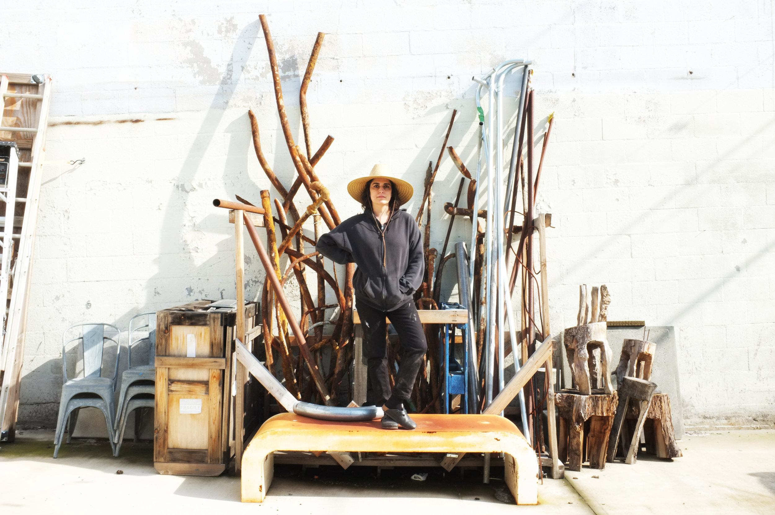
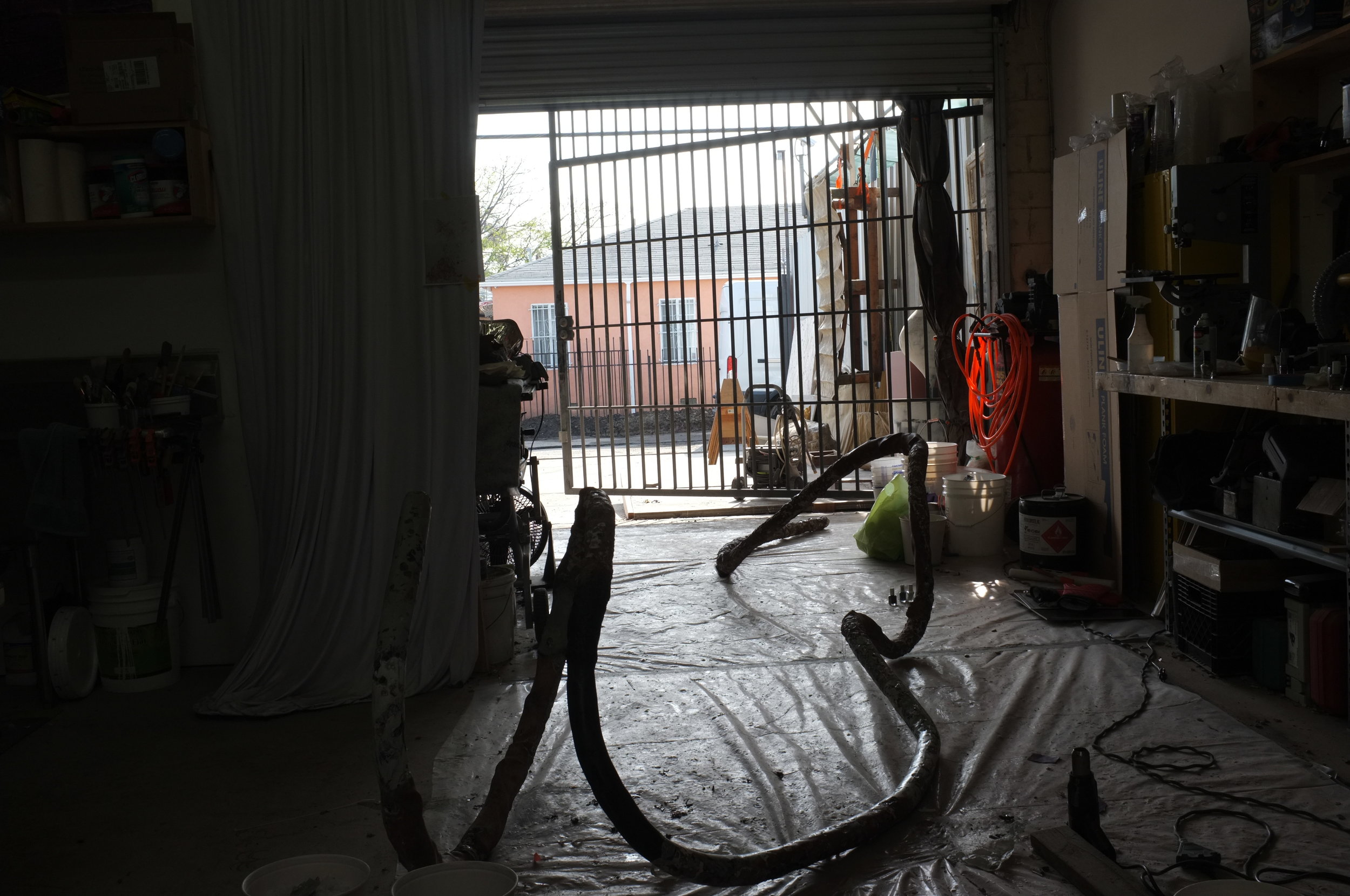
Earlier this year, EXIT hosted a residency with London-based Nigerian artist Slawn and Lil Yachty, who produced a full body of work in just two days. That collaboration now extends to New York with an exhibition pop up at The Hole, underscoring the project’s mission: to give Atlanta’s creative community the resources to stay rooted locally while connecting to global networks.
OLIVER KUPPER: Atlanta is this really interesting nexus point in the Venn diagram between New York and Los Angeles. Maybe we could start with Atlanta—what it is, where it is, what the cultural scene is.
KEVIN “COACH K” LEE: I’m from Indianapolis, Indiana, and growing up, sports were my refuge. I was raised in a single-parent household in what you could call the ghetto, and basketball became my escape. I played all through school, and when it came time for college, it was my first love. I went to an HBCU in Raleigh, North Carolina, but the first offer I ever got was from Clark Atlanta University.
I remember visiting Atlanta right after high school, and I was honestly a little nervous. The Atlanta child murders in the early 1980s were still a lingering memory for me—35 kids disappeared over a three-year period—and that always frightened me as a kid. So, I ended up going to school in North Carolina, but I had friends at Morehouse and Clark Atlanta, and I would drive down from Raleigh to visit. It was about a five-hour drive, but whenever I went, I could see the city thriving in a way I’d never experienced before.
This was around the time LA Reid moved to Atlanta and started shaping the music scene with his label, LaFace Records. Freaknik was happening, the culture was vibrant, and it felt like a pot of gumbo—you had locals, “Atlantonians,” who were born and raised there, and then you had students coming from all over the country to the city’s four major HBCUs, bringing with them their subcultures. Every time I came back and forth, I remember thinking, I’ve never seen Black people in this kind of position before.
I remember visiting a friend in West Atlanta—he grew up in Cascade—and the neighborhood was just mansions. And it was almost entirely Black families. I’d never seen anything like it. That’s when I realized Atlanta was special, not just because of its music or culture, but because it had sustained African American leadership for decades, and the city’s infrastructure allowed Black culture to flourish. After the ’96 Olympics, Atlanta became a global city in a real way. Traveling for work now, people ask if I’ll move to LA or New York, but there’s nothing like coming home here. The southern hospitality, the warmth—it’s incomparable. And beyond music, the art scene has really started to bloom over the past twenty years.
OLIVER KUPPER: But in the past decade, especially with social media and TikTok, Atlanta’s influence has gone global—it’s supercharged.
AMI SUEKI: Absolutely. Even when I traveled a few years ago—I was in Amsterdam at a hotel bar—people asked where I was from. I said Atlanta, and immediately they said, “Oh, that’s where Migos are from!” A few years prior, people didn’t even know where Atlanta was. Trap music from Atlanta now has a global audience, and it really connected with the younger generation.
OLIVER KUPPER: Ami, what brought you to Atlanta originally?
AMI SUEKI: I’m Japanese American. I was born in Knoxville, Tennessee, and grew up in a military town in North Carolina near an Air Force base. 9/11 happened during my formative years, and my everyday life was shaped by conversations about war—my friends and family were serving overseas. I grew up around a very American, very Southern environment. People hunted, drank beer, shopped at Walmart when they still had guns.
I studied neuroscience and industrial design in Raleigh and Durham, and my first job out of college was at Coca-Cola as an industrial designer. I stayed in Atlanta after three years because I realized how deeply my upbringing connected to Southern culture. People often assume I’m from Tokyo because of how I dress or my interests in art, music, and fashion, but I feel a deep resonance with Atlanta—the language, the slang, the food, the community.
OLIVER KUPPER: And what was your role at Coca-Cola?
AMI SUEKI: I was an industrial designer—working on packaging, vending machines, merchandising, and retail.
OLIVER KUPPER: And what was it about neuroscience that drew you in?
AMI SUEKI: I was a total math and science nerd growing up. I loved biology and the complexity of the brain—how it shapes movement, perception, and experience. I even worked in a Duke lab studying Alzheimer’s. But lab life wasn’t for me; it was too rigid. Then I discovered design through Surface Magazine at an airport, and that completely shifted my trajectory. I ended up at NC State for industrial design, and from there, I stayed in Atlanta.
OLIVER KUPPER: Kevin, tell me about the start of Quality Control Music.
COACH K: I’d been in the music business for fifteen years before starting QC. At the time, I managed Gucci Mane, and Pierre Thomas, my business partner now, used to travel with us and observe. In 2013, I was ready to start my own label because I realized I had been building brands for other artists but not for myself. Pierre had a studio and wanted out of the business. I convinced him to partner, saying I’d bring talent. A week later, we signed Migos, and that was the beginning.
OLIVER KUPPER: What was the pitch?
COACH K: Honestly, Gucci was about to go to prison, so he passed on signing them. Pierre and I said, “We’ll do it,” and that was it. We didn’t look back.
OLIVER KUPPER: And your focus has always been authenticity, right?
COACH K: Yes. Authenticity and originality. I’m a storyteller at heart, and I need to feel the artist’s story. Voices move me, but authenticity drives me. That’s why when I saw Lil Yachty, I knew he had a lane no one else had—his confidence, his voice, his identity—all authentic. That’s how we brought him to brands like Target, Reebok, and Nike.
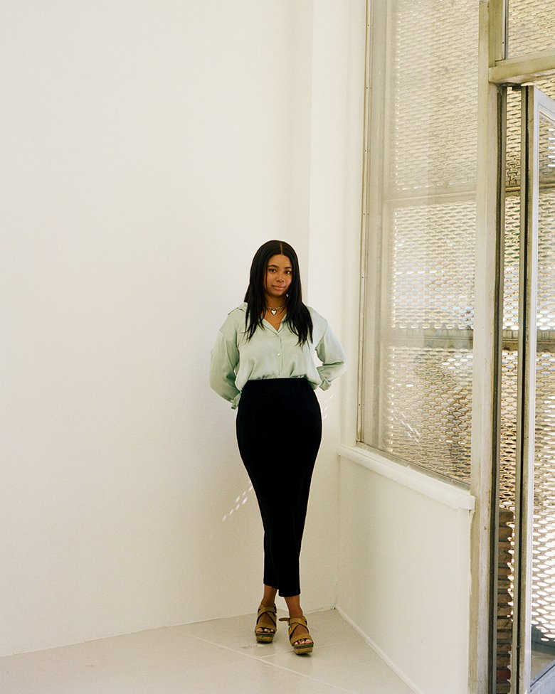
OLIVER KUPPER: Ami, how did you and Kevin meet?
AMI SUEKI: At a dinner. I wasn’t in the scene, but my team was doing creative work around the city.
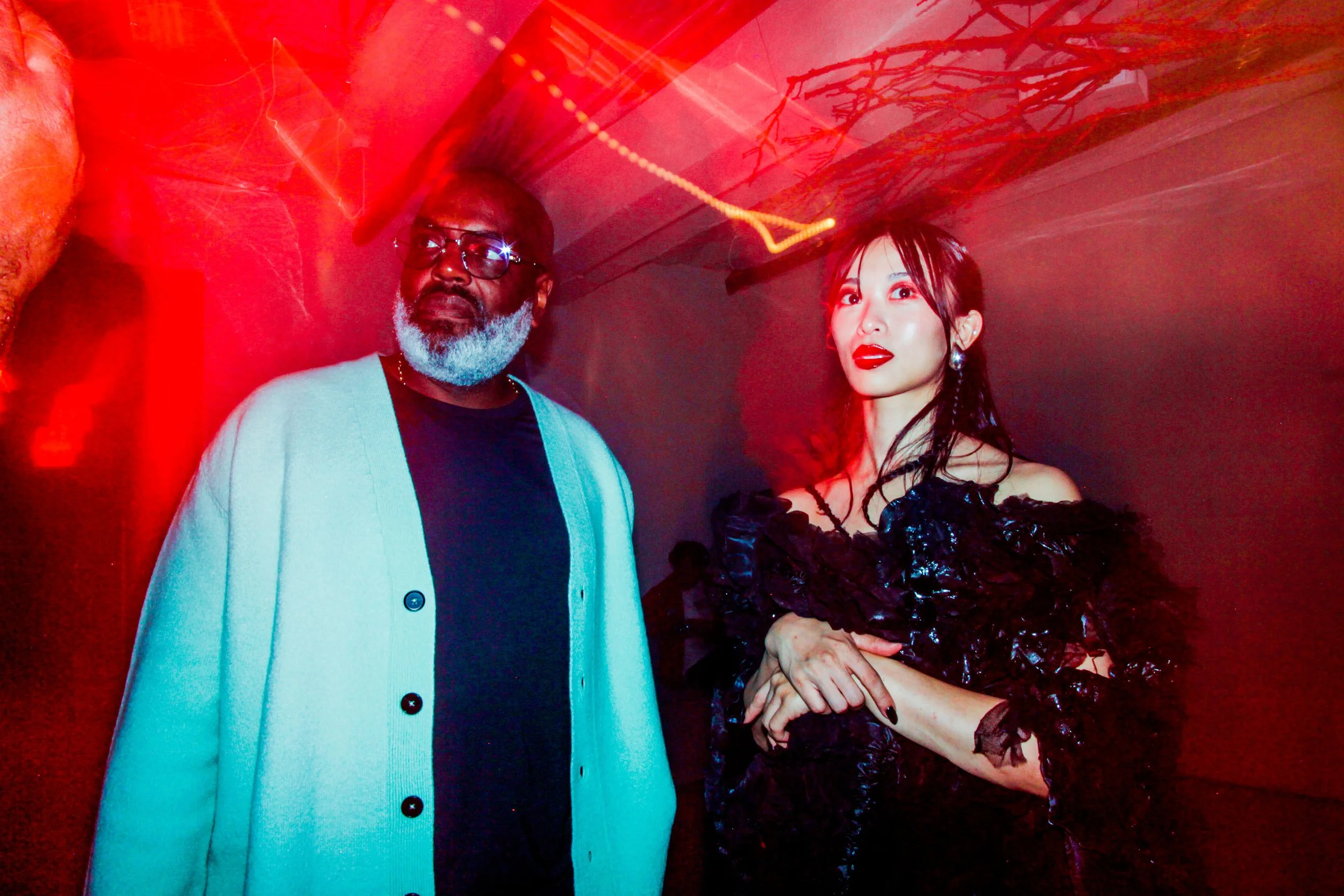
COACH K: We knew of each other but hadn’t met. A mutual friend set up a dinner, and we clicked immediately. The connections were crazy—shared birthdays, hometowns, kids, even shoes. Eventually, we decided to start a company together.
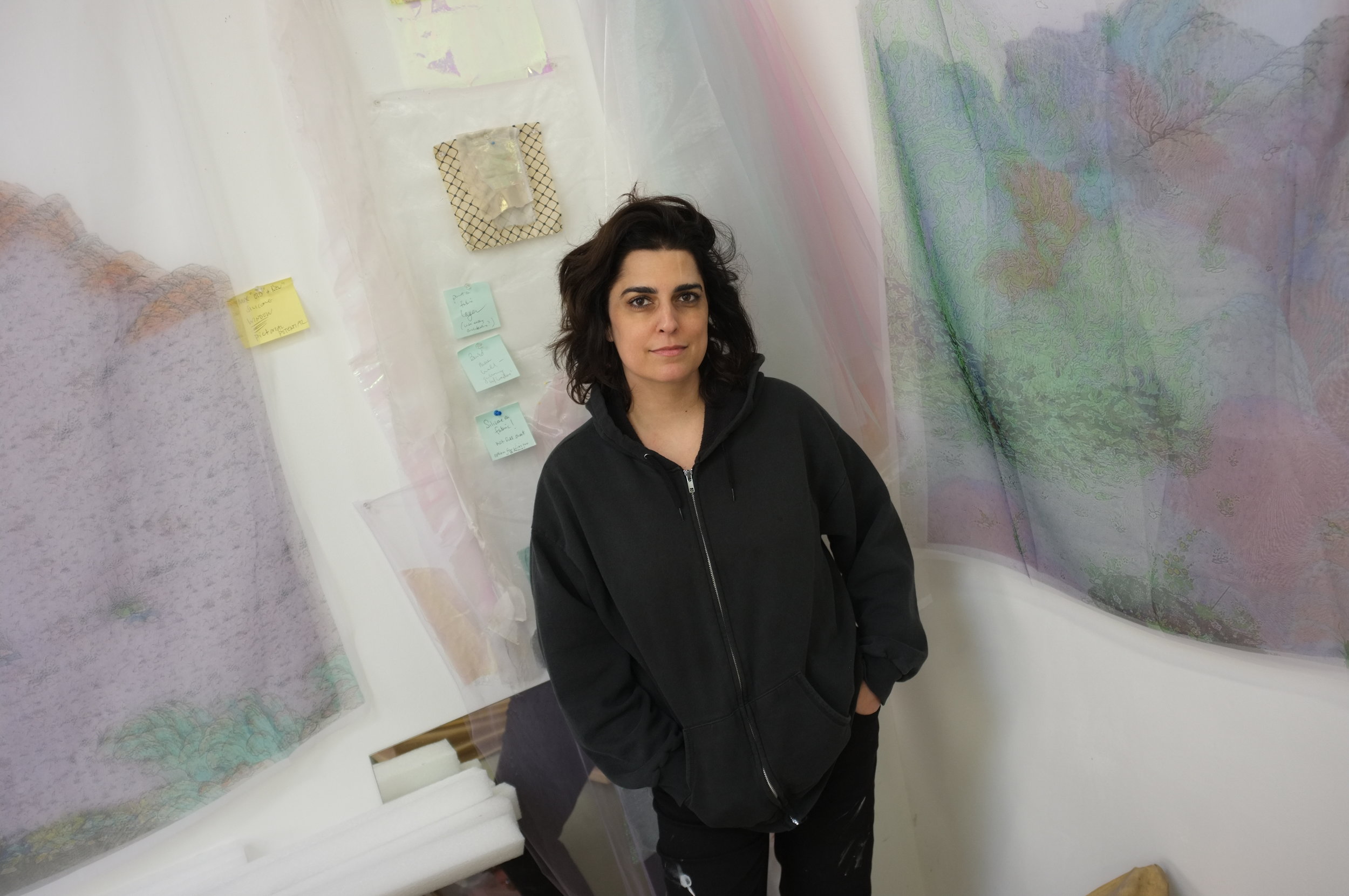
OLIVER KUPPER: Can you talk about Zoo as Zoo?
AMI SUEKI: The name comes from the old idea of a zoo—a place where lions, polar bears, goats, all coexist. We take that approach to creativity: diverse people, diverse disciplines. We focus on people first and let the outcomes emerge naturally. Our team has stayed together for ten years, which is rare, and we invest in curiosity-driven projects, like our Glow-in-the-Dark Ramen pop-up.
OLIVER KUPPER: How does Exit fit into all of this?
AMI SUEKI: Exit is a space for creatives to connect, experiment, and explore. Atlanta loses talent because people leave for global opportunities. Exit allows them to stay, collaborate, and thrive here without leaving.
COACH K: Exactly. From a music perspective, I was tired of artists having to go to LA or New York to be seen. Exit gives creatives a home in Atlanta.
OLIVER KUPPER: The pop-up this Friday—how did it come together?
COACH K: Lil Yachty’s friend SLAWN is a rising artist. We wanted to bring him here for a residency. Slawn created a huge body of work in 48 hours. I called Ami, and we realized it was perfect for Exit. The first Exit event was on her birthday, the second on mine—this one is another milestone.
OLIVER KUPPER: It sounds like you’re merging worlds—music, art, design—outside traditional gallery systems.
SUEKI: Yes. We’re fluid, holistic, and adaptive. Creative industries are in flux, and we embrace that.
COACH K: Physical presence matters. Experiencing art, culture, and people firsthand gives us the insight to tell authentic stories. Social media is fine, but it’s limited.
OLIVER KUPPER: It seems like Atlanta is a laboratory for culture, with both of you as the researchers.
SUEKI: Exactly. Physical interaction is crucial for real cultural development.
COACH K: Whether it’s music, fashion, or art, I need to be there to feel it—to understand the context, the energy, the story.
OLIVER KUPPER: The way you’re approaching this—it feels like you’re building infrastructure for creativity in a city that deserves it.
SUEKI: That’s the goal. To create platforms for collaboration, experimentation, and growth. Atlanta has incredible talent—it just needs the space and support.
COACH K: And it’s happening now. We’re seeing artists, designers, and creators staying here and building globally from Atlanta. That’s what makes this city special.
Friday, September 12 & Saturday, September 13, 2025. 12PM - 8PM. The Hole Gallery, 312 Bowery, New York