Interview By Luis De Jesus
Introduction By Summer Bowie
Photographs courtesy of Luis De Jesus Los Angeles
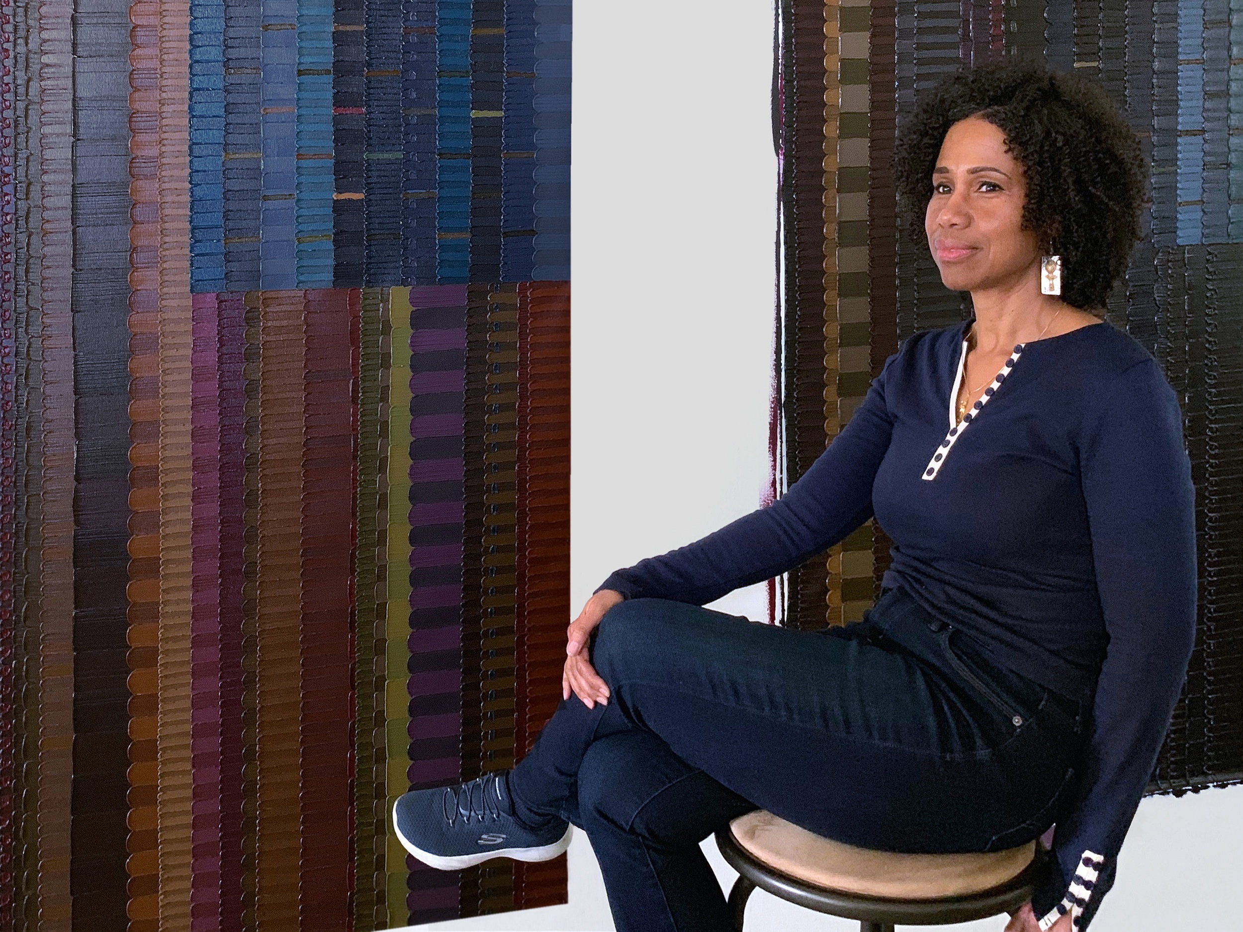
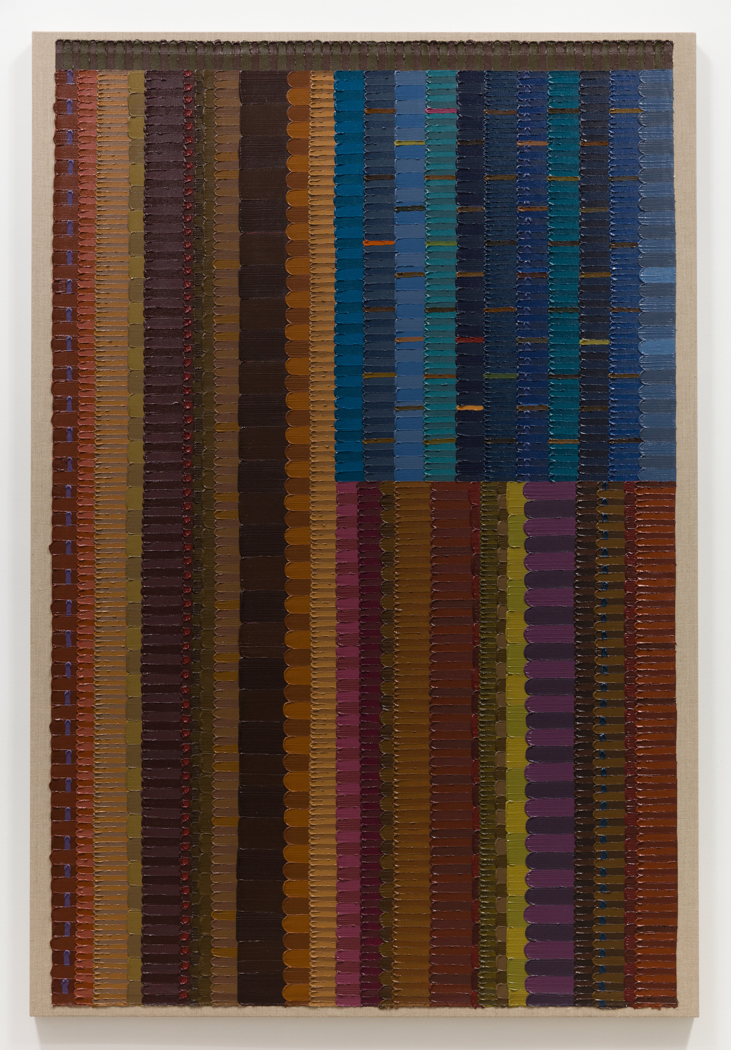
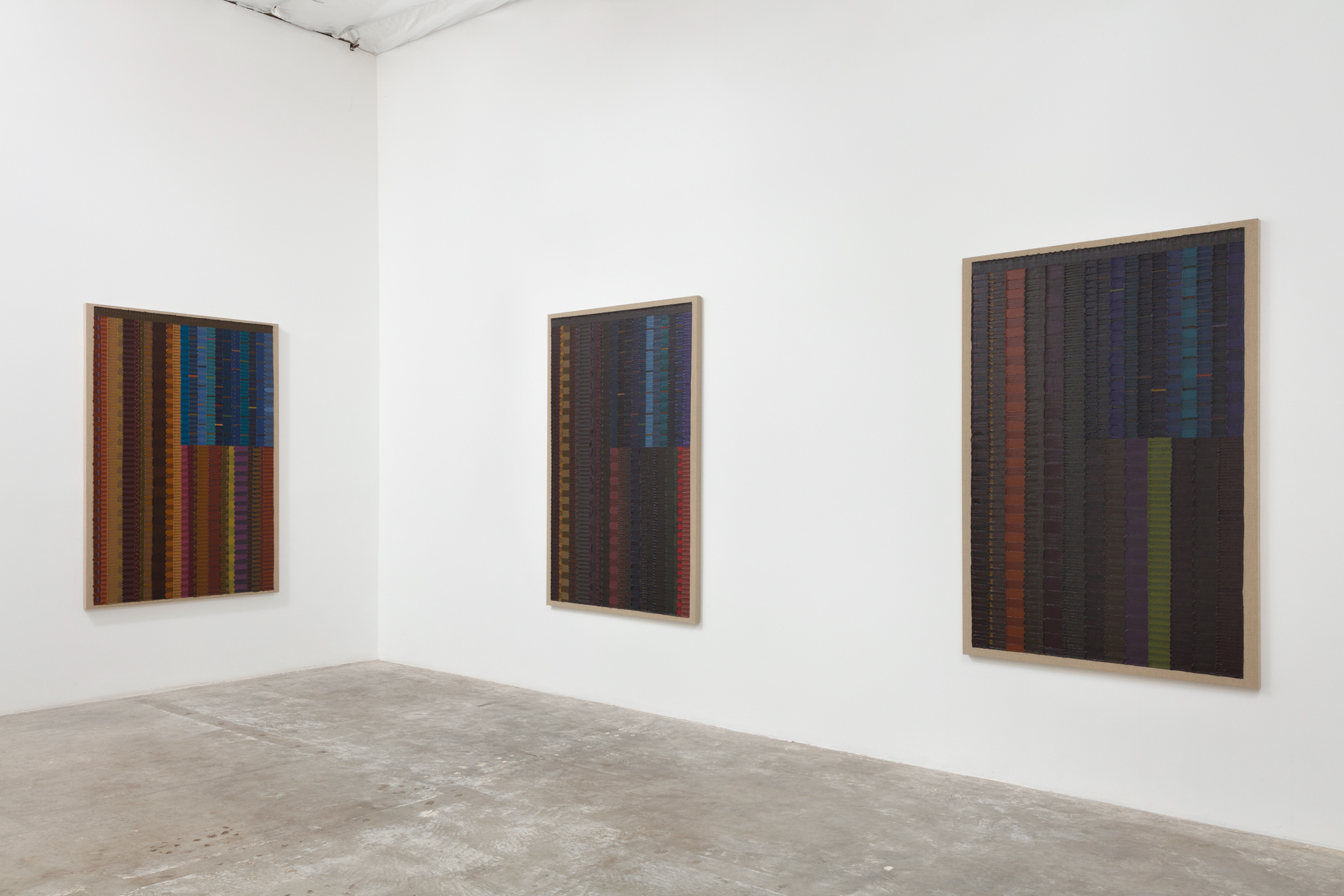
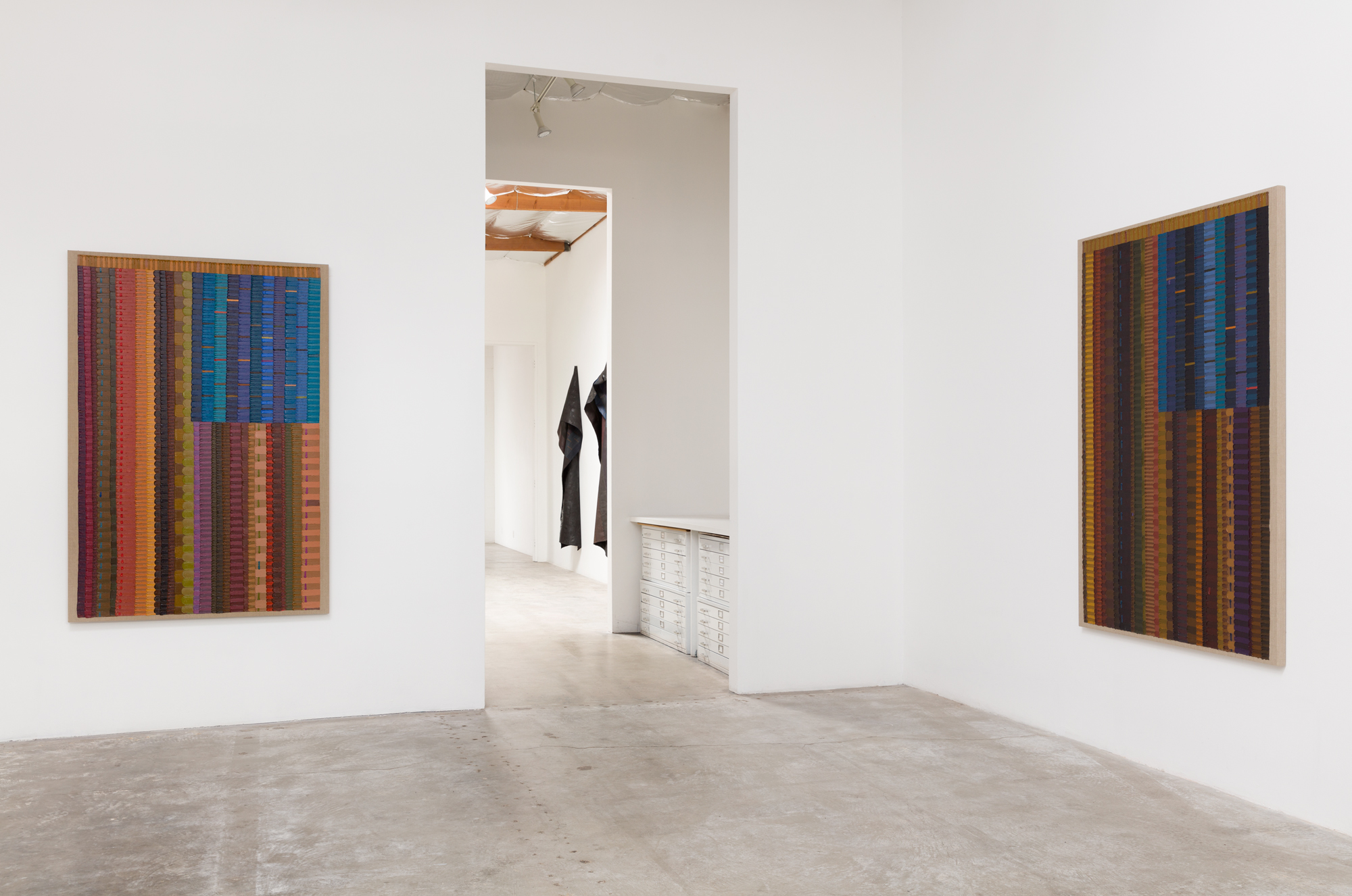
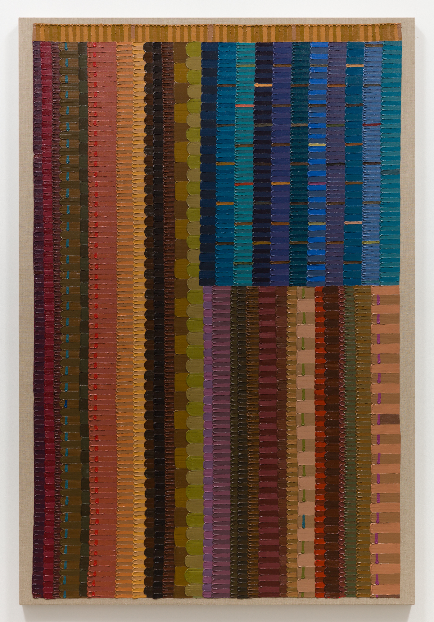
When tasked with defining America, the forefathers of this country attempted to create a union that, though forged in rebellion to an oppressive regime, was ultimately funded by slave labor. By declaring this land a union where all men are created equal, only to deny representation and basic civil liberties to all who are not white men, the framers of our constitution bequeathed to us a contradiction that we are still working to correct today. Almost 250 years later, with the divisive nature of our political system and a multitude of bifurcation points within each party, it seems that defining the American identity has become nearly impossible. While interviewing June Edmonds about her series of flag paintings that comprise Allegiances and Convictions, the current exhibition at Luis De Jesus Los Angeles, Owner/Director Luis De Jesus observed that the colors of the American flag were lifted directly from its British counterpart—it seems reasonable to suggest that our flag is due for an update. Vertically oriented, Edmonds’ flags vary from one to the next in color and pattern. They employ the primary hues of red, yellow, and blue, the three colors necessary to create a full spectrum of brown skin tones. During a recent public conversation between Edmonds and curator/writer Essence Harden hosted by De Jesus, an insightful teenage art student asked about the literal and conceptual roles that labor plays in the surrounding artworks. The student noted the meticulously painted smaller stripes that comprise each of the larger flag stripes, and the uniformity of each performed painted stroke. In person, these paintings certainly provoke questions about all aspects of American life, including the shrinking labor force that is so often leveraged by politicians on both sides of the aisle for personal gain. In an age when the average American seems illiterate or oblivious to abstraction and the power of art, it seems that the emblems to which we are asked to pledge our allegiances are in need of redefinition, and that definition necessitates an honest reflection of who we are: multi-hued, multi-faceted, of varying size, and in constant flux. The following conversation between Luis De Jesus and June Edmonds was conducted this past April at her studio at the Angels Gate Cultural Center in San Pedro, CA, in advance of her first solo exhibition at the gallery.
LUIS DE JESUS: You’ve said that the idea of the flags came to you in a dream in 2017, six months after you returned home from an artist residency in Paducah, Kentucky. What was it about that place, that landscape, that inspired your dream?
JUNE EDMONDS: Being out there, there is a different relationship to the flag. There is also that additional flag. Paducah is pretty much a progressive island within Kentucky, but outside of it is not. While driving to Memphis one day, I saw on top of a hill a Confederate flag as big as this wall. So, if you’ve got a Confederate flag that big in front of your house you really want the world to know something.
DE JESUS: So that planted this idea, this question in your mind about the flag.
EDMONDS: ...and about the power of flags, and what flags communicate, and how flags are appropriated.
DE JESUS: And the fact that you were on that land, you were in a place that played such a big role in the Civil War.
EDMONDS: Applying to Paducah I thought, “Okay, I’m going to No Man’s Land.” I’m going to a place no one’s been to before. But after Trump was elected and America started taking on this new tint, going to Paducah became a whole other idea and I was apprehensive. I was at a party and someone joked, “Well, at least you’re gonna be close to the Ohio River, because if it gets too deep you can swim across.” That sort of planted the seed in my mind. It’s really kind of meaningless right now, but that really meant something at one time. It became really interesting to me—the thought of being on that land 150 years ago. So, I started doing some research and I learned about Margaret Garner. I named the triptych “Ohio Story” after her. Her life is what inspired Toni Morrison to write Beloved. It’s about this woman who was a slave that was as close to the Ohio River as I was at the time.
DE JESUS: How long were you there for?
EDMONDS: One month.
DE JESUS: That visit had a big impact on you. When you came back it stayed with you for a long time, it permeated your daily reality and your dreams, obviously, because you had the dream about these flags some months later, which kind of kicked off this whole project. Tell me about your use of color in these flags because it’s very specific. It’s very different from an earlier body of work, the mandalas inspired by your meditation practice. Is this something that just came naturally? Did you say, “I’m going to paint these flags; I’m going to create a flag.” Did the colors happen naturally or was it something that you had to think about and it was a conscious decision—your decision—not to use bright colors?
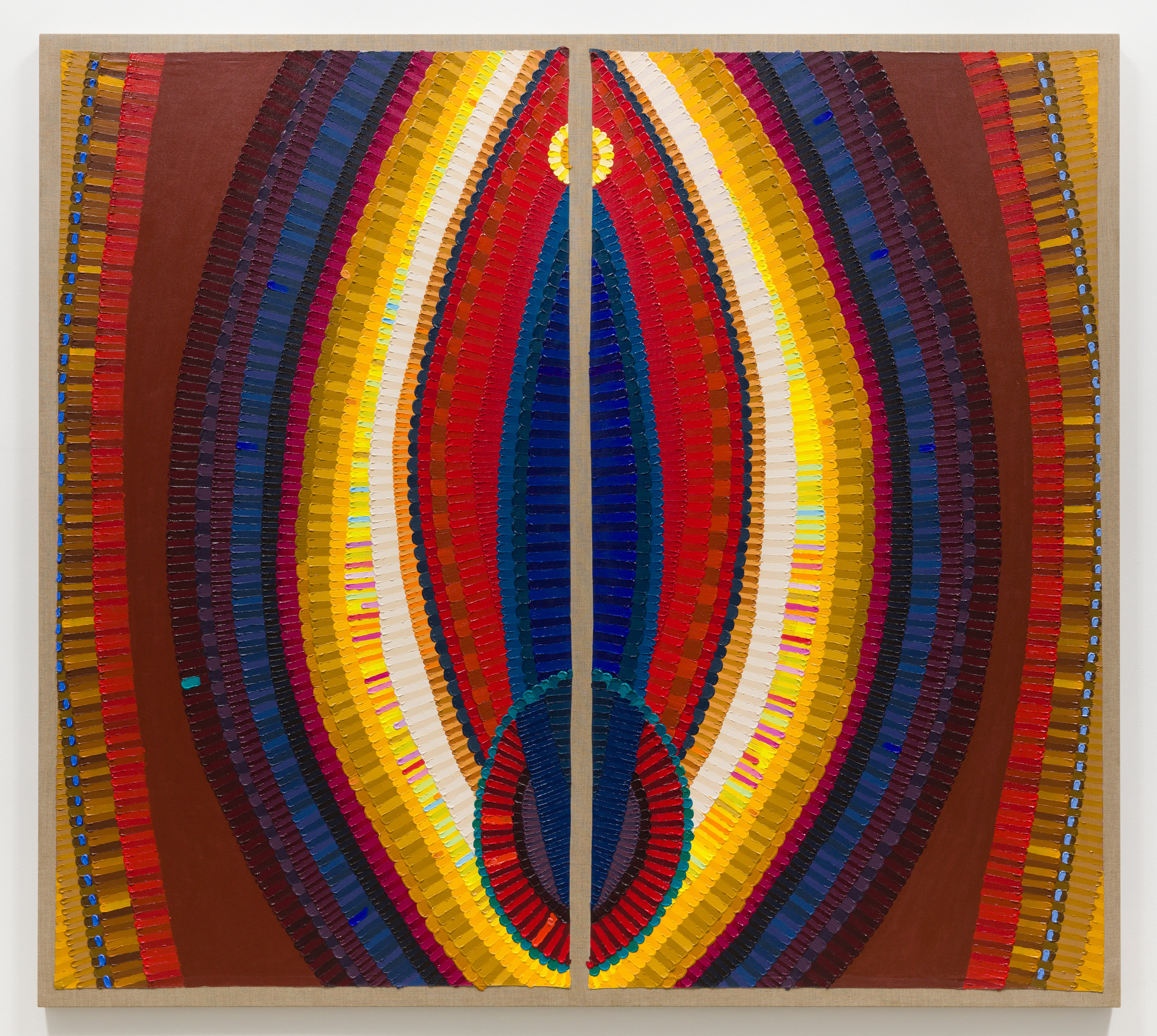
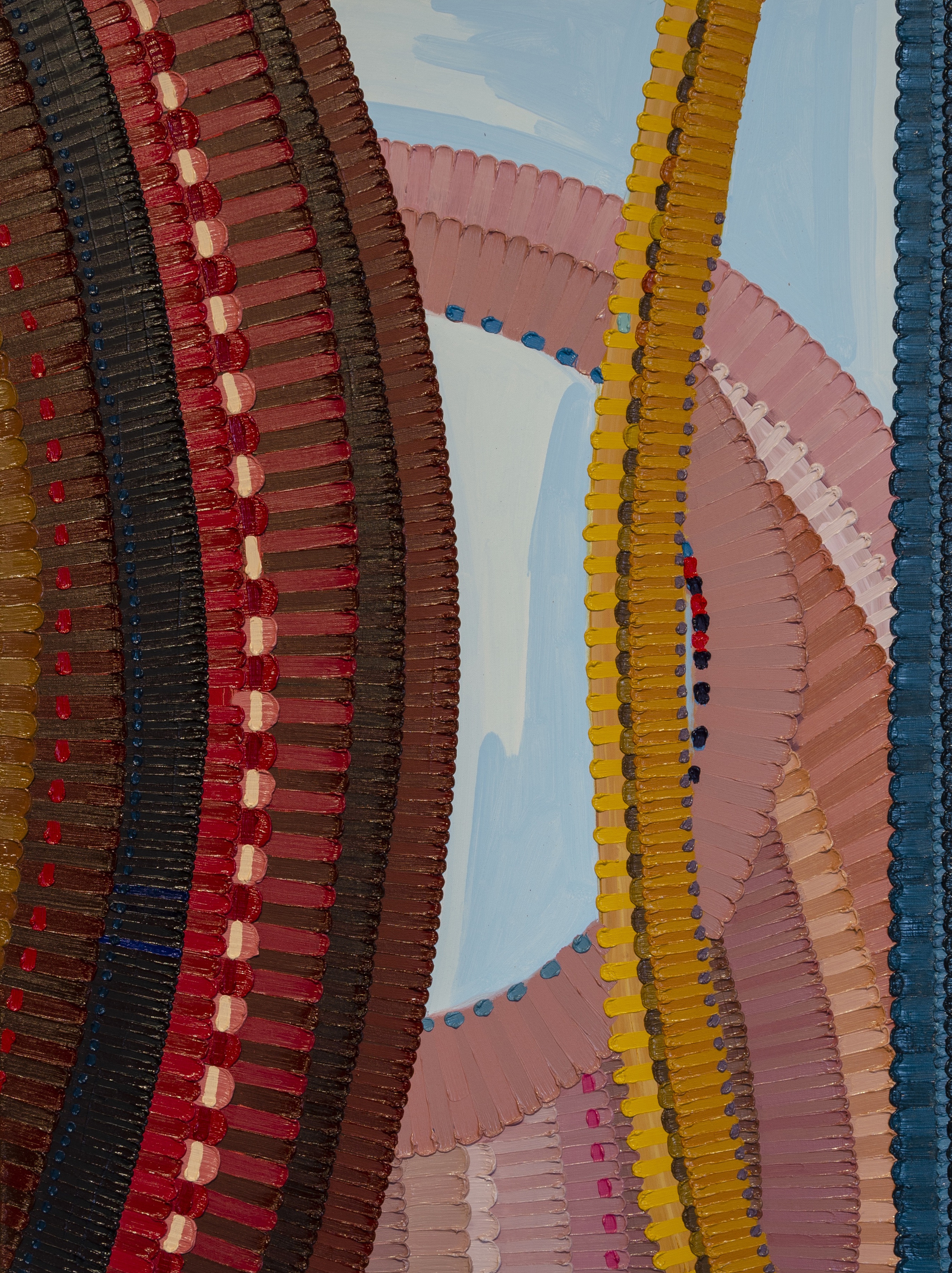
EDMONDS: Oh, it was conscious all the way. There are two things that inspired the color. The flags that came to me in my dream were black, but I was already thinking about using skin tones—brown skin tones. “Unina,” a painting I started in Paducah, is evidence of that. When I came back to LA I looked at another painting I started the year before called “Primary Theories” (2016), which used primary colors in brown tones. The idea is that all skin tones come from these particular primary colors that I was using in those works. If life started in Africa, then all skin tones come from that African skin tone. And then I thought back on how African black skin tones are referred to colloquially. You’ve got yellow—you know, we use that term. We use the term red, meaning this sort of Indian black skin tone, and we talk about really dark skin being blue black—primary colors. Those are the three colors that we use to talk about skin tones, to describe somebody that lives down the street.
DE JESUS: This is not something most people know about—unless you’re Black. I’ve never heard of this before.
EDMONDS: I’m really surprised! You being from DC and all!
[Laughter from both]
DE JESUS: Yeah, but I think Black people talk with each other differently.
EDMONDS: Of course, absolutely. When I think of the flag, I’m not going to do red, white, and blue. I’m doing red, yellow, and blue. I’m using the primary colors but still these are primary colors to brown. Very, very loosely, more and more and more loosely, I do consider that. I do consider that orange to be a red, or I consider that purple to be a red violet, or I consider that green to be a blue green. So, it just gets looser and looser.
DE JESUS: We’ve been asked, does she ever create horizontal flags? What’s behind the decision to keep these flags vertical?
EDMONDS: Okay, so two things. First, I dreamt them that way. The second thing is I wasn’t inspired by Jasper Johns, but I am inspired by Jasper Johns–the idea came to me independent of his flags–but I welcome the juxtaposition of those flags. With that said, his are horizontal and I want to keep mine distinct.
DE JESUS: And, typically, that’s how most people identify Johns flags—horizontally.
EDMONDS: These flags are standing for something, so I’m gonna to keep them standing.
DE JESUS: Also, a vertical has references to the standing figure. Seen together like this they sort of become these signposts. Each one has something to say that is unique to it.
EDMONDS: Cool. Do you feel that it abstracts them more?
DE JESUS: Well, that’s something I really love about them. I’ve had to point out to some people that they are flags. They don’t necessarily read them as flags, though some people do. Once I point it out they see it. I love that about it; it’s not obvious. You have to contemplate it a little more. But then the titles give it away.
EDMONDS: So that’s what I like: more abstracted, for it to come to you, and not be immediately legible.
DE JESUS: I have another question for you: have you ever felt that you were creating a new American flag?
EDMONDS: I’ve been thinking about this statement. It’s such a big idea that I shied away from it when you first asked me. But over the days I’ve been thinking, “Well, what are you painting for anyway? What are you doing this for anyway? Don’t you want to shift some ideas?” A new American flag says that we are shifting the idea of what something stands for. I accept that now.
DE JESUS: I love it! You’re embracing it now. I mean, it’s very powerful! To me, this whole idea of interpreting the flag in these colors, in these forms, is very provocative. As people in the art world we can appreciate it on a certain level. But a person who may not have that same connection or perspective may respond very differently. Their response may be similar to yours when you saw that Confederate flag outside of Paducah. They may look at your flag and say, “Oh man, that scares me!” It’s not just that you are making your own statement about the American flag, but you are proposing something quite radical here. It’s like you said, it’s an opportunity to really look at what this stands for, to think about its history, how it has impacted people—not just Black Americans—but all ethnicities who have come to this country, who embrace the flag, who embrace the country, and yet are always going up against things that keep them out, keep them from becoming fully realized Americans.
EDMONDS: I listen to a lot of audible books. One of the last ones I listened to is, The Rebellious Life of Ms. Rosa Parks. You hear about this person who came before Rosa Parks, who didn’t get up, but nobody knows her. Claudette Colvin was 17 years old and months before Parks did what she did somebody told her to get up from her seat. At the time she was studying government in school and she replied, “Don’t you know what the Constitution says?” I thought that was so powerful! So, one of these flags will be named for her.
DE JESUS: I consider what you are doing quite radical. All of your flags are becoming the new American flag. This constant change happening, the shift in colors from band to band and from flag to flag—this is not a static object, but something that represents evolution and change and progress.
EDMONDS: I like that. It’s sort of becoming.
DE JESUS: It’s always becoming, always working towards the goal, the ideal. What you said about the colors made me think of the stripes and the stars, how the design and meaning came from the tradition of European monarchies. The colors are from the British flag. We brought those ideals to this country and it became part of our own design. Yet, the ideals never became fully realized.
EDMONDS: Those colors were intended to stand for something. They probably said: “Okay, this is what it’s going to be. Red means valor. Blue means courage,” or something like that. But the flag is used to validate: this is what’s acceptable and this is what’s not acceptable in America, under this flag. If a person, behavior, or thing is not acceptable, it has no courage, it has no valor... and we all know that’s bullshit. This is important to me.

