Find everything from queer intimacy to infinity rooms to domestic Americana on paper this season in New York’s galleries.
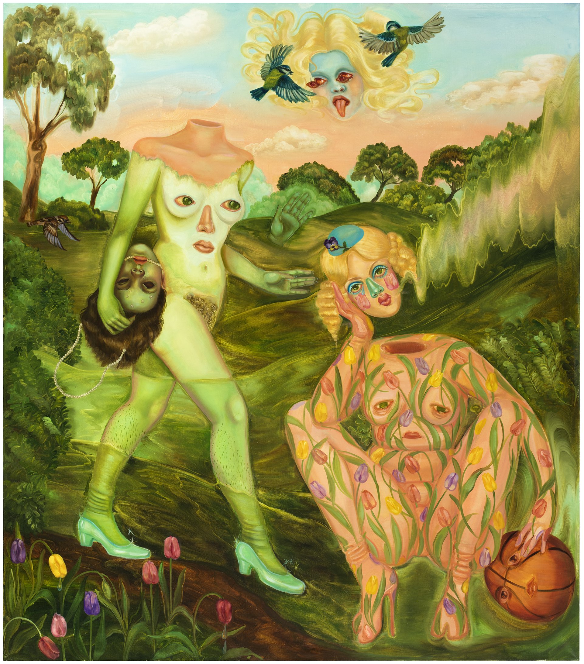
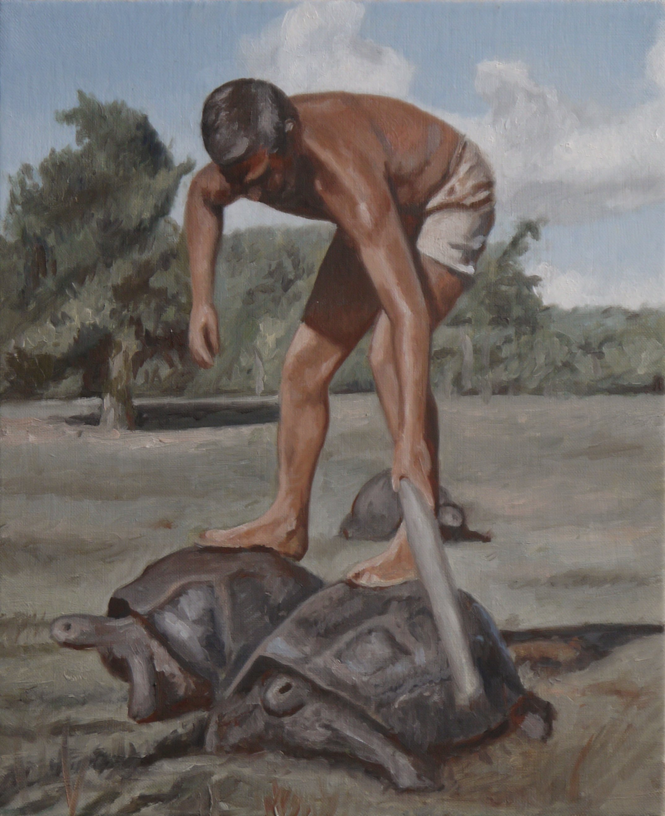
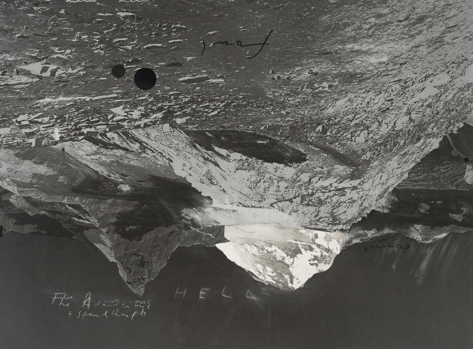
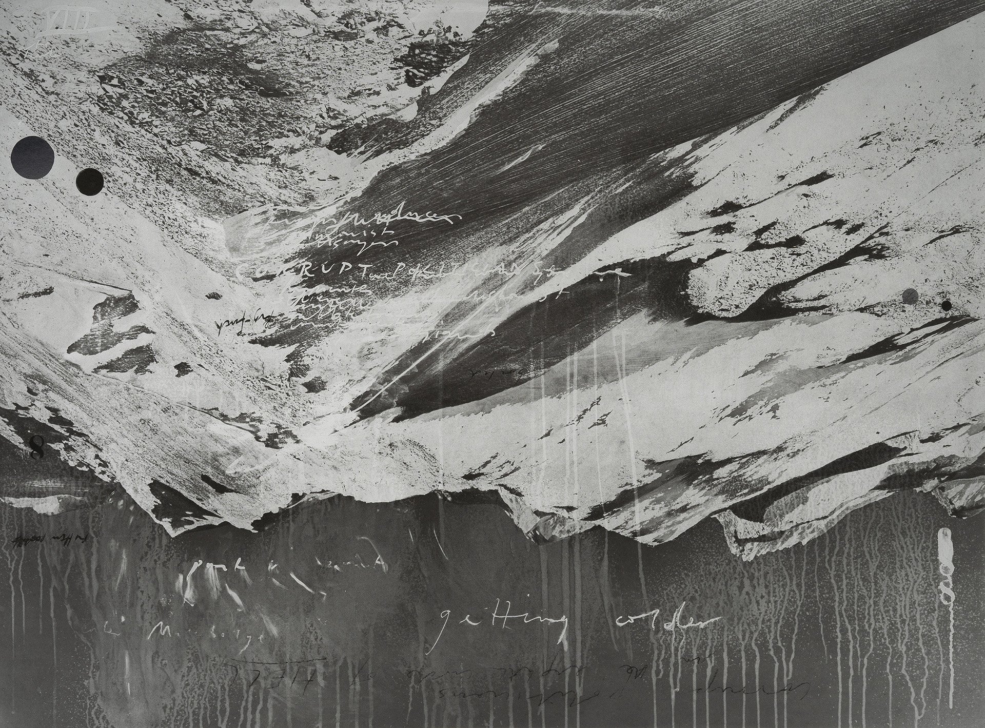
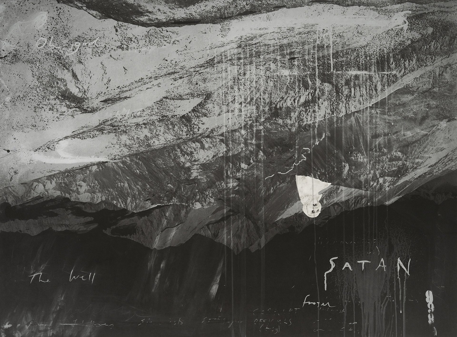
Jim Shaw
Study for “The Bride Stripped Bare” (2016)
Pencil on paper
text by Kim Shveka
Jim Shaw, Drawings
Gagosian
On view through June 14
For over thirty years, American artist Jim Shaw has mined the depths of Americana, popular culture, personal memory, and dream logic to create a body of work as chaotic as it is compelling. Now on view at Gagosian, Drawings is an exhibition of works on paper made between 2012 and 2024, showing Shaw’s intellectual inspirations in his artistic journey. Known for his ability to weave together the threads of America’s subconscious through surreal and symbolic visual language, Shaw here turns to the intimacy of graphite and ink, using sketch-like drawings to offer a direct window into his thinking; raw and unfiltered. These drawings are freely associated with references drawn from the artist’s mind and memory, as he imagines and recalls scenes from his own life and the collective American memory, translating the images in his mind’s eye onto paper. Jim Shaw’s “Drawings” is a deeply personal and evocative exploration of identity, nostalgia, and American culture.
Sam Moyer
Boca (2025)
Marble, acrylic on plaster-coated canvas
Sam Moyer, Subject to Change
Sean Kelly
On view through June 14
Multidisciplinary artist Sam Moyer is known for her distinctive approach to merging abstraction and materiality, often redefining conventional sculptural forms through her innovative use of natural elements. Her work blurs the lines between painting and sculpture, creating wall-mounted pieces that highlight variations in surface and light.
Now showing at Sean Kelly Gallery, Sam Moyer’s fourth solo exhibition features a dynamic body of new work. The exhibition showcases Moyer's fondness for inconsistency and contradictions across a variety of artworks. Featuring Moyer’s latest stone paintings from 2024, which combine reclaimed stone and painted canvas, alongside oil on panel paintings and handmade paper. In these new works, Moyer meditates on life's inherent dualities; decay and growth, loss and perspective, endings and emergent beginnings; capturing a moment of balance during trying times. The palette draws inspiration from Claude Monet’s late paintings, interpreting his shift towards purity of color and light as an investigation of essential visual language, ultimately reflecting Moyer's continued exploration of color and light as the core building blocks of abstraction.
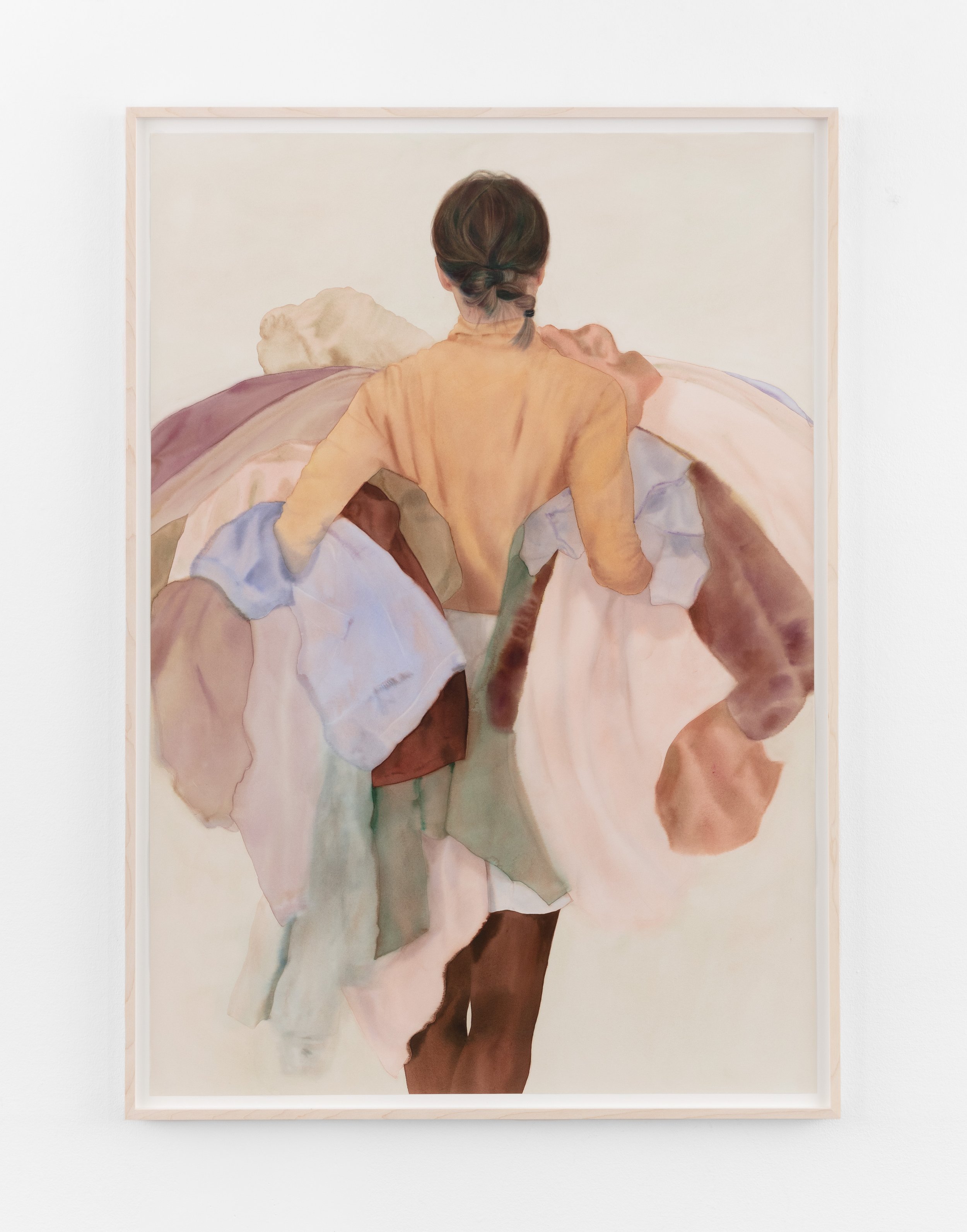
Salman Toor
Cross Street (2025)
Oil on panel
© Salman Toor; Courtesy of the artist, Luhring Augustine, New York. Photo: Farwad Owrang
Salman Toor, Wish Maker
Luhring Augustine
On view through June 21
Salman Toor is renowned for his evocative figurative works that explore vulnerability within contemporary public and private life, particularly in the context of queer, diasporic identity. His paintings delve into the opportunities, anxieties, and humor inherent in the search for selfhood and the immigrant experience. Now showing at Luhring Augustine, Wish Maker, Toor’s first major New York presentation since his pivotal 2020 Whitney Museum show, spans both gallery locations, featuring paintings at Luhring Augustine Chelsea and a dedicated presentation of works on paper at Luhring Augustine Tribeca. Toor's new paintings, drawings, and etchings place imaginary yet relatable figures in diverse settings, examining the complexities of our paradoxical times. His work vibrates between heartening and harrowing, often employing a distinctive viridescent palette that illuminates both beauty and violence, liberation and entrapment, reflecting how perception shifts with perspective. Toor skillfully fuses art historical references with contemporary concerns, creating a rich compilation of traditions, popular culture, and lived experience.
Installation view, Atsuko Tanaka, Yayoi Kusama, Paula Cooper Gallery, New York, May 8 - June 14, 2025.
Courtesy Paula Cooper Gallery, New York, Photo: Steven Probert.
Atsuko Tanaka and Yayoi Kusama
Paula Cooper Gallery
On view through June 14
Atsuko Tanaka, Yayoi Kusama, is an exhibition that brings together the groundbreaking works of two of Japan’s most innovative and influential artists. The exhibition presents a diverse selection of Tanaka’s works on canvas and paper, alongside early pieces by Kusama in various media, highlighting the parallel yet distinct artistic concerns of these pioneering figures.
Both Atsuko Tanaka (1932-2005) and Yayoi Kusama (b. 1929) matured in post-World War II Japan, a period of profound societal transformation that spurred radical shifts in the arts. Tanaka, a key female member of the Gutai movement, is known for vibrant works like her iconic “Electric Dress” (1956), where circles and lines dynamically interact. Kusama, active in 1960s New York, explored hypnotic repetition, creating immersive works evoking hallucination and boundlessness. Both shared a broadened approach to artmaking, incorporating textiles, sensory environments, and performance, developing personal abstract languages with repeated motifs in large, enveloping scales. The exhibition includes Tanaka's early drawings and paintings, Kusama’s pioneering “Infinity Nets,” rare collages, photographs, and historical films.
Dozie Kanu. Chair [ iii ] (Dark), 2022
Poured concrete, steel, rims
35.9 x 16.5 x 20.5 in. 91.4 x 41.9 x 52.1 cm.
Courtesy of anonymous gallery, New York, NY
the chair by the window is an old friend featuring work from Jane Dickson, Kamil Dossar, Nan Goldin, Felix Gonzalez-Torres, Dozie Kanu, Mike Kelley, Carolyn Lazard, Klara Liden, Elliot Reed, Josef Strau
Anonymous Gallery
On view through June 14
The chair by the window is an old friend explores the emotional layers of domestic space. It focuses on how our homes can feel safe and familiar, but also confining or heavy with memory. The objects we live with become more than decoration, they carry personal meaning, reflecting who we are, who we were, and who we might want to be. Some artworks, such as Nan Goldin’s My Bed, Hotel La Louisiane, seem to capture the trace of a moment that has just passed, preserving an atmosphere of intimacy and lingering presence. Others, like Elliot Reed’s leaning umbrellas, convey a sense of stillness and resistance to functionality, evoking suspension rather than resolution. Across the exhibition, everyday materials such as wires, fabric, and furniture are reimagined as vessels of emotion and meaning. Through these transformations, the works articulate themes of care, closeness, imbalance, and quiet shifts, drawing attention to the subtle psychological states embedded within domestic objects and spaces. In this way, the exhibition invites us to think about what ‘home’ really means. Is it a space where we can rest, or does it sometimes hold us back? As life outside moves faster and becomes more overwhelming, our interiors can become places where comfort and loneliness exist at the same time. They are both a retreat and a mirror of our inner world.